Reactor™ - The Manual
SKAARHOJ Reactor™ is a powerful broadcast control application running on Blue Pill Servers and Blue Pill Inside-products. Using Reactor you can do
- basic things like controlling your video switchers, video routers and PTZ cameras etc.
- advanced things like creating powerful macros, that automatically start several recorderss or position multiple PTZ cameras.
- highly custom things like protocol translation.
We aim to make common tasks and use cases intuitive and quick, but also believe it's reasonable to expect users to invest time in learning to master our technology to fully utilize its advanced features. It's that balance that allows us to provide the entire spectrum in one package.
This manual aims to document most of the features available in Reactor. It will focus on helping you understand the basic concepts that make up the world of Reactor, help you master them, and serve as a reference to a variety of topics.
Useful Links
Other articles and device-core specific information can be found on the SKAARHOJ Wiki pages:
The main changelog of Reactor and other SKAARHOJ software can be found on devices.skaarhoj.com
Be sure to also check out our YouTube channel, with videos on many topics regarding our products
For example our Blue Pill - Basic Training Series
Other info can be found on our Website
Manual Version: online
Reactor Overview
In this chapter, we will provide an overview of the parts of Reactor on the Blue Pill device's web UI.
We will cover:
The Home Screen
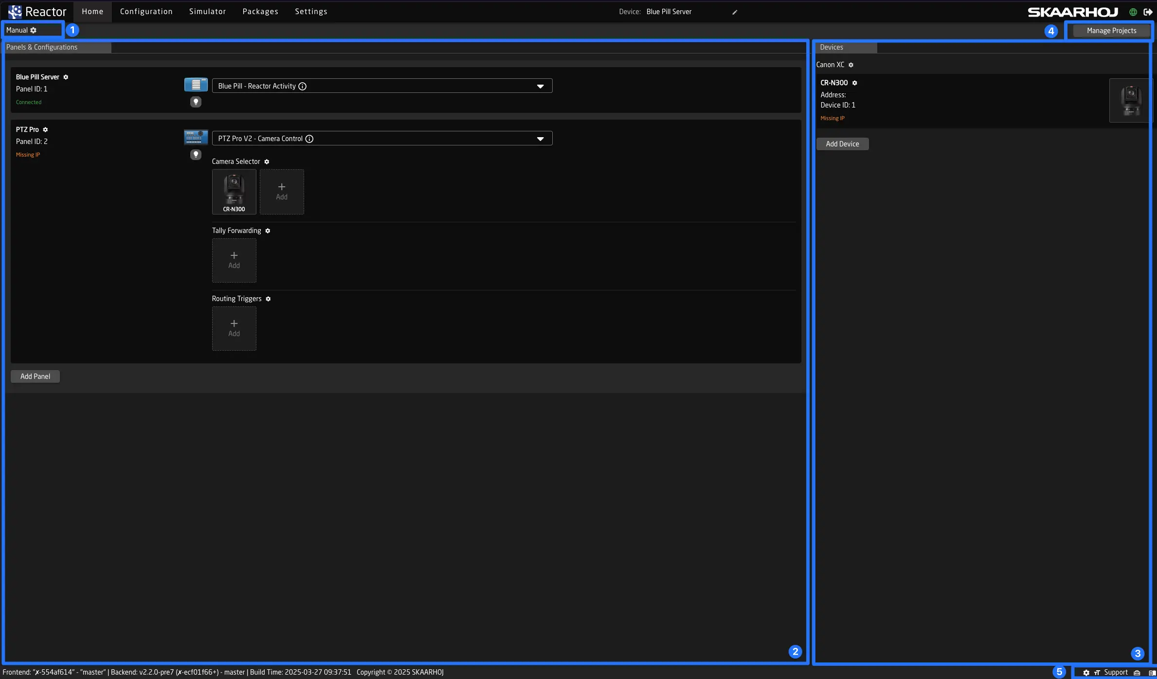
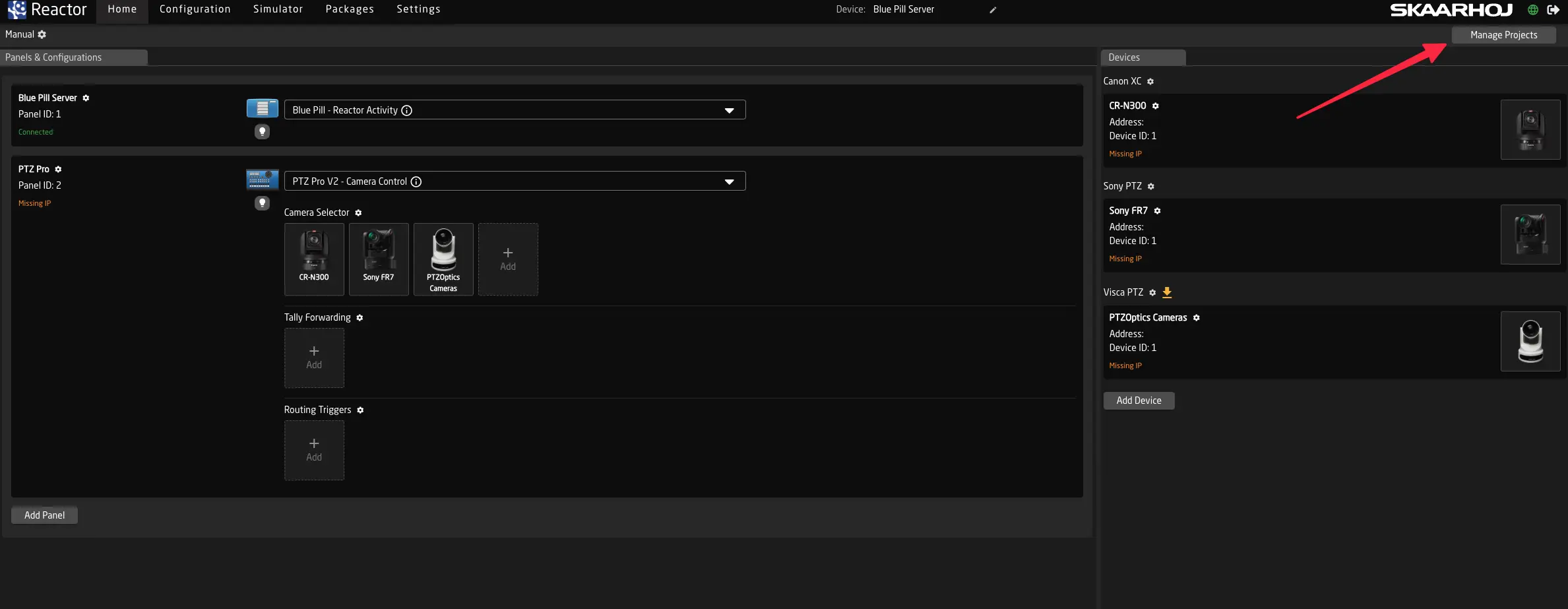
When you first open your Blue Pill product, you will see the 'Home Screen.'
-
Right below the navigation on the top you can see the current project name, and also edit it's details by clicking on the pen.
-
On the left side you can add and configure panels
-
On the right side you can add and configure devices
-
You can access and edit all Reactor Projects by clicking Manage Projects
-
In the bottom (footer) you can (from left to right):
- open the view settings. These are saved in your browser.

- change reactors global text size

- check the status of remote support mode (active when support text is yellow)

- find a link to the tools page (toolbox icon)

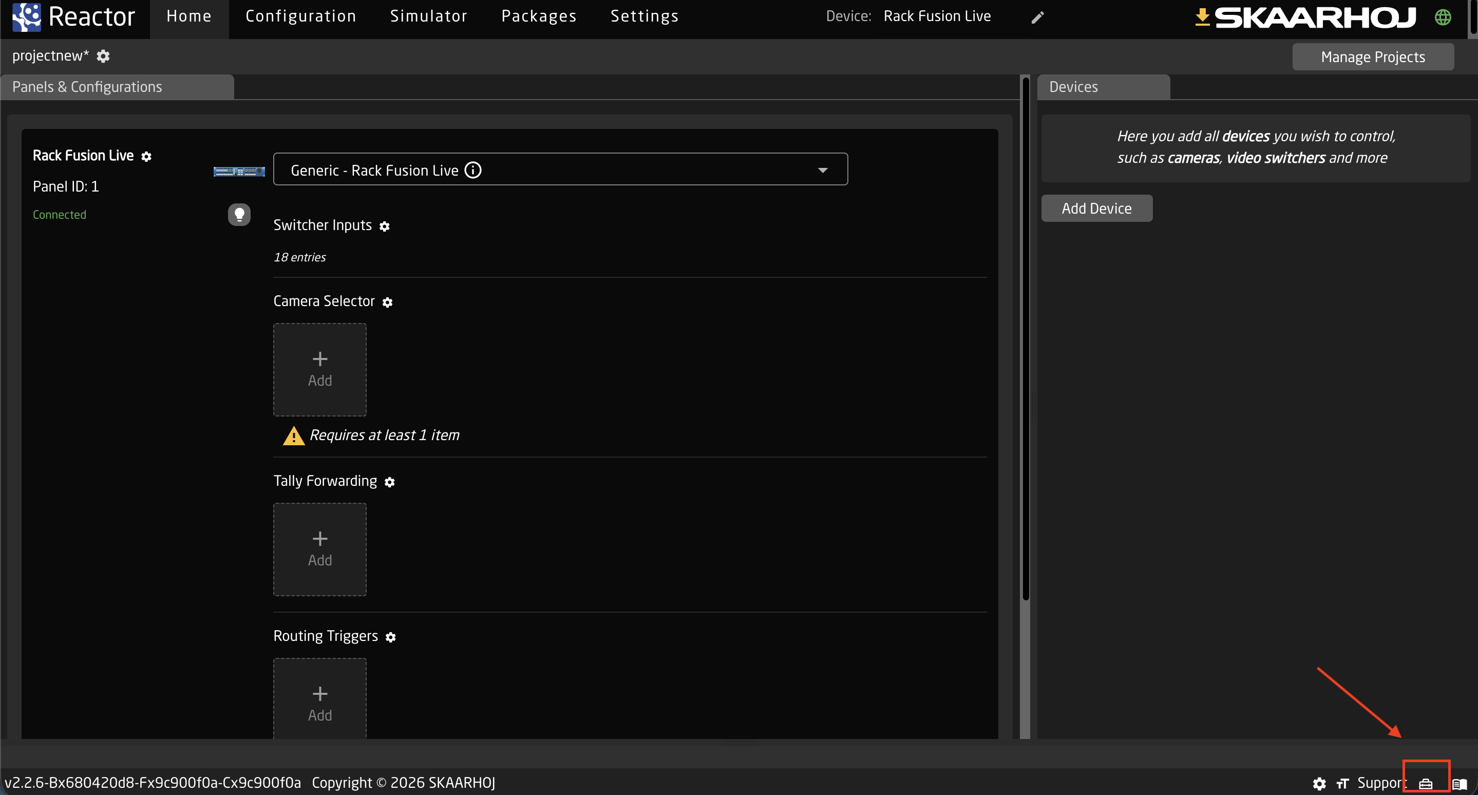
Devices
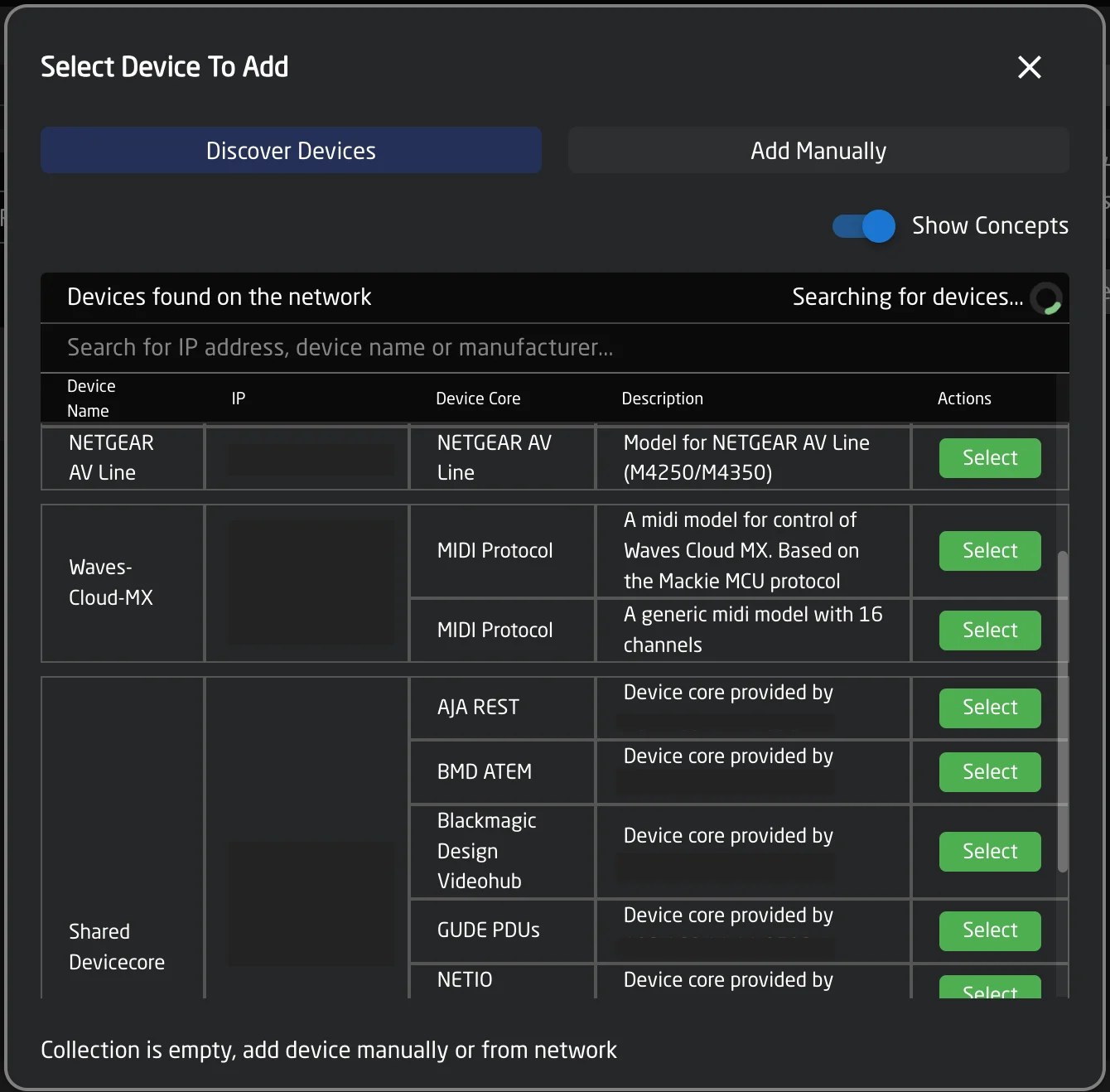
This is where you can add all connections to other devices on the network that you want to control with Reactor. Simply click "Add Device" at the bottom to open the device browser. You will see a list of all devices Reactor discovers on the network, using mDNS or other mechanisms. If your device does not support these, you can also click "Add manually" at the top and select your device from the list.
Pressing shift while clicking "select" will not close the window and let you add multiple devices quicker
Panels
On this tab, you can add your panels. When working with a Blue Pill device, your panel should automatically appear when creating a new project.
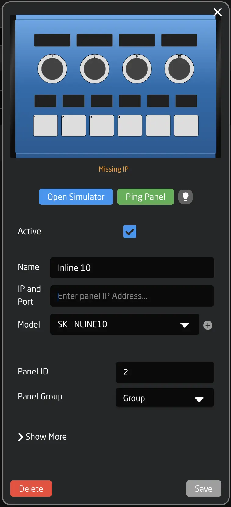
Clicking on the panels name allows you to adjust its IP address, name, brightness, and sleep settings.
After a panel is added, it will automatically select one of the available default configurations. In many cases, these configurations are the generic SKAARHOJ default settings, allowing you to easily add devices from different manufacturers to your panel.
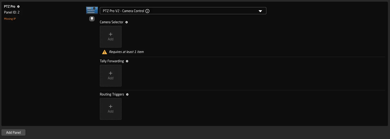
Below the selected configuration, you can see its configuration options. If the configuration includes a Camera Selector, you will also see which devices are already mapped to the controller, or you can add new ones. To configure the settings of your panel in more detail, click the blue name of the setting (e.g., Camera Selector, Switcher Inputs, Quick Class, etc.) to open them in a table.
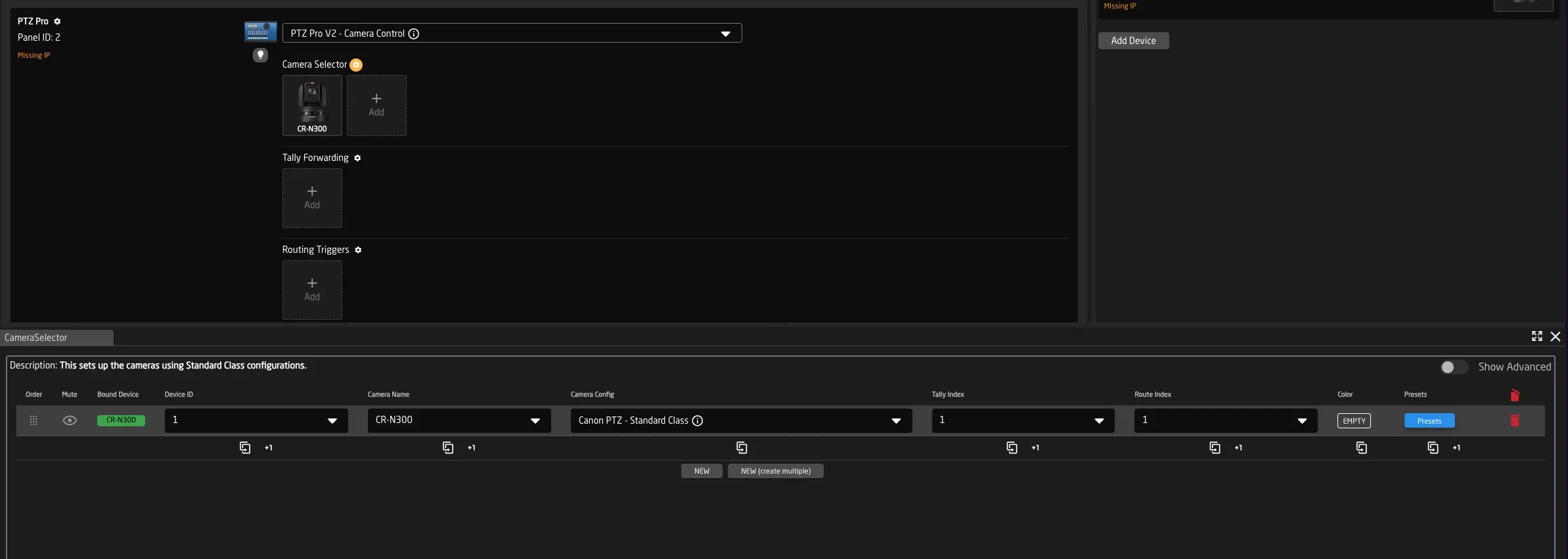
Selecting Configurations for your Panels
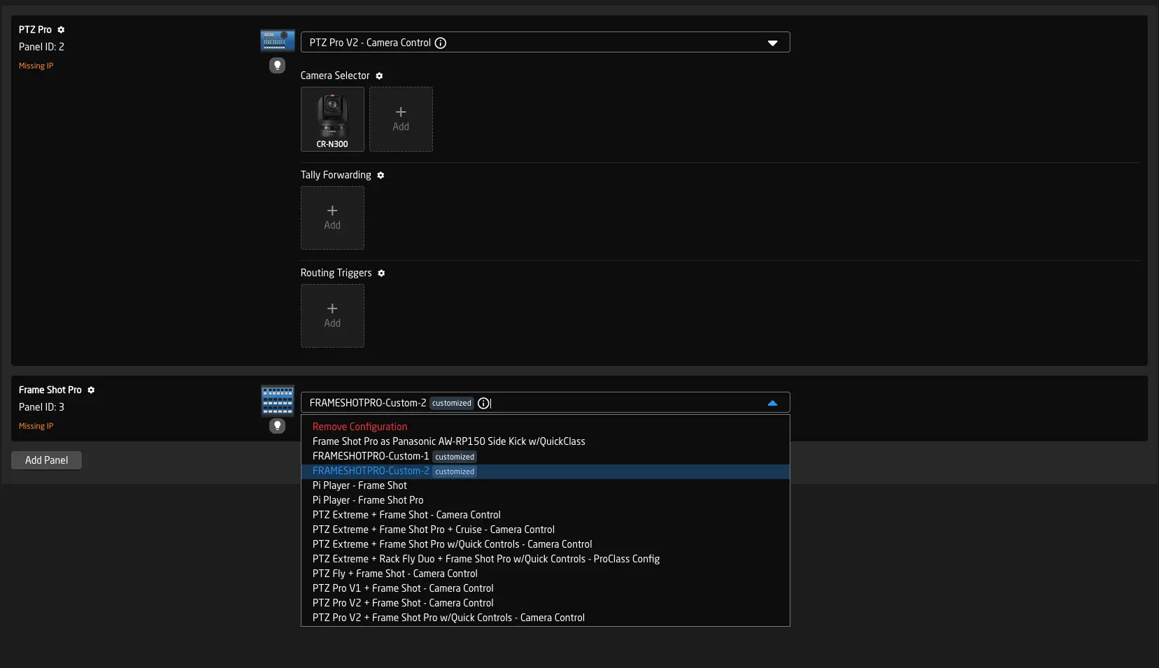
Once you have added panels and devices, you need to select the preferred configuration for your panels. This is done using the dropdown menus. From here, you can choose one of the built-in default configurations or create a fully custom configuration by clicking "Create Custom Config" in the dropdown.
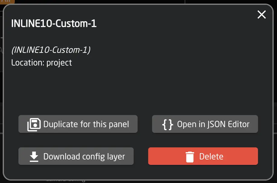
Using the small info icon, you can check additional details of your configuration, edit it in the JSON Editor, or delete/reset it to the system.
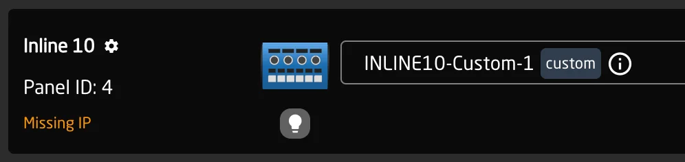
When creating custom configurations or modifying system configurations, you will see a small 'custom' or 'modified' indicator next to the configuration. Modifications are local to the current project.
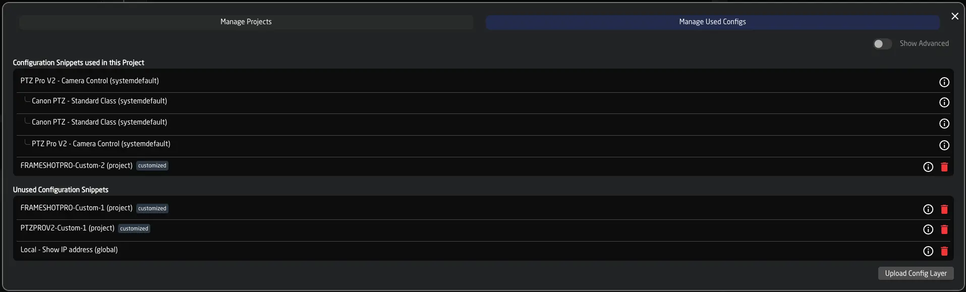
To manage all available configurations, click "Manage Projects" and select "Manage Used Configs" at the top.
Panel Groups
Panels can be grouped to set shared brightness and sleep time, and to provide additional organization.
This feature is disabled by default. Open the View Options (cog wheel in the footer) and activate it.
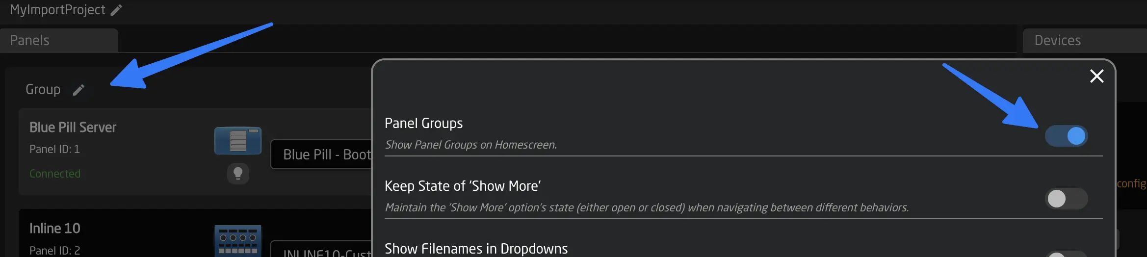
Groups can be renamed and their settings adjusted. Panels can be moved between groups, and sleep settings and brightness can be managed for multiple panels at once.
Projects
Using Projects, you can save and switch out the entire setup you have configured in Reactor, including panels, devices, and all configurations.
To do so, open the Project Window from Reactor's Home Screen by clicking on Manage Projects.
Manage Projects
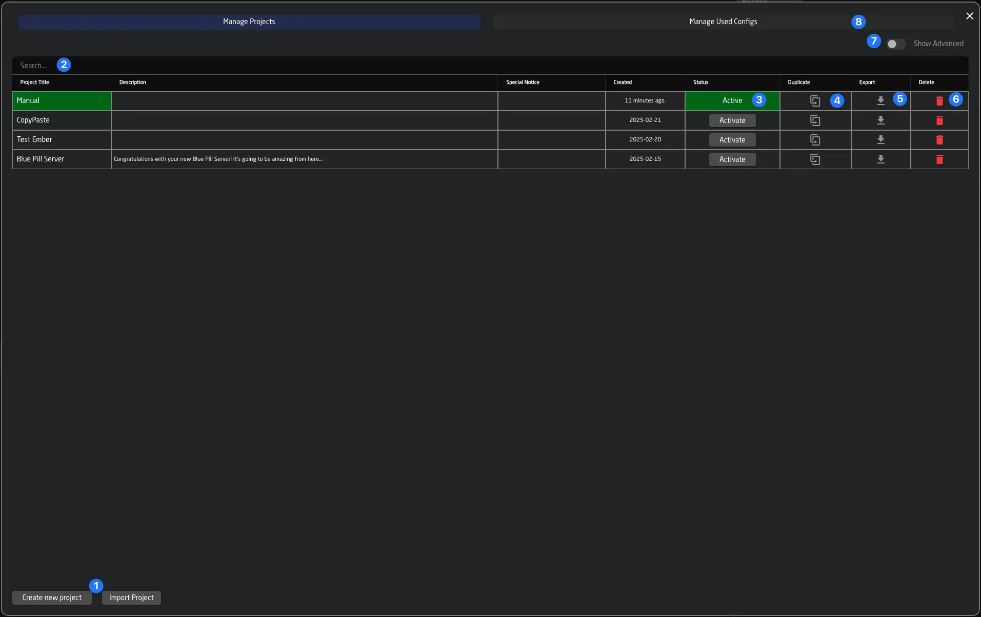
Here, you can see all projects saved on the controller.
- Use the buttons at the bottom to create new projects or import them from your computer. Reactor Projects are stored as .rpj (Reactor Project Format) and can easily be imported on other controllers.
- You can use the search function to find your projects, or click the triangle icons next to the name or created columns to sort your projects.
- Click Activate to switch the currently active project in Reactor.
- Duplicating your project allows you to experiment with new configurations and revert to the previous state easily.
- Click Export to export your project. Use right-click to get advanced export options.
- Use the red trash can icon to delete your project.
- Using the advanced toggle, you can show the components of your project. See below.
- Click Manage Used Configs to view all sub-configurations that the current project includes (See Manage Included Configurations).
You can also switch the project from the controller using the System Behavior Change Reactor Project
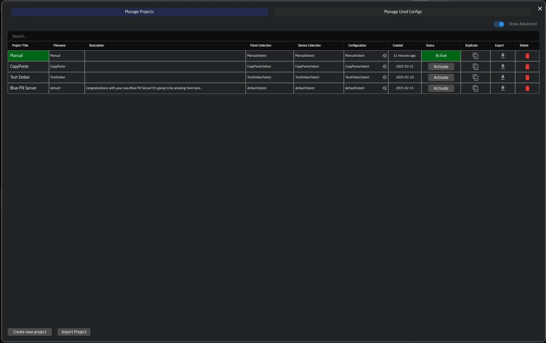
Advanced Project View
Under the hood, a project in Reactor consists of three parts:
- A panel collection, containing info about panels
- A device collection, containing all your cores and devices
- A root layer configuration, containing the actual layers of the configuration
These files can also be shared between projects. This is useful when you have the same set of devices or panels in a studio but want to run different configurations on different days. While you can duplicate the full project, it might sometimes be more beneficial to create these shared setups. In the advanced view of the project window, you can view and change the underlying configurations for the individual parts of your projects.
Manage Included Configurations
While your project might have one root layer configuration, Reactor uses several files to build the layer tree required for your project (See The layer tree).
In this section, you can get a quick overview of all configurations currently used in your project's layer configuration. This might include system default configurations, customized system defaults, or custom configs that you have created yourself. You can quickly view information about them and even delete them from this view.
Also note that you can upload configuration layers via this window, that have been downloaded from the Configuration'dropdowns Info Icon See Info Icon on Homescreen
Example:
This configuration includes a PTZ Pro that uses:
- its default (Standard Class) configuration
- Additionally, a Canon Camera has been added
- The Frame Shot Pro has two custom configurations created for it, one of which is used, while the other is not.
Here you can see how the scenario looks on the Used Configurations page:
Several Canon-specific system default configurations are included automatically. The unused Frame Shot config (created by the user) shows up below.
The Configurator
The Configurator (also sometimes called "Configuration Tab") is the main place where you can make customizations to your controller layout.
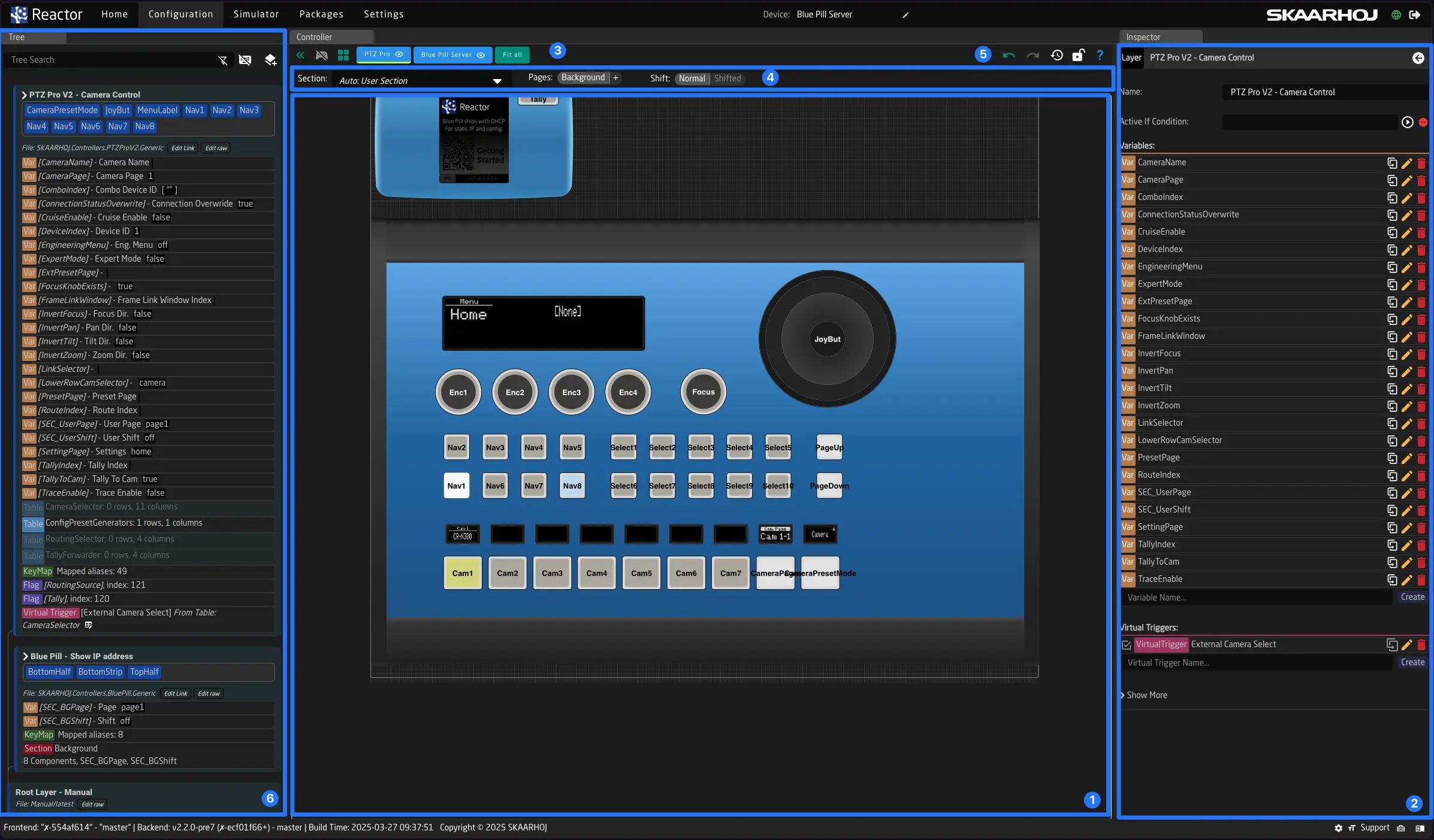
There are 4 main areas:
-
Controller Canvas:
Here you can see and interact with your controllers. Check the legend (blue question mark in the top right corner) for tips on navigating the canvas with your controllers. You can zoom in and out by scrolling and move by dragging the mouse with a right click.
Press ctrl+e (or cmd+e on macOS) to toggle between "configuration mode" and "simulation mode".
-
Inspector:
Here you can see and adjust individual elements of the controller or the layer tree. The Inspector shows all properties of the currently selected object, such as a Component Behavior, Layer, Variable, or others.
Sometimes, you may be looking at a Behavior that cannot be seen on the controller due to a different layer covering it. In this case, the Inspector will give you a hint and allow you to switch to the Active Behavior currently on top of the component.
-
Panel Selection:
Use the blue buttons on the top to switch between different panels and focus on them. A green line will shou you the panel you are currently selecting. By clicking the button you will also select the panels root configuration layer (corresponding to the configuration file you selected on the dropdown on homescreen)
-
Section Selector:
A Section in Reactor is a part of the controller that can have a menu with a few Pages. The section selector, located above the controller canvas lets you choose which section of the panel you are currently editing. SKAARHOJ default configurations often allow you to simply edit pages of existing menus. You can select these pages by clicking on their names, or add, remove, and rename them as needed. The Auto mode is the best way to always edit what you are seeing on the controller right now. If you just want to place new behaviors above any functionality of one of the SKAARHOJ Default configurations you can use the User Section to do so.
-
Undo / Redo:
You can use undo / redo to revert changes you might have made on accident to the configuration.
-
Tree:
The tree is initially hidden. You can show it by clicking the small green icon in the top left corner of the controller view. In the tree view, you can see all configuration layers. Every project has one root layer, on which your configurations are added as sub-layers. These can also have their own sub-layers and include other layer files. Read more about this here: The tree.
Using the layer tree is recommended only if you're committed to learning more about the underlying technology in Reactor. The benefit is that, once understood, everything can be tweaked and modified without limits.
Reactor Tools
To open the Reactor tools, click the toolbox icon in the bottom right corner of the screen.
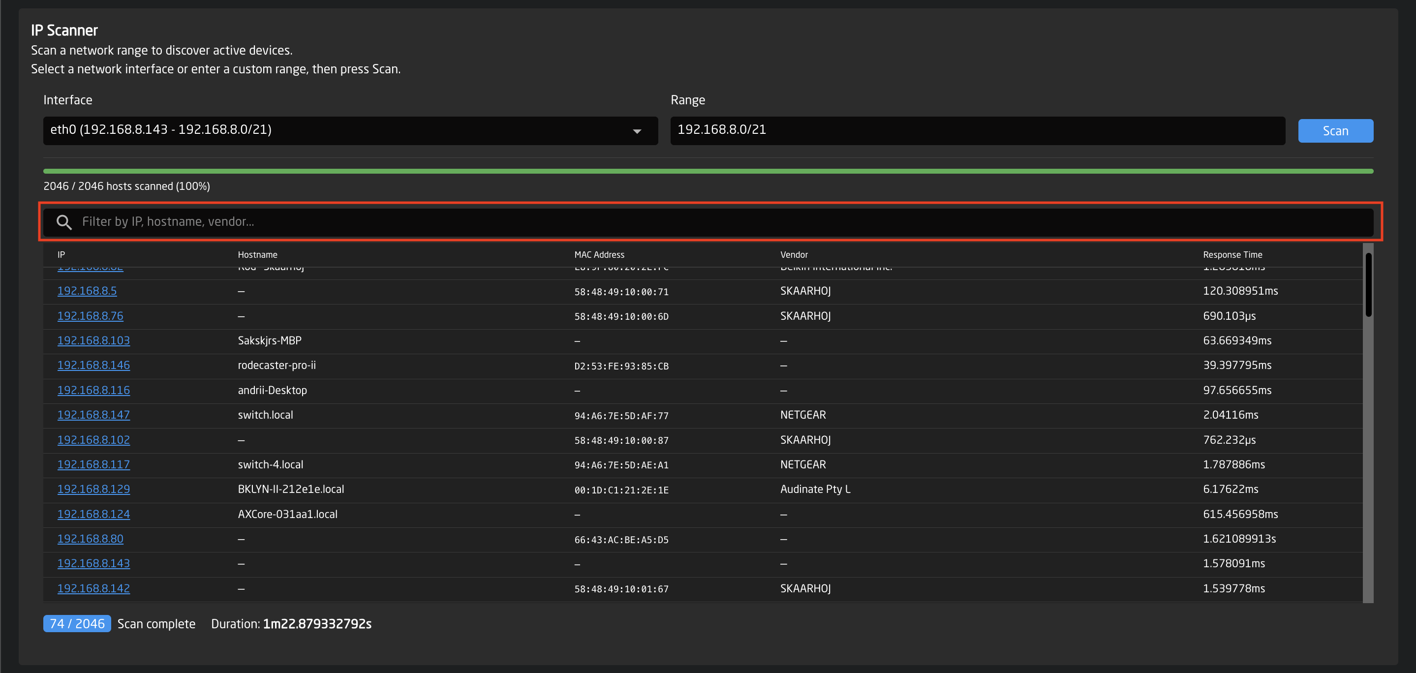
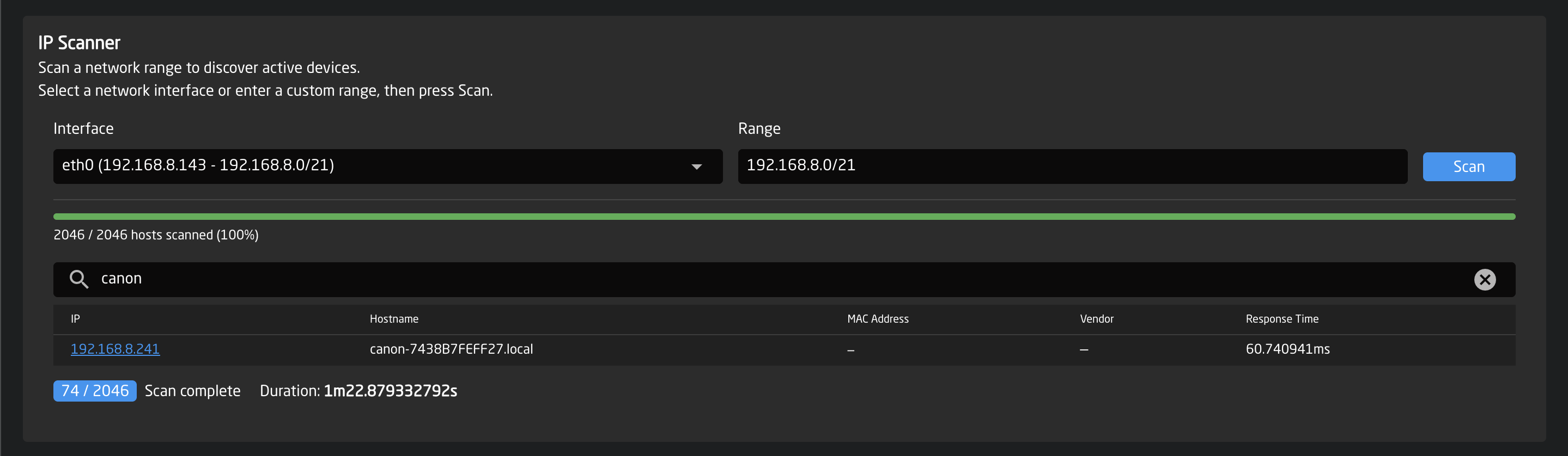
IP Scanner
The IP Scanner allows you to scan a network range to discover active devices connected to the network.
It is useful for identifying devices, checking connectivity, and finding equipment by IP address, hostname, or vendor.
The scanner works by sending requests to each IP address in the selected range and listing all devices that respond.
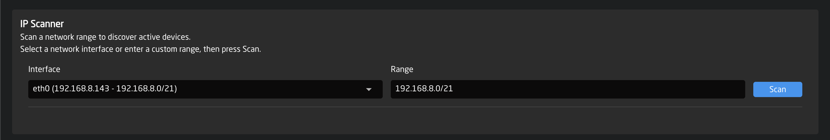
How to use it
-
Select the network interface (Ethernet, WiFi, or USB).
This determines which network connection will be used for the scan. -
Check the network range, automatically filled based on the selected interface.
The range uses CIDR notation to define which IP addresses will be scanned. Adjust the range if you want to scan a smaller portion of the network. -
Click Scan to start scanning.
- Use Stop to cancel the scan anytime.*
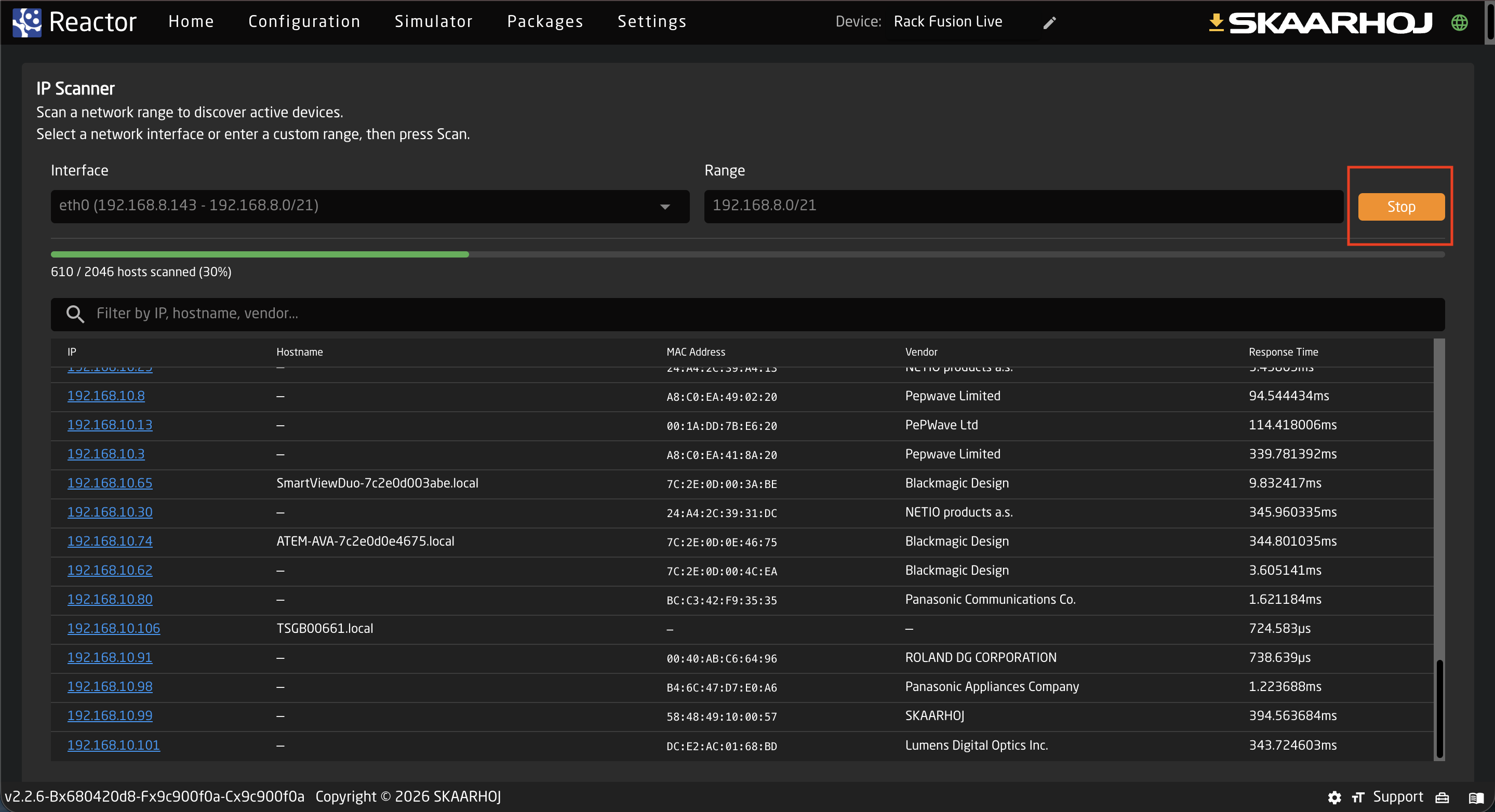
- View discovered devices in the results table.
You can filter devices by IP, hostname, or vendor using the search field.
Reactor Configuration
In this chapter, we will dive into the details of controller configuration. We will explore the different components of a controller, the Layer Tree and its elements, and how they all work together.
We will cover the following topics:
- Components and Behaviors
- The Tree and its Layers
- Variables and Conditions
- The Parameter Reference (IOReference)
- Feedbacks and Actions
- Virtual Triggers
- Advanced Topics
Hardware Components and Behaviors
What is a Hardware Component (HWC)?
Hardware Components are all the elements found on a SKAARHOJ controller or any Raw Panel compatible device (e.g., xpanel-* applications).
Some physical components, such as a joystick, can be represented as multiple Hardware Components in Reactor (e.g., Up/Down, Left/Right, and Rotate).
There are four basic types of hardware components:
- Buttons (Binary Inputs)
- Faders/Potentiometers (Analog Inputs)
- Encoders (Pulsed Inputs)
- Joysticks (Speed/Intensity Inputs)

Additionally, these components may have various types of displays linked to them.
Buttons can have different types of color LEDs to indicate status.
Larger displays can consist of different Tiles, allowing you to configure individual parts separately and easily.

What is a Behavior?
To configure what a specific component does and shows, we need to assign a Behavior to it. Click any hardware component in the configurator view to access the Behavior defined for it. If no Behavior has been created for this component yet, the inspector will show a palette of pre-configured Behaviors based on the devices you've added in the Home Screen.
Clicked on a component and found a purple Generator? This component's behavior is likely defined by a Settings Table from the Home Screen. You can overlay it by selecting the User Section in the section dropdown. If you'd like to learn more or modify the generator, please refer to the chapter on generators.
Selecting a Parameter
To select a Behavior, simply choose the component you want to modify. If no behavior has been defined for the component yet, you will see the behavior palette in the inspector. You can select any preconfigured parameter from the list of your devices.
If you have selected a component that already has a configured behavior, you can click Change Behavior in the top right corner. This will reopen the behavior palette, allowing you to switch to a different one.
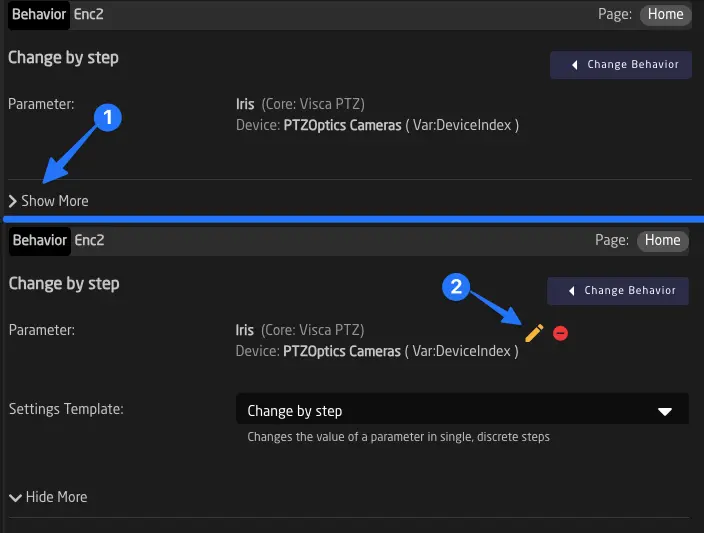
Manually Changing a Parameter in a Behavior
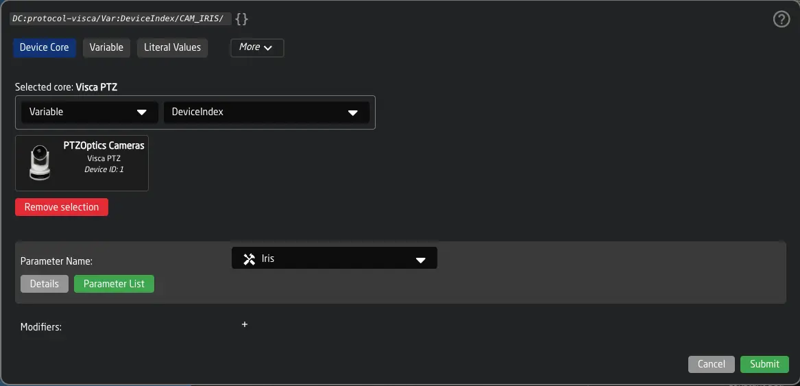
To manually edit a parameter inside a behavior (without using the preconfigured behaviors from the palette), click the Show More button. A yellow pen icon will appear next to the name of the parameter field. Click it and use the parameter reference helper window to configure the parameter you want.
Once you click submit, you will be presented with this window:
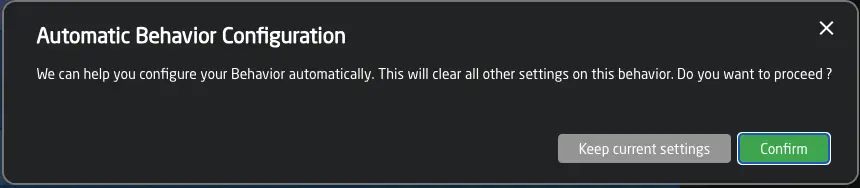
If you click the green Confirm button, you will use the Automatic Behavior Configuration.
This means Reactor will automatically select a Template Behavior and add configuration fields to your behavior. This makes it very quick to add almost any parameter to a component.
In some cases, you may want to keep the settings you have manually configured in the behavior. In these cases, simply click Keep current, and Reactor will only change the parameter reference.
Changing Template Behavior
Reactor does its best to choose the correct Template Behavior based on the type of component and the parameter you select. However, you may still want to change it. To do so, click Show More to display the Template Behavior dropdown.
The Template Behavior dropdown shows the most commonly used templates at the top. If you have created Template Behaviors yourself, they will also appear. If you cannot find what you're looking for, click Show All to display more included Template Behaviors from Reactor.
Available Template Behaviors
Here is a list of the most important Template Behaviors included in Reactor.
Set specific value
Set specific value
Use this template if you want any action on the component to set a specified value on the selected parameter.
Example: Setting an AUX of an ATEM to input 1 using a button.
Set a value by index
Set a value by index
Same as "Set specific value," but you can specify an index of the option for the specific parameter.
Example: Setting the current Scene in OBS to the 5th scene from the start.
Change by Step
Change by Step
Use this when you want to move a value up and down using an encoder or Four-Way button.
Example: Use an encoder to control the current shutter speed of a camera.
This Template Behavior is the most versatile one. It is almost always usable.
Change by step for larger ranges
Change by step for larger ranges
Same as "Change by step," but for larger value ranges.
- Encoders will move more steps if rotated faster, and a fine/coarse selection can be made by pressing down shortly.
- Buttons will continue to increment when held down. Example: Changing the electronic shutter in 0.01 values of a degree.
Change by step with limited values
Change by step with limited values
Sometimes a parameter has many options, but you want to limit the options selectable with the current button or encoder. Use this template to define several valid options for the parameter.
Example: Making an encoder only switch between three specific white balance modes (e.g., Manual/Preset1/Preset2).
Change by step with confirmation
Change by step with confirmation
Use this template on encoders and Four-Way buttons if you want the user to select a value first, then confirm the change by pressing down.
If no change is confirmed, the value will revert to the current one after the specified time.1
Example: Loading a new setup file on an Arri Camera. Use left and right on an encoder to select, then press down to confirm.
Change a value on fader / potentiometer
Change a value on fader / potentiometer
This is the default Template Behavior for mapping a parameter to a fader or LEDBar.
Example: Controlling Gain on an RCP joystick.
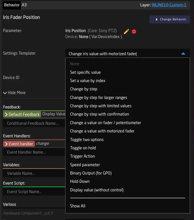
Change a value with motorized fader
Change a value with motorized fader
This is the default Template Behavior for mapping a parameter to a motorized fader. It correctly sends back the position to the fader if the value changes in the system.
Example: Controlling Iris using a Color Fly V2 fader.
Toggle two options
Toggle two options
Choose this Template Behavior for any On/Off, Show/Hide, Enable/Disable scenarios. The button will light up bright when the function is activated and dim when inactive. Example: Turning on/off bars on a camera.
Toggle on hold
Toggle on hold
This Template Behavior works similarly to "Toggle two options," but the action is triggered only after holding the button down for a specified time (default: 1000 milliseconds).
Example: A NETIO power outlet is toggled only when the button is held down for one second.
Trigger Action
Trigger Action
Use this template for any one-shot parameters (commands).
Example: Triggering OnePush Autofocus on a camera.
Speed parameter
Speed parameter
This is the default Template Behavior for mapping speed components (joysticks). It can also control speed commands from other components like encoders.
Example: Control Pan speed using a joystick.
Binary Output (for GPO)
Binary Output (for GPO)
This Template Behavior sets or clears the output of a GPO contact on RCPs or Link IO boxes using the parameter.
Example: Map a Tally Flag to the closed contact on the back of an RCP.
Hold-Down
Hold-Down
Used for parameters with two options. When the button is pressed down, the parameter is set to "on." When released, it is set to "off."
Example: Mapping Record to the state of a GPI closed contact of an RCP.
Hold down with values
Hold down with values
Similar to Hold-Down, but sends specific user-defined values for press and release instead of index 0/1. When the button is pressed down, it sends the configured "Press Value." When the button is released, it sends the configured "Release Value."
Example: Sending specific command values to a device on press and release, where the on/off values are not simply index 0 and 1.
Display value (without control)
Display value (without control)
Show a value without control or deliberately lock control of a value.
Example: Display the battery voltage of a camera.
Custom Template Behaviors
You can also create your own Template Behaviors. See the chapter Template Behaviors in Advanced Configuration.
MultiBehaviors
To combine multiple behaviors on a single hardware component — for example, creating sequences with delays, combining encoder rotation and press actions, or switching behavior based on a variable — see MultiBehaviors.
-
Before Reactor v2.0.5-pre5, this required a ':Confirm:1000' modifier and only worked on devicecore parameters. In later versions, this Template Behavior works without any extra configuration steps. The old Template Behavior was called 'SKAARHOJ:Confirm,' while the new one is called 'SKAARHOJ:ConfirmValue.' ↩
MultiBehaviors
A MultiBehavior allows a single hardware component to contain and execute more than one behavior. This is useful in three main scenarios:
- Sequences: Execute multiple behaviors one after another with configurable delays between them. For example, recall a camera preset, wait two seconds, then start recording.
- Multiple functions on one component: Combine different behaviors on a single button or encoder. For example, an encoder that controls a parameter with rotation and triggers an action on press.
- Variable-based selection: Use Active-If conditions on individual sub-behaviors so that a variable determines which behavior is active. For example, a joystick that dynamically switches between Pan and Tilt control based on a rotation variable.
Many of Reactor's built-in Template Behaviors are MultiBehaviors internally. For example, "Encoder with Press Action" and "4 Ways 4 Parameters" each contain multiple sub-behaviors. When you need similar flexibility for custom configurations, you can create your own MultiBehavior.
Creating a MultiBehavior
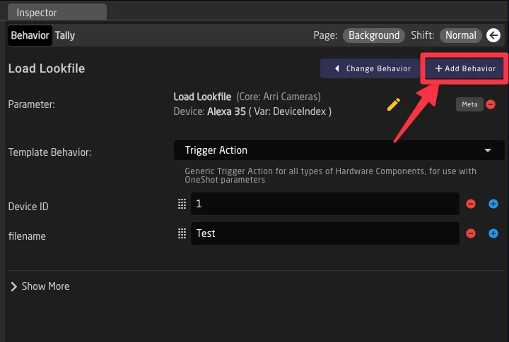
To create a MultiBehavior, start with a hardware component that already has a configured behavior:
- Select the component in the configurator to open its behavior in the inspector.
- Click the Add Behavior button in the top-right area of the inspector (next to Change Behavior).
- Your behavior is automatically converted to a multibehavior, and you can pick a second behavior to add.
- The inspector title changes to "Multi Behavior" and all sub-behaviors appear as a list.
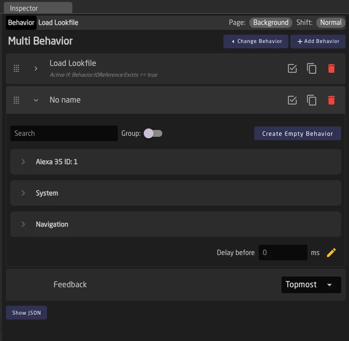
Managing Sub-Behaviors
Adding Sub-Behaviors
Click Add Behavior at the top of the MultiBehavior form to add a new sub-behavior at the end of the list. The behavior palette appears inside the expanded row, allowing you to select a preconfigured behavior or create a custom one.
Reordering Sub-Behaviors
Sub-behaviors execute from top to bottom, so their order matters. Each row has a drag handle (six-dot icon) on the left side. Grab it and drag rows to reorder.
Editing Sub-Behaviors
Click a row (or the chevron icon) to expand it and reveal the full behavior editor, identical to what you see for a regular behavior. Double-click the behavior name to rename it inline.
Duplicating and Deleting
Each row has a copy icon to duplicate the sub-behavior and a red delete icon to remove it. Duplicating creates a copy at the end of the list.
If you delete sub-behaviors until only one remains and the feedback is not set to "Custom", the MultiBehavior automatically converts back into a regular single behavior.
Bypassing Sub-Behaviors
Each row has a checkbox icon on the right side. When unchecked (bypassed), the sub-behavior is skipped during execution but stays in the list. This is useful for temporarily disabling a sub-behavior without removing its configuration.
Execution Order and Delays
When a trigger reaches the MultiBehavior (button press, encoder turn, etc.), Reactor processes the sub-behaviors from top to bottom. For each one:
- Check bypass — skip if bypassed.
- Evaluate Active-If — skip if the condition evaluates to false.
- Apply delay — wait the configured number of milliseconds.
- Execute — fire the behavior's event handlers.
Per-Entry Delays
On the bottom of each behavior, a Delay before field lets you specify a value in milliseconds to wait before executing.
The yellow pencil icon next to the delay field opens the parameter reference helper, allowing you to use a parameter value (IOReference) as the delay instead of a static number.
Active-If Conditions
Each sub-behavior can have an Active-If condition. When present, the condition is checked before the sub-behavior executes. If it evaluates to false, the sub-behavior is skipped.
This is the primary mechanism for variable-based selection: by giving each sub-behavior a condition (e.g., Var:Mode == 1, Var:Mode == 2, Var:Mode == 3), you can dynamically change what a component does and shows based on a variable's current value.
Setting Active-If Conditions
If set, the Active-If condition appears below the behavior name in each row: Active If: condition. Click on this text to open the Condition Helper window — the same one used for layer conditions and feedback conditions. See Variables and Conditions for details on condition syntax.
For sub-behaviors that inherit from a Template Behavior with an existing Active-If condition, the inherited condition is shown. You can override it by clicking and editing.
When a sub-behavior's Active-If condition evaluates to false at runtime, its row appears greyed out in the configurator. This gives you live visual feedback of which sub-behaviors are currently active.
Use Case: Variable-Based Selection
Say for example you want to have a quick way to switch the axes of a joystick, eg when switching from a 16:9 to a 9:16 workflow for social media with a PTZ camera. A variable PT_Rotate is used to select the neededrotation angle (0°, 90°, 180°, 270°). You can create a MultiBehavior with four sub-behaviors:
| Sub-Behavior | Active-If Condition | Function |
|---|---|---|
| Pan | Var:PT_Rotate == 0 | Controls Pan speed |
| Tilt Inverted | Var:PT_Rotate == 90 | Controls Tilt speed (inverted) |
| Pan Inverted | Var:PT_Rotate == 180 | Controls Pan speed (inverted) |
| Tilt | Var:PT_Rotate == 270 | Controls Tilt speed |
With the feedback set to Topmost, the display automatically shows the currently active direction. When the user rotates the controller, only the matching sub-behavior executes.
Feedback Configuration
Since a MultiBehavior contains multiple sub-behaviors, you need to choose which one determines the visual feedback (LED color, display text, etc.) shown on the hardware component. This is configured via the Feedback dropdown at the bottom of the MultiBehavior form.
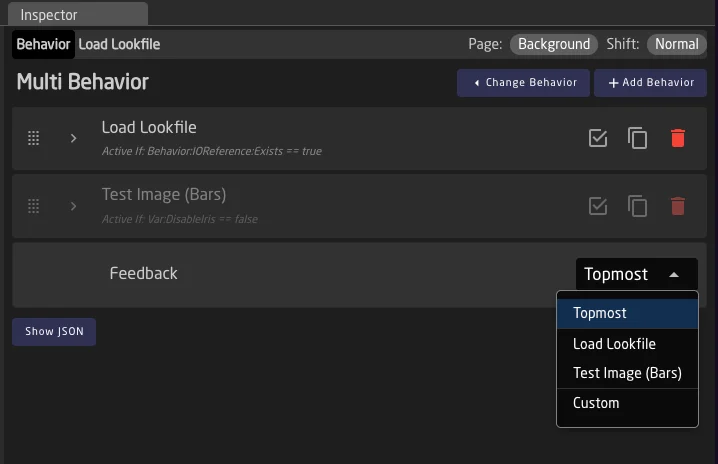
Topmost
Topmost
The first sub-behavior in the list whose Active-If condition evaluates to true (or has no condition) determines the feedback. This is the default and works well with variable-based selection, because the displayed feedback automatically matches whichever sub-behavior is currently active.
Specific Sub-Behavior
Specific Sub-Behavior
Select a specific sub-behavior by name from the dropdown. The feedback always comes from that sub-behavior, regardless of Active-If conditions or execution order. The dropdown lists all sub-behaviors by their configured name.
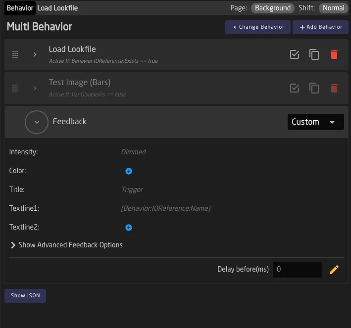
Custom
Custom
Define feedback independently of any sub-behavior. When selected, the feedback row expands to reveal the full feedback editor (the same one available in regular behaviors). This also reveals the default delay configuration field. Use this when none of the sub-behaviors' feedback is appropriate for the MultiBehavior as a whole.
Practical Examples
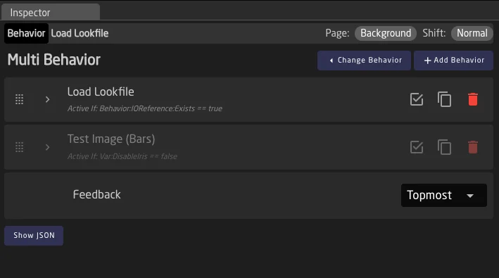
Example 1: Sequential Actions (Recall Preset + Record)
A button that recalls a camera preset and starts recording after a delay:
- Sub-behavior 1: "Recall Preset 1" — Uses the Trigger Action template with the camera preset recall parameter. No delay.
- Sub-behavior 2: "Start Recording" — Uses the Set Specific Value template with the record parameter. Delay: 2000ms.
- Feedback: Topmost — shows the preset recall status on the button LED.
When pressed, the button immediately recalls the preset. After two seconds, recording starts automatically.
Example 2: Encoder with Rotate and Press
An encoder that controls a parameter with rotation and triggers an action on press:
- Sub-behavior 1: "Iris Control" — Uses the Change by Step template for the iris parameter. Responds to rotation events.
- Sub-behavior 2: "Auto Iris Toggle" — Uses the Toggle Two Options template for the auto-iris parameter. Responds to press events.
- Feedback: Set to "Iris Control" so the display shows the current iris value.
Reactor includes several built-in Template Behaviors for this pattern, such as "Encoder with Press Action" and "Encoder with Toggle Action". Use MultiBehaviors when you need custom combinations beyond what the built-in templates offer.
Example 3: Variable-Based Mode Selection
A button whose function changes based on a variable:
- Sub-behavior 1: "Bars Toggle" — Active If:
Var:CameraMode == bars. Toggles bars on/off. - Sub-behavior 2: "Record Toggle" — Active If:
Var:CameraMode == record. Toggles recording on/off. - Sub-behavior 3: "Standby Toggle" — Active If:
Var:CameraMode == standby. Toggles standby mode. - Feedback: Topmost — the button always reflects the active mode.
When the CameraMode variable changes (e.g., from another button or layer), the same physical button automatically switches its function and display.
Limitations
- No nesting: Sub-behaviors cannot themselves be MultiBehaviors. Only one level of sub-behaviors is supported.
The Layer Tree
Although it is hidden at first, the underlying structure that powers the controller’s menus and components is called the "Layer Tree". For most people, this is initially an advanced concept, but it's extremely powerful and well worth understanding. Think of it like Photoshop for controller configuration: Different layers can be visible or invisible, and depending on that, different Behaviors are visible on your controller. We will later explore how these visibilities can be controlled by various Conditions, but for now, let's take a closer look at how the tree works.
Tip: The tree is hidden by default. Check this page to see how to open it: Configurator Layout
The Inverted Tree
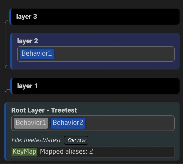
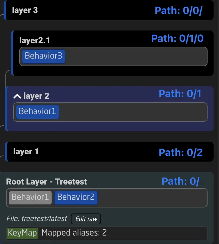
When viewing the tree, you will notice that it doesn’t unfold like hierarchies in other applications, such as file browsers. This is because we are looking at the tree from above, just like viewing the controller. Layers and behaviors on top will be visible first, while those further down may be covered.
The tree’s Root Layer is the base at the bottom. Layers can be opened and collapsed to show their sub layers (branches).
Multiple Files Make Up the Tree
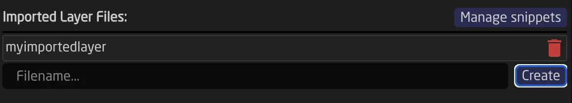
The Tree can be a combination of one or more layer files. The root layer is always defined by the current Reactor project, but it can include other files that get appended to the layer that includes them. To add a layer file, use the "Included Layer File" section in the layer's inspector window. When viewing the tree, you can identify where other files have been included.
Having the tree split into separate files allows for the reuse of configuration parts in other places. This is sometimes referred to as Snippets. In our default configuration, this concept is essential, allowing for quick switching of sub-configurations like Tally Forwarding or Routing Triggers. For building most custom configurations, we recommend not splitting it into multiple files, as this tends to increase complexity.
Layer Visibility and Behaviors
In the tree, every layer can have an Active-If condition. Depending on this condition, the layer is either active or hidden. When viewing the tree in the configurator, you can check if a layer is currently visible by looking at the blue border on the left side. If the border is visible, the layer is active; if not, it is hidden.
When a layer is hidden, all its elements are also hidden. Behaviors defined on the layer, variables, sub layers, virtual triggers, layer scripts, and other elements are hidden or disabled from the controller.
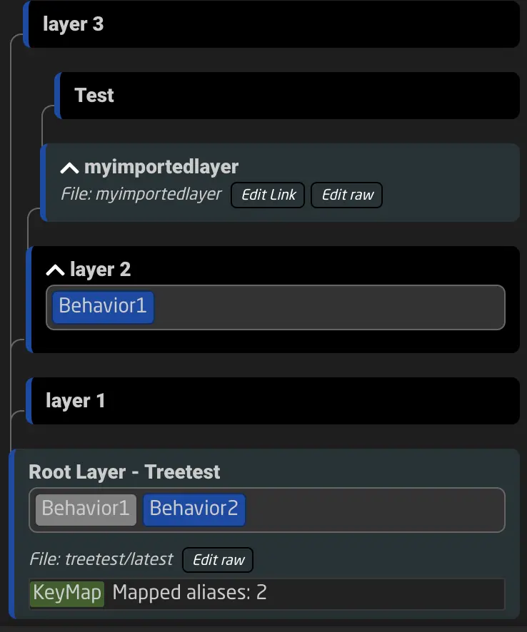
In the simplified example below, the root layer defines a Behavior called Behavior1. Since layer 2 above it redefines the behavior, the one shown on the controller is the one defined on layer 2, as it is higher up in the tree. Behavior2 on the other hand is not redefined, so the definition on the root layer is the active one.
Tree Elements
Layers in the tree include the definition of every other configuration element. These include:
- Behaviors
- Variables
- Virtual Triggers
- Flags
- Preset Kinds
- Template Behaviors (aka Master Behaviors)
- Settings Tables (aka Constant Sets)
- Key Maps
In the tree view, you can see most of these elements, making it easier to find them and the layer they are defined on. You can use the tree search function at the top of the tree to find elements more quickly. Additionally, you can select which elements of the tree are shown.
Inheritance
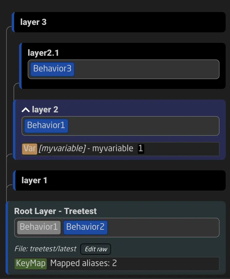
When a tree element is defined on a layer, it is also inherited by all of its sublayers. Let’s take a simple example of a variable.
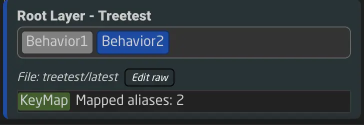
The variable myvariable is defined on layer 2. This means that behaviors defined on the layer can read and modify this variable. The same applies to all behaviors of sublayers of layer 2, such as layer 2.1. However, the two behaviors on the Root Layer - Treetest cannot access the variable myvariable.
By following this basic concept, we can understand which tree elements are available to which behaviors and layers. 1
Types of Tree Elements
Let’s take a look at the different tree elements and their functions.
Behaviors
Behaviors are shown in the tree by their names. The color indicates whether the behavior is selected and visible (or covered).
When a behavior is shown in:
- blue: It is currently visible.
- green: It is currently visible and selected.
- grey: It is currently hidden (covered by a different behavior above or on a non-visible layer).
- orange: It is currently hidden and selected.
Variables
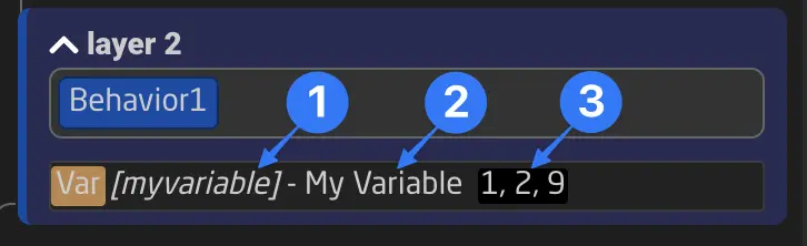
Variables are shown in the tree with their key. A variable can have a key and a name - the name is a friendly name displayed in the interface, while the key is the actual reference to this variable used in all Parameter References. Changing the name only changes how the variable appears in different places, but changing its key breaks the links to other parts of the configuration.
Next to the variable, you can also see its current value. A variable can have more than one value at once (an array); if that is the case, the current values will be shown separated by commas.
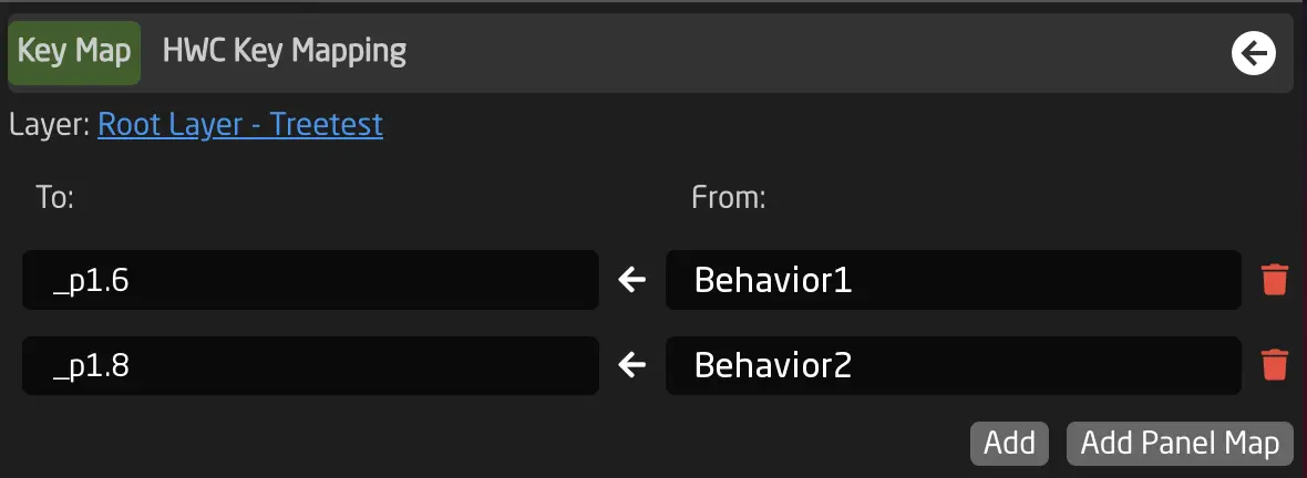
Key Maps
A Key Map can map behavior names to the physical hardware components on panels. They can also remap behavior names to different ones. Most of the time, Key Maps are managed automatically by the configurator.
Each hardware component of a panel has a fixed address format:
_p<panelID>.<componentID>
For example: _p1.15 (Panel 1, Hardware Component 15) or _p3.23 (Panel 3, Hardware Component 23).
To make configurations compatible with multiple panels and more understandable, Key Maps are used to assign names to these addresses.
A Key Map can contain different mappings:
- Component address to behavior name: This assigns behavior names to hardware components in the configurator.
- Behavior name to behavior name: Remap a behavior name to a different one in the layers below, often used when a configuration is remapped to a different set of buttons.
- Panel Wildcard (e.g., _p1.*): Remap a panel ID used in the layers below to a different one. This is mostly used by the Home Screen to map your panels to their selected configurations.
Behavior to behavior mapping and Panel Wildcard mapping are often used in combination with the inclusion of different layer files. This is useful when remapping IDs in an included configuration.
The Key Map is shown in the tree on the layer where it is defined, and its mapping is valid for that layer and all its sublayers, like the inheritance of any other tree element.
Virtual Triggers
Virtual Triggers are defined on layers in the tree. When a layer becomes hidden, the virtual trigger will not execute anymore. See more about Virtual Triggers in the chapter Virtual Triggers.
Preset Kinds
Preset Kinds define a Reactor Preset as a list of parameters that can be stored and recalled from your panel. You can read more in the chapter Shading Presets.
Flag Group
Flag Groups are defined in the tree. Read more about them in the chapter Flag Groups.
Custom Template Behaviors
If you find yourself creating the same kind of behavior repeatedly, you might want to create a Template Behavior. In Reactor, Template Behaviors are also called Master Behaviors.
You can create a Template Behavior on any layer and configure it as needed. Afterward, you can select the new Template Behavoir for other Behaviors (within the scope of inheritance). See more in the chapter Custom Template Behaviors.
Settings Tables (aka Constant Sets)
Settings Tables - (formerly Constant Sets) - are a table structure used for various purposes in Reactor, such as:
- Storing configuration settings that can be changed directly on the Home Screen.
- Generating layers with Behaviors based on table rows.
- Creating multiple Virtual Triggers based on table rows.
As with all other tree elements, they follow inheritance. Learn more about their use here: Generators and Settings Tables.
Examples of Settings Tables in default configurations include:
- Camera Selector
- Tally Config
- GPIO Mappings
- (See more examples in Default Configurations)
We call them Settings Tables because they often store important settings available from the Home Screen. Their original name, Constant Sets, reflects the fact that their values are stored within the configuration and cannot be changed while the controller is running, unlike variables. Any modifications require updating the configuration through the UI.
Layer Paths
Technically, every layer has a path. Paths are denoted as, for example, 0/1/4/1/.
0/ always references the root layer. 0/0/ references the topmost child layer of the root layer, and so on.
Knowledge of layer paths is not required to use Reactor, but it can help you better understand the system.
-
Variables and Settings Tables (Constant Sets) can have advanced options that affect inheritance, such as Expand Scope, Capture, and Always Define. This is an advanced topic and will be covered later. Please refer to the corresponding tool tips in the configurator for more details. ↩
Variables and Conditions
To better understand how menus and other logic can be created in Reactor, we need to understand Reactor's Variables and Conditions.
Variables
A Variable is, like many other things, an element in the tree (See Tree Elements). Variables are a concept used in programming and mathematics to store information. In Reactor, they can be used to store values like:
- the current page of a menu
- the currently selected Device ID
- whether the engineering menu is open
- and much more...
Types of Variables
Reactor variables can have two main types:
- Option List: A list of options, where each option can also have a label. Option values can be numbers or strings.
- Range: A numeric range with a minimum, a maximum, and a default (or center) value.
When a variable is set, the system checks if the value matches the possible defined values. If not, it will not set the variable unless the option Accept any value is checked under "Show More".
Basic Usage of Variables
Variables can be created on layers. The quickest way to do so is to select the base layer of your current configuration and add a variable. Start by clicking anywhere on the blue or black area of your controller. You should now see the root layer of this panel.
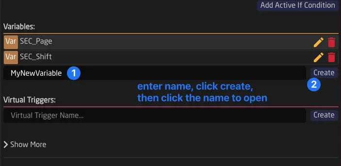
When a variable is created, its value defaults to the first value unless otherwise specified. From that point on, you can use your variables in all Parameter or Condition fields in any layer or behavior. Keep in mind that variables are available only to the layer they are defined on and its child layers. This follows Tree Inheritance.
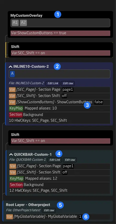
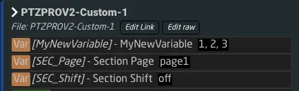
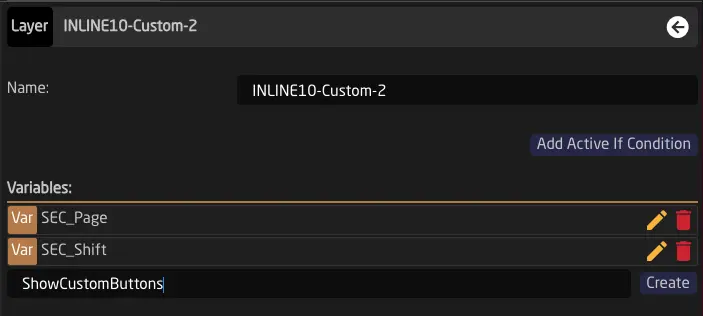
Example:
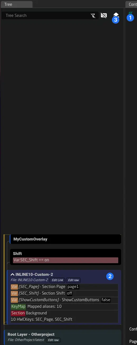
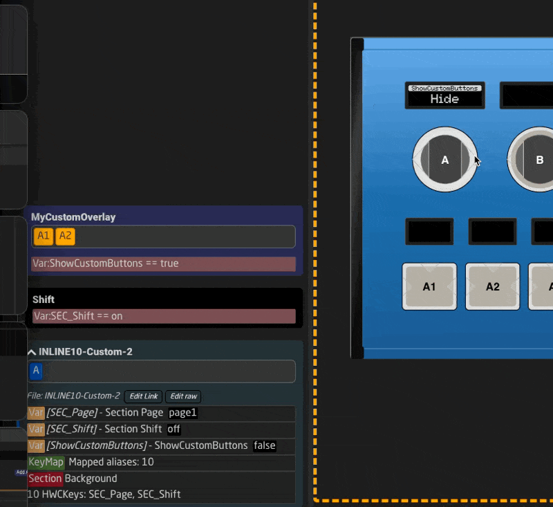
The components on the layer MyCustomOverlay (1) and INLINE10-Custom-2 (2) can use the variable ShowCustomButtons (3). Components on the layer QuickBar-Custom-1 (4) cannot use the variable, as they do not inherit its definition.
To create variables that can be accessed by all layers, they need to be created on the main root layer of the project (5). The variable MyGlobalVariable (6) is accessible to all layers and controllers.
Setting and Checking Variables Using the Configurator
In the configurator, you can always see the current values of variables in the tree.
In the Inspector, you can also set different options active using the blue flag icon next to them.
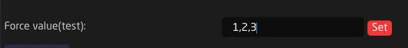
Finally, you can use the bottom of the form to force set a variable or even set more than one value.
One Variable, Multiple Values
Any variable in Reactor can be seen as an array of values. While this array will only contain one element in most cases, it can also be empty or contain multiple elements. To add or remove values from a variable, you can use the Set Mode in the EventHandler config:
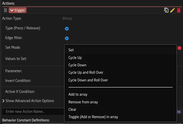
Here are the relevant ones explained:
- Add To Array: Adds a new value to the current value array.
- Remove From Array: Removes a specified value from an array.
- Clear: Clears all values of a variable, resetting it to an empty array.
- Toggle Add Remove: Adds a value to the array or removes it if it's already there.
Example: In a setup with multiple cameras, you may want to have one button controlling gain on several cameras at once. You can set up buttons to add more than one ID to the DeviceIndex to make this possible. ParameterReferences that already reference Var:DeviceIndex will now control all Devices in the array.
Conditions
Conditions are a structure used in many places in Reactor. They are text strings that combine multiple Parameters into a condition that can ultimately evaluate to either "true" or "false".
Some example places where they are used are:
- Active-If Condition on Layers: Determines if a layer is visible (rendered) or not.
- Active-If Conditions on FeedBack Handlers: Determines if a certain Feedback (e.g., Text, Color, etc.) is active or not.
- Active-If Conditions on Event Handlers: Determines if a certain interaction (e.g., left edge press) is active or not.
- Conditions on Virtual Triggers: Determines if a Virtual Trigger simulates an active button press (See Virtual Triggers).
- And several other places...
The Condition Helper Window
When you see a condition in Reactor, you can simply click it once to open the Condition Helper Window.
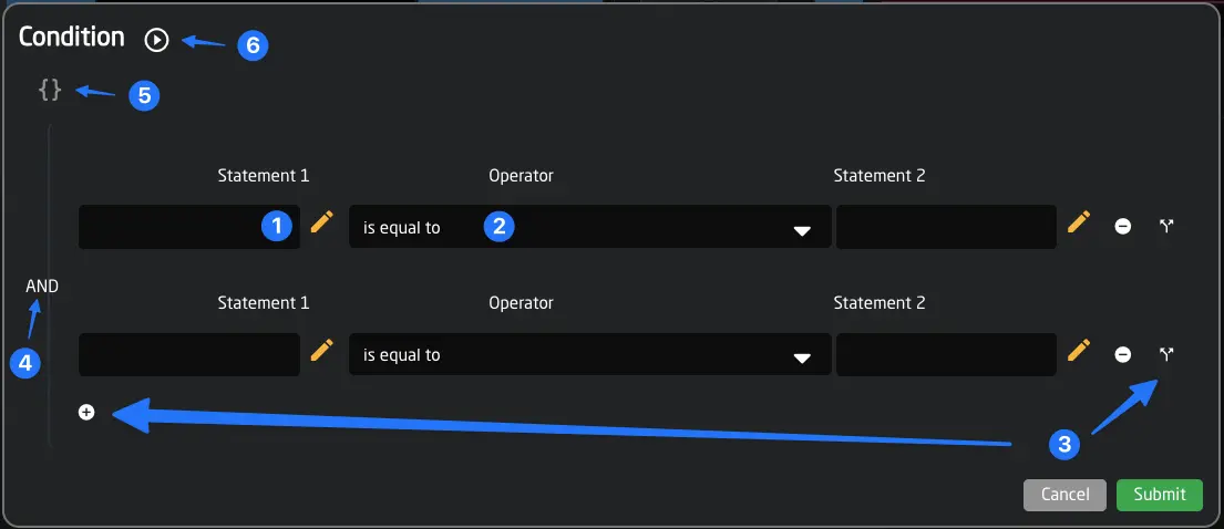
The helper window can make it quick to create the condition you need. You can:
- Select Parameter References by clicking the yellow pencil icons or just start typing values into the text field.
- Change the comparison operator in the middle to check.
- Add logical branches to your conditions.
- Change how your conditions are combined (AND or OR).
- Edit the raw string value of your condition.
- Evaluate the current result of the condition in Reactor by clicking the button. If true, you will see a green check ✅, else a red mark ❌.
Basic Format
The basic format of a Condition looks like this:
<Value or Parameter Reference> <comparison operator> <Value or Parameter Reference>
Comparison Operators
The basic operators for comparing values are:
- == equal to
- != not equal to
- < smaller than (only for numeric values)
- <= smaller than or equal to (only for numeric values)
- > larger than (only for numeric values)
- >= larger than or equal to (only for numeric values)
You can also quickly "force" a variable by simply typing true or false directly into the first field and leaving the second one empty.
Combining Different Conditions into One
You can also combine several different conditions using the logical combination operators:
- && AND
- || OR
Additionally, you can use parentheses ( ) to group parts together and specify the order in which the individual parts of a combined condition are evaluated.
Example:
Var:MyVariable == true && (DC:bmd-atem/1/programInputVideoSource/1 == 5 || DC:bmd-atem/1/programInputVideoSource/1 == 8)
This will evaluate to true if the variable MyVariable is set to true and the Program Parameter of the ATEM device 1 (on ME1) is either 5 or 8.
Example:
Var:MyVariable == true && DC:bmd-atem/1/programInputVideoSource/1 == [5,8]
This is the same, but shorter, using an array for the literal values 5 and 8, which implies an OR operator.
Checking Against Empty or Zero Values
When checking if a value is empty, there are different possibilities to consider:
- A value can be completely undefined: In this case, we can check against an empty array
[]or['']. - A value can be an empty string: In this case, we can check against
''.
Inside of the Condition Helper Window, you will get these values recommended in a dropdown.
Example Usages of Variables and Conditions
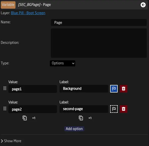
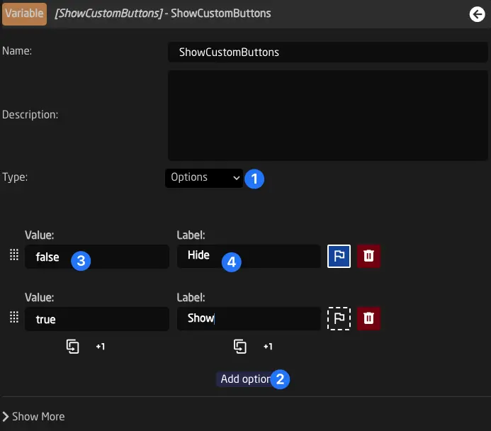
The simplest use case for variables and conditions is to switch the visibility of a layer on and off. To do so, simply create a Variable - let's use "ShowCustomButtons" as the name for this example.
In the variable settings, set it to "Options" (1), click "Add option" (2), and add true and false options (3). We can also add labels (4) to these options - let's type in "Show" and "Hide" for this example.
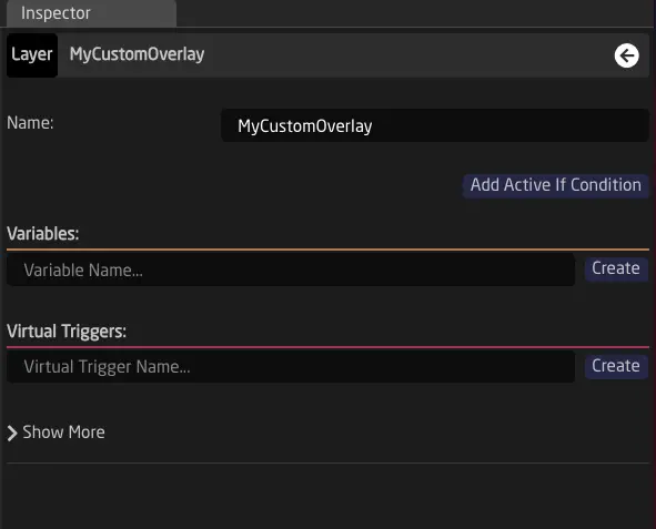
The next step is to add our custom layer.
(If the tree is not open yet, click the green arrow in the top left corner (1)).
We can click the config layer (2) of our controller's config and click the Add Child Layer button (3).
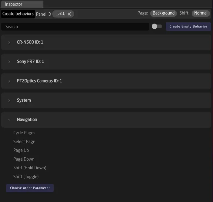
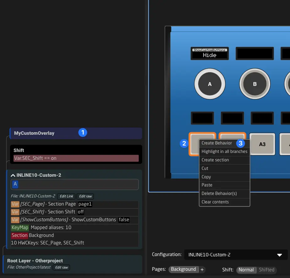
Let's add two Behaviors to our buttons. To do this, we click the layer (1), select the two components by dragging (2), right-click them, and choose Create Behaviors (3). By default, Reactor will create dummy behaviors that show their button name and layer path.
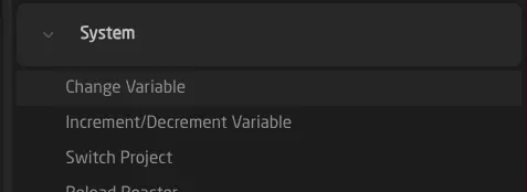
We also need to map one of the encoders of our controller to the variable we just created. Simply click the component, choose System -> Change Variable from the sidebar, and select the Variable ShowCustomButtons.
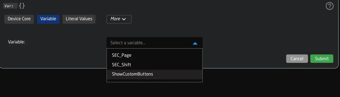
Finally, we need to add an Active-If condition to our layer. To do this, click the layer and select Add Active-If Condition in the inspector.
On the left side, click the yellow pencil and select the variable ShowCustomButtons. On the right side, you can just type out true.
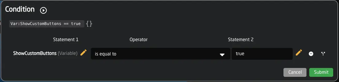
Click "Submit", and we are done.
To check the result, activate simulation mode (ctrl/cmd+e) and change the variable using the encoder. It should look like this:
The Parameter Reference (aka IO Reference)
One of the fundamental concepts in Reactor is the Parameter Reference, also sometimes referred to as IO Reference. This is a text string used to address any parameter within Reactor. Parameter References are similar to URLs, providing a consistent method for accessing and manipulating data. The main groups of addressable parameters are:
- Device Core Values
- Variables and Flags
- System Values
- Presets
- Panel Settings
- The current Behavior and its settings or fields
- A value from a specific Settings Table
Additionally, the parameter reference can also include simple (literal) values, like a number or a text string.
Configuring Parameter References using the helper window
In Reactor, wherever you encounter a Parameter Reference, you can open a helper window to select what you need easily. You can also configure the Parameter Reference manually if you wish.
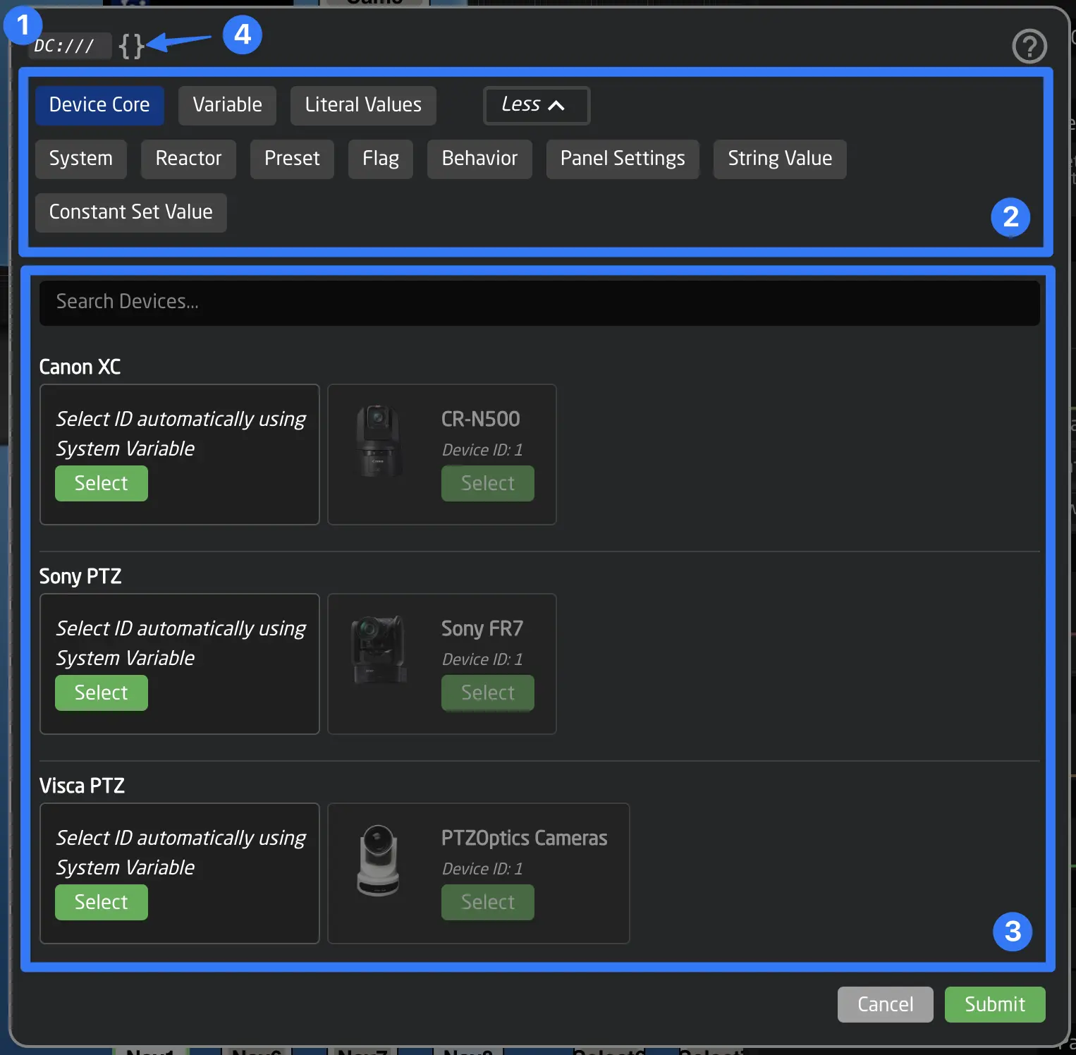
The helper window consists of several parts:
- The top displays the actual text string being built by the options you choose.
- Select the type of Parameter Reference you want to create.
- Configure the Parameter Reference; in this case, select the parameter of a device. The form will show more options as you make selections.
- Click the Edit Raw button to directly edit the Parameter Reference text string.
Manual Configuration
To manually configure a Parameter Reference, you must first understand the format and the possible options that make up the reference.
Basic Format
The basic format looks like this:
Type:part1/part2/part3:modifier1:modifier2:modifier3
Some parts can include nested Parameter References using curly brackets { }, allowing a different Parameter Reference to select a certain device ID for example. This is valid in some combinations but not universally. Refer to the specific option in the reference for more information about templating.
It is also possible to create a Parameter Reference that points to multiple parameters using array syntax with [ ] for IDs.
Types and their Options
Different Types of Parameter References can have different options or modifiers.
Literal Values
Literal Values
Literal values can be written as they are, provided they do not include a colon.
For example: 3, true, or page1
To specify an array of values, enclose the values in brackets and separate them with commas, for example, [red, green, blue].
In cases where your value contains special characters, prefix the value with String: to explicitly indicate that the rest of the value is a literal value.
Eg: String:{"DATA":"Custom JSON value"}
Variables (Var:)
Variables (Var:)
Variables can be referenced by combining the type and the variable key.
For example: Var:SEC_Page or Var:DeviceIndex
Modifiers can be added at the end.
For example: Var:SEC_Page:Name (displays the friendly name of the variable) or Var:DeviceIndex:Current:Name (displays the label of the current value).
Device parameters are the most common type of Parameter Reference. They allow you to address any parameter on any connected device.
Fields (Field:)
Fields (Field:)
This allows you to access the "Fields" in the top of the Behavior. These values used to be called "Behavior Constants" prior to Reactor 2.2.5. Sometimes Fields are also injected from a Generator.
Panel Settings (Panels)
Panel Settings (Panels)
Panel parameters like brightness and sleep can be controlled using this type of parameter reference.
The basic format is:
Panels:[target type]/[target index]/[panel parameter type]
Target Type can be one of the following:
- Canvas - Directly address the whole canvas (panel group) by its ID.
- Panel - Address a specific panel by its ID.
- CanvasOfPanel - Address the whole canvas (panel group) of the panel specified by the target ID.
The target index can be a Parameter Reference, which means it can be a Variable, Behavior Field, or any other reference. If the reference includes slashes (/), it must be wrapped in curly braces {}.
Important: Reactor typically addresses panel parameters like this: Panels:CanvasOfPanel/Behavior:Panels/[panel parameter type], ensuring the full panel group is addressed. In most cases, this is the best method.
Panel Parameter Types:
- SleepTime (minutes)
- DimTime (minutes)
- DisplayBrightness (0-8)
- LEDBrightness (0-8)
- GlobalBrightness (0-8)
- Sleep (binary: "on", "off")
- ResetSleepTimer (one-shot trigger)
- Name (read-only)
- Model (read-only)
System Values (System:)
System Values (System:)
System variables can be accessed using the System parameter type.
Available options:
-
System:PanelLock - Locks the entire Reactor system.
-
System:IPAddress - Displays the IP address of Reactor. It can also be used to change the system IP with a set value command or the SKAARHOJ:ChangeIP Template Behavior.
-
System:CurrentProject - Triggers a project change using Set Value.
-
System:RestartEngine - Restarts Reactor's engine, similar to switching projects.
-
System:ProjectTitle - Displays the current project title.
-
System:ConfigTitle - Shows the current name of the root layer.
-
System:UptimeFormatted - Displays the uptime since Reactor was started.
-
System:Panels:Connected - Number of currently connected panels.
-
System:Panels:Warnings - Number of panels with warnings.
-
System:Panels:Unconnected - Number of unconnected panels (errors).
-
System:Panels:LastEvent - Last event as a string, e.g., "Down (T)" if the top edge of a Four-Way button was pressed down.
-
System:Panels:LastEventSource - The HWC source of the last hardware event, including panel ID, in the form "P[panel id]#[HWC id]", for example, "P1#43."
-
System:Devices:Connected - Number of connected devices.
-
System:Devices:Warnings - Number of devices with warnings.
-
System:Devices:Unconnected - Number of unconnected devices (errors).
-
System:Devices/[idx]:Name - The name of a device, where
idxis an index number. -
System:Warnings - Total number of warnings in Reactor.
-
System:Errors - Total number of errors in Reactor.
The current Behavior and its settings (Behavior)
The current Behavior and its settings (Behavior)
Behavior parameters reference values configured for the current Behavior or display related information. These are often used in Template Behaviors.
Format: Behavior:[subtype]:[additional type]:Modifiers...
Examples include accessing the main parameter’s value or name using Behavior:IOReference:Name (to display the name) or Behavior:IOReference:Current (to display the current value).
Subtypes
- IOReference (main parameter reference)
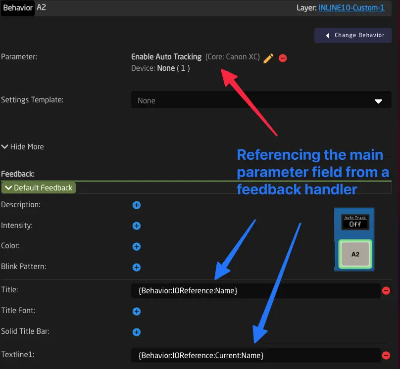
Using this subtype, the main parameter in the behavior can be referenced. Additionally, modifiers can be added. This allows you to refer to the main parameter's value or name without hardcoding it in other parts of a behavior (such as Feedbacks or Actions).
Examples:
Behavior:IOReference:Name (Displays the main parameter's name) or
Behavior:IOReference:Current (Displays the main parameter's current value).
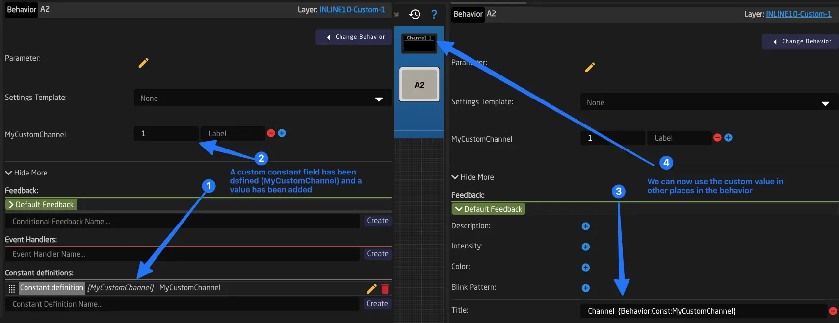
- Const (Behavior Field)
Using Behavior:Const:[field key], you can access fields of the behavior. This allows you to create SettingsTemplates for behaviors with customizable fields. It is used in many built-in Template Behaviors.
Advanced Subtypes
Several other subtypes exist to access information about the current behavior:
-
Name - The friendly name of the behavior.
-
Path - Returns the "path" of the behavior in the layer tree, e.g., "0/3/0/A3".
-
ID - Returns the behavior's main mapping to a panel, for example,
"_p4.32"(panel ID 4, Hardware Component (HWC) 32). -
Panels - An array of all panel IDs this behavior is mapped to (used mainly for accessing panel parameters, see below at Panel Settings).
-
Script - Using the Script subtype, you can access information about the currently running scripts of this behavior. See Scripting Engine.
- LastEvent
Access information about the last hardware event (trigger) received by the behavior.
| IO Reference | Comment |
|---|---|
| Behavior:LastEvent:Type | Type of last event. Options: Binary, Pulsed, Analog, Speed |
| Behavior:LastEvent:TimeToNow:[Limit] | Returns the time in milliseconds that has passed since the last event. Although setting a limit is optional, it's recommended to set it at or above the comparison value for performance efficiency. If a limit is set, it designates the maximum returned value. |
| Behavior:LastEvent/Binary:Pressed | Returns whether the last binary trigger was pressed (ActDown) or not (ActUp). Options: true, false |
| Behavior:LastEvent/Binary:Edge | Returns which edge the last binary trigger sent. Options: NoEdge, Top, Left, Bottom, Right, Encoder |
| Behavior:LastEvent/Pulsed:Direction | Returns the direction of the last pulsed trigger received. Options: Up, Down |
| Behavior:LastEvent/Pulsed:Value | Returns the value of the last pulsed trigger |
| Behavior:LastEvent/Analog:Value | Returns the value of the last analog trigger (0 to 1000) |
| Behavior:LastEvent/Speed:Value | Returns the value of the last intensity trigger (-500 to 500) |
-
Events
Access information about the last Action executed on the behavior.Behavior:Events/[Action Name]:TimeToNow:[Limit]
Returns the time in milliseconds since the last accepted trigger for the specified action. Setting a maximum limit is recommended for performance reasons in Reactor.
Behavior:Events/[Action Name]:SequenceStep
The current sequence step being executed (see Binary Sequence). -
Sub Behaviors ("Sub" sub-type)
Parameters related to the execution of MultiBehavior sub-behavior sequences.IO Reference I/O Comment Behavior:Sub:TotalSteps Read Total number of sub-behaviors in the MultiBehavior Behavior:Sub:TotalTime Read Total time (ms) for the full sequence, summing all delays Behavior:Sub:CurrentStep Read Current execution step (0 = not running, 1 = first step) Behavior:Sub:CurrentDelay Read Delay (ms) for the currently executing step Behavior:Sub:CurrentName Read Name of the behavior being executed in the current step
Presets (Presets)
Presets (Presets)
Preset Parameters control Reactor’s Parameter Preset Engine.
The basic format:
Preset:[preset kind name]/[command]/[preset index]/[device index]/
Command can be one of the following:
- Store
- Recall
- Delete
The preset index and device indexes can be set in different ways. They are Parameter References, meaning they can be a Variable, Behavior Field, or any other reference. If the reference includes slashes (/), it needs to be wrapped in curly braces {}.
Flags (Flag)
Flags (Flag)
Flags can be set, cleared, or displayed. The format:
Flag:[flag group name]/[flag color]/[flag number]:modifier1:modifier2:modifier3 Flags can be referenced to set, clear, or display them. The basic format is:
Flag:[flag group name]/[flag color]/[flag number]:modifier1:modifier2:modifier3
Make sure you have created a flag group before using this. More information can be found here: Flag Groups.
The Flag color can be selected from the fixed list of [Red, Green, Blue, White].
Finally, an index between 0 and 99 can be selected.
Note: Flags are generally used for SKAARHOJ Default Tally Forwarding and Routing Triggers. However, most things that can be done with flags can also be achieved with variables.
Value from Settings Tables (Const)
Value from Settings Tables (Const)
This type of parameter reference allows read-only access to a value in a Settings Table.
It can be useful for accessing settings values defined on the home screen or values from a Settings Table in virtual triggers.
Reactor's fields are unchangeable values embedded in the configuration code, used for various purposes within the configuration. Unlike variables, fields can only be modified by altering the configuration. Settings Tables in Reactor are essentially tables of related fields.
The basic format is:
Const:[Settings Table name]/[row index]/[field name (column)]:Modifiers...
The Row Index can be set in different ways. It is a Parameter Reference, meaning it can be a Variable, Behavior Field, or any other reference. If the reference includes slashes (/), it must be wrapped in curly braces {}.
Examples:
Const:CameraSelector/0/CameraName
Returns the value of the field "CameraName" in the first row (index 0) of the Settings Table "CameraSelector."
Const:CameraSelector/{Var:CameraIndex:Current:Offset:-1}/CameraName
This retrieves the value of the field CameraName from the row in the CameraSelector Settings Table, as indicated by the CameraIndex variable. If the CameraIndex variable is set to 1, it refers to the first row (index 0), as the variable's value is reduced by one when inserted as the row index (:Current:Offset:-1).
General Modifiers
Modifiers are used by certain Parameter References to access additional information or present the data in a different format. Modifiers are simply appended to the Parameter reference like this:
ParameterReference:Modifier1:Modifier2 ...
Most of the time, modifier combinations are dependent on their order.
Not all Parameter types support all modifiers. Reactor will limit the selection based on your Parameter selection in the helper window.
Here is a complete list for reference:
| Modifier | Comment | DC | Var | Const |
|---|---|---|---|---|
| (no modifiers) | Without any modifiers, returns the values. | Yes | Yes | Yes |
| Name | Returns the name of the reference, such as a parameter or variable name. | Yes | Yes | Yes |
| Default | Returns the default values of the IO reference. | Yes | Yes | - |
| Default:Name | Returns the names/labels of the default values of the IO reference. | Yes | Yes | - |
| All | Returns all option values for a parameter. For integer ranges with fewer than 100 values, it will calculate and return that as an option list. | Yes | Yes | No |
| Exists | Returns "true" if the reference exists. | Yes | Yes | Yes |
| Mutable | Returns "true" if the reference can be changed. | Yes | Yes | Yes |
| Multiple | Returns "true" if a parameter or variable has more than one dimension selected that does not have the same value, same as the display feedback when it shows "(Mul)" | Yes | Yes | - |
| Assumed | Returns "true" if a parameter is assumed in the core. | Yes | - | - |
| FineSteps | Returns the recommended fine steps for a Device Core; otherwise, returns 1. | Yes | - | - |
| CoarseSteps | Returns the recommended coarse steps for a Device Core; otherwise, returns 10. | Yes | - | - |
| ASCIIOnly | Returns true if only ASCII characters are found in the return value. | Yes | Yes | Yes |
| Current | ||||
| Current | Returns the current values. Same as not using the "Current" modifier. | Yes | Yes | Yes |
| Current:Name | Returns the names of the current values. | Yes | Yes | Yes |
| Current:Normalized | Returns the normalized value in the range of 0-1000. | Yes | Yes | No |
| Current:NormalizedInverted | Returns the normalized value in the inverted range of 1000-0. | Yes | Yes | No |
| Current:Percent | Returns the normalized value in the range of 0-100. | Yes | Yes | No |
| Current:Remap:[low int]:[high int]:[optional integer divisor, default to 1] | Returns the value normalized to the range [low int]-[high int], divided by the divisor. | Yes | Yes | No |
| Current:Index | Returns the index of the current value from the option list, starting with zero. Works only for parameters and variables with option lists, not ranges. | Yes | Yes | No |
| Current:Count | Returns the number of values in the IO reference array. | Yes | Yes | Yes |
| Current:Join:Token | Returns an IO reference with a single value, concatenating all values it had, separated by the Token string. | Yes | Yes | Yes |
| Current:SingleValue:[integer / Field or Variable Reference / "last" ] | Returns a single value from the current values by index. | Yes | Yes | No |
| Current:Offset:[int] | Returns the value with [int] added to it. | Yes | Yes | Yes |
| Current:BufferTimeToNow | Returns the time in milliseconds from the buffered value timeout to the current time. | Yes | - | - |
| Confirm:[int] | Changes the value only locally, waiting to be confirmed for [int] milliseconds. | Yes | - | - |
| Wait:[int] | Similar to Confirm, but the change is automatically accepted after the time expires. | Yes | - | - |
| Index | ||||
| Index:[integer comma list incl. "Last" keyword / Field or Variable Reference] | Returns option value with index [int] or, if it's a string, the field of the HWC Behavior. | Yes | Yes | No |
| Index:[integer comma list incl. "Last" keyword / Field or Variable Reference]:Name | Returns the name of the option value with index [int]. | Yes | Yes | No |
| Index:[integer comma list incl. "Last" keyword / Field or Variable Reference]:Exists | Returns true if the index exists. | Yes | Yes | No |
| Index:[integer comma list incl. "Last" keyword/ Field or Variable Reference]:Offset:[int] | Returns the value at index with a numeric offset (can be negative). | Yes | Yes | No |
| Index:[integer comma list incl. "Last" keyword / Field or Variable Reference]:Raw | Returns the raw index value of the option value with index [int]. | Yes | Yes | No |
| DimensionName | ||||
| DimensionName:[int]:[optional int] | Returns the name of the specified dimension (0 index). If two integers are specified, returns the name of the specified element. | Yes | No | No |
| ID | ||||
| ID:[integer / Field or Variable Reference] | Returns an option by its value ID (different than index on some cores). Also supports :Name and :Exists. | Yes | Yes | No |
Device Core Parameters (DC:)
Device parameters follow this syntax:
DC:[name of the core1]/[device ID]/[name of parameter]/[dimension1 index]/[dimension2 index]/...:Modifiers
The device ID and dimension values can be set in different ways, as they are Parameter References themselves, meaning they can be Variables, Behavior Fields, or any other reference. If the reference includes slashes (/), it must be wrapped in curly braces {}.
Examples: DC:bmd-atem/{Var:DeviceIndex}/AuxSource/{Var:AuxChannel}/
This references AUX sources on the ATEM switcher with Device ID found in "Var:DeviceIndex" and the AUX Channel denoted by "Var:AuxChannel". In this case, wrapping the nested Parameter Reference is not required, as there are no forward slashes that might interfere with parsing, but it improves readability to do so.
Selecting multiple devices or dimensions:
To address multiple devices or dimension values at once, you can use array syntax with brackets [ ] or the all keyword:
-
Array syntax: List specific indices separated by commas. Example:
DC:protocol-visca/[1,2,3,4,5]/dcCruiseControl/ -
allkeyword: Select all available devices on a core or all values of a dimension. Example:DC:protocol-visca/all/dcCruiseControl/(all devices) Example:DC:protocol-visca/1/fader_Channel/all(all dimension values)
Using all is particularly useful when you want to trigger an action across all devices of a core without having to enumerate each device index manually.
Understanding Dimensions
Some device parameters have one or more dimensions, which represent additional indices needed to fully address the parameter. For example, on a Blackmagic ATEM switcher, the AUX source parameter has a dimension for the AUX channel number, because each AUX output can be set independently.
When you select a parameter that has dimensions, extra fields will appear in the Parameter Reference helper window below the parameter selection:
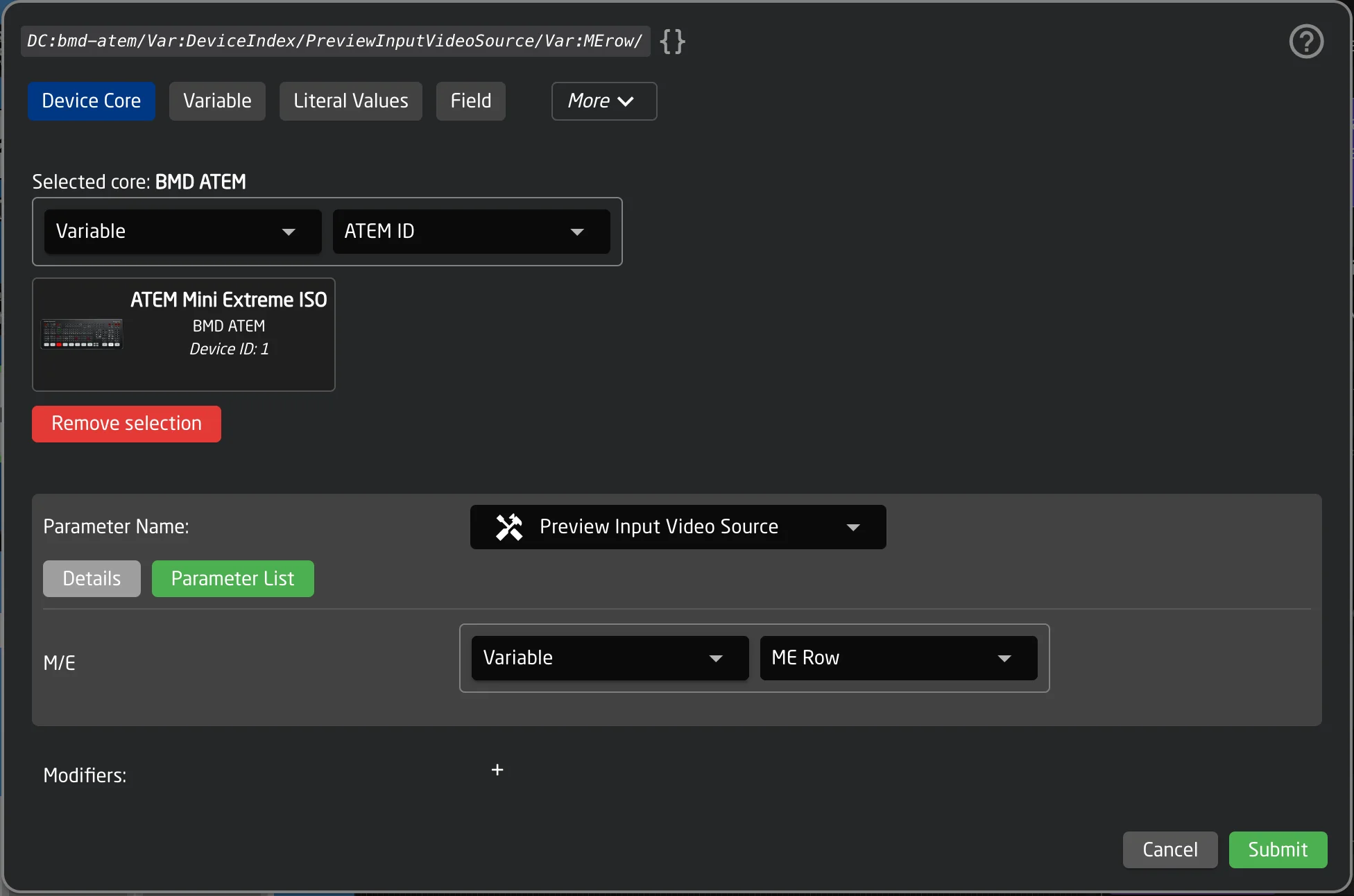
Each dimension has a name and a description. The value for each dimension is itself a Parameter Reference, meaning you can use a literal number, a Variable, a Field, or any other reference type to dynamically select which index to address.
Example with one dimension:
DC:bmd-atem/1/AuxSource/1/ — addresses AUX Source on ATEM device 1, AUX channel 1.
DC:bmd-atem/1/AuxSource/{Var:AuxChannel}/ — uses the variable "AuxChannel" to dynamically select which AUX channel to address.
Example with multiple dimensions:
Some parameters have more than one dimension. For instance, a keyer parameter on an ATEM may have both an M/E (Mix/Effect) dimension and a USK (Upstream Keyer) dimension:
DC:bmd-atem/1/KeyOnAir/1/1/ — M/E 1, Upstream Keyer 1.
In the helper window, you will see a separate field for each dimension, labeled with its name and description.
The DimensionName modifier can be used to retrieve the human-readable name of a dimension or one of its elements. See the General Modifiers table for details.
Meta Values
Certain device core parameters require additional configuration data beyond the parameter value itself. These are called Meta Values. They provide extra context that the device core needs when setting a value on the device.
Meta Values are most commonly found on protocol-based device cores like MQTT and HTTP, where additional details such as a topic, URL path, or request type are needed alongside the value being sent.
Unlike dimensions, Meta Values do not appear in the Parameter Reference string itself. They are configured separately in the helper window.
When you select a parameter that has Meta Values, the helper window will show additional fields below the parameter and dimension fields:

Depending on the type, each Meta Value field may be:
- A text input (String)
- A number input (Integer or Float)
- A true/false toggle (Boolean)
- A dropdown with predefined options (Options)
Examples:
The MQTT protocol core's "Publish" parameter has three Meta Values:
- topic (required) — The MQTT topic to publish to.
- value (required) — The message payload.
- retain — Whether the message should be retained by the broker (true/false).
The HTTP protocol core's trigger parameter has Meta Values for:
- Path — The URL path for the request.
- Request Type — A dropdown to select GET, POST, PUT, PATCH, or DELETE.
- Body — The request body (for POST/PUT/PATCH).
- Header — Custom HTTP headers.
Using dynamic values in Meta Values
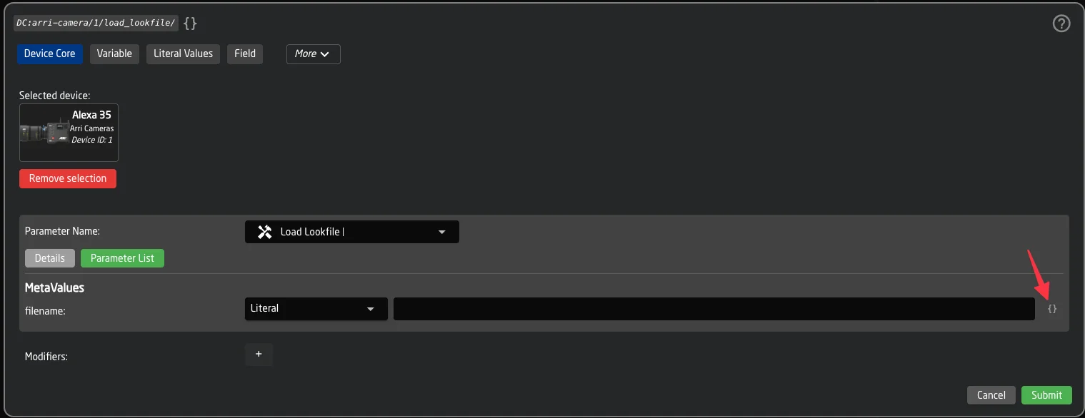
Each Meta Value field supports two input modes:
- Simple mode (default): Works like a standard Parameter Reference selector — you can choose a literal value, a Variable, a Field, or any other reference type.
- Template mode: Toggled via the { } (code-braces) button next to the field. This allows you to mix free text with embedded Parameter References, for example
Prefix: {Var:Topic}or{DC:core/1/param/}. This works identically to Feedback text templating. The button turns yellow when template mode is active.
Meta Values in the Inspector
When a behavior uses a parameter with Meta Values, the configured values are visible in the behavior inspector alongside the parameter name.
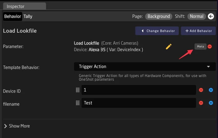
Meta Values only affect how values are sent to the device. They do not change how values are read or displayed.
Tip: Using Meta Values in raw JSON
Tip: Using Meta Values in raw JSON
In the raw JSON configuration, Meta Values are stored under the "MetaValues" key inside the Parameter Reference object. In preset state values, they appear under the key "MetaMap".
-
without core- prefix ↩
Finding Device Core Parameter Lists
There are four places to access parameter lists of a device core
Configuration Page Inspector
Configuration Page Inspector
When editing a parameter from the Inspector on the Configuration page, you can access the parameter list.

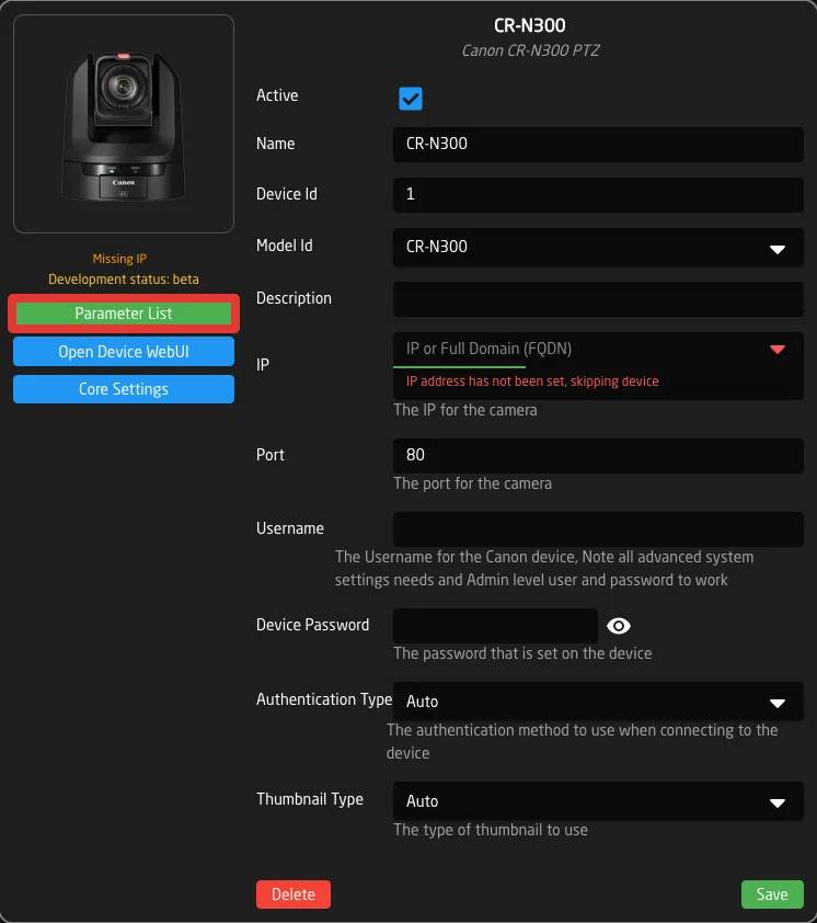
If you select to control a single device, when clicking 'Parameter List' you will be directed to the parameter list for that specific model of device.
Device Details
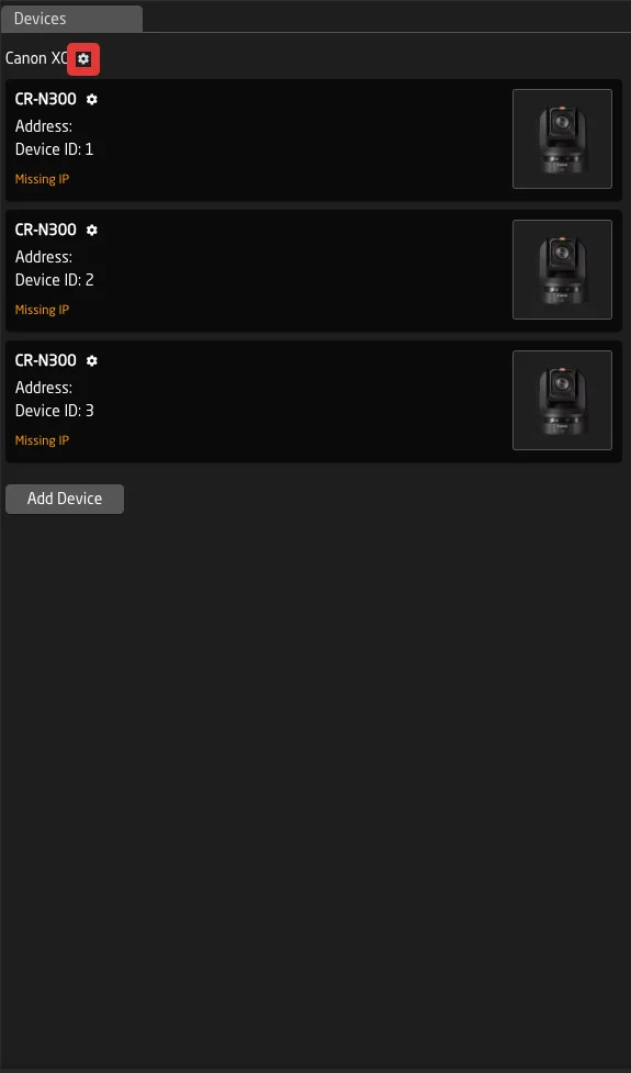
Device Details
Click the gear icon next to the Name of the device you want to know about, to access this popup. Then click on 'Parameter List'
This will then open the full parameter list for that specific model device.
Device Core Details
Device Core Details
Click the gear icon next to the name of a device core to open it's details page
Then click on 'Parameter List'
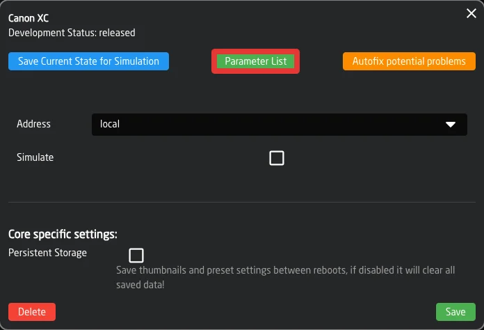
This will then open the web link to the full parameter list for that device core and all supported models within.
Devices.Skaarhoj.com
Devices.Skaarhoj.com
All devices we integrate with can be searched on our web page devices.skaarhoj.com
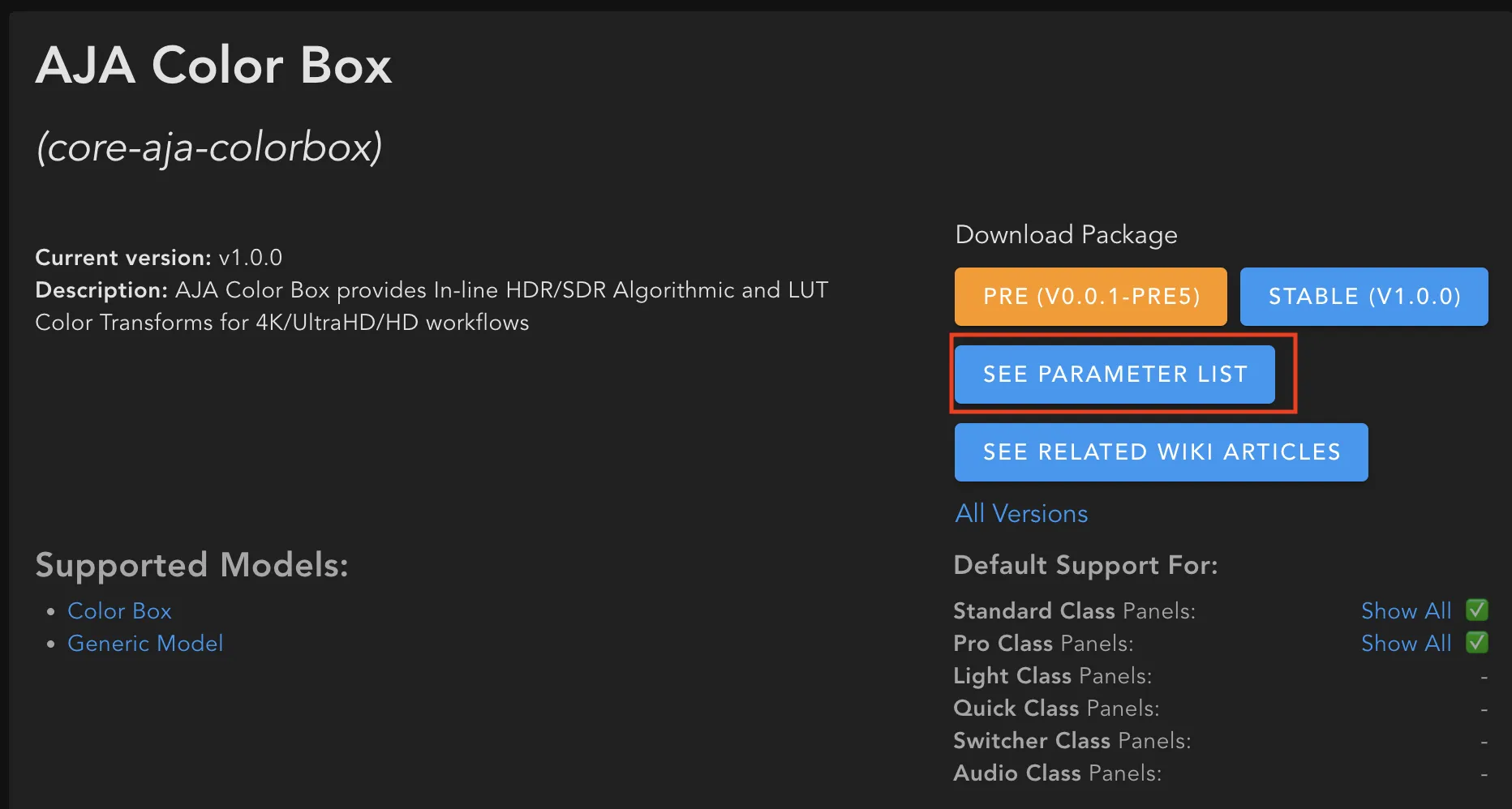
Clicking on 'Supported Parameter List' from the main page will then open the web link to the full parameter list only for that specific model device. 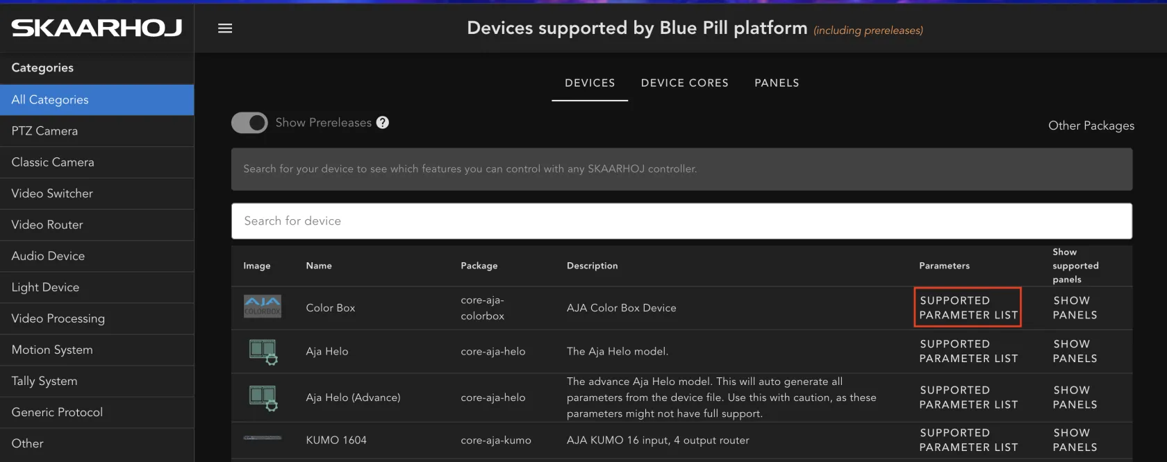
Clicking into the device for additional information will give you two options. Clicking on specific device name will then open the web link to the full parameter list only for that specific model device.
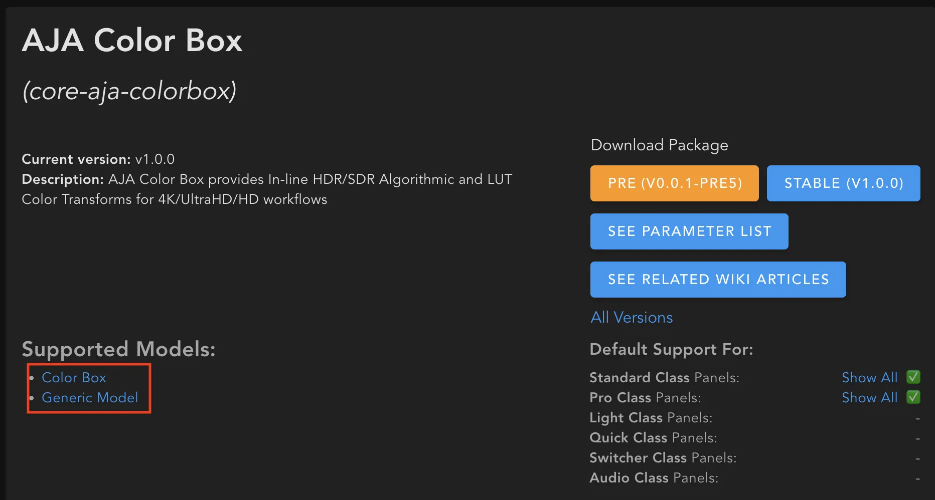
Clicking on 'See Parameter List' will open the web link to the full parameter list for that device core and all supported models within.
Feedbacks and Actions
So far, we have been using the included Template Behaviors to define how a component interacts with a parameter.
When we want to customize individual parts of a behavior or even create one from scratch (without selecting a Template Behavior), we need to understand Feedback Handlers and Actions (formerly known as Event Handlers).
Feedback Handlers
Feedback Handlers are the parts of the Behavior that define what a component shows. They can adjust things like LED color, display text and elements, and even the position of a motorized fader.
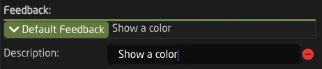
Every Behavior and Layer has a Default Feedback, which is shown automatically. Additionally, there are Conditional Feedbacks, which are only active when their Active-If condition returns true.
Let’s take a look at the available fields in a Feedback Handler:
There are several groups of fields:
General Feedback Fields
Description
Description
Give your Feedback Handler a readable description. This will be shown in the header and can make your behavior easier to understand.


Color
Color
Set the LED Color. You can select one from the color picker or even use a parameter to define the color of a component.
NOTE: You will not see a color show up if Intensity is OFF.

Blink Pattern
Blink Pattern
Make the component blink in a certain pattern. This is useful for cases where you want a button to attract additional attention, like warnings or other alerts.
Text Display
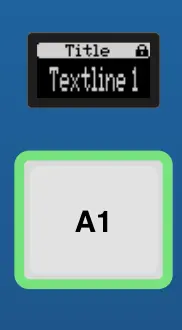
Solid Title Bar
Solid Title Bar
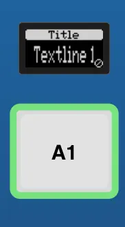
Select whether the Title Bar should have a solid white background or be transparent. In SKAARHOJ default configs, a transparent title bar is often used to indicate that a button "Sets" the value written on it, while displays with a solid header bar usually show the current state of a value.
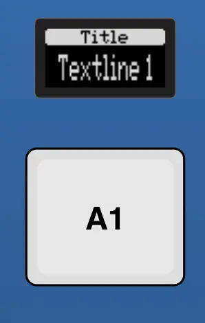
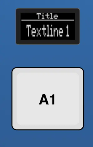
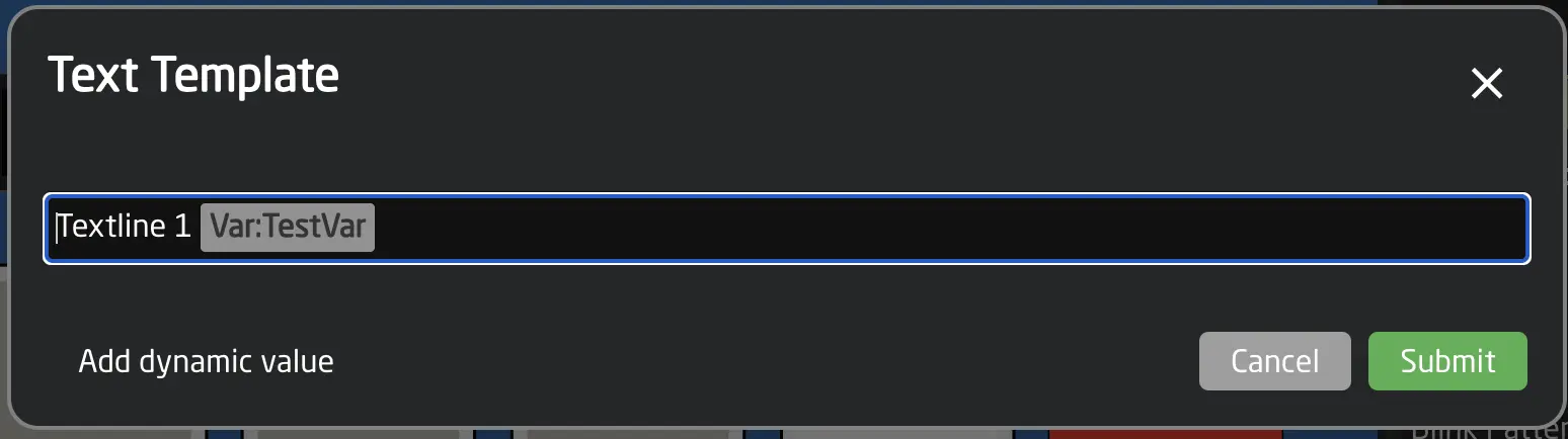
Textline 1 & Textline 2
Textline 1 & Textline 2
Specify the main text for the component. You can add dynamic values with parameters into the text using the helper window or braces {}.
Text Size
Text Size
Select a specific text size. This value corresponds to the font width and height as a comma-separated pair: 0,0 = Auto, 1,1 = smallest, 3,3 = largest, 1,2 = Tall and narrow, etc.
AutoWrap
AutoWrap
AutoWrap will automatically break the contents of Textline 1 to Textline 2 if the text exceeds the available display space.
Use Graphics for Unicode
Use Graphics for Unicode
By default, our displays do not support unicode characters. When turning on this option, text that contains unicode will automatically be rendered into an image, allowing the displays to fully support unicode.
Note: This may sometimes slightly change the rendering, or modify text size and font.
Simple Icons
State Icon Fine
State Icon Fine
Set a condition for when to show the fine icon, generally used to indicate when coarse mode is active.
Modifier Icon
Modifier Icon
Select one of several modifier icons to use. Modifier Icons are usually used to indicate what type of interaction is possible.
Tip: If you need these to be shown based on a condition, you will need to use several conditional feedback handlers.
Advanced Feedback Fields
Graphic Source
Graphic Source
Selecting a Graphic Source will override most of the text related fields from before and replace them with a graphical image. If you still like to specify a Title and Header Bar use the new "Graphics Title".
You can select between Icon, Parameter, QRCode and Widget.
Icons can be existing Bitmap icons from Reactors Library, or you can upload custom little images into your project.
Parameter allows you to select a parameter that will populate the image. This is needed for image parameters such as thumbnails from PTZ Cameras
QRCode allows to quickly and easily add a QR Code with a link into a Display.
Widget allows you to use specialized display widgets for dynamic visualizations.
Two widget types are available:
- VUMeter - Audio level meters with optional peak indicators, supporting both mono and stereo display. Perfect for monitoring audio levels with dB-scaled ranges and custom background graphics.
- Strength Widget - Horizontal bar indicators ideal for showing continuous values like iris position, focus, or fader levels.
Widgets require normalized data sources (use the :Current:Normalized modifier) and support multiple data inputs for complex visualizations.
For detailed widget configuration, field references, and examples, see Widgets.
Tip: To get rid of the white Background use the Image Filters "Invert" option.
Extended Feedback
Extended Feedback
Extended Feedback is what drives LED Bars or Motorized Fader's Motor Position. Make sure you use the correct modifiers for the parameter, EG: Behavior:IOReference:Current:Normalized
Show Value Indicator Bar
Show Value Indicator Bar
Here you can specify a Parameter to use for a small value indicator below the main display content. Make sure you use the correct modifiers for the parameter, EG: Behavior:IOReference:Current:Normalized
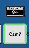
Don't inherit this feedback handler from template
Don't inherit this feedback handler from template
Turning on this option will ensure no parameters are inherited from the Template Behavior for this entire Feedback. Read more about inheritance here: Behavior Inheritance.
Actions
Actions are the parts of the Behavior that define what the component does when it is interacted with in various ways. Multiple Actions can be added to each behavior to enable different types of interactions or control different parameters.
Actions can also have an Active-If condition, but unlike Conditional Feedbacks, Actions are always active by default.
General Action Settings
Let's take a look at the available fields in an Action:
Handler Type
The Handler Type is a special field that determines the other available fields for configuration.
An Action can have one main type of trigger it interacts with. The trigger types are (as described earlier in Hardware Components): Binary, Pulsed, Analog, and Speed.
- A Binary Component can create ActDown and ActUp triggers.
- A Pulsed Component can create Pulsed Value triggers, like +1 and -1.
- An Analog Component can create Analog Value triggers from 0 to 1000.
- A Speed Component can create Speed Value triggers from -500 to +500, resetting to 0 when released.
After selecting the Handler Type, you can still add PreProcessors to the Action, which define how to respond when a different trigger type is received.
General Action Fields
Parameter
Parameter
Each Action can specify a different parameter to control. If no parameter is specified, the one defined at the top of the behavior form will be used.
Active If Condition
Active If Condition
Each Action can have a condition. If the condition is false, the Action remains disabled and is not used.
Example: This can be used to specify different Actions based on the value of a variable.
Invert Condition
Invert Condition
Specifies a condition that (if true) inverts the normal direction for control. If you would like to always invert it, simply select true.
Specific Settings: Binary
Binary Type
Binary Type
Specify whether this handler reacts only on a down press (ActDown) or only on release (ActUp). If not set, it will fire in both cases.
Edge Filter
Edge Filter
When mapped to a Four-Way button or encoder, use this setting to filter for a specific event, like pressing only up.
Set Mode
Set Mode
This allows you to specify how a press of the component will change the parameter. The following options are available:
-
Set
Set a specific value (specified using set values, see below). -
Cycle Up
Cycle up through the available options. -
Cycle Down
Cycle down through the available options. -
Cycle Up and Roll Over
Cycle up through the available options and continue at the start when going over the maximum. -
Cycle Down and Roll Over
Cycle down through the available options and continue at the maximum when going below the start. -
Random
Set a completely random value out of the possible ones that is not the same as the current value. -
Sequence
Sequence allows you to set several values in sequence, even for different parameters. You can specify a different parameter at each step. Choose sequence and add several steps.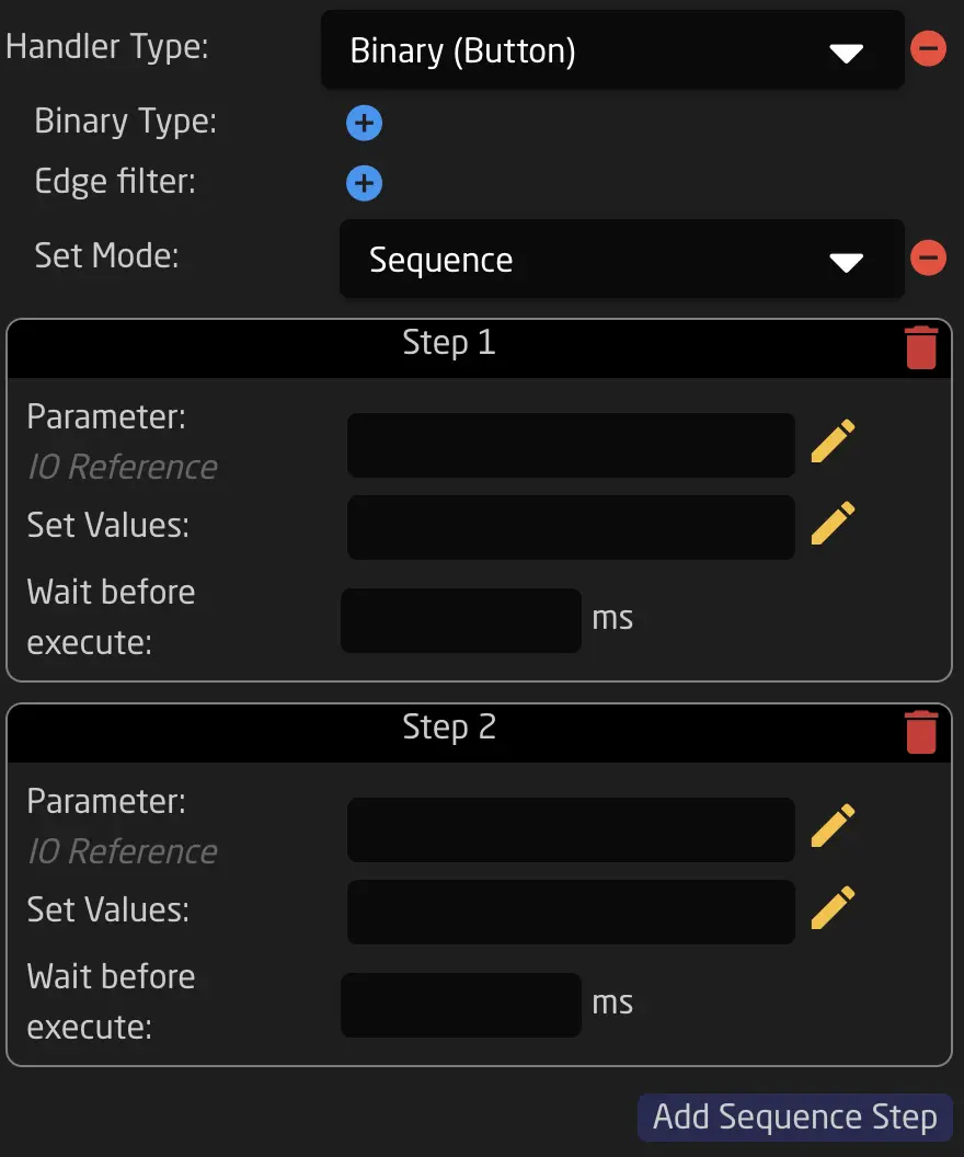
Binary Sequence Example -
Array-specific options for Variables:
See Chapter Variables.
Set Values
Set Values
Specify the list of values that this Action selects from. This defaults to using all options from the main parameter of the behavior (:All modifier).
Specific Settings - Pulsed
Rollover Condition
Rollover Condition
Specify a condition in which Rollover is allowed. Rollover means that when the end of the value range is reached, the next step jumps to the other end of the range.
Fine Step
Fine Step
Specify the fine step size for stepping through the parameter. You can either use the default for the behavior’s parameter (Behavior:IOReference:FineSteps) or specify your own.
For example: Select Literal Values -> then type 0.01 in the field.
The fine step size is used by default unless the CoarseCondition is true (see below).
Coarse Step
Coarse Step
Specify the coarse step size for stepping through the parameter. You can either use the default for the behavior’s parameter (Behavior:IOReference:CoarseSteps) or specify your own.
For example: Select Literal Values -> then type 10 in the field.
The coarse step size is used when the CoarseCondition is true (see below). In Reactor built-in behaviors like Change by step for long ranges, this is used when pressing down an encoder.
Coarse Condition
Coarse Condition
Selects between using fine steps (when false) or coarse steps (when true).
In Reactor built-in behaviors like Change by step for long ranges, this is used when pressing down an encoder.
Ganged Control Mode
Ganged Control Mode
When set to "Relative", and the component controls multiple parameters at once, they will all be stepped relative to their own values.
Otherwise, only the first value will be stepped, and all other values will be set to the destination value of the first.
Specific Settings - Analog
Discontinuity
Discontinuity
Discontinuity specifies what happens if the parameter being controlled has a different value than the current setting of the analog component. It defines the takeover strategy.
For example: If Iris is mapped to a RCP Joystick but has been changed on the camera in the meantime.
-
Double Linear: Double linear will map the value linearly from the current value towards each end of the value range. The rate of change (slope) may be different in each direction depending on the actual position of the analog component.
-
Offset: Offset will change the value from the current value towards the ends using the same and original rate of change. This means it may not entirely reach the end value as the analog component hits its end stop or it may reach the end value earlier than when the analog component hits its end position.
-
CatchUp: In this mode, the value won't change until the analog component is moved to the position that represents the current parameter value. At that instant, the analog component will linearly map its position to the value range of the parameter.
-
None: The value will jump to the correct mapped value when the component is moved.
Some information on this feature can be found in this YouTube video:
Note: This is not recommended to be used with MultiBehaviors.
Static Value Mapping
Static Value Mapping
Static Value Mapping allows you to change the 0-1000 range that the component outputs. You can use this to limit the range of faders or change how quick they respond.
Specific Settings - Speed
Speed handlers currently don't have configuration options exposed in the UI.
Advanced Action Fields
Event Preprocessor
Event Preprocessor
Event preprocessors allow all kinds of advanced modifications, like hold down, repeat, and other tricks. See the advanced chapter on Event Preprocessors for more details.
Rate Limiting for Pulsed Events (Encoders)
Pulses Per Second
Pulses Per Second
Rate-limits incoming encoder pulses to the specified maximum number per second. When set to a value greater than 0, pulses arriving faster than the allowed rate are either discarded or pooled (see Pool Pulses).
This is useful when controlling devices that cannot handle rapid encoder input, or when you want to smooth out encoder response.
Example: Setting this to 15 limits encoder events to 15 pulses per second maximum.
Pool Pulses
Pool Pulses
When enabled (and Pulses Per Second is set), incoming pulses that arrive during the rate-limiting interval are accumulated instead of discarded.
- Disabled (default): Extra pulses within the rate limit window are discarded - only one pulse per interval is forwarded.
- Enabled: Pulses are added together and sent as a combined value when the interval elapses.
Example: If the user rapidly turns an encoder 5 clicks within one rate-limit interval, with pooling enabled all 5 clicks are summed and sent as a single value of 5.
Pooled Pulses Scale
Pooled Pulses Scale
When Pool Pulses is enabled, this applies a scaling multiplier to the accumulated pulse value, creating an acceleration effect for rapid encoder movements.
The scaling formula increases the output progressively: slower turns remain precise while faster turns produce larger jumps.
| Pooled Pulses | Output (Scale: 3) |
|---|---|
| 1 | 1 |
| 2 | 4 |
| 3 | 7 |
| 5 | 13 |
| 10 | 28 |
Use case: Allows fine control with slow encoder turns while enabling quick navigation through large value ranges with fast turns.
Rate Limiting for Analog/Speed Events (Faders, Joysticks)
Value Changes Per Second
Value Changes Per Second
Rate-limits incoming analog (fader) and speed (joystick) events to the specified maximum number per second. When set to a value greater than 0, only the most recent value within each rate-limit interval is forwarded.
This is useful when controlling devices that cannot process rapid value changes, or to reduce network/system load.
Example: Setting this to 20 limits fader/joystick updates to 20 per second maximum.
Value Changes Per Second Send First
Value Changes Per Second Send First
When enabled (and Value Changes Per Second is set), the first incoming event is sent immediately, before rate-limiting kicks in for subsequent events.
- Disabled (default): Only trailing-edge events at rate-limited intervals are sent.
- Enabled: The first event is sent immediately for responsive feedback, then rate-limiting applies to continuous movement.
Use case: Provides immediate response when starting a fader movement while still limiting the update rate during continuous adjustment.
Don't Inherit
Don't Inherit
Turning on this option will ensure no parameters are inherited from the Template Behavior for this entire Feedback. Read more about inheritance here: Behavior Inheritance.
Inheritance of Feedback and Event Handlers from Template Behaviors
When adding Feedback Handlers to a behavior that uses a Template Behavior, they will be combined with those from the template. Feedback Handlers defined in the template are marked as Inherited.
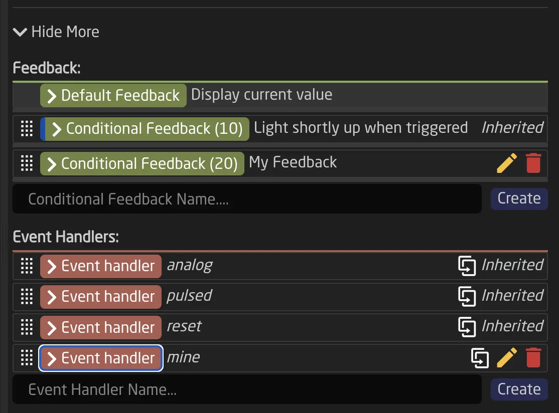
Feedback Handlers with the same index number in both the template and the behavior will be merged (overridden). The same applies to Actions with the same name.
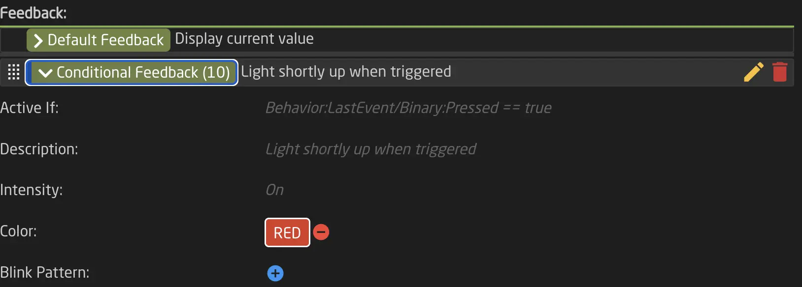
In the example above, after modifying the Feedback Handler with index 10 (changing the color), the fields inherited from the Template Behavior's Feedback Handler with index 10 are still visible.
Display Widgets
Display Widgets are specialized visualizations that can be used as a Graphic Source in Feedback Handlers. They provide dynamic, data-driven displays for monitoring and indicating values on panel displays.
Widgets are particularly useful for:
- Audio monitoring - Display audio levels with peak indicators
- Value indicators - Show continuous values like iris position, focus, or fader levels
VUMeter Widget
The VUMeter widget displays audio levels with optional peak indicators. It supports both mono and stereo configurations and can be customized with dB-scaled ranges and background graphics.
Use Cases
- Monitoring audio input/output levels on ATEM switchers
- Displaying mixer channel levels
- Audio source level monitoring
- Any normalized value display with peak indication
Configuration Fields
| Field | Description | Required |
|---|---|---|
| Type | Must be set to VUMeter | Yes |
| Subtype | Rendering style: empty (default dynamic), Fixed176x32 (classic bar), or Fixed176x32w (wide blocks). | No |
| Title | Title text shown above the meter. Supports IO references with {} syntax. | No |
| AltTitle | Alternative title text. If provided, this is used instead of Title. | No |
| Data1 | Primary level source (left channel or mono). Must be normalized (0-1000). | Yes |
| Data2 | Secondary level source (right channel). Leave empty for mono display. | No |
| Data3 | Primary peak indicator (left channel or mono peak). | No |
| Data4 | Secondary peak indicator (right channel peak). Leave empty for mono. | No |
| RangeMapping | Comma-separated values for custom range mapping (e.g., dB scale). | No |
| BackgroundFile | Custom background image (only for fixed subtypes). Available: VUMeter_12dB_176x32.png, VUMeter_0dB_176x32.png, VUMeter_wide_12dB_176x32.png, VUMeter_wide_0dB_176x32.png | No |
Note: All Data fields require the :Current:Normalized modifier to provide values in the 0-1000 range.
Mono vs Stereo
The VUMeter automatically detects whether to display in mono or stereo mode:
- Mono: Only specify Data1 (and optionally Data3 for peak)
- Stereo: Specify both Data1 and Data2 (and optionally Data3 and Data4 for peaks)
VUMeter Subtypes
The Subtype field controls the rendering style and size of the VUMeter:
Default (empty/not set):
- Dynamic sizing based on display component
- Block-based level display
- Title shown with line separator
Fixed176x32:
- Fixed 176×32 pixel size
- Classic horizontal bar style
- Rotated title text (90° clockwise)
- Works with custom background images
Fixed176x32w:
- Fixed 176×32 pixel size
- Block-based wide rendering style
- Rotated title text (90° clockwise)
- Works with custom background images
When using fixed subtypes, you can specify a BackgroundFile to overlay dB scale markings or other visual guides. The background image must be placed in the embedded/gfx/widgets/ directory or selected from the available presets.

Range Mapping for dB Scales
Audio levels are often measured in decibels (dB). To properly display dB-scaled audio levels, use the RangeMapping field to map the linear 0-1000 range to logarithmic dB values.
Example: dB Scale Mapping
For a standard audio meter with -60dB to +12dB range:
RangeMapping: "0,77,154,231,308,385,462,538,615,692,769,846,923,1000"
This maps to dB values: -60, -54, -48, -42, -36, -30, -24, -18, -12, -6, 0, +6, +12
Without RangeMapping, the meter displays linearly from 0 to 1000.
Display a single audio channel with peak indicator:
{
  "DisplayGraphics": {
    "DataSource": "Widget",
    "Widget": {
      "Type": "VUMeter",
      "Title": "Audio Input",
      "Data1": {
        "Raw": "DC:my-device/1/AudioLevel/:Current:Normalized"
      },
      "Data3": {
        "Raw": "DC:my-device/1/AudioPeak/:Current:Normalized"
      },
      "RangeMapping": "0,77,154,231,308,385,462,538,615,692,769,846,923,1000"
    }
  }
}
Result: A single vertical audio meter with dB scaling and peak indicator.

Advanced Example: Stereo Audio Meter
Display left and right audio channels with peaks:
{
  "DisplayGraphics": {
    "DataSource": "Widget",
    "Widget": {
      "Type": "VUMeter",
      "Title": "L/R Levels",
      "Data1": {
        "Raw": "DC:my-device/1/AudioLevelLeft/:Current:Normalized"
      },
      "Data2": {
        "Raw": "DC:my-device/1/AudioLevelRight/:Current:Normalized"
      },
      "Data3": {
        "Raw": "DC:my-device/1/AudioPeakLeft/:Current:Normalized"
      },
      "Data4": {
        "Raw": "DC:my-device/1/AudioPeakRight/:Current:Normalized"
      },
      "RangeMapping": "0,77,154,231,308,385,462,538,615,692,769,846,923,1000"
    }
  }
}
Result: Two side-by-side vertical meters showing left and right channels with individual peak indicators.

Strength Widget
The Strength widget displays a single horizontal bar indicator, perfect for showing continuous values like iris position, focus distance, or fader levels.
Strength Use Cases
- Camera iris position indicator
- Focus position display
- Motorized fader position feedback
- Any single normalized value display
Strength Configuration Fields
| Field | Description | Required |
|---|---|---|
| Type | Must be set to Strength | Yes |
| Title | Title text shown above the bar. Supports IO references with {} syntax. | No |
| Value | Value text shown on the left side (rotated 90°). Supports IO references. | No |
| Data1 | Value source for the bar indicator. Must be normalized (0-1000). | Yes |
| RangeMapping | Comma-separated values for custom range mapping. | No |
Note: Data2, Data3, and Data4 are not used by the Strength widget.
Basic Example: Iris Position Indicator
Display camera iris position with f-stop value:
{
  "DisplayGraphics": {
    "DataSource": "Widget",
    "Widget": {
      "Type": "Strength",
      "Title": "Iris",
      "Value": "F{DC:my-camera/1/FStop}",
      "Data1": {
        "Raw": "DC:my-camera/1/Iris/:Current:Normalized"
      }
    }
  }
}
Result: A horizontal bar showing iris position with "F2.8" (or current f-stop) displayed on the left side.

Example: Fader Position Indicator
Display the current position of a motorized fader:
{
  "DisplayGraphics": {
    "DataSource": "Widget",
    "Widget": {
      "Type": "Strength",
      "Title": "Fader Position",
      "Data1": {
        "Raw": "Behavior:IOReference:Current:Normalized"
      }
    }
  }
}
Result: A horizontal bar showing the current fader position from 0 to 100%.

Important Notes
Data Source Requirements
All widget Data fields (Data1, Data2, Data3, Data4) must provide normalized values in the range 0-1000.
Always use the :Current:Normalized modifier when referencing parameters:
- ✅ Correct:
DC:my-device/1/AudioLevel/:Current:Normalized - ❌ Incorrect:
DC:my-device/1/AudioLevel/:Current
Without normalization, widgets will not display correctly.
Caching and Performance
Widget rendering is optimized with time-based caching (maximum 25 frames per second). This ensures smooth updates without excessive CPU usage.
You can control caching behavior using the CacheExpiration field on the parent DisplayGraphics object:
{
  "DisplayGraphics": {
    "DataSource": "Widget",
    "Widget": { ... },
    "CacheExpiration": 100
  }
}
This is a time value in milliseconds. Lower values provide faster updates but may increase CPU usage.
Title Text with Parameter References
Both Title and AltTitle fields support dynamic text using IO references:
{
  "Title": "{Var:ChannelName} - {DC:my-device/1/AudioLevel/:Current}dB"
}
This allows widget titles to display real-time parameter values and variable contents.
If AltTitle is specified and not empty, it will be used instead of Title.
Virtual Triggers
While a component can generate triggers, sometimes you might want to trigger something based on an external event, such as a parameter change on one of your switchers. To facilitate this, Reactor can generate a trigger based on:
- Conditions
- Time
- Value Changes
Modes
Virtual triggers can operate in one of the following modes:
Change: Trigger when an external value changes
Change: Trigger when an external value changes
In Change mode, you can select any parameter. When the parameter changes or updates, the trigger is fired, simulating a button press (similar to Binary mode).
Analog: Simulate a fader move
Analog: Simulate a fader move
In Analog mode, the selected parameter becomes an Analog Trigger (simulating a fader). Every time the value changes, a new Analog Value is sent to the defined Behavior.
Schedule: Use a fixed time schedule to trigger something
Schedule: Use a fixed time schedule to trigger something
In Schedule mode, you can configure a schedule for when your trigger will be executed using cron-like syntax. Every time the specified time is reached, the Virtual trigger sends a Binary trigger (simulating a button press) to the defined behavior.
See below for how to configure the time format.
Creating and Configuring Virtual Triggers
Like many other elements, VirtualTriggers are part of the tree and are defined on a layer. To keep things simple, it is recommended to create VirtualTriggers on the base configuration layer of your configuration. Start by clicking anywhere on the blue or black area of your controller. You should now see the root layer of this panel.
To create a VirtualTrigger, follow these steps:
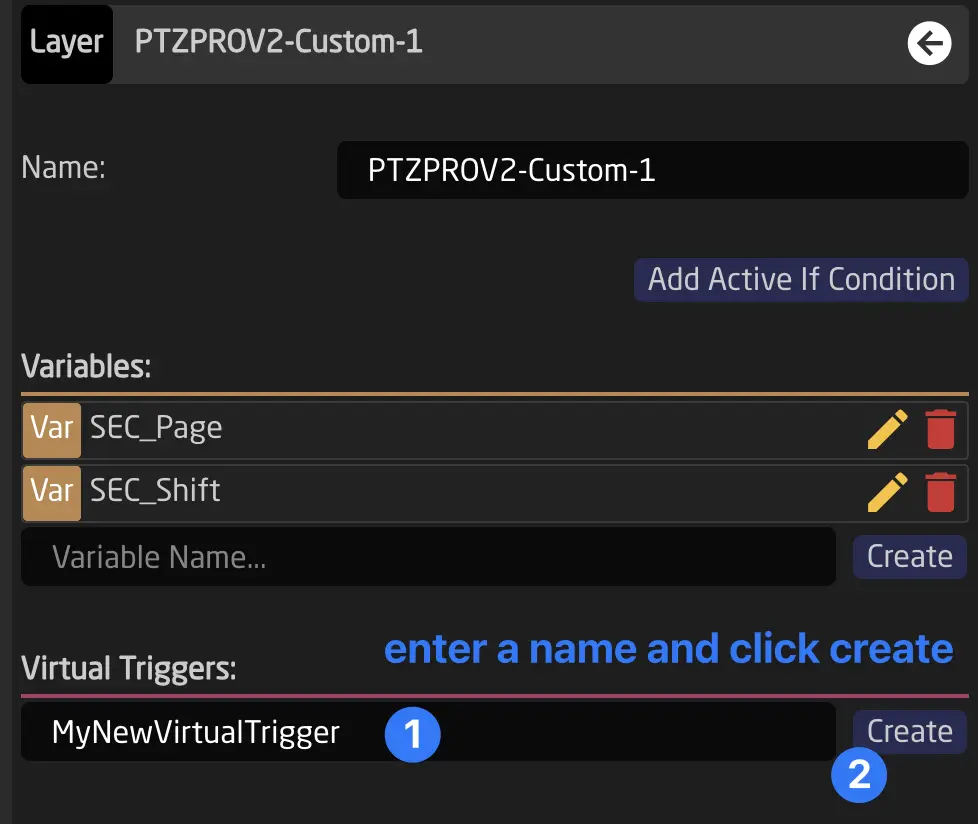
After creation, click on the name to edit it. You will see this in your inspector:
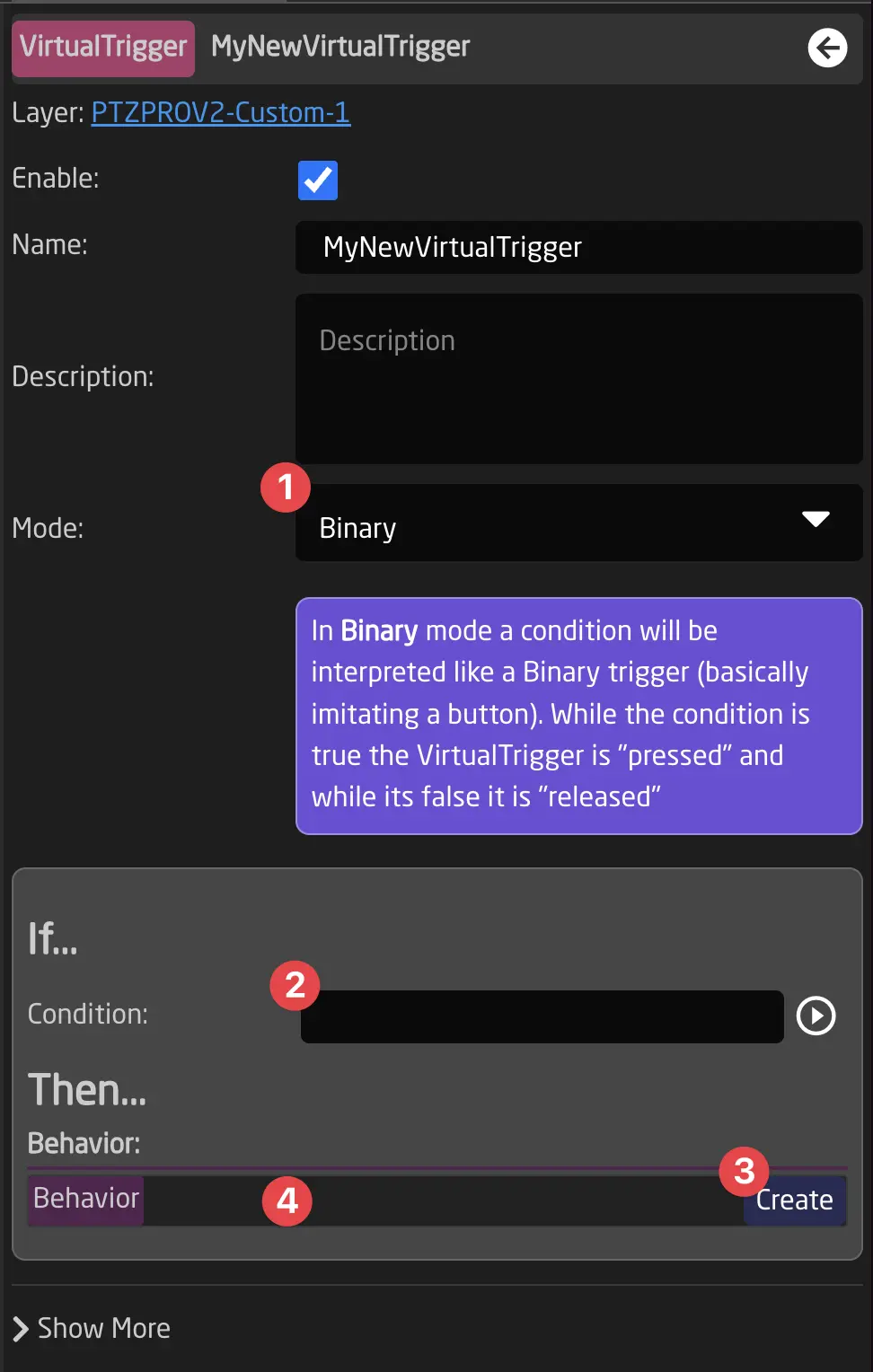
- When adding a Virtual Trigger, first select its mode using the dropdown.
- After creating a trigger, select either a Condition, Parameter Reference, or time schedule.
- Click Create to create a Behavior.
- Click on the Behavior to configure a behavior that will be used for the Virtual Trigger.
Configuring 'Schedule' Virtual Triggers
Schedule Virtual Triggers use a configuration format called Cron. Cron is a Linux application that schedules commands or scripts to run automatically at specified times and dates.
The syntax works as follows:
| * | * | * | * | * | * | |
|---|---|---|---|---|---|---|
| Field name | Seconds | Minutes | Hours | Day of month | Month | Day of week |
| Allowed values | 0-59 | 0-59 | 0-23 | 1-31 | 1-12 or JAN-DEC | 0-6 or SUN-SAT |
| Allowed special characters | * / , - | * / , - | * / , - | * / , - ? | * / , - | * / , - ? |
All six fields are required.
Allowed special characters explained:
-
Asterisk ( * ) The asterisk indicates that the cron expression will match all possible values of the field. For example, using an asterisk in the 5th field (month) would indicate every month.
-
Slash ( / ) Slashes describe increments of ranges. For example,
3-59/15in the 1st field (minutes) would indicate the 3rd minute of the hour and every 15 minutes thereafter. The form*/...is equivalent tofirst-last/..., meaning an increment over the largest possible range of the field. The formN/...is accepted as meaningN-MAX/..., starting at N and using the increment until the end of the specific range. It does not wrap around. -
Comma ( , ) Commas separate items in a list. For example, "MON,WED,FRI" in the 6th field (day of the week) would mean Mondays, Wednesdays, and Fridays.
-
Hyphen ( - ) Hyphens define ranges. For example,
9-17would indicate every hour between 9am and 5pm inclusive. -
Question mark ( ? ) A question mark may be used instead of
*to leave either the day-of-month or day-of-week field blank. Important: When using day-of-week, you must use?in the day-of-month field, and vice versa.
Alternatively, we also allow the following inputs:
| Entry | Description | Equivalent To |
|---|---|---|
| @yearly (or @annually) | Run once a year, midnight, Jan. 1st | 0 0 0 1 1 * |
| @monthly | Run once a month, midnight, first of month | 0 0 0 1 * * |
| @weekly | Run once a week, midnight between Sat/Sun | 0 0 0 * * 0 |
| @daily (or @midnight) | Run once a day, midnight | 0 0 0 * * * |
| @hourly | Run once an hour, beginning of hour | 0 0 * * * * |
Common Schedule Examples
Here are some practical examples to help you create your own schedules:
| Description | Schedule Expression | Explanation |
|---|---|---|
| Every weekday at 8:00 AM | 0 0 8 ? * MON-FRI | Seconds=0, Minutes=0, Hours=8, Day-of-month=? (any), Month=* (all), Days=Mon-Fri |
| Every weekday at 8:00 AM (numeric) | 0 0 8 ? * 1-5 | Same as above, using 1=Monday through 5=Friday |
| Mon, Wed, Fri at 10:30 AM | 0 30 10 ? * MON,WED,FRI | Specific days of the week at 10:30 |
| Every day at 6:00 PM | 0 0 18 * * ? | Day-of-month=* (every day), Day-of-week=? (ignored) |
| First day of every month at 9:00 AM | 0 0 9 1 * ? | Day-of-month=1, Day-of-week=? (ignored) |
| Every 15 minutes during business hours | 0 */15 9-17 * * MON-FRI | Every 15 minutes from 9am-5pm on weekdays |
| Every Sunday at midnight | 0 0 0 ? * SUN | Day-of-week=Sunday (0 or SUN) |
| Every Sunday at 10:00 AM | 0 0 10 ? * SUN | Day-of-week=Sunday at 10:00 AM |
| Every hour on the hour, every day | 0 0 * * * ? | Minutes=0, Hours=* (every hour) |
| Every 5 seconds | */5 * * * * ? | Seconds=every 5 seconds (/5), all other fields= (any time) |
When you want to trigger on specific days of the week (like MON-FRI), always use ? in the day-of-month field (4th field). This tells the scheduler to ignore the day-of-month and only pay attention to the day-of-week field.
Example: 0 0 8 ? * MON-FRI - The ? in the 4th position is required!
Videos
We currently have 3 videos on our YouTube channel documenting Virtual Trigger Configuration:
Reactor Parameter Presets
Reactor Shading Presets allow you to define a list of parameters that can be stored and recalled from your panel. You can combine any device core value on any device and recall it for either the same or a different device.
Here is a Video showing how this works in practive:
To get started, create a Preset Kind on a layer in the tree. To keep things simple, we recommend creating Preset Kinds on the configuration layer related to your panel. Start by clicking anywhere on the blue or black area of your controller. You should now see the root layer of this panel.
Next, go ahead and add a new Preset Kind. Preset Kinds are hidden under the "Show More" toggle of the Layer Inspector
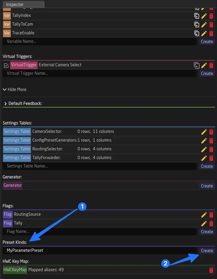
Afterward, you can start adding parameters to the Preset Kind. Click "Add Parameter" Select the Device Core, then select the parameter you want to control.
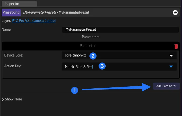
When you're satisfied with your preset, you need to map buttons for storing and recalling presets. To do this, create a new Behavior on a button and open the parameter (yellow arrow).
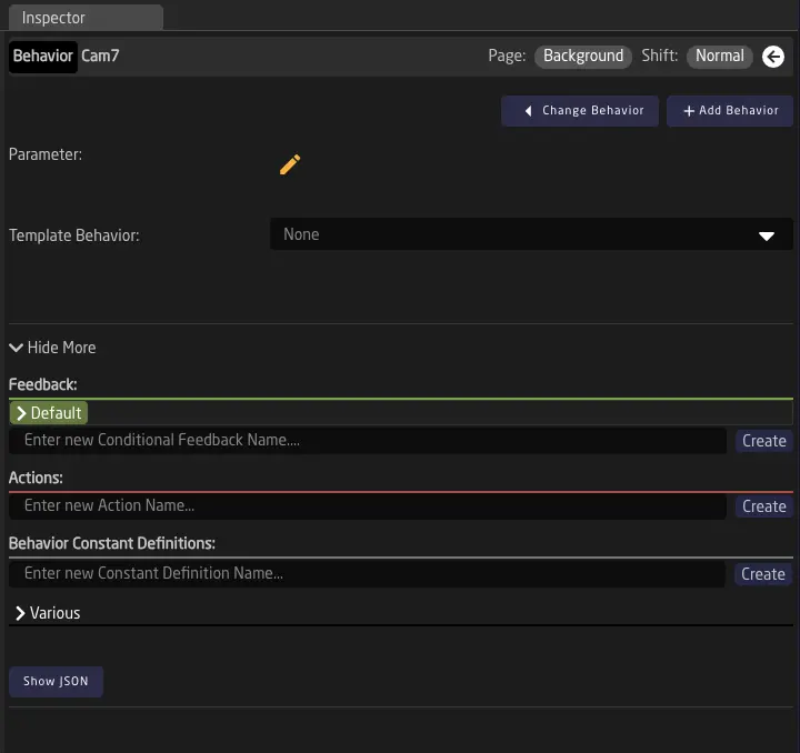
Select Presets, then your newly created Preset Kind. For the device ID, you can either choose a fixed device that this button will store and recall a preset on or select a Variable like DeviceIndex to use. Finally, choose a preset number that this button will store and
Select Store as the action. Preset ID you can choose a number freely, specify a DeviceID or leave empty to pick the Systems DeviceIndex Variable (if available in your configuration)
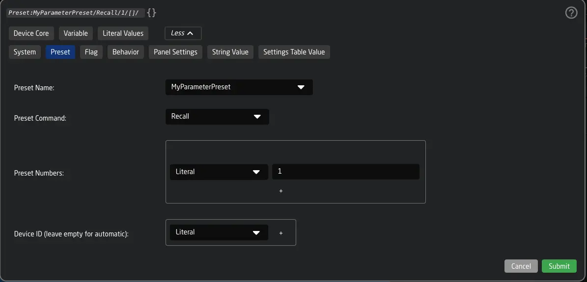
When using the Automatic Behavior Configuration Reactor will automatically select the "Long or Short Press" Template Behavior for you, makking it with a "Store" action on a Long Press (button will blink green) and a "Recall" on short press.
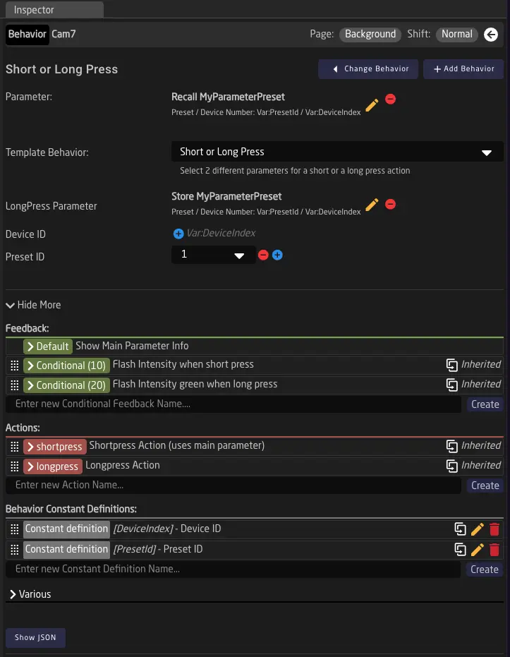
You can now use the button to store and recall a preset with your specified parameters 🎉
Advanced Topics
In this chapter, we will explore some of the more advanced topics in Reactor's configuration. Many of these concepts are used extensively in our default configurations, and learning about them will provide a deeper understanding of what is happening within our built-in configurations.
We will cover the following topics:
- Settings Tables and Generators
- Flags
- Custom Template Behaviors
- Advanced Inheritance
- Understanding Sections
- Scripting in Javascript
- History View
- The JSON Editor
Settings Tables and Generators
Settings Tables and Generators allow Reactor to provide complex dynamic configurations. This mechanism is primarily used in SKAARHOJ Default Configurations, but can allow you to build dynamic configurations yourself, that can be adapted very quickly from the home screen.
Common usecases for Settings Tables can be
- Storing configuration that can be changed directly on the Homescreen
- Generating layers with behaviors based on table rows
- Creating several Virtual Triggers based on table rows
In the following sections we will take a look into each of these usecases.
Setting Tables
Settings Tables, like all other tree elements, follow inheritance. (See Tree Chapter)
Examples of Settings Tables in default configurations include:
- Camera Selector
- Tally Forwarding
- Routing Triggers
- GPIO Mappings
- (See more here: Default Configurations)
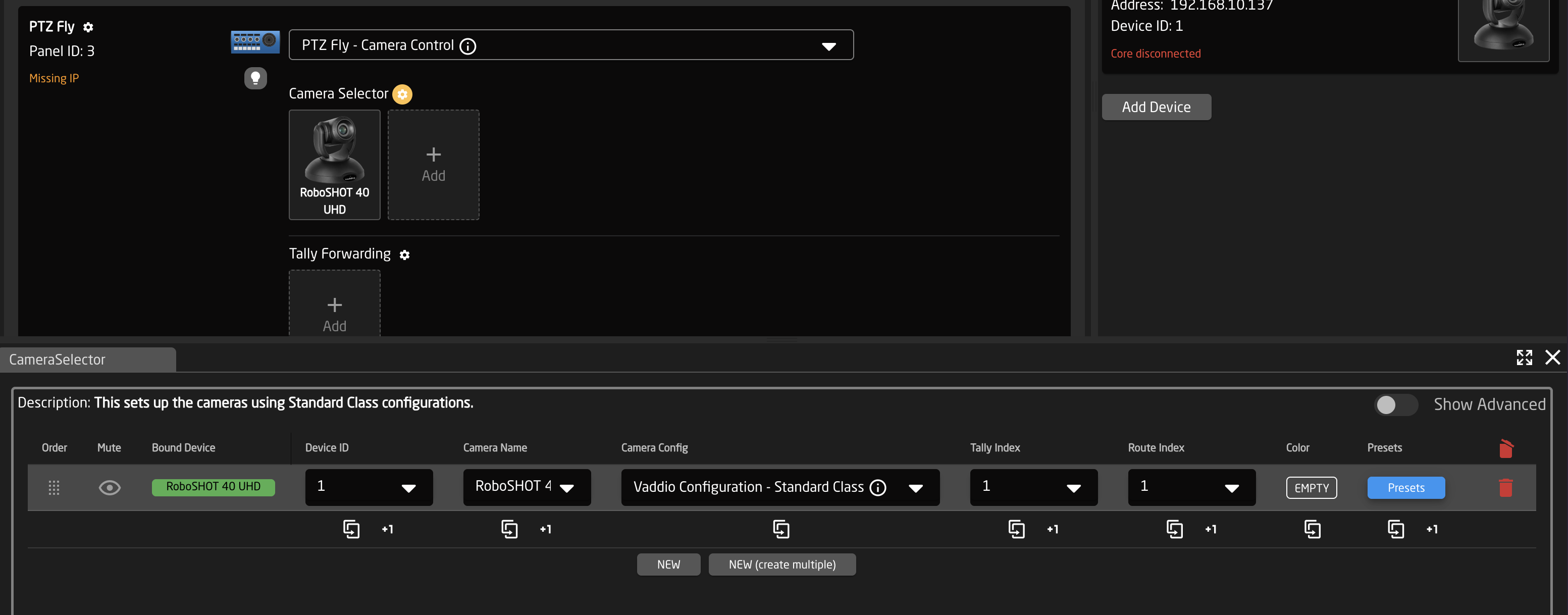
Reactor's fields are values embedded in the configuration code, used for various purposes within the configuration. Unlike variables, fields can only be modified by altering the configuration.
Settings Tables in Reactor are essentially tables of related fields (this is why they have been known as Constant Sets in earlier versions of Reactor). Each row forms a set of field values, and columns represent different fields within these sets.
They can be used for a variety of functions, such as setting switcher inputs or configuring a PTZ controller's camera selector. Simpler uses might include single-row Settings Tables for configuring specific aspects of a configuration, such as the number of cameras on a page.
Example 1: Storing configuration that can be changed directly on the Home Screen
In this example we will create a simple Settings Table, that allows us to change the first button's color from the home screen. This is just an example. Using this technique you could use any kind of setting, control layer visibilities, button behaviors, default colors or other aspects of your configuration directly from the Homescreen. This can be great to build simple configs that can be customized by less technical users.
To create a new Settings Table for a controller simply click on your controllers black or blue background (1), open Show More (2) in the inspector and add a new Settings table
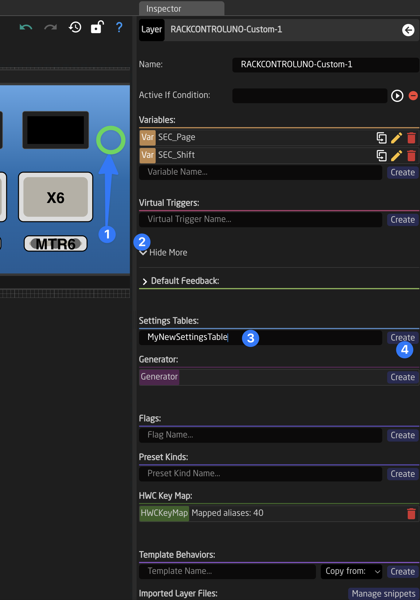
Next click on the name of your new settings table to open it in the inspector. You will see a blank table without any columns (fields). To add some columns let's add Field Definitions. You can do that easily by creating them in the top of the Settings Table inspector
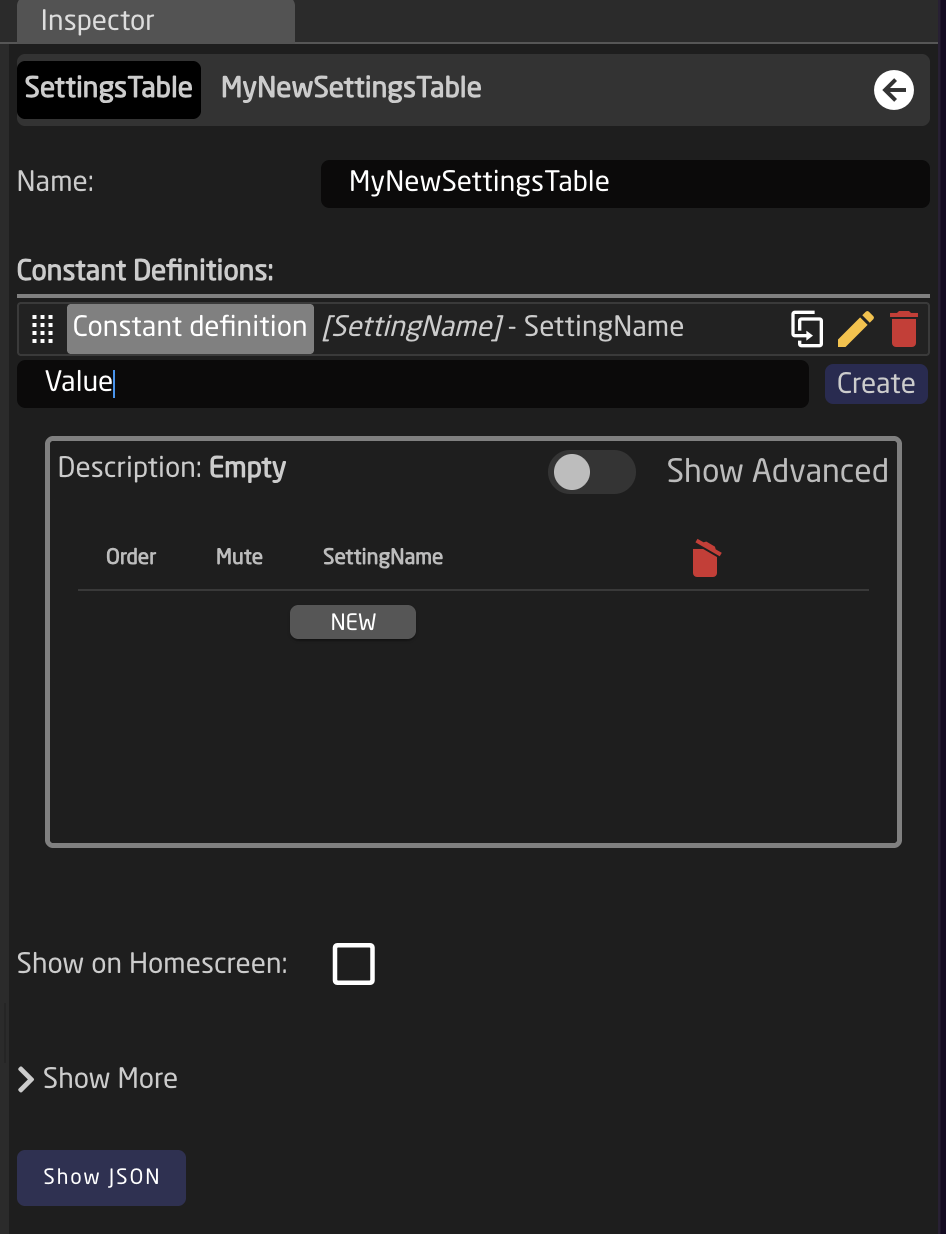
By default new Fields will have the type String, but this can be quickly changed, by clicking the field and selecting a different type from the dropdown. You can also open show more and check if the field should have a label or not. You can use the back button in the right top corner of the inspector to get back.
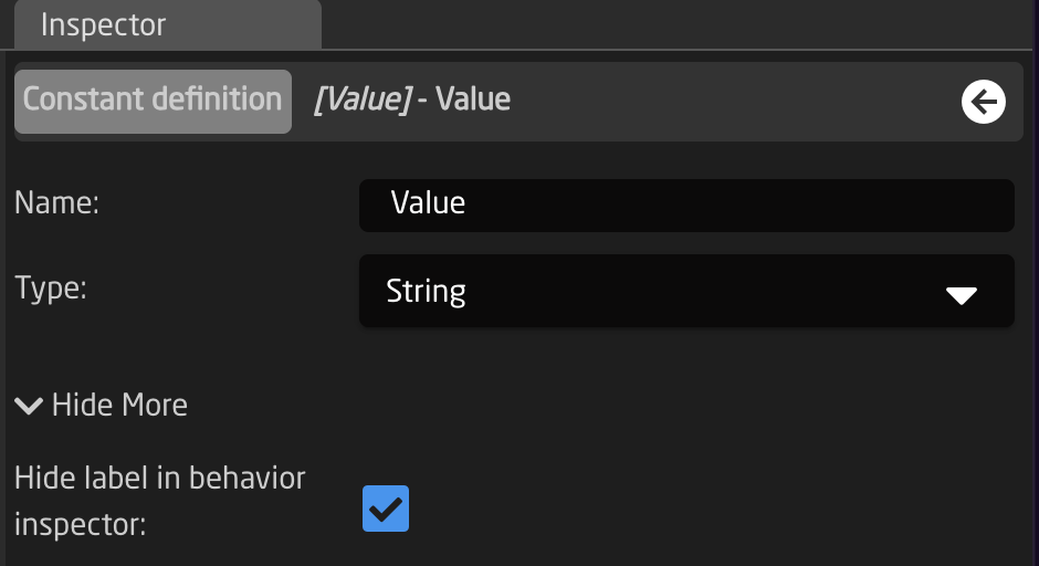
Lets create 2 Fields: a SettingName and a Value. SettingName should be a String and Value a Color. Afterwards you can add the first row into the Table.
We can now open Show More and select Show on Homescreen in the bottom. This way we can now edit the contents from the home screen. Notice that you can not edit your Settings Table from the Configuration Page directly anymore.
Explanation
Explanation
Why can't I edit it from Inspector anymore once it is shown on Homescreen ?
When 'Show on home screen' is activated the data is copied to the Link Layer. You can make this visible by open the view settings (cogwheel in the bottom right corner of the screen) and enable 'Show Include Layers'.
This is done so that different controllers using the same configuration snippet (selected on home screen) can have different values. If you like to make changes you should make sure you have your table data backuped somewhere and then uncheck 'Show on Homescreen', edit and recheck the box. Then restore your table data (needs to be done manually).
Your Settings Table should look like this:
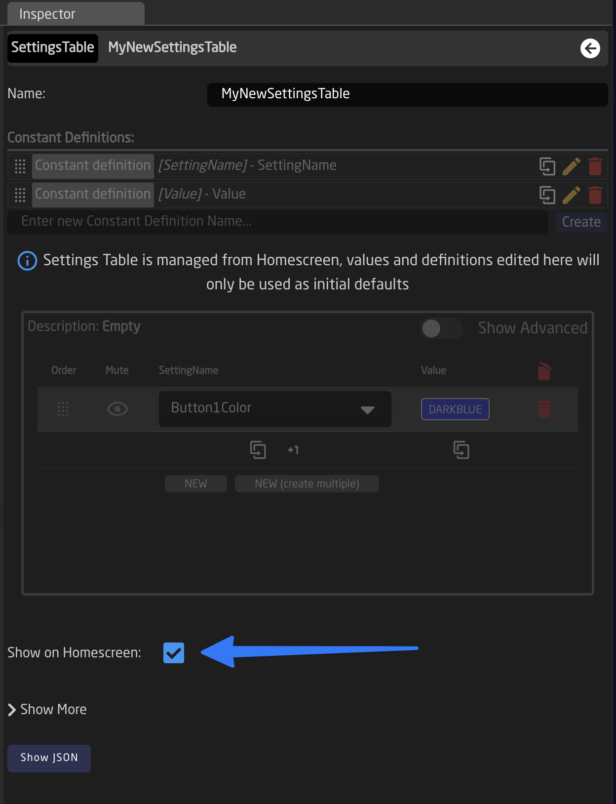
To make our newly created table actually do something we will create a empty Behavior on the first button of our controller Then we need to select Intensity: Dimmed and add a Color, open the color picker window by clicking on the 'Empty' Text.
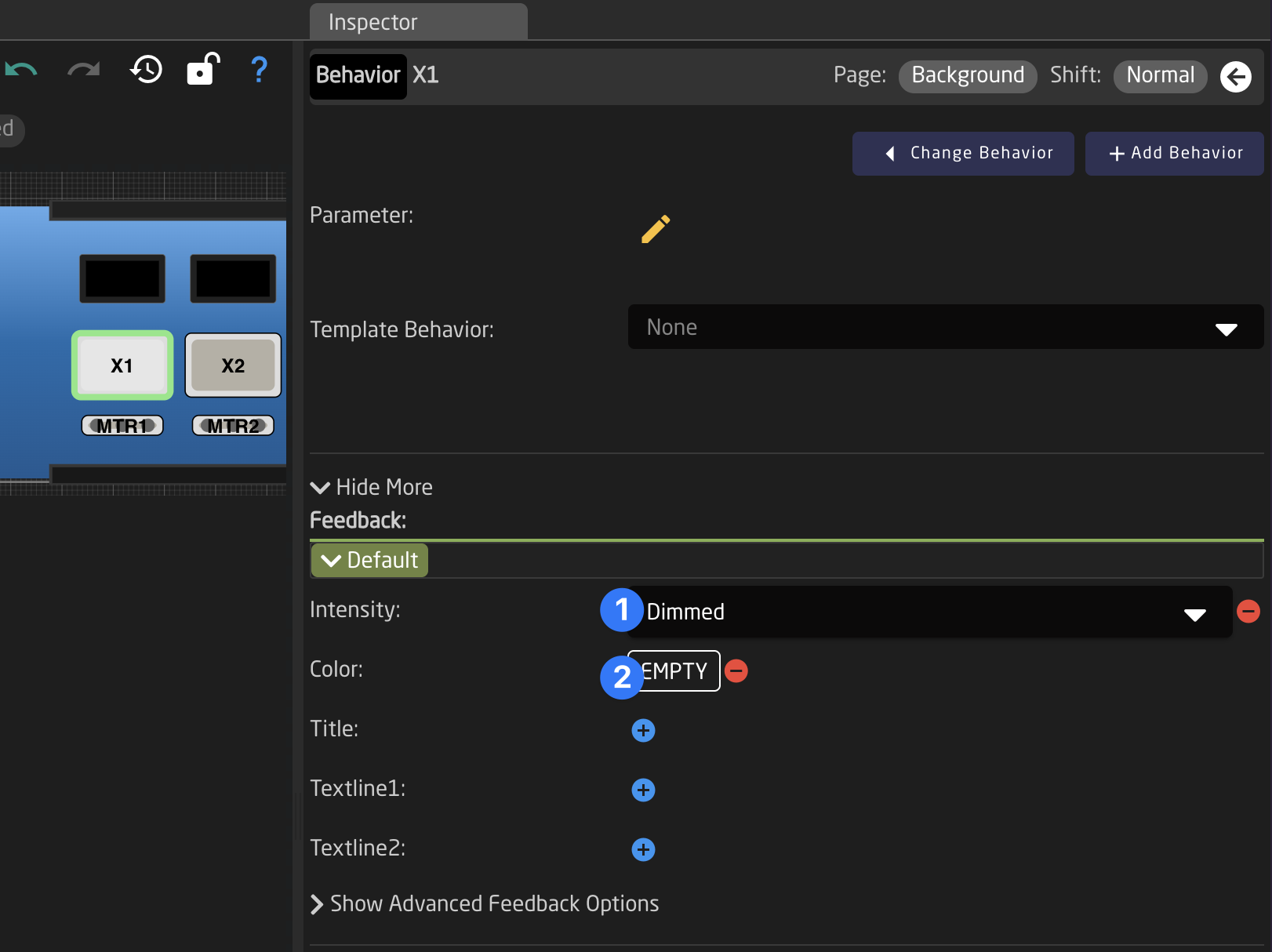
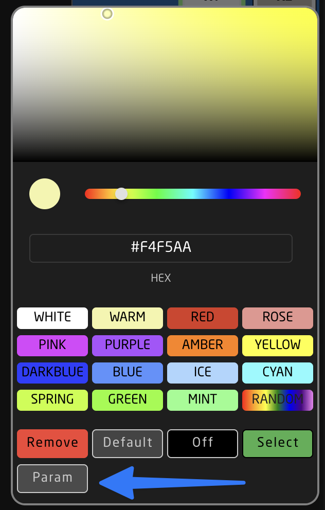
Now select 'Param' in the color picker, and a Parameter Helper Window will open. Here we can now directly select 'Settings Table' and pick our row (0 in this case) and select the Value field.
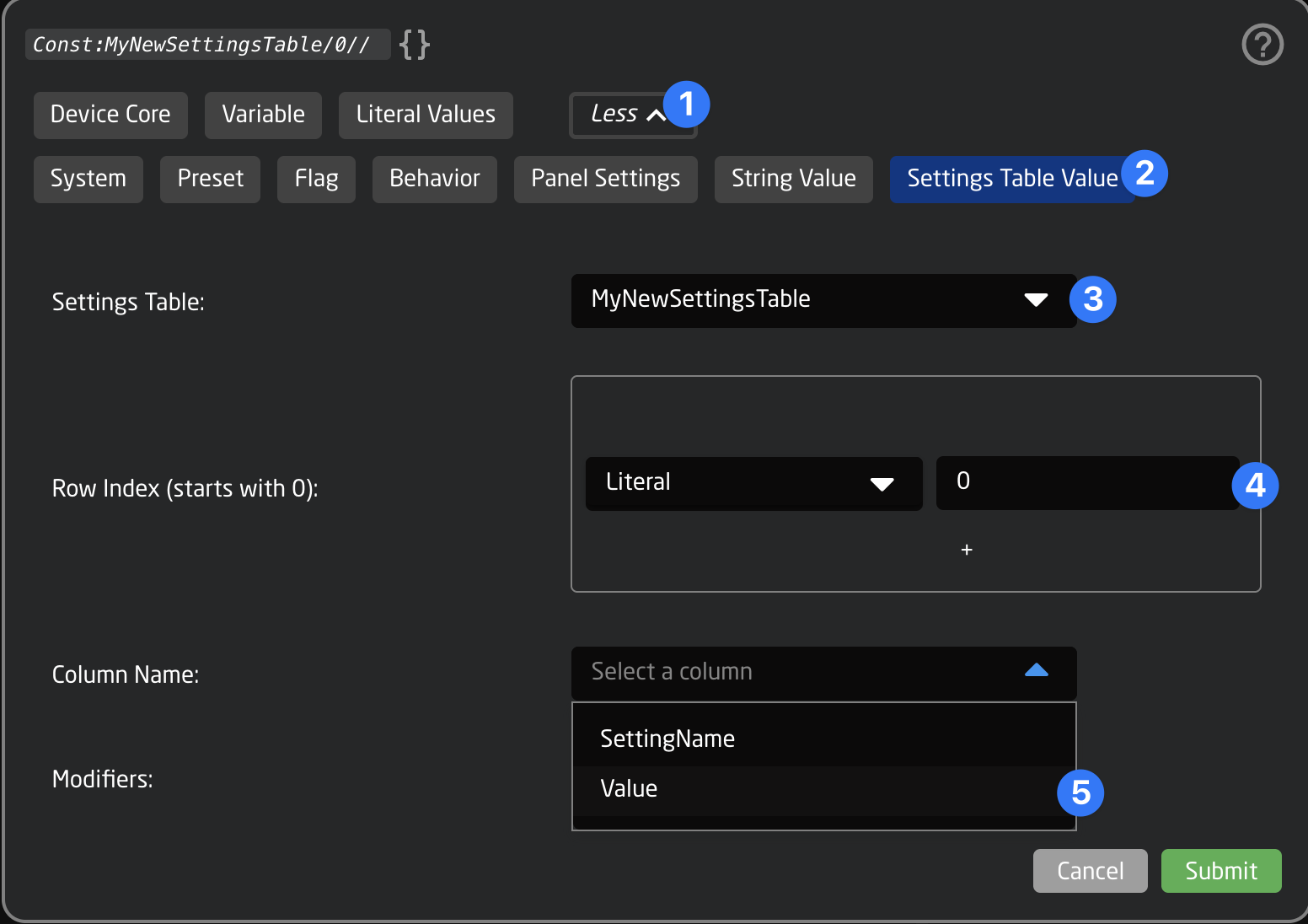
Great! 🎉
The button now shines in the color that is selected in the table from Homescreen
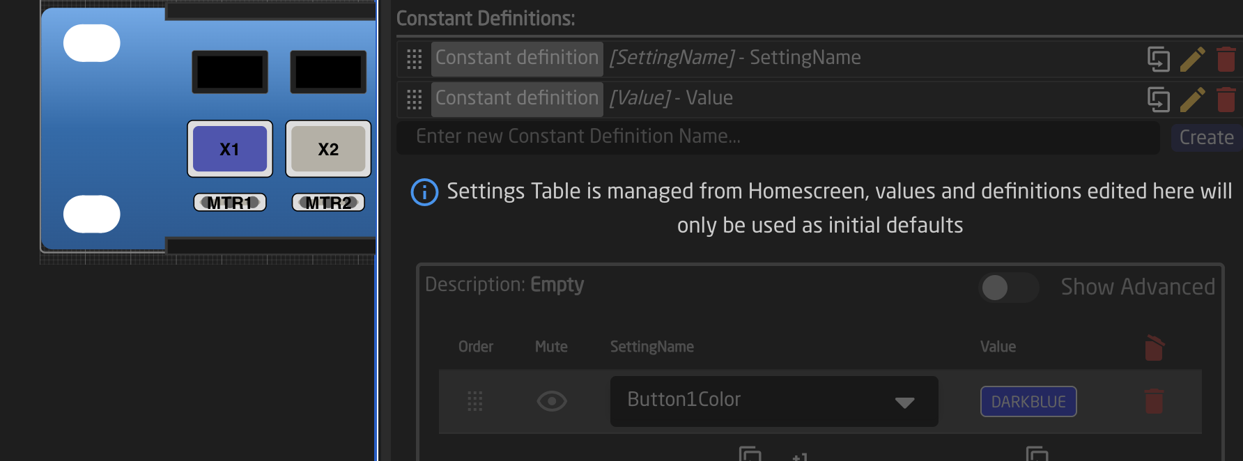
Example 2: Creating Several Virtual Triggers from a Table
Another use case is to create several, similar Virtual Triggers, one for each row in a Settings Table. This can be useful if you want to listen for a change of a parameter for several cameras, or trigger complex routings on an ATEM mixer, depending on the state of its inputs.
For our example we want to create a table of Aux Channels. We will create a Virtual Trigger that can link an AUX Channel from one ATEM Mixer to another. Users can then add or remove rows to the Settings Table and therefore link or unlink Aux Channels between the two devices. This is just an example, there are many other things that can be done here
To get started let's create a Settings Table on our Controller. It will have 2 columns: AuxAtem1 and LinkedAuxAtem2. We can add 2 entries for linking AUX1 of our first Mixer to AUX2 of our second mixer and AUX2 of the first to AUX3 of the second. (This example assumes two ATEM Mixers with more than 4 AUX Outputs)
The Settings Table should look like this:
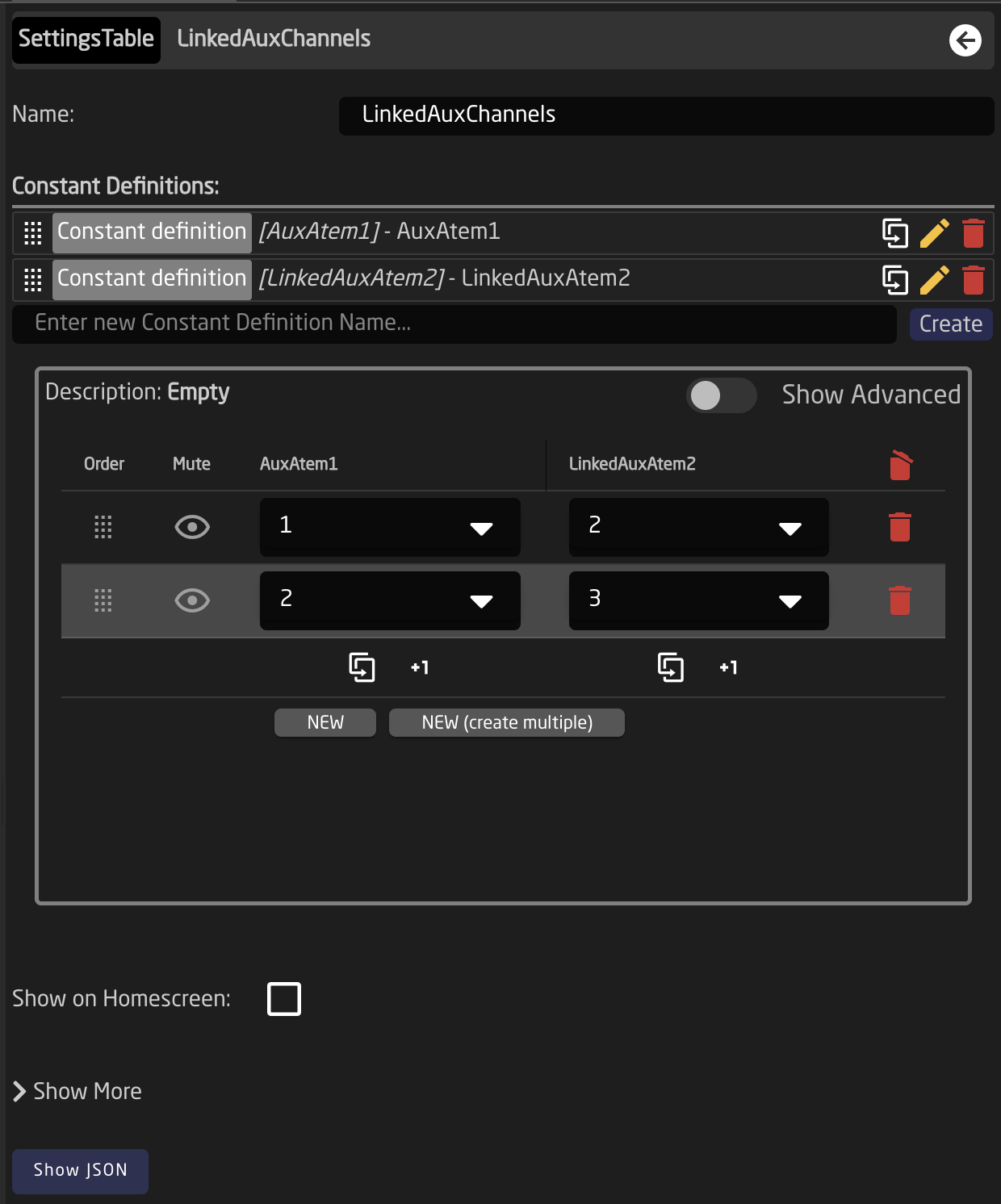
Then we click the controller again and add a new Virtual Trigger. The Type we will use should be Change. Click 'Show More' in the Virtual Trigger Inspector and scroll all the way down. Select the Settings Table from the dropdown in 'Generate multiple from Settings Table'
It is good to do this step first, as it will now ensure that the names of the table columns will show up in the Parameter Helper Window when we configure our Virtual Trigger.
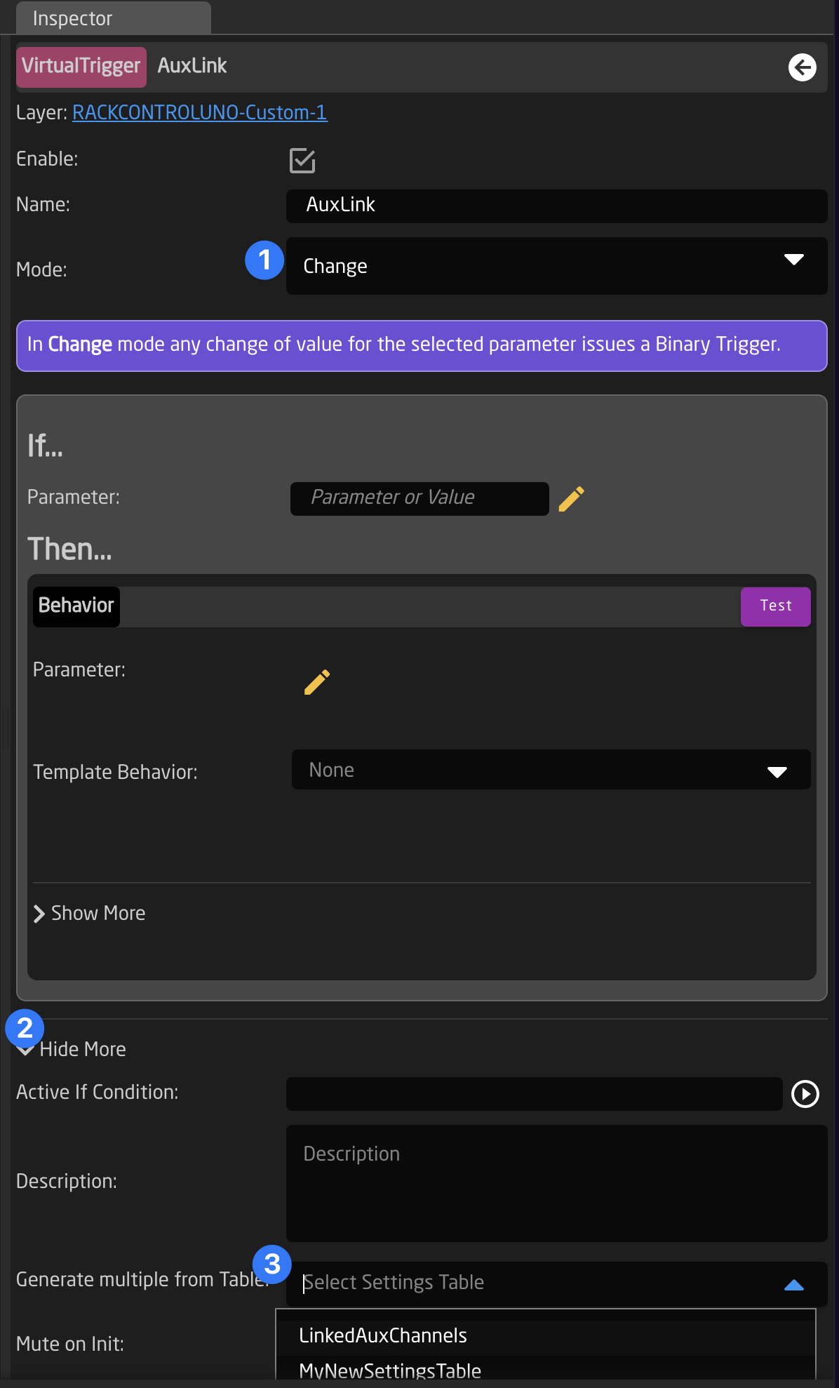
Next select the parameter to monitor. We select the ATEM 1, Parameter: AUX Source, and for Aux Channel: Field:AuxAtem1. This represents the first column from our table.
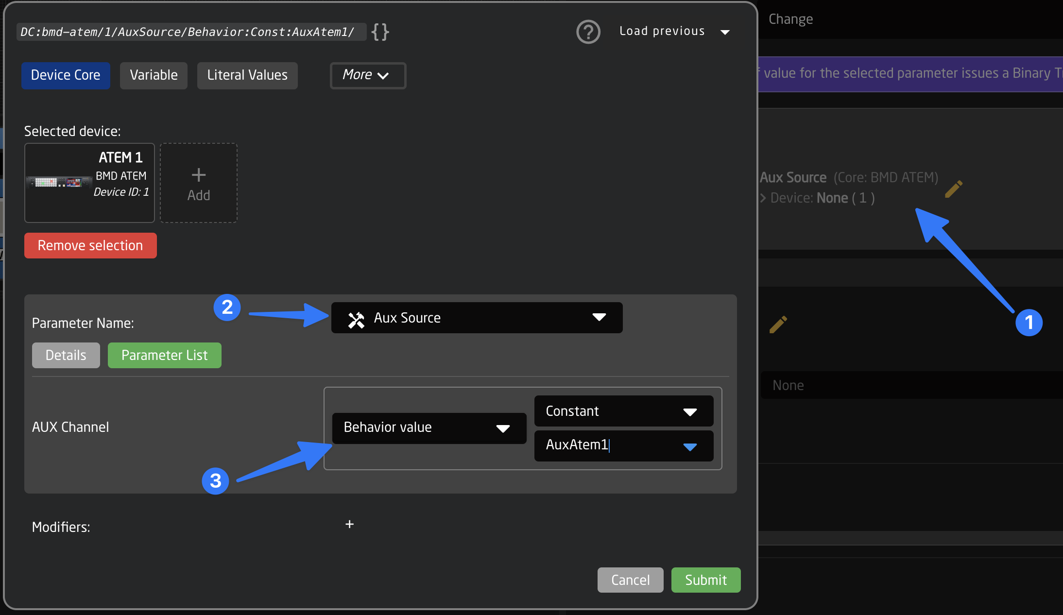
Now we select the parameter in the Behavior (the Then section of the Virtual Trigger). The parameter we want to set this time will be the ATEM 2, Parameter: AUX Source, and for Aux Channel: Field:LinkedAuxAtem2.
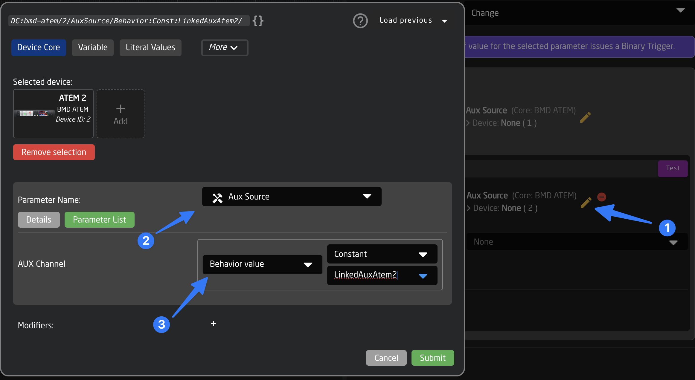
Important Note: This time the Automatic Behavior Configuration will not help us, so we select "Keep current" when asked, and select "Set specific value" in the Template Behavior Dropdown ourselves.
Finally we need to select the Value that we want to set into the second mixer's AUX channel. This will basically be the same parameter reference as we used as the trigger: ATEM 1, Parameter: AUX Source, and for Aux Channel: Field:AuxAtem1
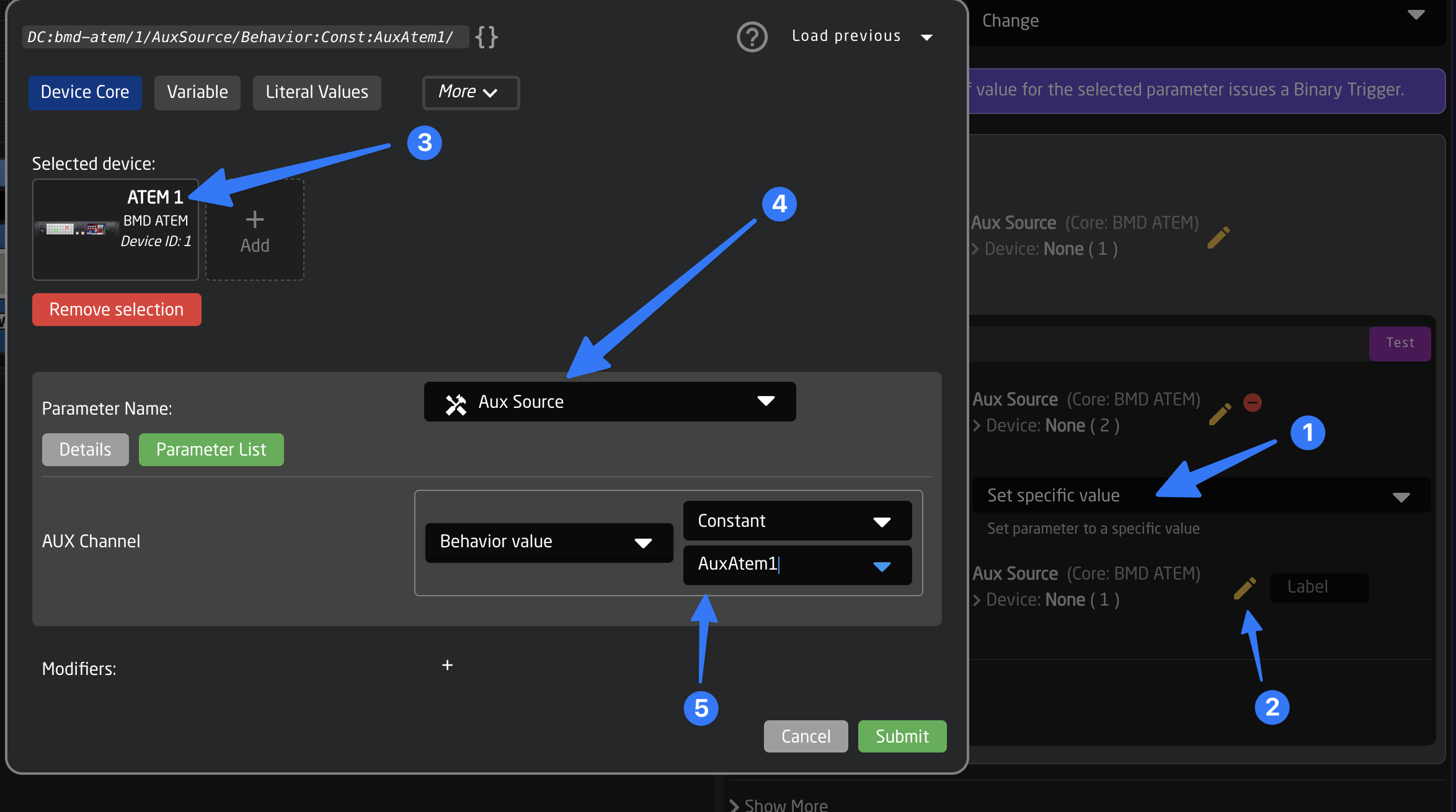
Done! 🎉
Reactor will now create a separate VirtualTrigger for each row of the table and execute when a change happens.
We can now change the first ATEMs Aux channel 1 or channel 2 and should see the change on the second mixer AUX 2 and 3
Generators
Generators are the second piece of the puzzle if you want to use Settings Tables to dynamically create parts of your configuration (Behaviors and Layers). When a Generator is created on a layer it can create behaviors and even new sub-layers. It needs to be noted that only one generator can be created per layer.
Think of a Generator like something that can generate several pages of layers and behaviors based on a template
There are several different Types of Generators with different functions.
- Behavior Generator: The most common type, used to create 'pages' layers for a larger amount of behaviors.
- Channel Pages: Mostly used in AudioConfigs, where an entire Layer gets repeated. (eg: a channel group on the Waveboard, consisting of Fader+Display+GainEncoder, hence the name of this type)
- Import Config Selector: Used to include a specified Configuration Snippet on a sub-layer, most commonly used in the Camera Selector.
For now we only have a example and sufficient UI support for the first type Behaviors. For the other types you will need the JSON Editor to specify the exact layer and behavior templates.
Example: Creating Pages of behaviors for a row of buttons
Often we need a row of buttons to perform a very similar task, for example a Preset Recall or a Video Input Selection. This means that all buttons (or other components) in this row will often use a very similar Behavior, with minor changes from button to button, like a different preset number, label or color. Sometimes we might also want to create several pages of these buttons (for example preset 1-20 mapped on a row of 5 buttons and one paging button)
We can achieve this by copying the same behavior on all of the buttons and working with the Batch editor, but that gets tedious quickly, and does not provide a lot of flexibility after the fact.
To solve this task in a more elegant way we can create a Settings Table first, that will hold all the preset numbers and labels. Then we will use a Generator to turn the rows of the table into several pages of behaviors for the buttons. Finally we will map the page variable to a button, so we can cycle through them.
Lets get started:
First click anywhere on the controller you want to use to select its main layer, then open "Show More" and create a new Settings Table. we will call it "Presets"
Now click the new Table and add some Fields (Columns). We will add a Preset Number, a Label and a Color. After creating click on the individual Field Definitions and change their types accordingly to "Integer", "String" and "Color". Optionally also enable 'Show on Homescreen after you are done with everything' After doing so your Settings Table should look like this:
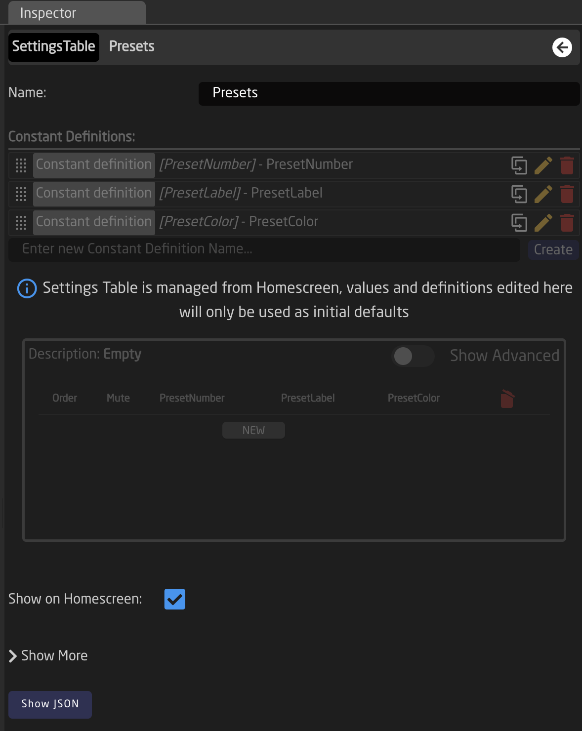
Now we switch to the Homescreen to edit the contents of our table
We can add several rows to our set. After adding a first row we can use the (then visible) "New (multi)" Button to create our 20 Presets
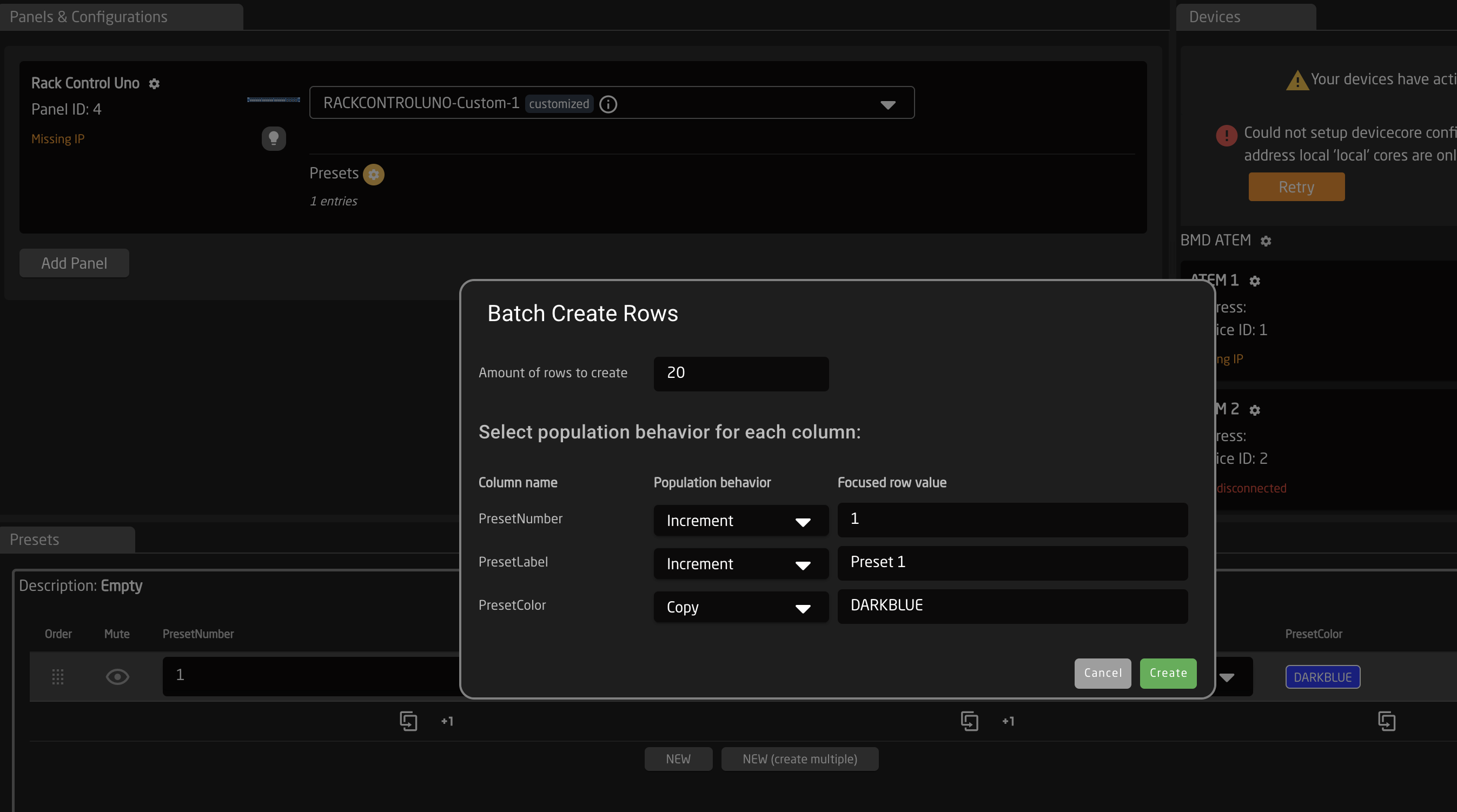
Back to the Configuration Tab, click the controller again to select it's main layer, now let's create a Generator to turn the rows of the table into Behaviors.
Keep in mind that only one generator can exist on a layer, sso if you need several generated elements on your controller you need to add these on new sub-layers
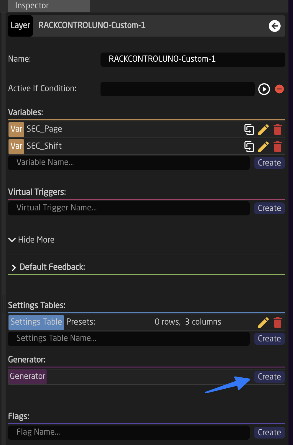
Select the Settings Table created in the beginning as the Data Source for the Generator. You can also override the default name of the page variable (this variable will be created automatically by the generator if it does not exist already). In this example we name it PresetPage.
Choosing a Component Naming Mode
Next, you need to tell the Generator which hardware components (HWCs) it should address. The Component Naming toggle lets you choose between two modes:
- Prefix/Suffix (default): Components are addressed using a naming pattern like
{Prefix}{N}{Suffix}, where N is a sequential number. Best when your components follow a uniform, sequential naming scheme (e.g., X1, X2, X3...). - Component List: You explicitly specify each HWC alias as individual entries in a list. Best when your components do not follow a sequential pattern or when you need fine-grained control over which specific components are addressed.
Prefix/Suffix Mode (default)
In this mode, the Pattern fields determine how the new behaviors map to your controller. Enter a Prefix (and optionally a Suffix). The generator will create component aliases by combining Prefix + sequential number + Suffix (e.g., prefix "X" generates X1, X2, X3...).
You can only choose HWCs with continuously named key labels. If this is not the case on your particular controller, a KeyMap is needed to correct for that. In our example our prefix will be X.
Specify the page size and optionally a page offset to adjust which components are addressed. We leave them on 4 for size and empty for offset.
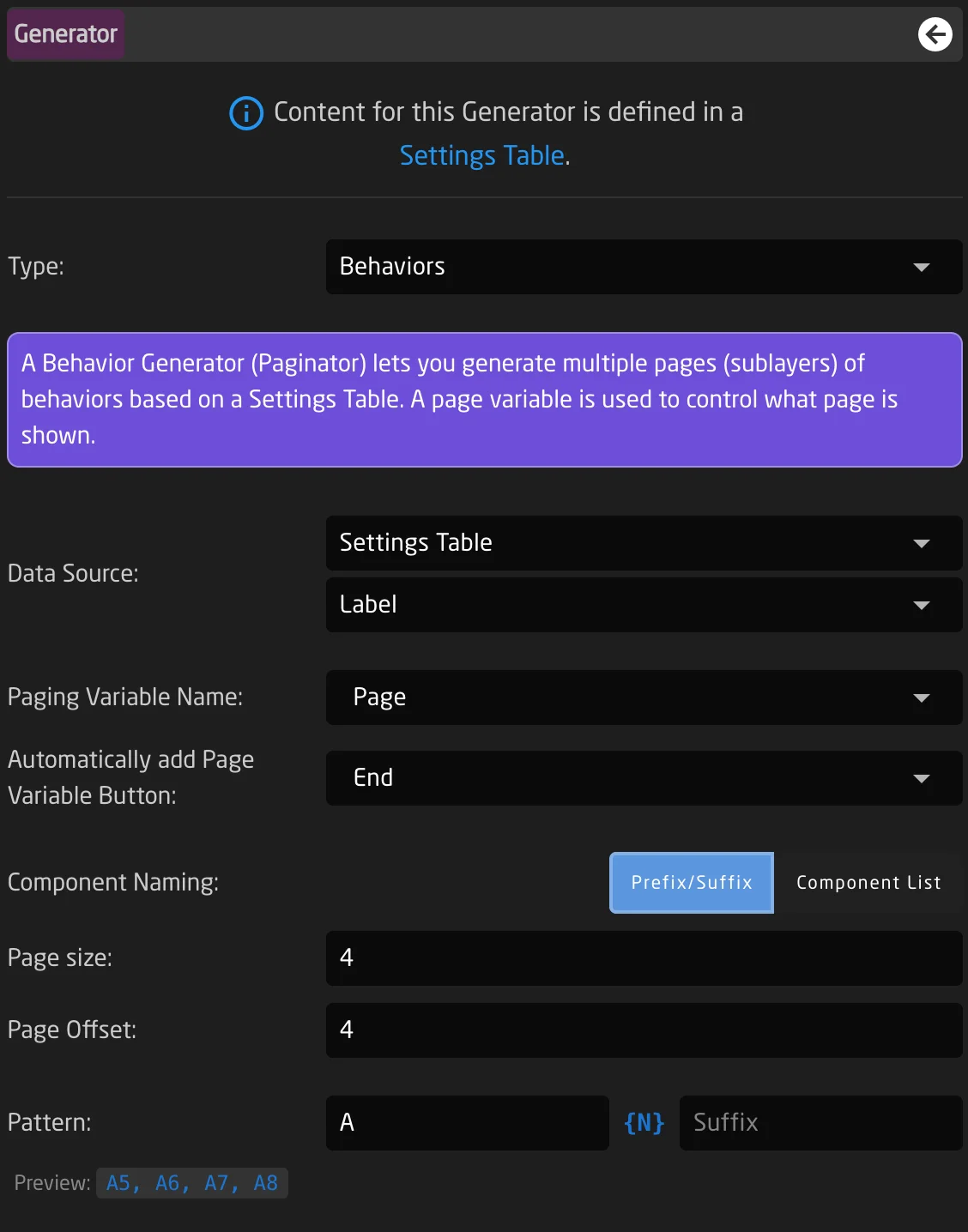
Component List Mode
If your components don't follow a sequential naming pattern — for example, you need to address components named "Enc1", "Fader2", and "Btn5" on the same generator — switch to Component List mode. In this mode, you specify each HWC alias individually rather than relying on a prefix and number pattern. Page Size and Page Offset settings are not used in this mode; the list itself defines which components are addressed and in what order.
The Component List provides several tools for building your list:
- Add button: Creates a new empty entry in the list. Type the HWC alias name into the text field.
- +1 button (increment): Takes the currently focused entry and appends a new entry with its number incremented by one. For example, if the focused entry is "Enc1", clicking +1 adds "Enc2".
- Eyedropper/Picker button: Activates picking mode. While active, clicking any component on the panel graphic adds its alias to the list. Duplicates are automatically skipped. Click Done when you are finished picking.
- Drag to Reorder: Each entry has a drag handle on the left. Click and drag to reorder entries. The order determines which component gets which row from the Settings Table.
- Delete icon: Each entry has a red delete icon on the right. Click it to remove that entry from the list.

Component List mode is especially useful when building generators for controllers with mixed component types — for example, a row of encoders and faders that don't share a common prefix, or when you want to skip certain components in a sequence.
Configuring the Template Behavior
Now we need to configure what content is put on our buttons. To do that we select the template behavior, for our example we will select a PTZ Preset Recall function from the Canon Core. For the Preset Number we can select Field:PresetNumber.
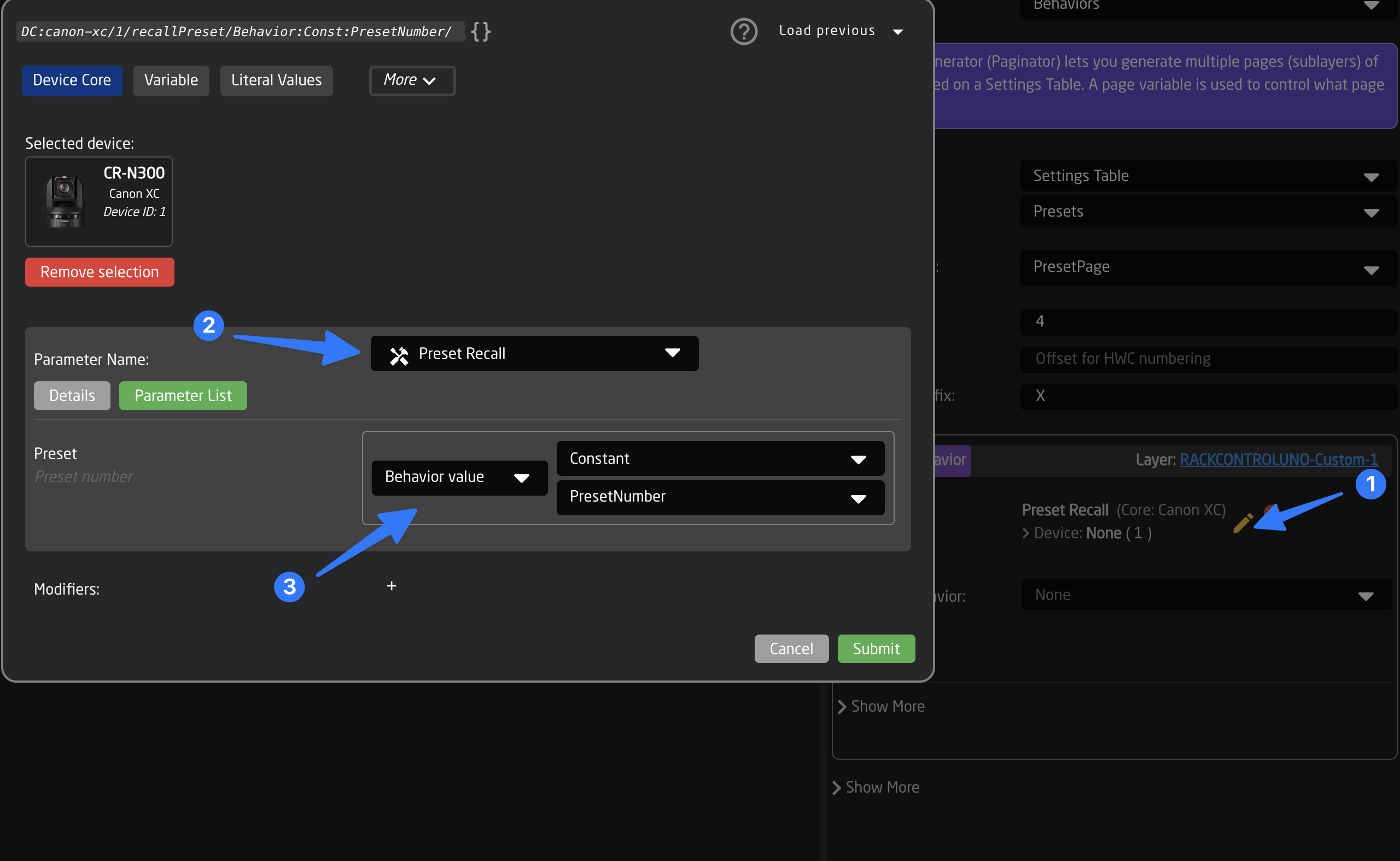
For the label and Color we need to add these to the feedback. Use the same method of selecting the Field Value to access the field from the original Settings Table in the Behavior.
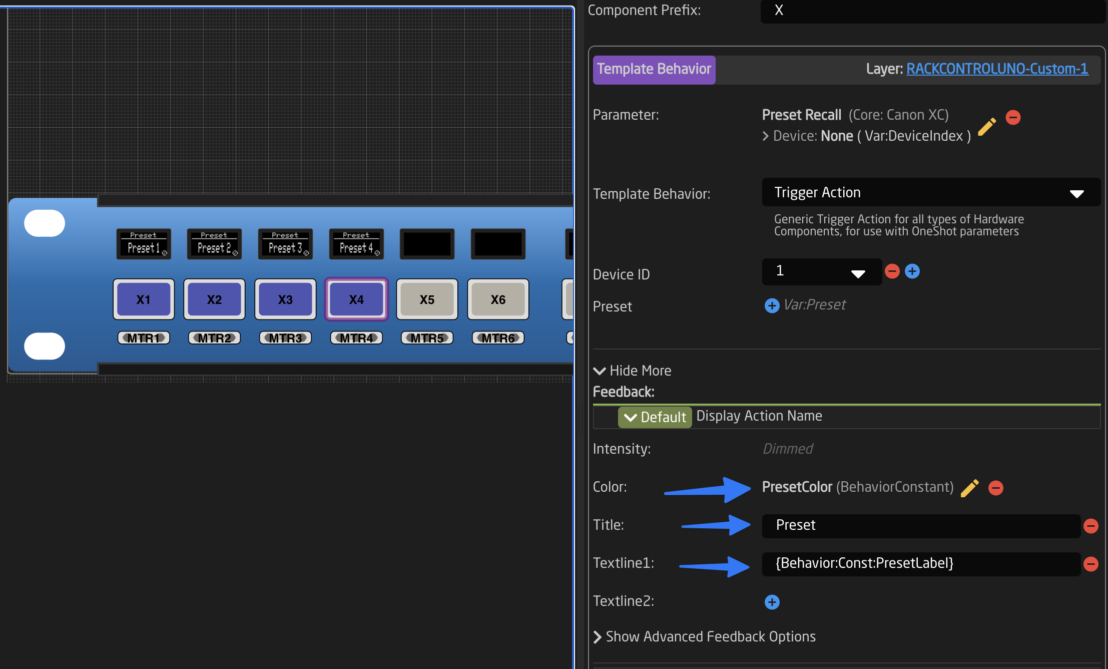
Configuring the Page Button
As a final step we need to map the generated page Variable to a button, to be able to change the current page. Todo that click the next button and select the Page Variable as the parameter on a fresh behavior.
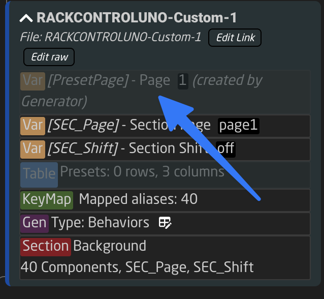
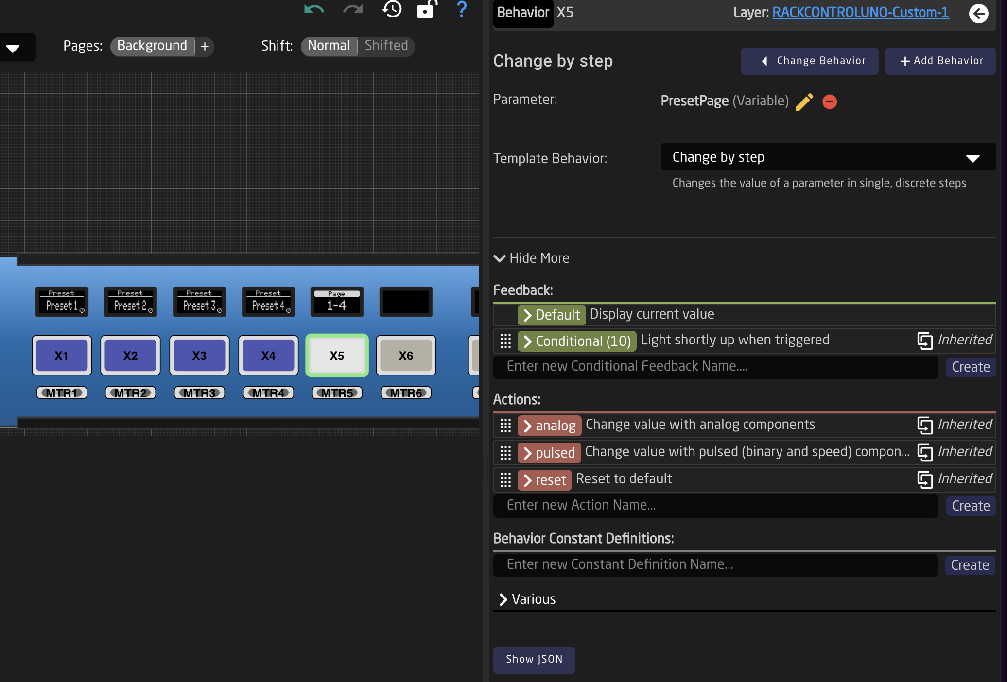
Done! 🎉
Reactor will now create as many sub-layers as needed, with one behavior for each row of the table. The table content can then be changed and the pages will be automatically updated. In the tree you can now see all elements that are managed by the generator in purple:
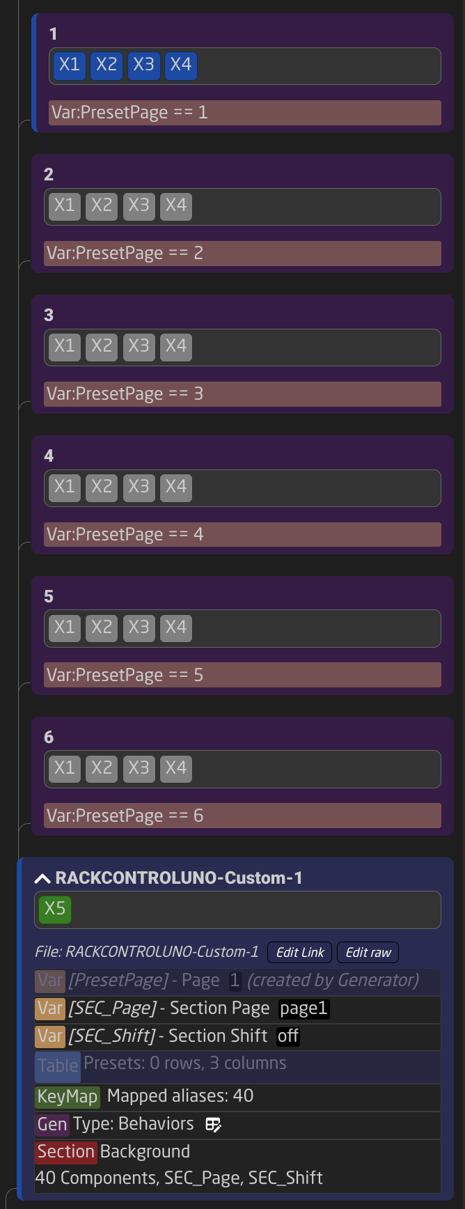
Summary
Settings Tables and Generators can be a bit intimidating at first, but when used properly they can be a super powerful tool to take your configurations to the next level. Feel free to explore the use of generators in our default configurations, as there are many tricks to find there.
Custom Template Behaviors
To simplify repetitive configuration tasks, you can create your own Template Behaviors. These are sometimes referred to as Master Behaviors in Reactor (similar to a MasterSlide in PowerPoint or Keynote).
For example, suppose you want to create a custom behavior for an Encoder that performs a preset recall with a left turn and a preset store with a right turn. Additionally, you want the encoder to have a green ring light.
Once configured, you can reuse this encoder across multiple places in your configuration, controlling different preset IDs. This is a perfect use case for creating a Template Behavior.
Creating and Configuring Template Behaviors
Template Behaviors are a Tree Element and can be defined on a layer, following the usual scheme for Inheritance, as explained in the Tree Chapter.
To keep things simple, we recommend creating Template Behaviors on the global Root Layer of your configuration or the configuration layer related to your panel. In this example, we will use the second option. Start by clicking anywhere on the blue or black area of your controller. You should now see the root layer of this panel.
Next, add a Template Behavior. Type a name (2) and press Create (3).
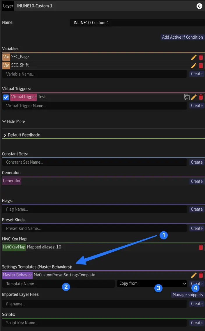
Click on the newly created entry (1) to open its form. Inside the form, you can use the eyedropper icon next to the name to copy the behavior of an existing hardware component into it.
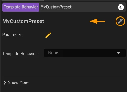
Afterward, you can configure your Template Behavior just like any other Behavior. 1
Using Field Definitions to Add Fields to the Template Behavior
When creating Template Behaviors, it's often useful to make certain parts of the nested configuration available at the top of the Behavior form. This is best done using Fields.
You can define Fields by adding Field Definitions to your Template Behavior. Type a name for the new Field (1) and press Create (2).
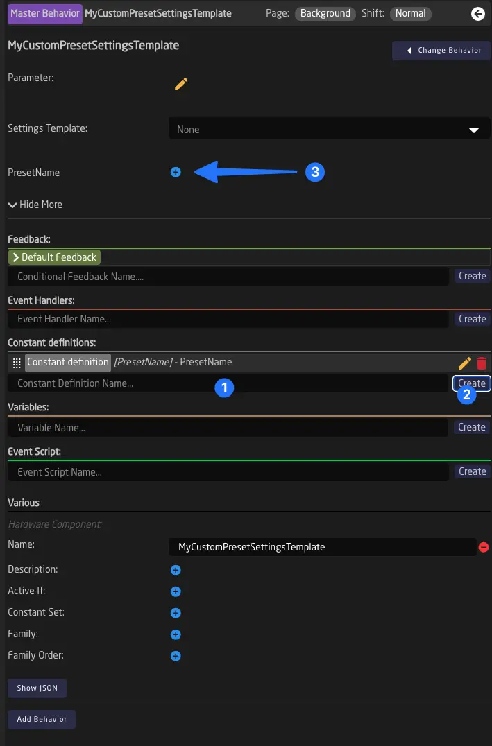
Once added, the new fields will be available at the top of the form (3).
Click on the definition to edit the properties of the new field. You can choose its type, add an extra label, and limit how many values it can hold.
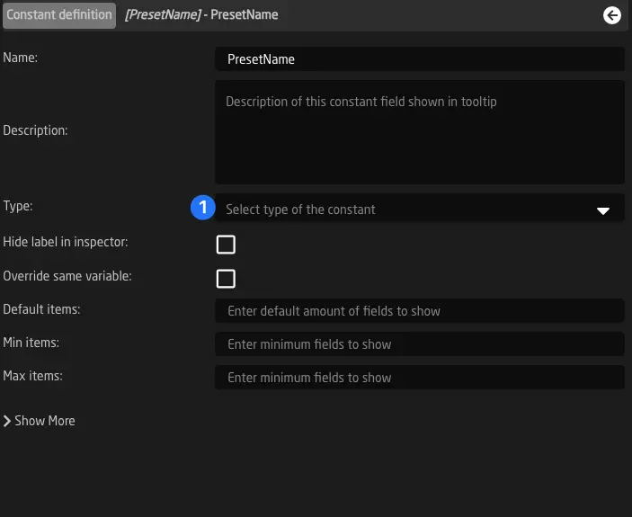
Using a Custom Template Behavior
Once you have created your Template Behavior, you can use it in the Template Behavior field of any Behavior that inherits it.
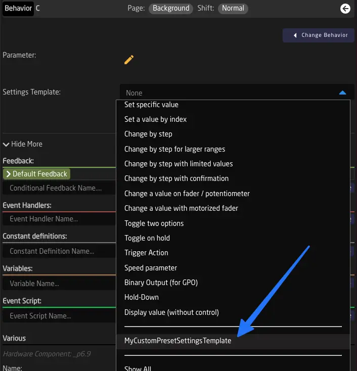
-
Keep in mind that some features of the form might not be available, such as checking conditions and correctly filtered parameter lists (in the parameter selection helper window). ↩
Flag Groups
In Reactor, a flag group is a structure used to store tally and routing information. It is a matrix of values, each with a color and a label.
The available colors are:
- Red
- Green
- Blue
- Yellow
Flag Groups are used in all default configurations for Tally Forwarding and Routing Triggers.
Creating and Configuring Flag Groups
Flag Groups are a Tree Element and can be defined on a layer, following the usual scheme for Inheritance, as explained in the Tree Chapter.
To keep things simple, we recommend creating Template Behaviors on the global Root Layer of your configuration or on the configuration layer related to your panel. In this example, we will use the second option. Start by clicking anywhere on the blue or black area of your controller. You should now see the root layer of this panel. Next, go ahead and add a Flag Group.
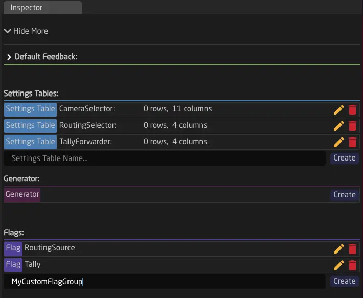
Once you have created a flag group, you can use it right away.
Flag Groups are Global
One of the most important settings of a flag group is its Flag Group link. Use this number to synchronize multiple Flag Groups, that may have been created in different places. By entering the same number in different Flag Groups, they automatically share their state, no matter where they are defined in Reactor. You can use this to make two controllers share the same tally information or to separate tally for controllers by using a different number.
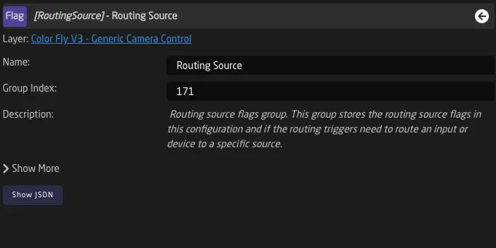
Controlling Flags from a Behavior
Flags can easily be set from a Behavior or used in a Condition. To do this, simply select Flag in the Parameter Helper Window.
Once you have selected a Flag, you can use Hold Down, Change By Step, or Set Specific Value Template Behaviors to control it. For GPO contacts, we usually use the Output Template Behavior.
Flags behave like any other Boolean Parameter. They have a value called 'true' and one called 'false'.
See more here: Parameter Reference.
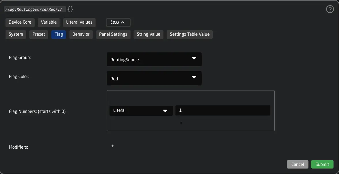
Monitoring and Debugging Flag Groups
If you open "Show More," you can see the first 150 flags as switches. This allows you to monitor their state and also control them manually while working on your configuration.
(Note: The number of flags is technically unlimited, but only the first 150 are shown in the inspector for performance reasons.)
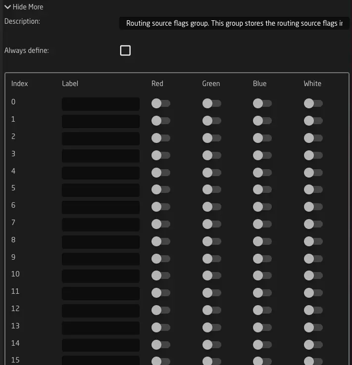
Advanced Inheritance
In the Tree and Layers chapter, we learned how inheritance works in Reactor - child layers inherit variables and other tree elements from their parent layers. This is the foundation of how configurations are organized and reused.
However, when you start composing configurations from multiple layer files, you need more control over how variables flow between these separate configuration pieces. This is where Advanced Inheritance features come in. These are optional features that give you fine-grained control over variable scope and definition when building modular, reusable configurations.
These features are primarily used in SKAARHOJ Default Configurations, where we often need to compose configs from multiple files. Most simple configurations don't need them! Make sure you have a solid understanding of basic inheritance before diving into these advanced topics.
In this chapter, we'll explore three powerful features that modify how variables behave in the layer tree:
- ExpandScope - Makes variables "bubble up" to parent layers
- Capture - Intercepts bubbling variables from child layers
- AlwaysDefine - Forces a variable definition to override previous definitions
Understanding Normal Inheritance
Before we look at these advanced features, let's quickly review normal inheritance behavior:
graph BT
    A[Main Controller Layer<br/>DeviceIndex = 1] --> B[Panel 2 Config Layer<br/>can use DeviceIndex]
    A --> C[Panel 1 Config Layer<br/>can use DeviceIndex]
    B --> D[Panel 2 Menu Layer<br/>can use DeviceIndex]

    style A fill:#5B9BD5,stroke:#2E5C8A,color:#fff
    style B fill:#F39C12,stroke:#C87F0A,color:#fff
    style C fill:#F39C12,stroke:#C87F0A,color:#fff
    style D fill:#B0BEC5,stroke:#78909C,color:#fff
- Variables defined in a parent layer are inherited by child layers
- Children can see and use their parents' variables
- The flow is from root to leaves in the tree
- If a child defines a variable with the same name, it doesn't redefine it unless explicitly told to do so (with AlwaysDefine)
The advanced inheritance features modify this behavior in specific ways.
ExpandScope - Sending Variables upward through the tree
ExpandScope reverses the normal inheritance direction. When you set ExpandScope: true on a variable, that variable travels outward through the layer tree instead of being confined to its layer and child layers.
How ExpandScope Works
When a variable has ExpandScope: true:
- The variable tries to travel toward the root of the tree
- It travels through parent layers, making itself available to them
- It stops in one of two situations:
- It reaches the root layer (the top of the tree)
- It encounters a variable with the same name that has
Capture: true
graph BT
    A["Root Layer<br/>(PageVariable available here!)"] --> B[Main Config Layer]
    B --> C[Included Layer]
    C --> D[Sub-Config Layer<br/>Defines: PageVariable<br/>ExpandScope: true<br/> Variables traverses OUTWARD]

    style A fill:#66BB6A,stroke:#43A047,color:#fff
    style B fill:#5B9BD5,stroke:#2E5C8A,color:#fff
    style C fill:#B0BEC5,stroke:#78909C,color:#fff
    style D fill:#F39C12,stroke:#C87F0A,color:#fff
When to Use It
ExpandScope is essential when you're including a configuration file that needs to expose internal variables to the parent configuration. Common scenarios include:
- Device configuration files that need to expose their internal page variables to the main controller
- Sub-configurations that manage their own state but need that state accessible to the parent
- Reusable configuration snippets that define variables which should be controllable from the including layer
Example: Device Configuration with Internal Paging
Imagine you have a reusable PTZ camera configuration saved as a separate layer file. This config has internal paging (preset pages 1-5), and you want to control that paging from your main controller.
PTZ Camera Config (included file):
{
  "Name": "PTZ Camera Config",
  "Variables": {
    "PresetPage": {
      "Name": "Preset Page",
      "Default": ["0"],
      "MinMaxCenterValue": [0, 4], // this is interesting
      "ExpandScope": true
    }
  },
  "HWCBehaviors": {
    "ENC1": {
      "Description": "preset behaviors using PresetPage"
    }
  }
}
Main Controller (includes PTZ config):
{
  "Name": "Main Controller",
  "ImportLayerFiles": [
    "PTZCameraConfig"
  ]
}
With ExpandScope: true, the PresetPage variable bubbles up from the PTZ config to your main controller layer, where you can then map it to a physical button or encoder.
Why is this needed ?
If you don't use ExpandScope, the PresetPage variable stays confined to the PTZ config layer and its children. Your main controller can't access it, making it impossible to create a paging button outside the PTZ config itself.
This would force you to define the page variable in the main controller layer and pass it down (which defeats the purpose of reusable configs) It also means the variable's options or range must be defined in the main controller rather than where they logically belong, making it impossible to have different supconfigs with different menu pages for example.
ExpandScope solves this by letting the included config "publish" variables upward, keeping the variable's options or range defined on the inner layer where they are most relevant.
Capture - Receiving "Expanded" Variables
Capture works hand-in-hand with ExpandScope. When you set Capture: true on a variable definition, it acts as a "receiver" or "blocker" for any ExpandScope variable with the same name coming from child layers.
How Capture Works
When a variable has Capture: true:
- It "listens" for ExpandScope variables with the same name from deeper in the tree
- When it finds one, it intercepts it and stops the upward propagation
- The variable is now "owned" by this layer, not the child layer where it originated
graph BT
    A[Root Layer<br/>DevicePage doesn't reach here] --> B[Main Controller Layer<br/>DevicePage: Capture = true<br/>✋ Intercepts all three!]
    B --> D[Camera Config A<br/>DevicePage: ExpandScope<br/>↓ Tries to traverse outward]
    B --> E[Camera Config B<br/>DevicePage: ExpandScope<br/>↓ Tries to traverse outward]
    B --> F[Camera Config C<br/>DevicePage: ExpandScope<br/>↓ Tries to traverse outward]

    style A fill:#B0BEC5,stroke:#78909C,color:#fff
    style B fill:#66BB6A,stroke:#43A047,color:#fff
    style D fill:#F39C12,stroke:#C87F0A,color:#fff
    style E fill:#F39C12,stroke:#C87F0A,color:#fff
    style F fill:#F39C12,stroke:#C87F0A,color:#fff
When to Use Capture
Capture is essential when you're including multiple configuration files that all define the same ExpandScope variable, and you want to coordinate them from a single location. Common scenarios include:
- Device selector configurations that include multiple device types, each with their own paging
- Multi-device setups where several devices share a common control variable
- Modular configurations where you want to centralize control of variables from multiple sub-configs
In our example the variable defined first would win and provide the definition. (So in this case Camera Config A)
Example: Multi-Device Controller
Imagine you're building a controller that can control multiple different devices (ATEM switcher, Canon camera, audio mixer). Each device configuration is a separate file with its own DevicePage variable that uses ExpandScope. You want a single paging control that works across all devices.
Main Controller:
{
  "Name": "Multi-Device Controller",
  "Variables": {
    "DevicePage": {
      "Name": "Device Page",
      "Default": ["0"],
      "MinMaxCenterValue": [0, 5],
      "Capture": true
    },
    "ActiveDevice": {
      "Name": "Selected Device",
      "Default": ["0"],
      "MinMaxCenterValue": [0, 2]
    }
  },
  "ImportLayerFiles": [
    "ATEMConfig",
    "CanonPTZConfig",
    "AudioMixerConfig"
  ]
}
Each Device Config (ATEM, Canon, Audio):
{
  "Variables": {
    "DevicePage": {
      "ExpandScope": true
    }
  }
}
With Capture: true in the main controller, all three device configs' DevicePage variables are intercepted at the main layer. Now you have a single place to map paging controls, and all three device configs respond to the same page variable.
AlwaysDefine - Forcing Variable Redefinition
AlwaysDefine is a different kind of control - it's about precedence rather than scope direction.
How It Works
Normally, when Reactor encounters a variable definition in a child layer that has the same name as a variable already defined in a parent layer, it will not redefine the variable. The parent's definition takes precedence.
graph BT
    A[Main Config<br/>DeviceID = 1] --> B[Device Config<br/>tries to define DeviceID = 2<br/>❌ Ignored - parent wins]
    A --> C[Device Config<br/>tries to define DeviceID = 3<br/>❌ Ignored - parent wins]

    style A fill:#5B9BD5,stroke:#2E5C8A,color:#fff
    style B fill:#EF5350,stroke:#C62828,color:#fff
    style C fill:#EF5350,stroke:#C62828,color:#fff
With AlwaysDefine: true, this behavior is reversed:
- The variable definition always takes effect at that layer
- It overrides any previous definition from parent layers
- From this layer downward, the new definition is used
graph BT
    A[Main Config<br/>DeviceID = 1] --> B[Device Config<br/>DeviceID = 2<br/>AlwaysDefine: true<br/>✅ Takes effect!]
    A --> C[Device Config<br/>DeviceID = 3<br/>AlwaysDefine: true<br/>✅ Takes effect!]

    style A fill:#5B9BD5,stroke:#2E5C8A,color:#fff
    style B fill:#66BB6A,stroke:#43A047,color:#fff
    style C fill:#66BB6A,stroke:#43A047,color:#fff
Important: ExpandScope takes precedence over AlwaysDefine. If both are set, ExpandScope behavior wins.
When to Use AlwaysDefine
AlwaysDefine is essential when you're including the same configuration file multiple times, and each instance needs its own unique variable values. Common scenarios include:
- Repeated configuration patterns where each repetition needs unique identifiers
- Generated or duplicated layers that need independent state
Debugging Tips
If inheritance isn't working as expected:
- Check the Tree View - In the configuration view, expand your layer tree and look at the variable definitions. Variables with special properties will show indicators
- Use the Variable Inspector - Click on a layer and open "Show More" to see all variables and their flags
- Verify Layer Paths - ExpandScope and Capture work based on the layer tree structure. Make sure your ImportLayerFiles statements create the hierarchy you expect
- Check Variable Names - Capture only works if the variable keys match exactly (case-sensitive), Names might differ, Keys matter
Related Topics
To deepen your understanding of these advanced features, explore these related chapters:
- The Tree and its Layers - Foundation of inheritance
- Variables and Conditions - How variables work in Reactor
- Settings Tables and Generators - Generators also use these features extensively
- SKAARHOJ Default Configurations - Real-world examples of config composition
HWC Key Mapping
Reactor's default configurations work across different panel types through HWC Key Mapping (HardWare Component Key Mapping) - a system that separates configuration logic from physical button assignments. For example: When you select a configuration from the homescreen dropdown, the system automatically maps this config to the correct panel ID.
HWC Key Mapping creates an indirection layer between behavior definitions and physical panel buttons. This enables configuration reusability across Reactor's ecosystem.
When you create a custom configuration through the UI, Reactor automatically generates a KeyMap with default entries. Understanding KeyMaps helps debugging configurations and build reusable configurations.
In this chapter, we'll examine how HWC Key Mapping works, why it's essential for configuration composition, and when you need to work with KeyMaps directly.
How Reactor Uses KeyMaps Automatically
Before we dive into the technical details, let's understand how you're already using KeyMaps without realizing it.
Automatic KeyMaps in Custom Configs
When you create a behavior in the Configurator by assigning it to a button, Reactor doesn't store a hardcoded physical reference like _p1.1. Instead, the system automatically:
- Picks an alias - a human-readable name for that button position
- Adds a KeyMap entry - mapping the physical button to the alias
- Defines the behavior - using the alias instead of the physical reference
Eg: You click on button 5 on panel 1, add a behavior, and behind the scenes Reactor creates the correct setup. If there is an existing valid mapping of your Component Reactor will use the existing one instead.
What you see in the UI:
- "Button 5 on Panel 1 controls Camera 1"
What Reactor stores:
{
  "HWCKeyMap": {
    "_p1.5": "CameraBtn"
  },
  "HWCBehaviors": {
    "CameraBtn": {
      "Name": "Camera 1",
      "IOReference": {
        "Raw": "DC:camera/Var:DeviceIndex/selectInput"
      }
    }
  }
}
Automatic Panel Mapping on Config Import
On Reactor's homescreen, you can select configurations from dropdowns and apply them to specific panels. When you do this, Reactor automatically adds your config to ImportLayerFiles and sets up a KeyMap to map your panel ID to Nr 1 used in the config. On some special configs, like PTZPro+ Frameshot or the MegaPanel configs the subconfigs will allow for more than 1 panel to be mapped.
Mapping all Components of a panel can be done with a wildcard mapping. A wildcard KeyMap uses the * character to map entire ranges of buttons at once. For example, _p3.* → _p1.* means "any button on panel 3 should behave like the same-numbered button on panel 1." This single rule automatically maps button 1 to button 1, button 2 to button 2, and so on - without needing to list every button individually.
Example: You have a TCPRack (panel 3) and select "ATEM Switcher Control" from the dropdown.
What Reactor automatically adds:
{
  "Name": "My Project",
  "HWCKeyMap": {
    "_p3.*": "_p1.*"
  },
  "ImportLayerFiles": [
    "ATEM_Switcher_Control"
  ]
}
This single wildcard mapping (_p3.* → _p1.*) makes every behavior in the ATEM config work on panel 3, even though the original configuration uses panel 1 references.
RackFusion Live is a great example of configuration reuse - it combines the PTZ Fly and LiveFly configurations into a single product. Both sub-configurations use HWC aliases internally, and KeyMaps handle the mapping to the physical panels.
Without KeyMaps, the PTZ and Live control logic would need to be duplicated and maintained separately for each combined product.
When You Need to Understand KeyMaps
Most of the time, Reactor handles KeyMaps automatically without user intervention. Understanding KeyMaps becomes important when:
- Building reusable configurations - Creating configs meant to be shared or reused
- Composing complex multi-file configs - Including multiple configuration files that need remapping
- Customizing default configurations - Modifying SKAARHOJ defaults for specific use cases
- Debugging configuration issues - Understanding why a button isn't triggering the expected behavior
- Creating advanced multi-panel setups - Creating configurations that combine multiple panels in one might in some cases require understanding of KeyMaps
Physical References vs. Aliases
HWC Key Mapping creates a translation layer in your configuration:
graph LR
    A["Physical Button<br/>_p1.1"] --> B["KeyMap Translation"] --> C["HWC Alias<br/>Cam1"] --> D["Behavior Definition<br/>Cam1"]

    style A fill:#5B9BD5,stroke:#2E5C8A,color:#fff
    style B fill:#66BB6A,stroke:#43A047,color:#fff
    style C fill:#F39C12,stroke:#C87F0A,color:#fff
    style D fill:#78909C,stroke:#546E7A,color:#fff
Physical References like _p1.1 represent actual hardware:
_p= Panel reference prefix- First number = Panel ID
- Second number = Hardware Component (HWC) ID on that panel
HWC Aliases like Cam1, Take, MenuNav are meaningful names you define:
- Human-readable
- Panel-agnostic
- Reusable across configurations
Mapping Syntax and Rules
The following sections explain KeyMap syntax in detail. This is helpful for understanding how configs work under the hood, debugging issues, or creating your own reusable configuration libraries.
HWCKeyMap supports several powerful mapping patterns. Let's explore each one.
Individual HWC Mapping
The most basic form maps specific panel buttons to aliases:
{
  "HWCKeyMap": {
    "_p1.1": "Cam1",
    "_p1.2": "Cam2",
    "_p1.48": "Take",
    "_p1.72": "Menu"
  }
}
- Key: Physical panel reference (
_p[PanelID].[HWCID]) - Value: HWC alias name
With this mapping:
- When a behavior is defined for
Cam1, it actually controls button_p1.1 - When you want to use the same config on panel 2, just change the KeyMap
- The behavior definitions remain unchanged
Full Panel Wildcard Mapping
Map all buttons from one panel to another using wildcards:
{
  "HWCKeyMap": {
    "_p7.*": "_p1.*"
  }
}
This powerful pattern means:
- Any behavior defined for panel 1 (
_p1.X) will now work on panel 7 (_p7.X) - Button 1 on panel 1 maps to button 1 on panel 7
- Button 48 on panel 1 maps to button 48 on panel 7
- And so on...
This is essential for multi-panel setups where panels have identical layouts.
graph LR
    A["_p7.1"] --> B["Wildcard Map<br/>_p7.* to _p1.*"] --> C["_p1.1"] --> D["Behavior"]
    E["_p7.48"] --> B --> F["_p1.48"] --> G["Behavior"]

    style A fill:#F39C12,stroke:#C87F0A,color:#fff
    style E fill:#F39C12,stroke:#C87F0A,color:#fff
    style B fill:#66BB6A,stroke:#43A047,color:#fff
    style C fill:#5B9BD5,stroke:#2E5C8A,color:#fff
    style F fill:#5B9BD5,stroke:#2E5C8A,color:#fff
    style D fill:#78909C,stroke:#546E7A,color:#fff
    style G fill:#78909C,stroke:#546E7A,color:#fff
Processing order matters: Full panel wildcards are processed first, then individual mappings.
The Blocking Rule
By default, any button references that don't match a KeyMap entry pass through unchanged. But you can change this with the blocking rule:
{
  "HWCKeyMap": {
    "_p1.1": "AllowedButton1",
    "_p1.2": "AllowedButton2",
    "_block": "*"
  }
}
With "_block": "*":
- Only explicitly mapped buttons are accessible
- Any button not in the KeyMap is blocked from reaching behaviors
- This is useful for creating restricted sub-configurations
graph TD
    A{Button reference} --> B{In KeyMap?}
    B -->|Yes| C[Map to alias]
    B -->|No| D{_block set?}
    D -->|Yes| E[Block - no behavior]
    D -->|No| F[Pass through unchanged]

    style A fill:#78909C,stroke:#546E7A,color:#fff
    style B fill:#78909C,stroke:#546E7A,color:#fff
    style C fill:#66BB6A,stroke:#43A047,color:#fff
    style D fill:#78909C,stroke:#546E7A,color:#fff
    style E fill:#EF5350,stroke:#C62828,color:#fff
    style F fill:#5B9BD5,stroke:#2E5C8A,color:#fff
Without _block: Unmapped references like _p1.50 would pass through and could match behaviors defined directly with _p1.50.
With _block: Only _p1.1 and _p1.2 work; everything else is blocked.
How KeyMaps Enable Configuration Composition
Let's say you have a sophisticated PTZ camera control configuration with presets, focus controls, and iris adjustments. You want to use this configuration across multiple projects with different panel types.
Step 1: Create a reusable configuration file (saved as PTZCameraControl.json):
{
  "Name": "PTZ Camera Control",
  "Variables": {
    "DeviceID": {
      "Name": "Camera Device ID",
      "Default": ["1"]
    }
  },
  "HWCBehaviors": {
    "Preset1": {
      "Name": "Recall Preset 1",
      "IOReference": {
        "Raw": "DC:ptz-camera/Var:DeviceID/recallPreset/Behavior:Field:PresetNum"
      },
      "Constants": {
        "PresetNum": {
          "Values": ["1"]
        }
      }
    },
    "Preset2": {
      "Name": "Recall Preset 2",
      "IOReference": {
        "Raw": "DC:ptz-camera/Var:DeviceID/recallPreset/Behavior:Field:PresetNum"
      },
      "Constants": {
        "PresetNum": {
          "Values": ["2"]
        }
      }
    },
    "FocusNear": {
      "Name": "Focus Near",
      "IOReference": {
        "Raw": "DC:ptz-camera/Var:DeviceID/focusNear"
      }
    },
    "FocusFar": {
      "Name": "Focus Far",
      "IOReference": {
        "Raw": "DC:ptz-camera/Var:DeviceID/focusFar"
      }
    }
  }
}
Notice: No physical panel references! All behaviors use HWC aliases.
Step 2: Use it on a RackFlyTrio controller (buttons 1-4):
{
  "Name": "RackFlyTrio Camera Control",
  "HWCKeyMap": {
    "_p1.1": "Preset1",
    "_p1.2": "Preset2",
    "_p1.3": "FocusNear",
    "_p1.4": "FocusFar"
  },
  "ImportLayerFiles": [
    "PTZCameraControl"
  ]
}
Step 3: Use the same config on a different controller with a different layout:
{
  "Name": "StreamDeck Camera Control",
  "HWCKeyMap": {
    "_p5.10": "Preset1",
    "_p5.11": "Preset2",
    "_p5.20": "FocusNear",
    "_p5.21": "FocusFar"
  },
  "ImportLayerFiles": [
    "PTZCameraControl"
  ]
}
graph BT
    A1["RackFlyTrio<br/>_p1.1-4 mapped to<br/>Preset1, Preset2, etc."] --> B["PTZ Camera Control<br/>Reusable Config<br/>Defines: Preset1, Preset2, FocusNear, FocusFar"]
    A2["StreamDeck<br/>_p5.10-21 mapped to<br/>Preset1, Preset2, etc."] --> B

    style B fill:#66BB6A,stroke:#43A047,color:#fff
    style A1 fill:#F39C12,stroke:#C87F0A,color:#fff
    style A2 fill:#F39C12,stroke:#C87F0A,color:#fff
Hierarchical Processing Through Layers
KeyMaps process hierarchically through the entire layer tree, enabling complex configuration composition.
How Resolution Works
When Reactor needs to find which behavior controls a physical button, it follows this process:
- Start at the leaf layer where the behavior is defined
- Apply that layer's KeyMap (if it has one)
- Move up to the parent layer
- Apply the parent's KeyMap (if it has one)
- Continue up the tree until reaching the root
- Result: Complete mapping path from HWC alias to physical button
graph BT
    A["Root Layer<br/>HWCKeyMap: _p7.* to _p1.*<br/>Maps panel 7 to panel 1"] --> B["Controller Layer<br/>HWCKeyMap: _p1.1 to Cam1<br/>Maps button to alias"]
    B --> C["Included Config Layer<br/>HWCBehaviors: Cam1<br/>Defines the behavior"]

    D["Physical Button: _p7.1"] -.->|Root maps to| E["_p1.1"]
    E -.->|Controller maps to| F["Cam1"]
    F -.->|Behavior found| C

    style A fill:#5B9BD5,stroke:#2E5C8A,color:#fff
    style B fill:#F39C12,stroke:#C87F0A,color:#fff
    style C fill:#66BB6A,stroke:#43A047,color:#fff
    style D fill:#EF5350,stroke:#C62828,color:#fff
    style E fill:#5B9BD5,stroke:#2E5C8A,color:#fff
    style F fill:#F39C12,stroke:#C87F0A,color:#fff
Example: Multi-Layer Mapping
Let's see a practical example with three layers:
Root Layer (Main Project):
{
  "Name": "Multi-Panel Project",
  "HWCKeyMap": {
    "_p2.*": "_p1.*"
  },
  "Layers": [
    { "Name": "CameraControl" }
  ]
}
Camera Control Layer (Child):
{
  "Name": "Camera Control",
  "HWCKeyMap": {
    "_p1.1": "Cam1Select",
    "_p1.2": "Cam2Select"
  },
  "ImportLayerFiles": [
    "CameraLibrary"
  ]
}
Camera Library (Included Config):
{
  "Name": "Camera Library",
  "HWCBehaviors": {
    "Cam1Select": {
      "Name": "Select Camera 1",
      "IOReference": {
        "Raw": "Var:ActiveCamera/SetValue"
      },
      "Constants": {
        "CameraIndex": {
          "Values": ["1"]
        }
      }
    },
    "Cam2Select": {
      "Name": "Select Camera 2",
      "IOReference": {
        "Raw": "Var:ActiveCamera/SetValue"
      },
      "Constants": {
        "CameraIndex": {
          "Values": ["2"]
        }
      }
    }
  }
}
Resolution path for a button press on _p2.1:
- Root layer:
_p2.1matches wildcard_p2.*→ maps to_p1.1 - Camera Control layer:
_p1.1matches KeyMap → maps toCam1Select - Camera Library: Behavior
Cam1Selectis found and executed
This three-layer mapping allows:
- The Camera Library to be completely panel-agnostic
- The Camera Control layer to define a logical button layout
- The Root layer to duplicate that layout to additional panels
Pass-Through Behavior
If a layer's KeyMap doesn't contain a matching entry, references pass through unchanged to the parent layer:
{
  "Name": "Parent Layer",
  "HWCKeyMap": {
    "_p1.1": "ButtonA"
  },
  "Layers": [
    {
      "Name": "Child",
      "HWCKeyMap": {
        "_p1.2": "ButtonB"
      },
      "HWCBehaviors": {
        "ButtonA": { "Name": "behavior A" },
        "ButtonB": { "Name": "behavior B" }
      }
    }
  ]
}
For behavior ButtonA in the child layer:
- Child layer KeyMap doesn't have
ButtonA→ passes through - Parent layer KeyMap has
_p1.1 → ButtonA→ match found!
This allows child layers to define additional behaviors without requiring the parent to know about them.
Practical Examples from Real Configurations
Let's look at how KeyMaps are used in actual SKAARHOJ Default Configurations.
Example 1: RackFlyTrio Routing Control
This configuration creates a routing controller on a RackFlyTrio panel:
{
  "Name": "Routing Control - Rack Fly Trio",
  "HWCKeyMap": {
    "_p1.1": "Select1",
    "_p1.2": "Select2",
    "_p1.3": "Select3",
    "_p1.4": "Select4",
    "_p1.5": "Select5",
    "_p1.6": "Select6",
    "_p1.24": "Shift",
    "_p1.48": "Take",
    "_p1.72": "Menu"
  },
  "HWCBehaviors": {
    "Select1": {
      "Name": "Input 1",
      "IOReference": {
        "Raw": "DC:router/Var:DeviceIndex/selectInput/Behavior:Field:InputNum"
      },
      "Constants": {
        "InputNum": {
          "Values": ["1"]
        }
      }
    },
    "Select2": {
      "Name": "Input 2",
      "IOReference": {
        "Raw": "DC:router/Var:DeviceIndex/selectInput/Behavior:Field:InputNum"
      },
      "Constants": {
        "InputNum": {
          "Values": ["2"]
        }
      }
    },
    "Shift": {
      "Name": "Shift Modifier",
      "IOReference": {
        "Raw": "Var:ShiftMode"
      }
    },
    "Take": {
      "Name": "Execute Route",
      "IOReference": {
        "Raw": "DC:router/Var:DeviceIndex/take"
      }
    },
    "Menu": {
      "Name": "Menu Button",
      "IOReference": {
        "Raw": "Var:MenuPage"
      }
    }
  }
}
Benefits:
- Behavior names are semantic (
Take,Shift,Menu) instead of cryptic (_p1.48,_p1.24,_p1.72) - If SKAARHOJ releases a new panel, adapting this config requires only changing the KeyMap
- The routing logic can be tested and debugged independent of the physical panel
Example 2: Blocking Unwanted Buttons
The MKA4 QuickClass configuration uses blocking to limit which buttons are active:
{
  "Name": "QuickClass Page 1 Controls",
  "HWCKeyMap": {
    "PageQ1": "PageQ1",
    "_block": "*",
    "_p1.23": "Q1",
    "_p1.24": "Q2",
    "_p1.25": "Q3",
    "_p1.26": "Q4",
    "_p1.27": "Q5",
    "_p1.28": "Q6"
  },
  "HWCBehaviors": {
    "Q1": { "Description": "quick button 1 logic" },
    "Q2": { "Description": "quick button 2 logic" },
    "Q3": { "Description": "quick button 3 logic" },
    "Q4": { "Description": "quick button 4 logic" },
    "Q5": { "Description": "quick button 5 logic" },
    "Q6": { "Description": "quick button 6 logic" }
  }
}
The _block rule ensures:
- Only buttons 23-28 on panel 1 are active
- The special
PageQ1variable passes through (used by parent layers) - All other buttons are blocked, preventing accidental behavior triggers
Edge Cases
Multiple Mappings to Same Destination
What happens if you map multiple physical buttons to the same alias?
{
  "HWCKeyMap": {
    "_p1.1": "TriggerButton",
    "_p1.2": "TriggerButton",
    "_p1.3": "TriggerButton"
  },
  "HWCBehaviors": {
    "TriggerButton": {
      "Name": "Any of three buttons",
      "IOReference": {
        "Raw": "Var:Trigger"
      }
    }
  }
}
Result: All three physical buttons (_p1.1, _p1.2, _p1.3) will trigger the same behavior. This is perfectly valid and useful for creating "any of these buttons" scenarios.
Collision Warnings
If multiple behaviors in the same layer map to the same physical button, Reactor will log a warning:
Behavior [path] mapped to key [button] which was already used by another behavior
on this layer! This will create random selection of which behavior defines the HWC!
This happens when:
{
  "HWCKeyMap": {
    "_p1.1": "Behavior1",
    "_p1.1": "Behavior2"
  }
}
Wait, that's impossible in JSON (duplicate keys). But it can happen in more subtle ways:
{
  "HWCBehaviors": {
    "_p1.1": { "Description": "direct definition" },
    "Alias1": { "Description": "aliased behavior" }
  },
  "HWCKeyMap": {
    "_p1.1": "Alias1"
  }
}
Both behaviors try to claim _p1.1! Reactor will pick one (often the last one processed), but the behavior is undefined. Avoid this pattern.
Order of Processing Matters
KeyMaps process in this order:
- Full panel wildcards first (e.g.,
_p2.*→_p1.*) - Individual mappings second (e.g.,
_p1.5→Button5)
This means:
{
  "HWCKeyMap": {
    "_p2.*": "_p1.*",
    "_p2.5": "SpecialButton"
  }
}
The individual mapping _p2.5 → SpecialButton overrides the wildcard for that specific button.
Understanding Sections
Sections provide a simplified way to configure menus without having to use the tree. Instead of working through complex layer hierarchies, sections let you focus on specific areas of your controller's functionality - like camera adjustments, user buttons, or routing controls.
It is basically our way of highlighting what is most important in our existing configs, so you can make adjustments with ease.
Most SKAARHOJ default configurations include sections. If you've ever used the Section Selector dropdown in the configurator, you've already been working with sections. When creating custom configs, they usually have one main section. You can also create your own sections and add or remove individual components from them (advanced feature)
What Are Sections?
A Section is a named group of hardware components (buttons, encoders, faders) that belong together functionally. When you select a section in the configurator directly from the dropdown, only that section's components are highlighted and editable. This makes it easier to:
- Focus on one functional area at a time
- Navigate complex configurations without needing to use the tree
- Make changes to related controls without affecting other parts
Working with Sections
To work with sections in the configurator:
- Open your configuration in the configurator
- Look for the Section Selector dropdown near the top of the interface
- Click the dropdown to see available sections
- Select a section to view and edit its components
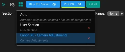
Normally, when editing an existing configuration, you would leave this dropdown in "Auto" mode, where the configurator will automatically select the section that a component you select is part of.
When a section is selected, the configurator highlights that section's hardware components on the controller visualization. You can then click on individual components to edit their behaviors.
When you're in Section View:
- Only the section's HWC Keys are shown and editable
- Other components on the controller still exist but are dimmed or hidden
- Changes you make only affect the selected section's components
To access components outside the current section, either switch to a different section or use Auto.
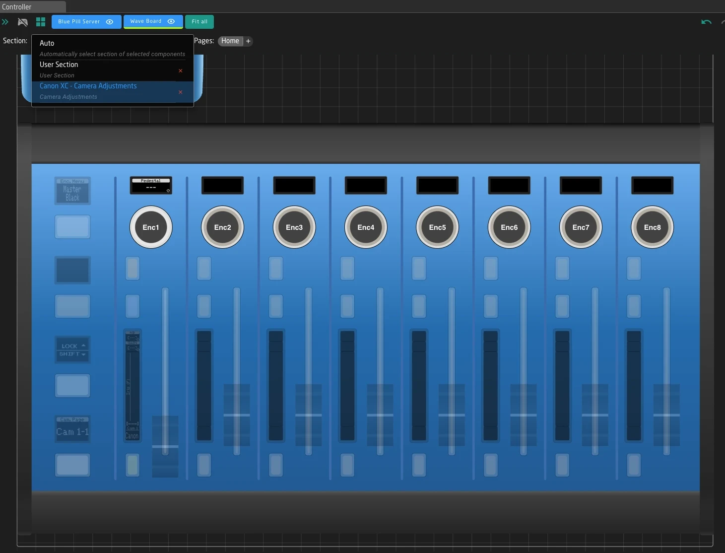
Page Variables and Menu Navigation
Many sections use Page Variables to provide multiple menu pages of functionality on the same physical components. This is how menu navigation works in most SKAARHOJ configurations.
How Pages Work
When creating and editing pages in the section view, Reactor will create layers and active if conditions accordingly. Page variable is used to select between those layers.
The Page Variable is a standard Reactor variable with multiple options (like "Home", "Exposure", "Color", "Focus"). The section displays different behaviors on its components depending on which page is currently selected.
Underneath reactor will always use "page1", "page2", "page3" and such for the values, only the labels of the variables options have the actual menu item name.
For example, in the Canon XC Camera Adjustments section on the PTZ Extreme:
- Home page: The 8 encoders control AWB Mode, Color Gain, Shooting Mode, Gain, Iris, and Focus
- Exposure page: The same 8 encoders now control Auto Iris, Gain Mode, Shutter settings, and ND Filter
- Color page: The encoders control White Balance, Color Temperature, and Master Pedestal
The physical encoders are the same - only the assigned behaviors change based on the active page.
Navigating Between Pages
In Section View, you'll see page navigation controls that let you:
- See the current page name
- Switch to different pages
- Understand which page you're editing
The exact location and appearance of these controls depends on the configuration, but they're typically visible when a section with pages is selected.
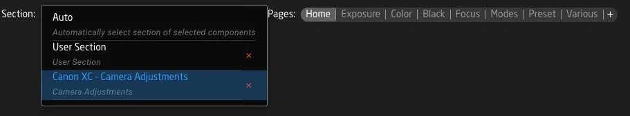
Page navigation in Section View is for editing the configuration. The actual runtime page switching is controlled by behaviors on your controller - often a dedicated Page button or encoder that cycles through the page variable's options.
Shift Variables
Shift Variables extend the functionality of your controls without requiring additional physical hardware. By holding a designated Shift button, you can access secondary behaviors on the same controls.
How Shift Works
A Shift Variable typically has two states:
- Off (Normal): Standard behaviors are active
- On (Shifted): Secondary behaviors become active
When you hold the Shift button on your controller, the Shift Variable changes to "on", and any shift-specific layers become active. This reveals additional controls that would otherwise be hidden.
Common Shift Patterns
In camera configurations like Canon XC, the Shift button provides access to:
- Exposure page: Shift reveals Auto Exposure Shift, DNR Mode, Flicker Reduction, Infrared Mode
- Color page: Shift reveals Matrix controls and extended color gain settings
- Focus page: Shift reveals additional focus adjustment parameters
This pattern effectively doubles the number of available controls on each page without adding physical buttons.
Shift in Section View
When editing a section with shift support, you may see:
- A shift state indicator showing whether you're viewing normal or shifted behaviors
- The ability to toggle shift state to edit shift-specific behaviors
- Separate layers in the tree for normal and shifted configurations
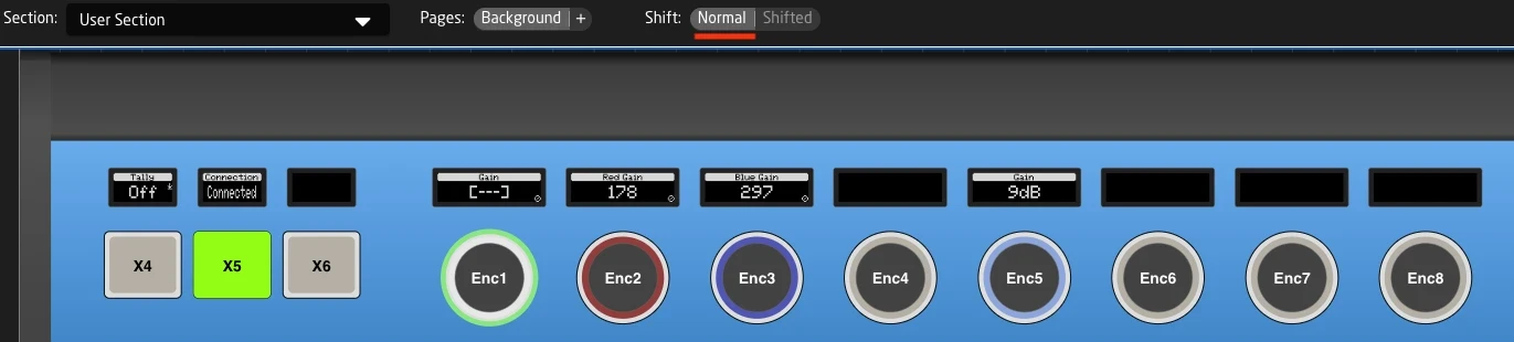
Normal
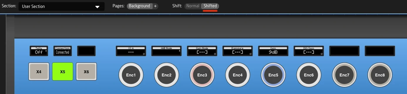
Shifted
User Section Pattern
Many SKAARHOJ configurations include a User Section - a dedicated area where users can customize their own button assignments.
The User Section
The User Section is part of all SKAARHOJ Default configurations. It is usually defined on top of all other parts of the configuration as an empty Layer, giving you a simple way to "overlay" additional pages and functions over the current configuration without having to change the existing config.
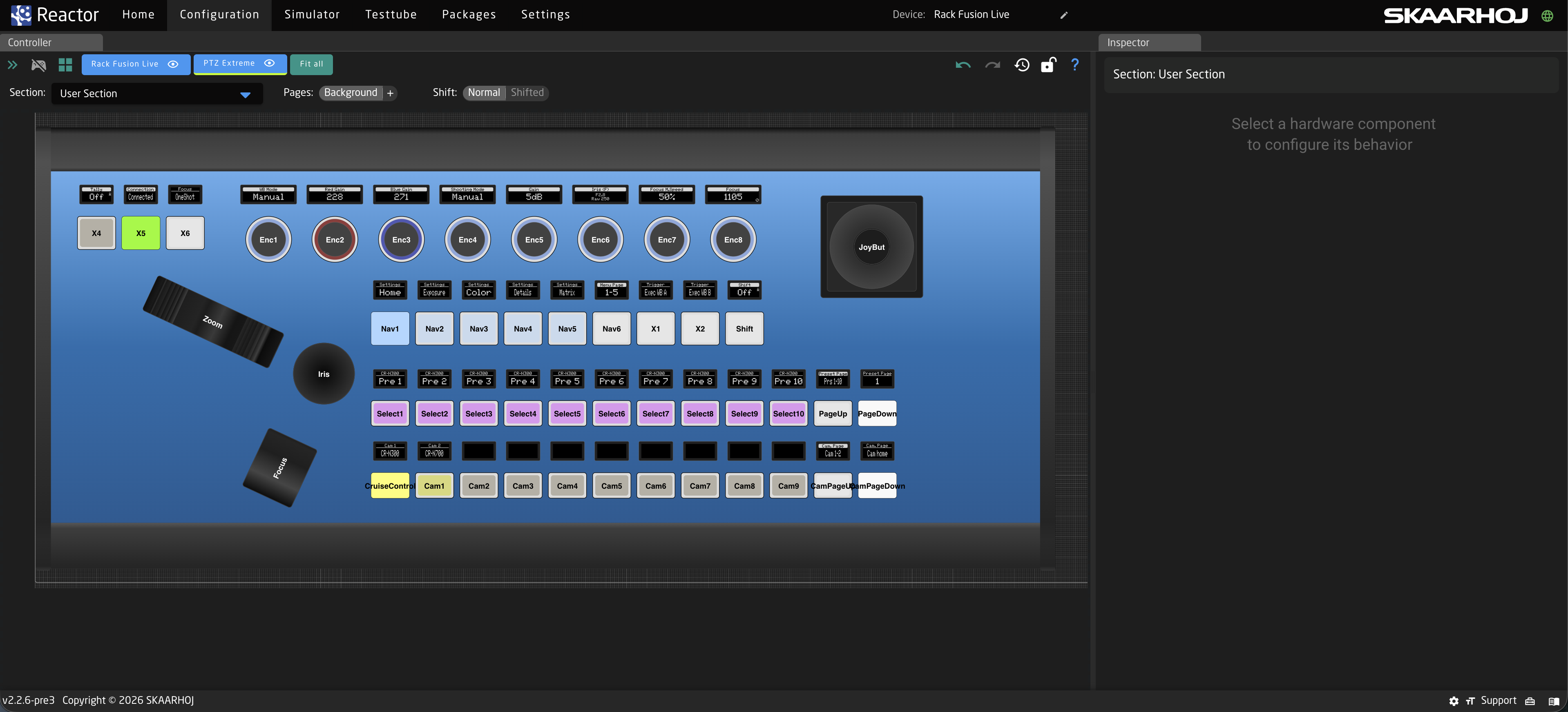
By default the User Section comes with a transparent Background layer, and includes all components on your controller. This means you edit it in a few simple steps:
- Select "User Section" from the Section dropdown

- Click any Component
- Assign a new Behavior on top of its current function.
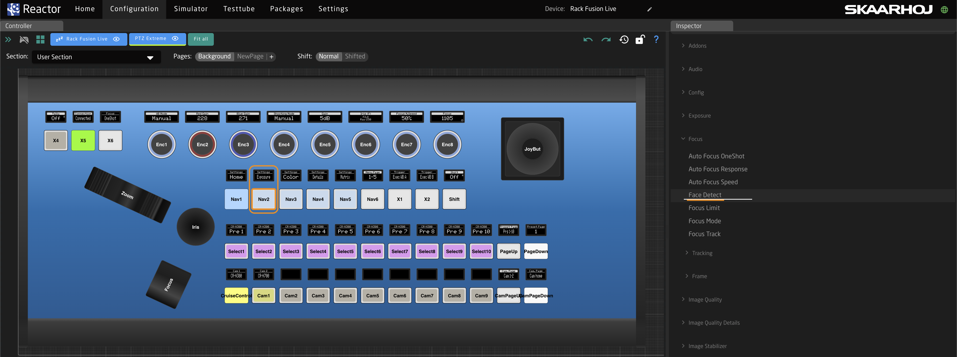
The new added Behavior will now be independent of what has previously existed in your default configuration. This way you can easily
- Add more Functionality to parts of the camera selector that would otherwise be "unused"
- Add Behaviors to Buttons on Program or preview row, in case you never use certain inputs
- Add a full new page over everything that allows you to make quick adjustments on other devices during your production
Adding a full new blank page to your user section
As mentioned above sometimes you want to use the existing default config, but have one button that triggers a completely different page.
The best way to do this is to add a new page on the user section:
- Select the user section from the dropdown
- Add a new Page, make sure it is not transparent and give it a good name.
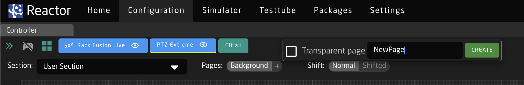
- Choose a button on your panel that will get you into the new page, select User Section -> select Background page and click your button.
- From the side choose Navigation -> Select Page
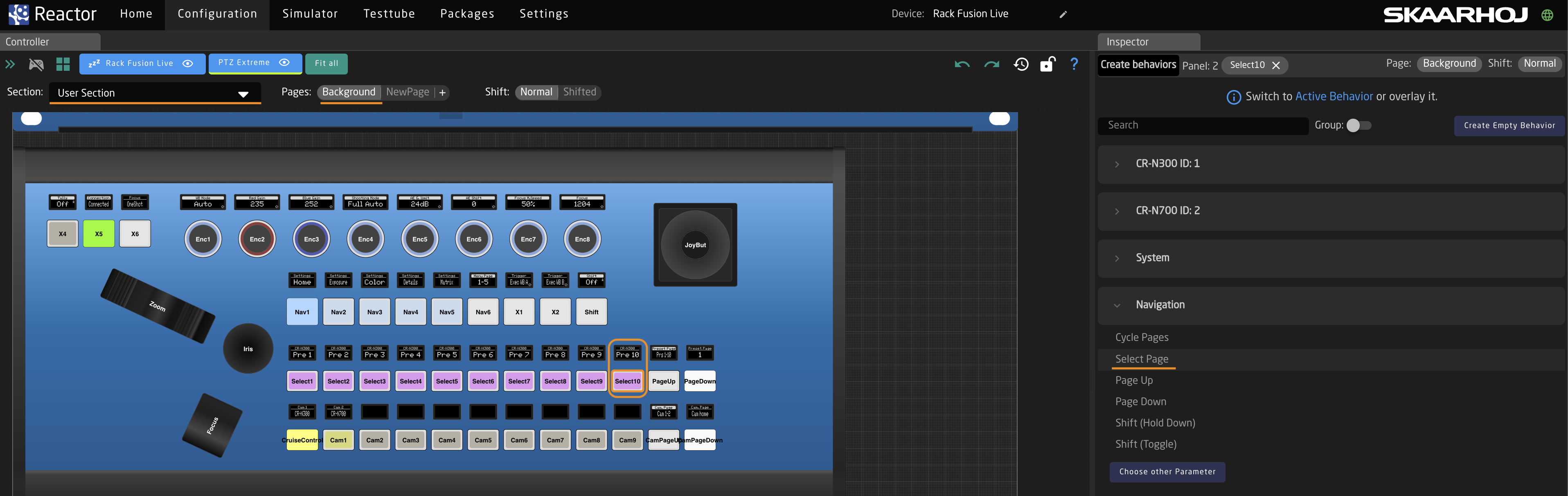
- Now select the value field and change it to your new page.
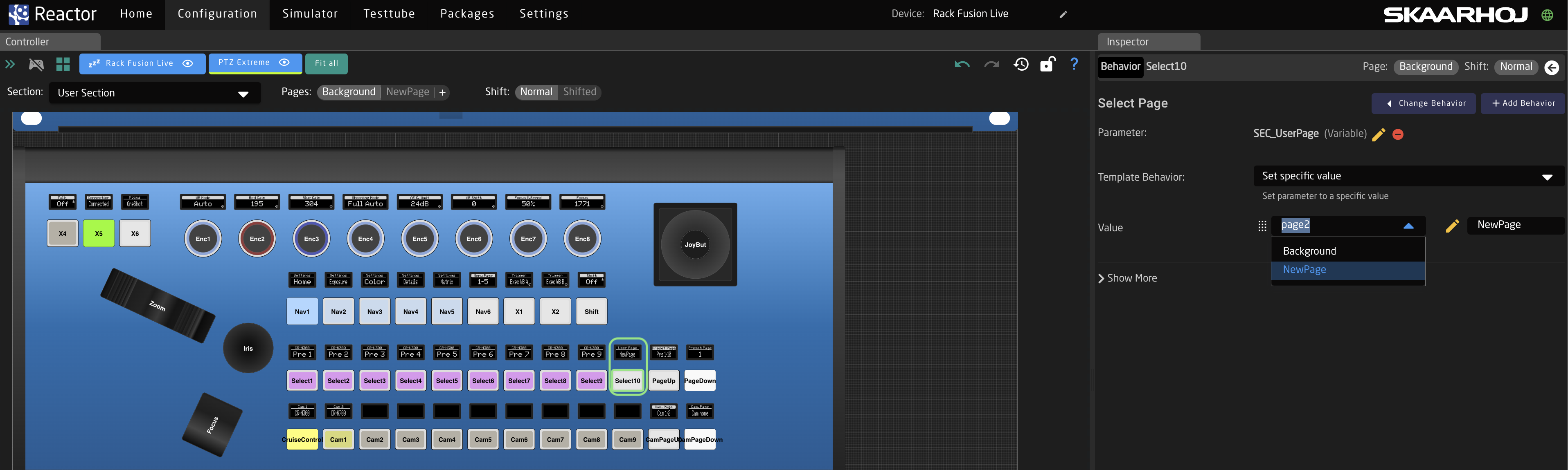
- Now you can start adding Behaviors to your new page, notice how the controller will blank out when you enter the page, and only show the new functions you added
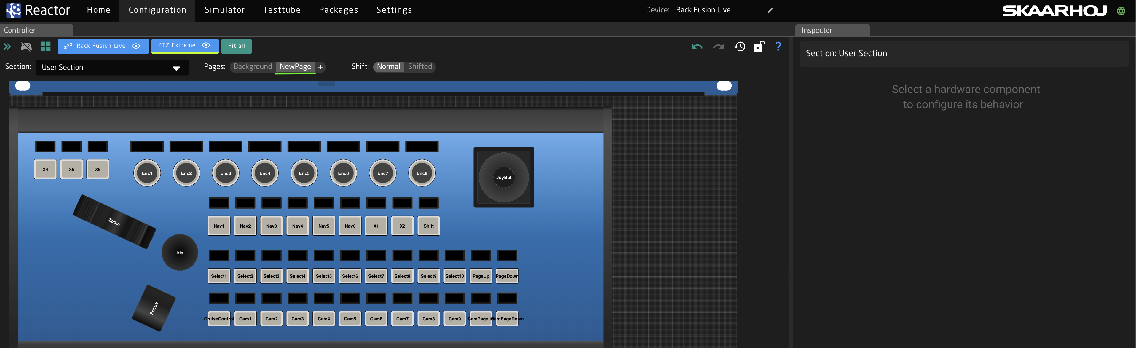
Real-World Example: Canon XC Camera Adjustments
The Canon XC ProClass configuration demonstrates a well-designed section structure. Let's walk through how it uses sections, pages, and shift.
The Camera Adjustments Section
This section maps 8 encoders (Enc1 through Enc8) to camera parameters. It uses:
- Page Variable: "SettingPage" with 10 different pages
- Shift behavior: Hold-to-activate for extended controls
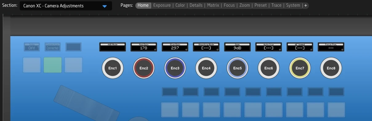
Page Structure
| Page | Enc1 | Enc2 | Enc3 | Enc4 | Enc5 | Enc6 | Enc7 | Enc8 |
|---|---|---|---|---|---|---|---|---|
| Home | AWB Mode | Color Gain R | Color Gain B | Shooting Mode | Gain | Iris | Focus Speed | Focus Position |
| Exposure | Auto Iris | Camera Iris | Gain Mode | (varies) | Shutter Mode | (varies) | ND Filter | Shooting Mode |
| Color | AWB Mode | - | - | Color Temp | Exec WB A | Exec WB B | Master Pedestal | Black Gamma |
| Focus | Focus Mode | Focus Speed | Focus Limit | Face AF | Focus Area | - | - | Focus Position |
Each page provides a complete set of related controls, making it easy to adjust one aspect of the camera without navigating through menus.
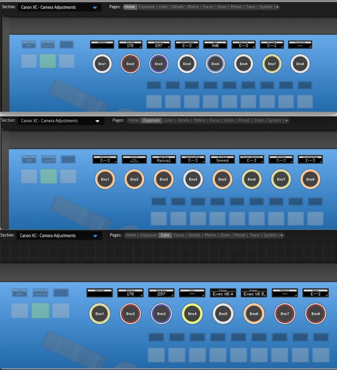
Shift Functionality
On the Exposure page, holding Shift reveals:
- Auto Exposure Shift and Response settings
- DNR Mode and settings
- Flicker Reduction
- Infrared Mode
- Image Stabilizer controls
This pattern repeats across pages - Shift always provides access to less frequently used but related parameters.
Advanced Tips for Working with Sections
Section Definitions
Sections and what belongs to them can be defined on layers in the configuration tree. Each section specifies which hardware components belong to it, and optionally, which variables control its pages and shift states. This way a simple layer is highlighted in the section selector, together with the components that need to be taken into account when reactor creates additional pages and shift layers for this section.
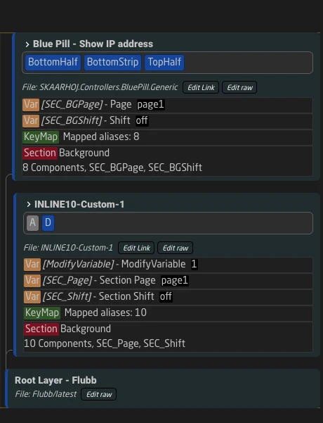
Each section defines a list of HWC Keys (Hardware Component Keys) - the names assigned to buttons, encoders, and other controls that belong to that section.
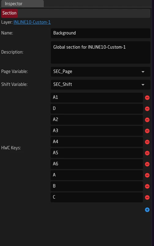
Variable Scope
Remember that Page and Shift Variables follow tree inheritance:
- They must be defined at or above the section layer
- Child layers can read and modify these variables
- This is why section variables are often defined on the same layer as the section configuration
Understanding this scope helps when troubleshooting why a page or shift isn't working as expected.
Built-in Scripting Engine
In some cases, more flexibility is needed than what can be achieved using Virtual Triggers and Variables alone. For these situations, Reactor offers a built-in JavaScript scripting engine that allows you to write custom logic for complex automation tasks.
The scripting engine only supports JavaScript ES5. Modern JavaScript features such as let, const, arrow functions, template literals, classes, and other ES6+ syntax are not available. Write all scripts using ES5-compatible syntax.
When to use scripting instead of Virtual Triggers:
- You need complex logic with loops or conditional branching
- You need to transform or parse data before using it
- You want to implement state machines or multi-step workflows
- You need to perform lookups against Settings Tables based on several conditions
There are two ways scripts can work in Reactor:
- Event Scripts - Defined on a Behavior, triggered by hardware events (button press, encoder turn, etc.)
- Layer Scripts - Defined on a Layer, run continuously while the layer is active
Event Scripts on Behaviors
Event Scripts are attached to behaviors and execute when the behavior receives a hardware event. They are ideal for one-shot actions like sending an email, executing a complex transition sequence, or performing a series of operations in response to a button press.
Adding an Event Script
To add an Event Script to a behavior:
- Select the behavior in the configurator
- Open "Show More" in the inspector
- Scroll down to find the "Event Script" section
- Add a new script
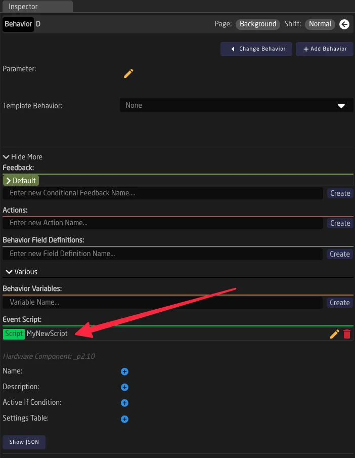
Script Properties
Each script has the following properties:
| Property | Description |
|---|---|
| Name | A descriptive name for the script |
| Description | Explanation of what the script does |
| ActiveIf | A condition that determines if the script should run. Leave empty to always run |
| Script | The JavaScript code to execute |
| MaxRunTime | Maximum runtime in seconds. Set to -1 for unlimited runtime |
For Event Scripts, if MaxRunTime is not set (or set to 0), the script will have a default timeout of 100ms between Sleep() calls. For longer operations, set an appropriate MaxRunTime value.
Example: Simple Logging Script
This script demonstrates basic console logging with timing:
// Send "Hello" and "World" to log with 50ms between
console.log("Hello");
Sleep(50);
console.log("World!");

Sleep(100);
console.log("This prints because MaxRunTime allows it");
Example: Responding to Button Press
Most Event Scripts should check what type of event triggered them before taking action:
var event = GetEvent();

// Only act on button press (not release)
if (event.Binary != undefined && event.Binary.Pressed) {
    console.log("Button was pressed!");

    // Get current value of a variable
    var currentValue = GetIOReferenceFirstValue("Var:MyVariable");
    console.log("Current value: " + currentValue);

    // Set a new value
    SetIOReferenceValues("Var:MyVariable", "newValue");
}
The event object can contain:
event.Binary- Button press/release withPressed(true/false) andEdgepropertiesevent.Pulsed- Encoder turn withValue(positive = clockwise, negative = counter-clockwise)event.Analog- Analog input (fader, potentiometer) withValue(0-1000)
Layer Scripts
Layer Scripts are defined on layers rather than behaviors. They run continuously while their parent layer is active, making them ideal for monitoring state and reacting to changes over time.
Adding a Layer Script
To add a script to a layer:
- Click on a layer in the tree to select it
- Open "Show More" in the inspector
- Find the "Scripts" section
- Add a new script with a unique name
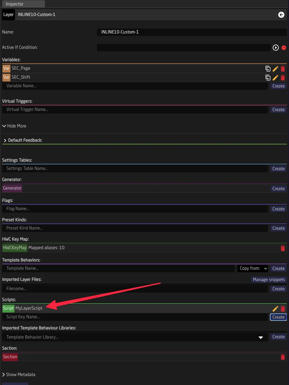
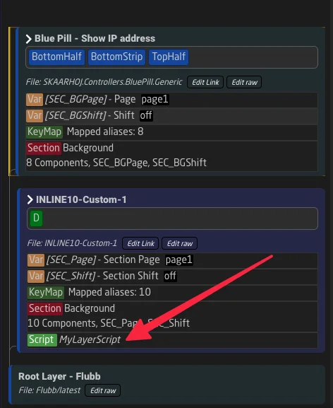
Layer Script Behavior
- Layer Scripts start running when the layer becomes active (based on ActiveIf conditions)
- They stop when the layer becomes inactive or when the script's own ActiveIf condition becomes false
- Multiple scripts can exist on a single layer
- Scripts run in separate threads and don't block each other
Layer Scripts must have a MaxRunTime set (possibly also -1 for unlimited). Without it, the script will not start.
Example: Monitoring State
This Layer Script monitors a variable and logs when it changes (remember to create the variables you use in the script):
var lastValue = "";

while (1 > 0) {
    var currentValue = GetIOReferenceFirstValue("Var:SomeVariable");

    if (currentValue != lastValue) {
        console.log("Value changed from " + lastValue + " to " + currentValue);
        lastValue = currentValue;

        // React to the change
        if (currentValue == "special") {
            SetIOReferenceValues("Var:AnotherVariable", "triggered");
        }
    }

    Sleep(100);  // Check every 100ms
}
Available Functions Reference
The scripting engine provides the following functions for interacting with Reactor:
Sleep(milliseconds)
Pauses script execution for the specified duration.
Parameters:
milliseconds(integer): Duration to pause in milliseconds
Example:
console.log("Starting...");
Sleep(1000);  // Wait 1 second
console.log("Done!");
Calling Sleep() resets the script's idle timeout counter. If a script doesn't call Sleep() within 100ms, it may be terminated. Always include Sleep() calls in loops to prevent timeouts.
GetIOReferenceValues(ioReference)
Retrieves all values from an IO Reference as an array.
Parameters:
ioReference(string): The IO Reference path
Returns: Array of string values
Example:
var values = GetIOReferenceValues("DC:bmd-atem/1/ProgramInputVideoSource/1/");
console.log("Values: " + values);  // e.g., ["1"]

// Access first value
if (values.length > 0) {
    console.log("First value: " + values[0]);
}
GetIOReferenceFirstValue(ioReference)
Retrieves the first value from an IO Reference. This is a convenience function for when you only need a single value.
Parameters:
ioReference(string): The IO Reference path
Returns: String value, or undefined if no value exists
Example:
var source = GetIOReferenceFirstValue("DC:bmd-atem/1/ProgramInputVideoSource/1/");
if (source != undefined) {
    console.log("Current program source: " + source);
}
SetIOReferenceValues(ioReference, value1, value2, ...)
Sets one or more values to an IO Reference.
Parameters:
ioReference(string): The IO Reference pathvalue1...valueN(strings): Values to set
Example:
// Set a single value
SetIOReferenceValues("Var:MyVariable", "newValue");

// Set multiple values
SetIOReferenceValues("Var:MultiValue", "value1", "value2", "value3");

// Trigger an action (empty value triggers actions like Cut or Auto)
SetIOReferenceValues("DC:bmd-atem/1/Cut/1/");
SetIOReferenceValuesWithMeta(ioReference, metaObject, value1, value2, ...)
Sets values to an IO Reference with additional metadata. This is useful for device cores that require extra parameters.
Parameters:
ioReference(string): The IO Reference pathmetaObject(object): JavaScript object with key-value pairs for metadatavalue1...valueN(strings): Values to set
Example:
// Send an email with metadata for recipient, subject, etc.
SetIOReferenceValuesWithMeta(
    "DC:email/1/send_generic_email/",
    {
        "To": "recipient@example.com",
        "Cc": "",
        "Bcc": "",
        "Header": "Alert from Reactor",
        "Body": "This is the email body"
    }
);
GetEvent()
Returns the hardware event that triggered the script. Only meaningful for Event Scripts.
Returns: Event object with properties depending on event type
Example:
var event = GetEvent();

// Check for button press
if (event.Binary != undefined) {
    if (event.Binary.Pressed) {
        console.log("Button pressed, edge: " + event.Binary.Edge);
    } else {
        console.log("Button released");
    }
}

// Check for encoder turn
if (event.Pulsed != undefined) {
    var direction = event.Pulsed.Value > 0 ? "clockwise" : "counter-clockwise";
    console.log("Encoder turned " + direction + " by " + Math.abs(event.Pulsed.Value));
}

// Check for analog input
if (event.Analog != undefined) {
    console.log("Analog value: " + event.Analog.Value);
}
GetFirstTableRowForKey(constantSetName, columnName, matchValue)
Searches a Settings Table (Constant Set) for a row where a specific column matches a value.
Parameters:
constantSetName(string): Name of the Settings TablecolumnName(string): Column to search inmatchValue(string): Value to match
Returns: Row object with all columns, or empty if not found
Example:
// Find a camera configuration by index
var row = GetFirstTableRowForKey("Cameras", "Index", "3");

if (row != undefined && row.DeviceIndex != undefined) {
    var deviceIndex = row.DeviceIndex.Values[0];
    console.log("Camera 3 uses device index: " + deviceIndex);
}
console.log(value1, value2, ...)
Outputs messages to the console log. Messages are visible in Reactor's log output and are also sent to the script editor ui.
Parameters:
value1...valueN(any): Values to log (will be converted to strings)
Example:
console.log("Simple message");
var someVariable = GetIOReferenceFirstValue("Var:SomeVariable");
var anotherVar = GetIOReferenceFirstValue("Var:AnotherVariable");
console.log("Value is:", someVariable, "and another:", anotherVar);
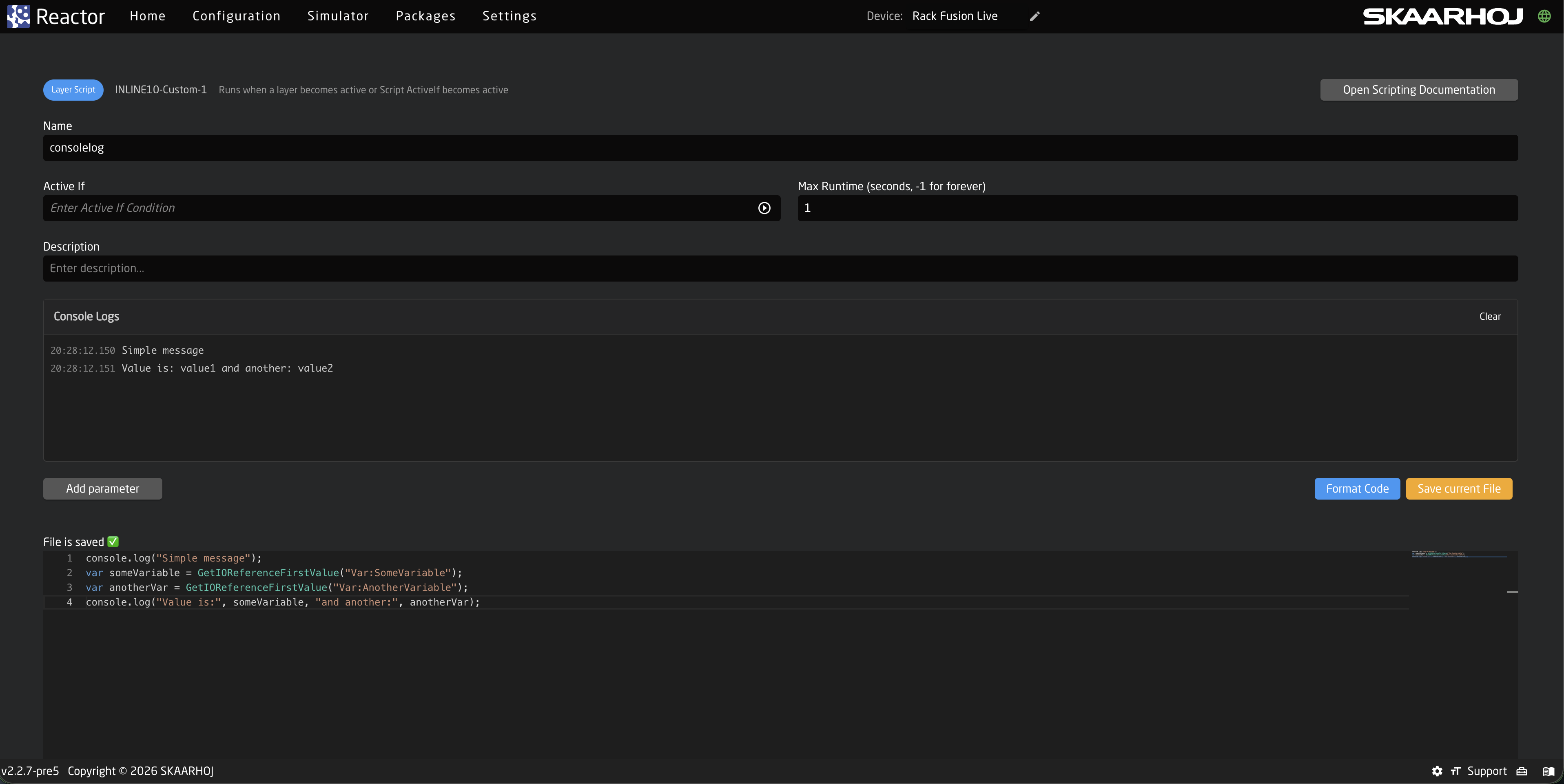
Accessing Script State from Feedbacks
You can use special IO References to check script state and control scripts from behaviors:
Behavior:Script:IsRunning
Returns true if the behavior's Event Script is currently running. Useful for visual feedback.
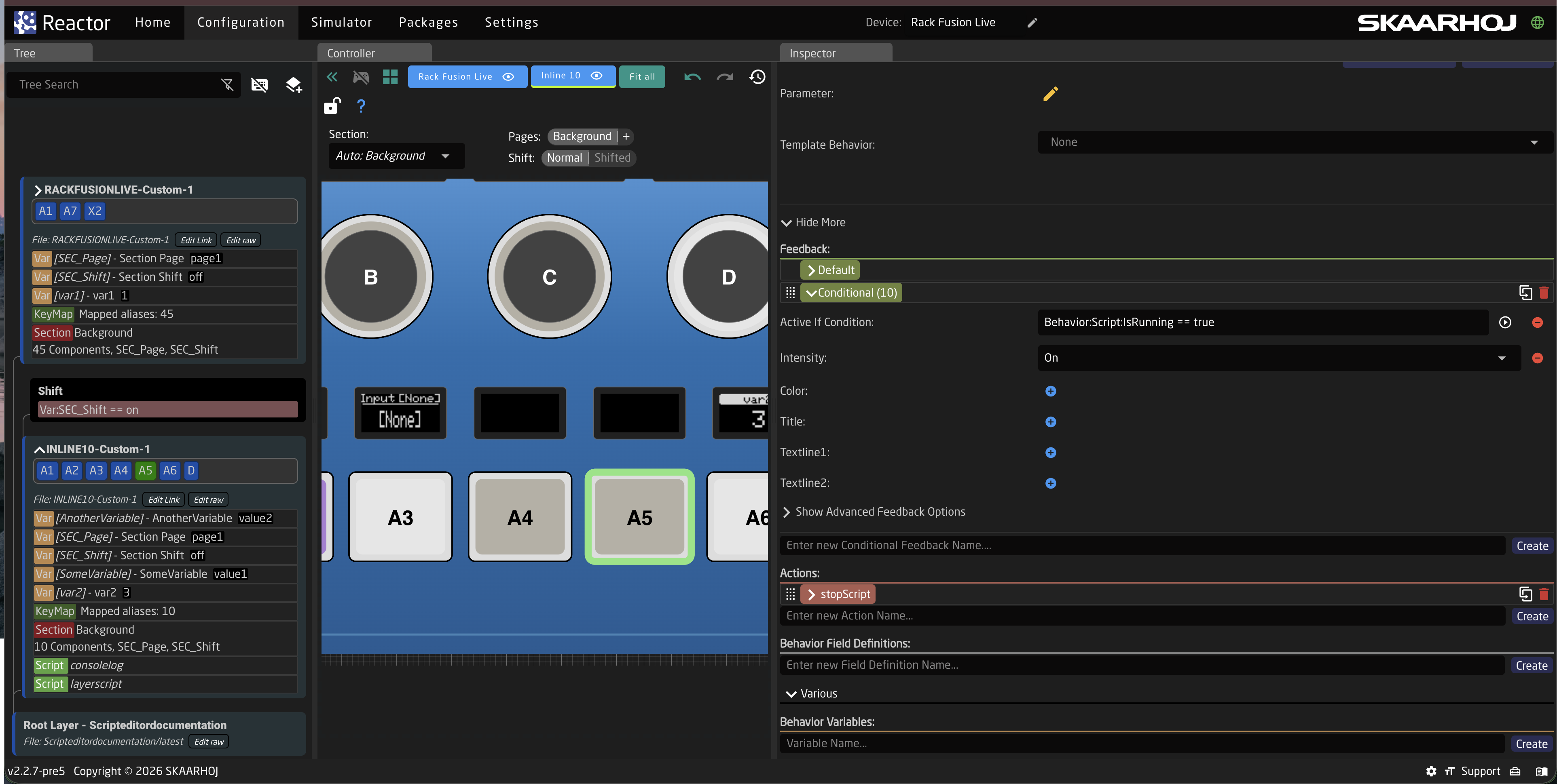
Json example Feedback Configuration:
{
    "FeedbackConditional": {
        "10": {
            "ActiveIf": "Behavior:Script:IsRunning == true",
            "Intensity": "On"
        }
    }
}
This makes the button light up while the script is executing.
Behavior:Script:Stop
An IO Reference that stops the running script when triggered. Can be used in Event Handlers.
Example: Stop script on button release:
{
    "EventHandlers": {
        "stopScript": {
            "AcceptTrigger": "Binary",
            "BinaryType": "ActUp",
            "IOReference": { "Raw": "Behavior:Script:Stop" }
        }
    }
}
JavaScript Interpreter Notes
Reactor uses the Otto JavaScript interpreter, which supports ES5 JavaScript syntax. Keep these limitations in mind:
Not supported (ES6+ features):
- Arrow functions (
=>) letandconst(usevarinstead)- Template literals (
`string ${var}`) - Classes
- Destructuring
- Spread operator
- Promises/async-await
Supported:
- Standard
vardeclarations - Regular functions
- Objects and arrays
for,while,if/else,switchparseInt(),parseFloat(),Math.*functions- String methods
Scripts must call Sleep() at least once every 100ms to avoid being terminated. This prevents infinite loops from blocking the system. For long-running operations, call Sleep(10) periodically even if you don't need the delay.
Practical Use Cases
Use Case 1: Send Email with Dynamic Content
This example shows how to parse text containing IO Reference placeholders and send a dynamic email:
var event = GetEvent();
if ((event.Binary != undefined && event.Binary.Pressed) || event.Pulsed != undefined) {

    // Get email configuration from behavior fields
    var to = parseText(GetIOReferenceValues("Behavior:Field:To"));
    var cc = parseText(GetIOReferenceValues("Behavior:Field:Cc"));
    var bcc = parseText(GetIOReferenceValues("Behavior:Field:Bcc"));
    var header = parseText(GetIOReferenceValues("Behavior:Field:Header"));
    var body = parseText(GetIOReferenceValues("Behavior:Field:Body"));

    if (to != "" && header != "" && body != "") {
        SetIOReferenceValuesWithMeta("DC:email/1/send_generic_email/", {
            "To": to,
            "Cc": cc,
            "Bcc": bcc,
            "Header": header,
            "Body": body
        });
        console.log("Email sent to: " + to);
    } else {
        console.log("ERROR: Missing recipient, header, or body");
    }
}

// Function to parse text and replace {IORef} placeholders with actual values
function parseText(text) {
    var str = new String(text);
    var strResult = "";
    var arrStr = str.split(/[{}]/);

    for (var i = 0; i < arrStr.length; i++) {
        var prefix = arrStr[i].split(":")[0];

        // Check if this segment looks like an IO Reference
        if (prefix == "Var" || prefix == "DC" || prefix == "Const" ||
            prefix == "Behavior" || prefix == "System" || prefix == "Reactor") {
            strResult = strResult + GetIOReferenceValues(arrStr[i]);
        } else {
            strResult = strResult + arrStr[i];
        }
    }
    return strResult;
}
This allows users to configure email templates like:
- Header:
"Alert: {Var:AlertType} on Camera {Var:CameraNumber}" - Body:
"Current tally state: {DC:bmd-atem/1/ProgramInputVideoSource/1/}"
Use Case 2: Automated ATEM USK Transition
This script performs an auto transition on a specific Upstream Keyer while preserving and restoring the transition settings:
function USKlabel(a) {
    return a == 0 ? "BKGR" : "USK" + a;
}

var event = GetEvent();
if (event.Binary != undefined && event.Binary.Pressed) {

    // Get configuration
    var usk = parseInt(GetIOReferenceFirstValue("Behavior:Field:USK"));
    var meRow = parseInt(GetIOReferenceFirstValue("Var:MErow"));

    console.log("Executing USK " + usk + " Auto on ME " + meRow);

    // Store current transition states (BKGR + 4 USKs)
    var nextTransitionStates = [];
    for (var a = 0; a < 5; a++) {
        nextTransitionStates[a] = GetIOReferenceFirstValue(
            "DC:bmd-atem/1/TransitionNextTransition/" + meRow + "/" + (a + 1) + "/"
        );
        console.log("Stored " + USKlabel(a) + ": " + nextTransitionStates[a]);
    }

    // Set transition to only include our USK (disable others first, then enable target)
    for (var a = 4; a >= 0; a--) {
        var newValue = (a == usk) ? "true" : "false";
        if (nextTransitionStates[a] != "---" && nextTransitionStates[a] != newValue) {
            console.log("Setting " + USKlabel(a) + " to " + newValue);
            SetIOReferenceValues(
                "DC:bmd-atem/1/TransitionNextTransition/" + meRow + "/" + (a + 1) + "/",
                newValue
            );

            // Wait for the change to take effect
            for (var wait = 1; wait <= 100; wait++) {
                if (GetIOReferenceFirstValue(
                    "DC:bmd-atem/1/TransitionNextTransition/" + meRow + "/" + (a + 1) + "/"
                ) == newValue) {
                    break;
                }
                Sleep(5);
            }
        }
    }

    // Trigger Auto transition
    SetIOReferenceValues("DC:bmd-atem/1/Auto/" + meRow + "/");
    Sleep(100);

    // Wait for transition to complete
    console.log("Waiting for transition to complete...");
    var completed = false;
    for (var wait = 1; wait <= 100; wait++) {
        if (GetIOReferenceFirstValue("DC:bmd-atem/1/TransitionInTransition/" + meRow + "/") == "false") {
            completed = true;
            break;
        }
        Sleep(50);
    }

    if (!completed) {
        console.log("ERROR: Transition did not complete in 5 seconds");
    } else {
        // Restore original transition states
        for (var a = 0; a < 5; a++) {
            var currentValue = GetIOReferenceFirstValue(
                "DC:bmd-atem/1/TransitionNextTransition/" + meRow + "/" + (a + 1) + "/"
            );
            if (nextTransitionStates[a] != "---" && nextTransitionStates[a] != currentValue) {
                console.log("Restoring " + USKlabel(a) + " to " + nextTransitionStates[a]);
                SetIOReferenceValues(
                    "DC:bmd-atem/1/TransitionNextTransition/" + meRow + "/" + (a + 1) + "/",
                    nextTransitionStates[a]
                );
                Sleep(5);
            }
        }
        console.log("Done");
    }
}
Best Practices and Troubleshooting
Always Check the Event Type
For Event Scripts, always verify the event type before taking action to avoid unintended behavior:
var event = GetEvent();

// Only act on button press, not release
if (event.Binary != undefined && event.Binary.Pressed) {
    // Your code here
}
Use Sleep() Regularly
In loops, always include Sleep() calls to prevent the script from being terminated:
while (1 > 0) {
    // Do something
    Sleep(100);  // Always include this!
}
Handle Undefined Values
IO References may return undefined if the device is not connected or the parameter doesn't exist:
var value = GetIOReferenceFirstValue("DC:bmd-atem/1/SomeParameter/");
if (value != undefined && value != "---") {
    // Safe to use the value
    console.log("Value: " + value);
} else {
    console.log("Parameter not available");
}
Debugging with console.log()
Use console.log() liberally during development. Output appears in Reactor's logs and can be viewed in the UI:
var event = GetEvent();
console.log("Starting script...");
console.log("Event type:", event.Binary != undefined ? "Binary" : "Other");
console.log("Current value:", GetIOReferenceFirstValue("Var:var1"));
Common Pitfalls
- Script doesn't start: Check that MaxRunTime is set (required for Layer Scripts)
- Script terminates unexpectedly: Add Sleep() calls in loops
- Values are undefined: The device may be offline or the parameter path may be incorrect
- Script runs multiple times: Check that you're filtering for the correct event type (e.g., only button press, not release)
- ES6 syntax errors: Remember to use
varinstead oflet/const, and regular functions instead of arrow functions
History View
The History View shows what has changed in a configuration over time and allows you to restore a previous version. Versions are kept for a limited time. Only tagged versions are kept.
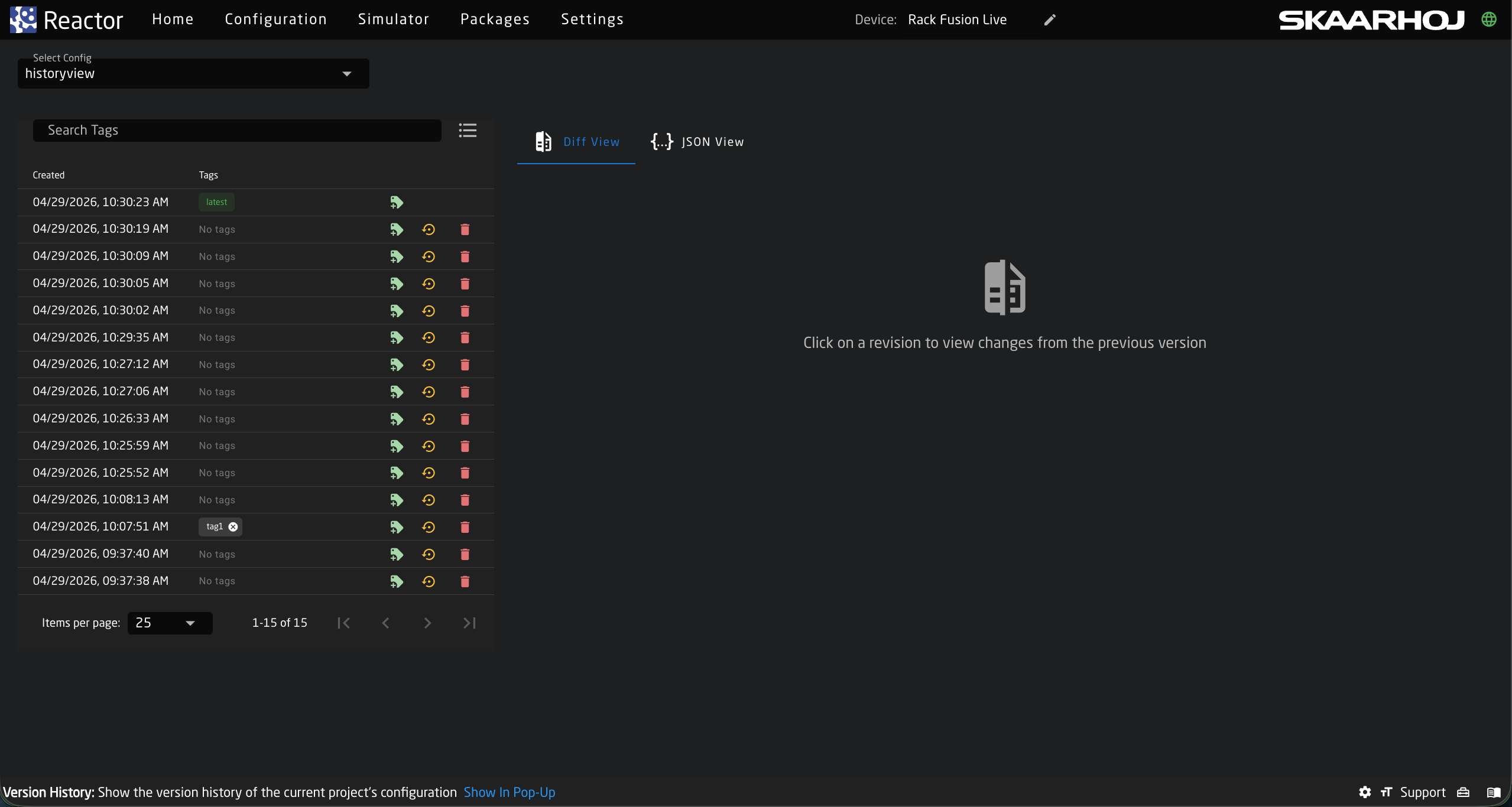
Selecting a Configuration
The Select Config dropdown allows you to choose the configuration for which you want to view version history.
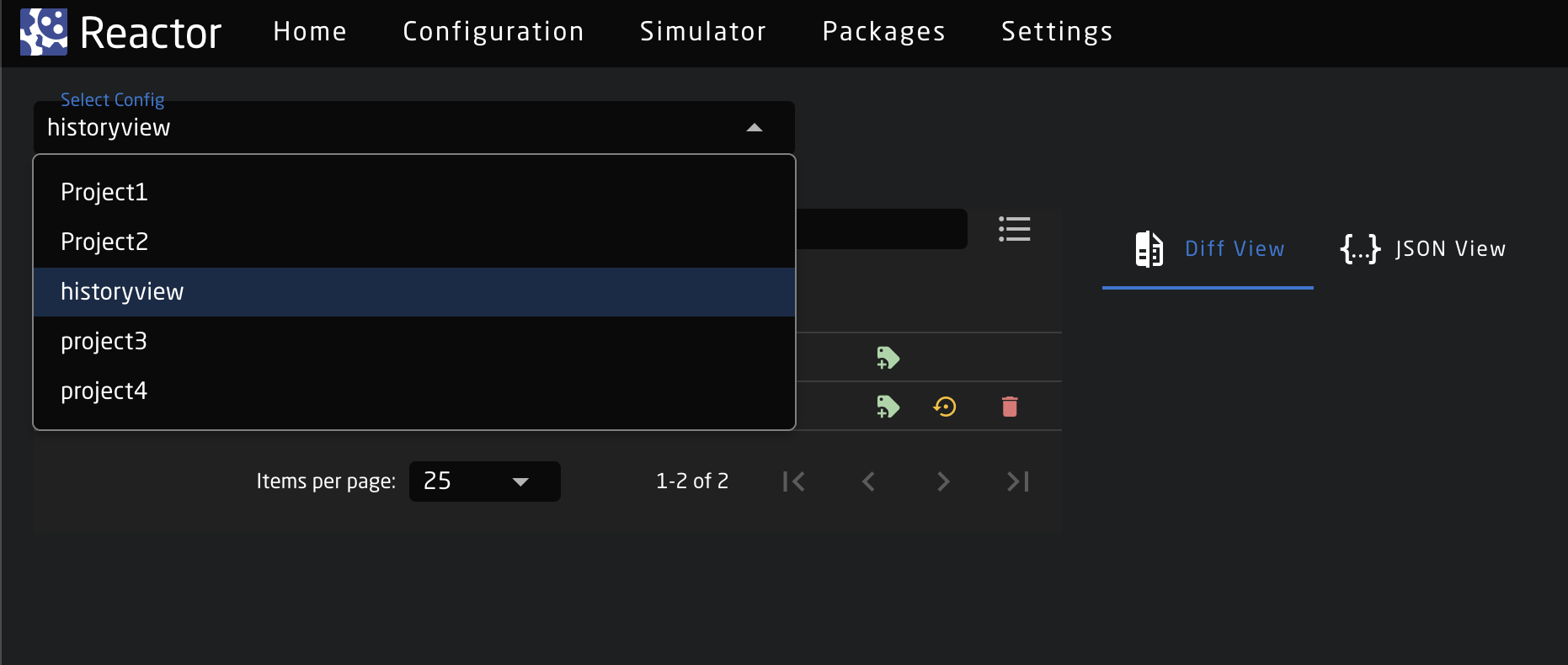
Version List
The version list shows all generated versions for the selected configuration.
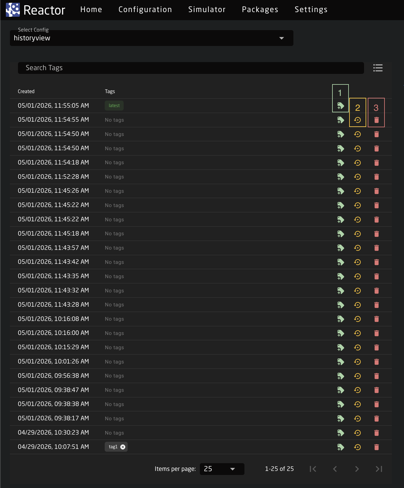
In the version list we can:
- Tag a version: We can assign a custom tag to a version. This allows us to easily find it using the Search Tags bar. It also allows us to preserve a specific version, since versions are deleted after a period of time and only tagged ones are kept.
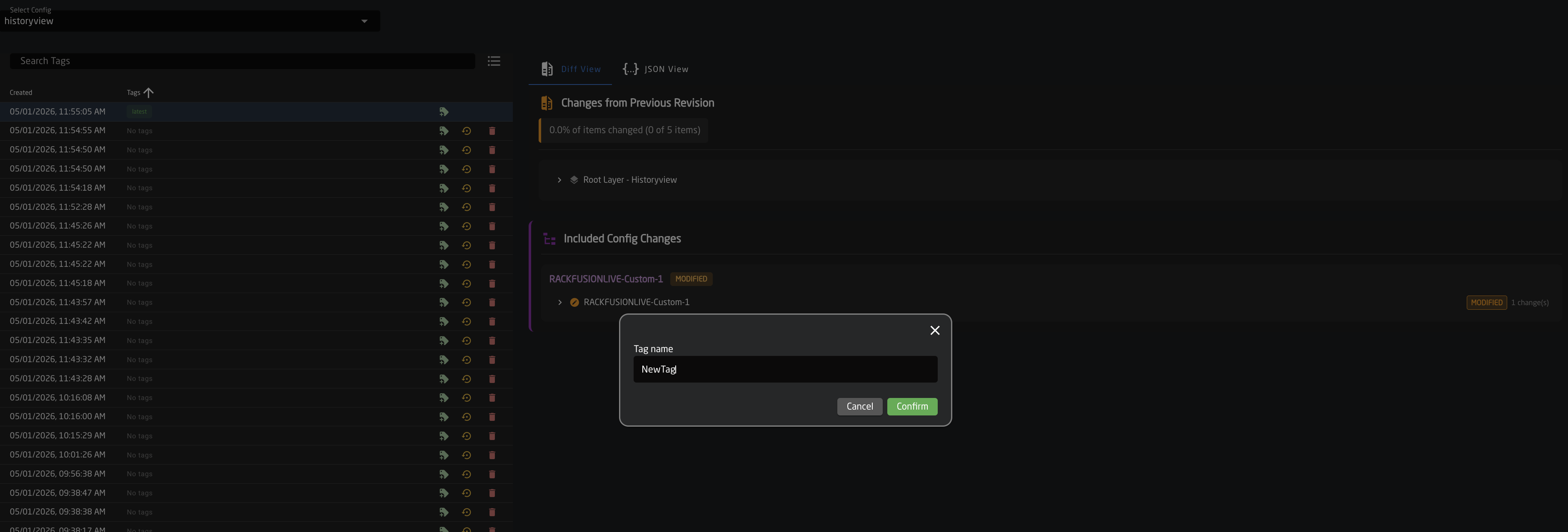
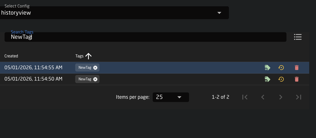
- Set as Latest: Allows setting a version as the latest version; once marked as the latest, it becomes the base from which further work continues.
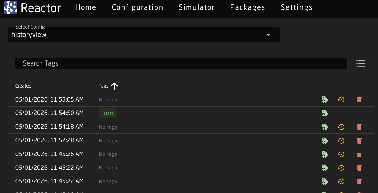
- Delete a version: Allows deleting a version from the history.
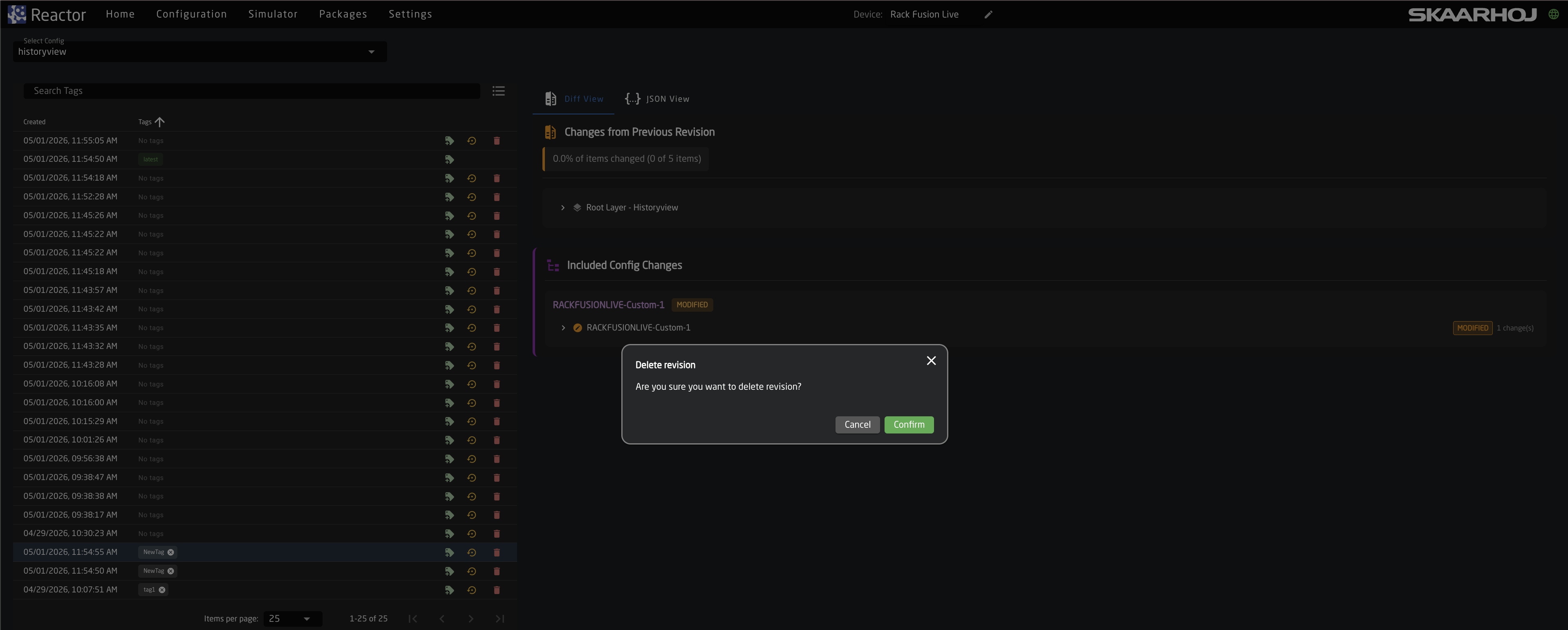
Diff View Tab - Viewing Version Details
When selecting a version, we can review changes compared to the previous version.
Changes from Previous Revision
Displays whether any changes were made at the Root Layer level. If no changes were made, this section will indicate 0% differences.
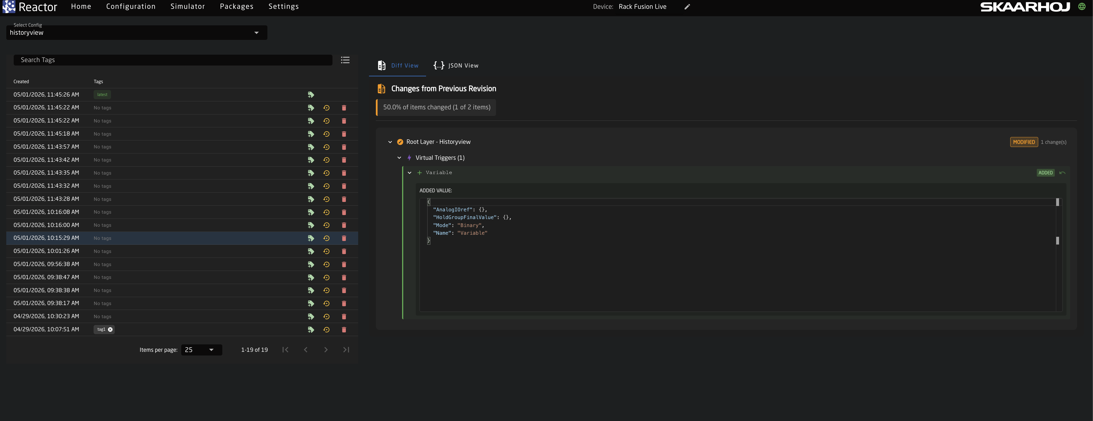
Included Config Changes
Shows detailed changes within the configuration, such as behavior modifications, adding/editing virtual triggers, and more. All these changes are from the panel layer.
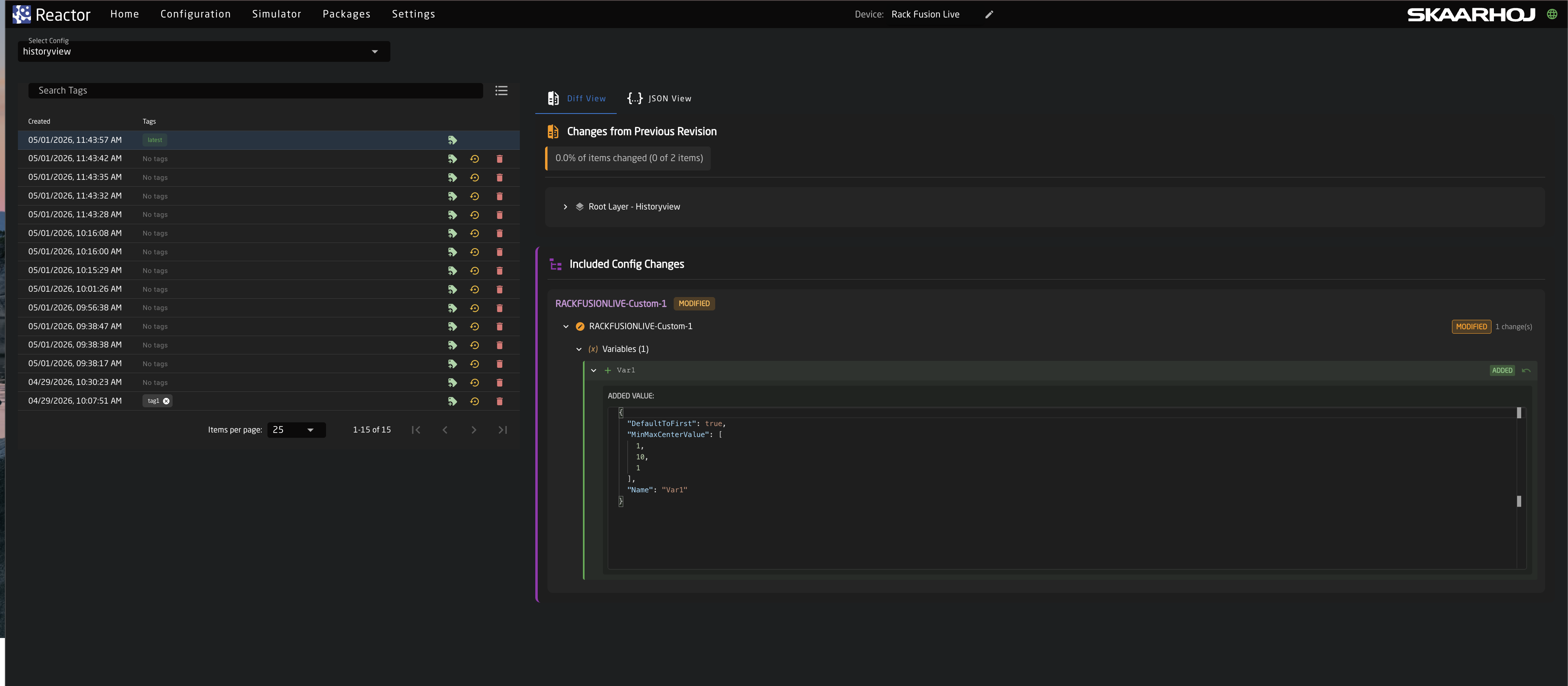
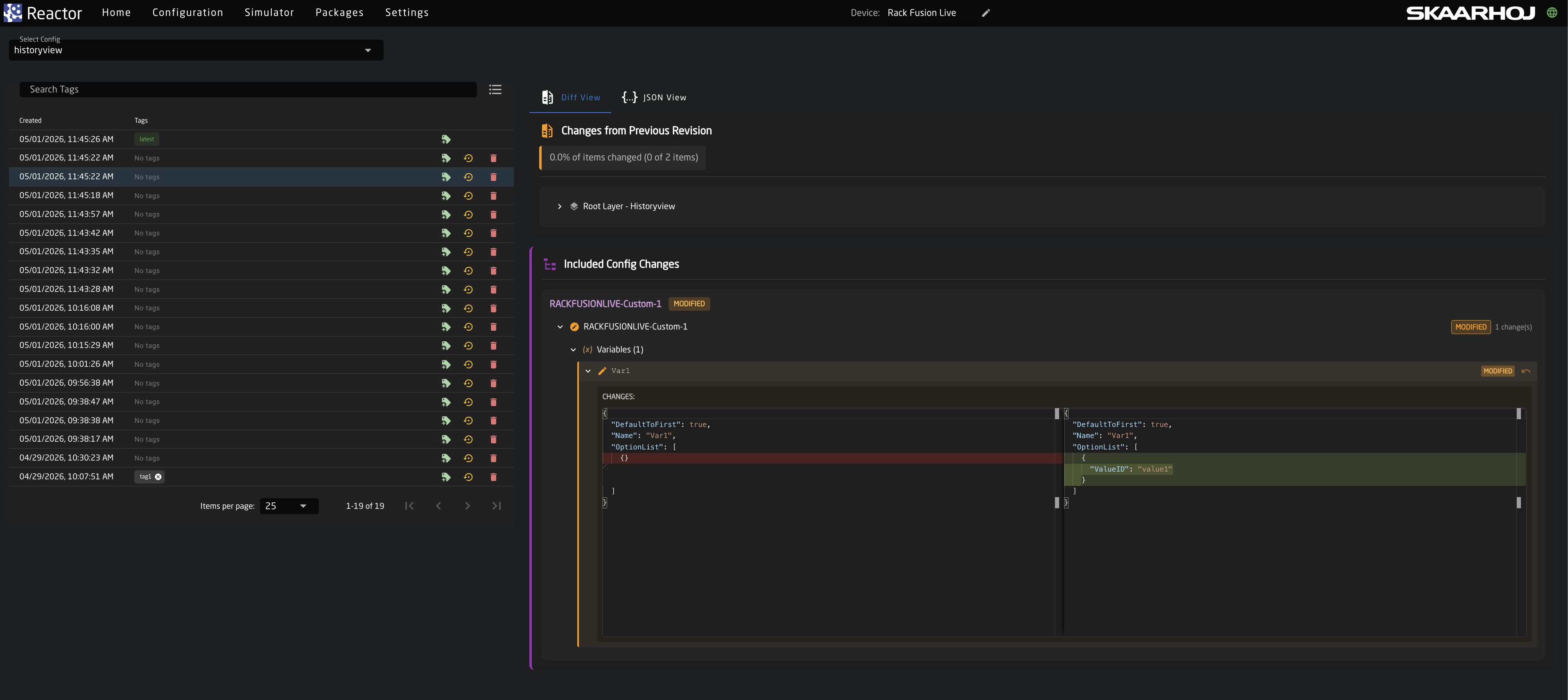
Json View Tab
In the JSON View tab, we can see the raw configuration of the root layers and the panel layers in JSON format for each version.
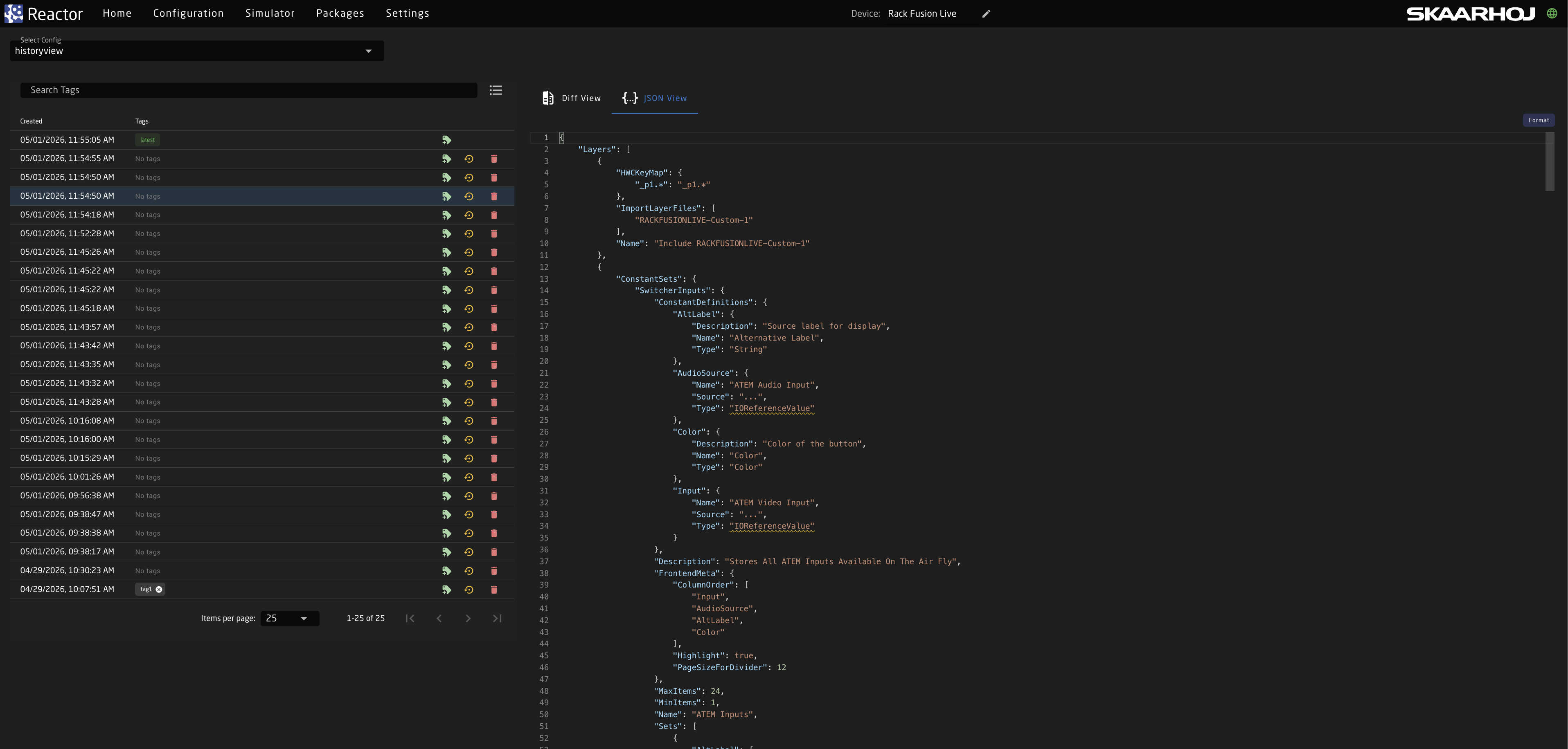
System Management
In this chapter, we will cover system-level management and configuration.
This is not directly related to Reactor, but rather the "System Manager" application. As both applications are the heart of most of our products, it is essential to understand how they work together.
Most noticeably, in the navigation bar the first three tabs (Home, Configuration, Simulator) belong to Reactor, while the last two tabs (Packages, Settings) are part of the System Manager.
We will cover the following topics:
- Packages
- System Settings
- Distributed Architecture - Using remote panels and shared device cores
- Configuration over USB (Advanced)
Package Management
The Packages page provides tools to install, update, and manage software packages on your SKAARHOJ device. These software packages might be
- device cores (core-...)
- system applications (like reactor, system-manager, hardware-manager or skaarOS)
- Other Applications, like XPanel-Touch, Producer-Assistant or Testtube
Package Installation
Online Installation
When the device has internet access, packages can be installed directly from the SKAARHOJ package repository:
- Navigate to Packages in the main menu
- Scroll to Available Packages
- Select the desired version from the dropdown
- Click Install
The package will be downloaded, verified, and installed automatically.
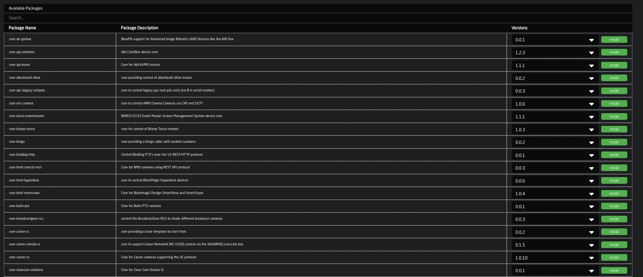
Offline Installation
For devices without internet access, packages can be uploaded manually:
- Click Upload and install package (or press
Alt+U) - Select a
.ipkspackage file from your computer - The package will be verified and installed
Package files can be downloaded from pkg.skaarhoj.com on a computer with internet access.

System Updates
To update skaarOS itself:
- Locate skaarOS in the Installed Packages list
- Select the target version from the dropdown
- Click Update
Alternatively, upload a .raucb system update bundle using the upload function. The device will reboot to apply system updates.
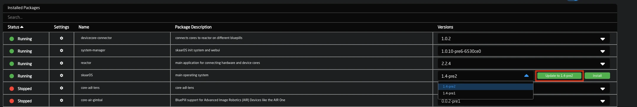
License Installation
License files extend device capabilities. Normally they will be assigned automatically if your controller has access to the Internet. They can also be installed offline if needed, just the same as any other package
- Click Upload and install package
- Select your
.licor.licslicense file - The license will be validated and applied
Installed Packages
The Installed Packages section shows all packages on your device with:
| Column | Description |
|---|---|
| Status | Green = running, Red = stopped |
| Settings | Link to package configuration |
| Name | Package identifier |
| Description | Package purpose |
| Versions | Installed version and available updates |
Package Controls
Right-click a package for additional options:
- Start/Stop - Control the service
- Enable/Disable - Toggle autostart on boot
- Download Logs - Export package logs
- Uninstall - Remove the package
Note: System packages (hardware-manager, system-manager) cannot be uninstalled or stopped
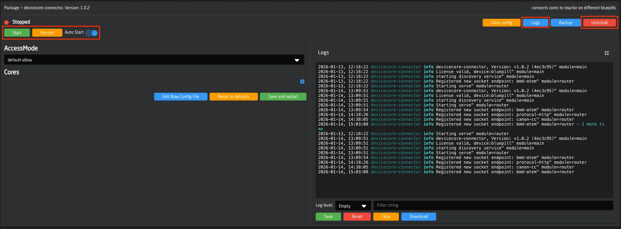
Package Configuration
Click the settings icon next to a package to access its configuration page.

Configuration Methods
Settings Form: The default view presents configuration options as a form for the package's configuration.
Raw Config file editing: Click Edit Raw Config File to directly edit the underlying TOML configuration file.
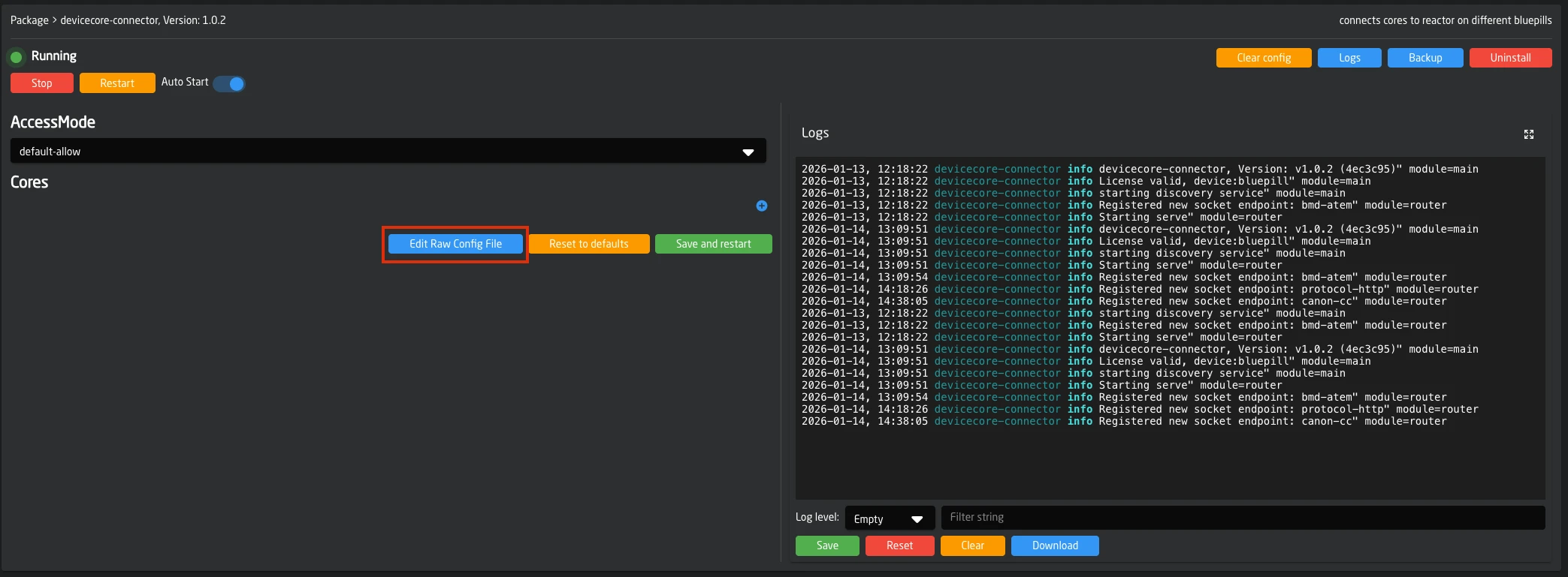
Configuration Actions
| Button | Action |
|---|---|
| Save and Restart | Apply changes and restart the service |
| Reset to Defaults | Revert all settings to default values |
| Clear Config | Delete all configuration and data of the package. (requires confirmation) |
| Backup | Download configuration backup, this is useful for support cases |
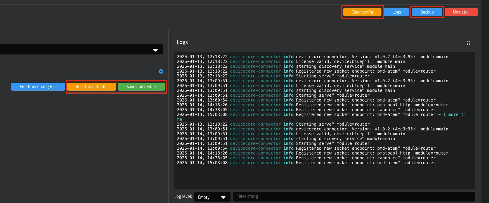
Log Viewer
The log viewer displays real-time output from package services.
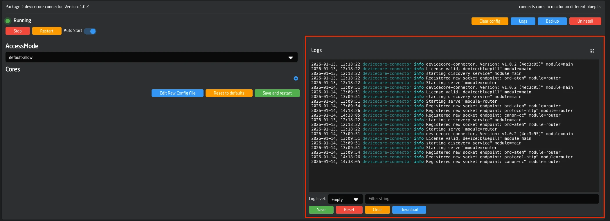
Controls
| Control | Function |
|---|---|
| Module dropdown | Select which package logs to view |
| Log Level | Filter by severity (Trace, Debug, Info, Warn, Error) |
| Clear | Clear the log display |
| Download | Export logs as compressed archive |
Logs stream in real-time. Duplicate messages are grouped with a counter to reduce noise.
You can download logs from all packages at once from the Settings page. This is useful when creating support requests or diagnosing system-wide issues.
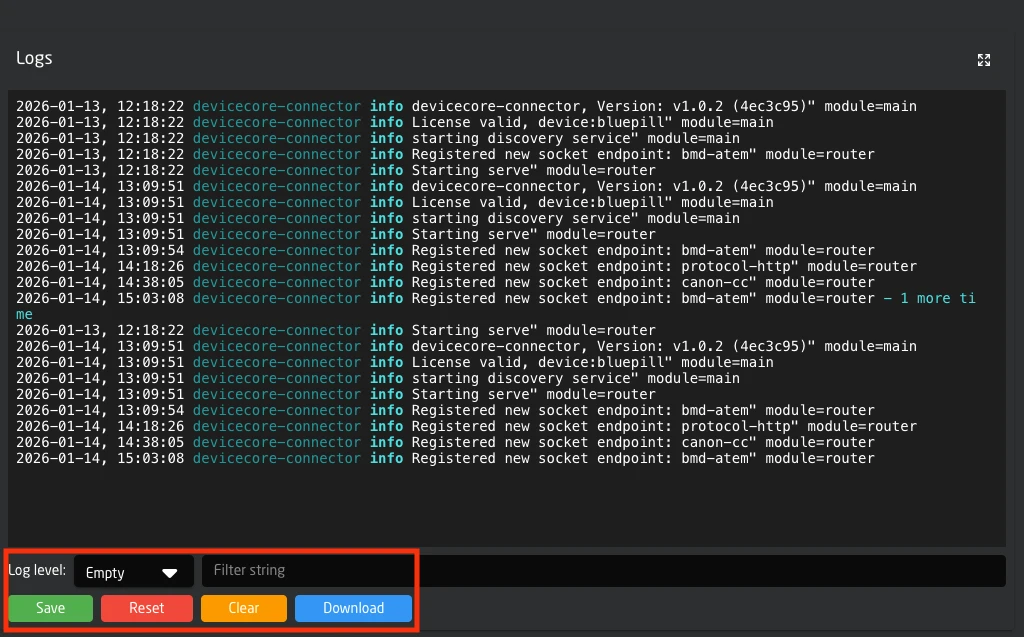
Device Settings
The Settings page provides configuration options for network, security, and system features.
System Information
At the top of the Settings page:
| Button | Action |
|---|---|
| System Stats | Opens system stats (top output, temperature, throttle, clock) in a new tab |
| Identify | Lights up the LED next to the config button for device identification |
| Reboot | Restarts the device completely |
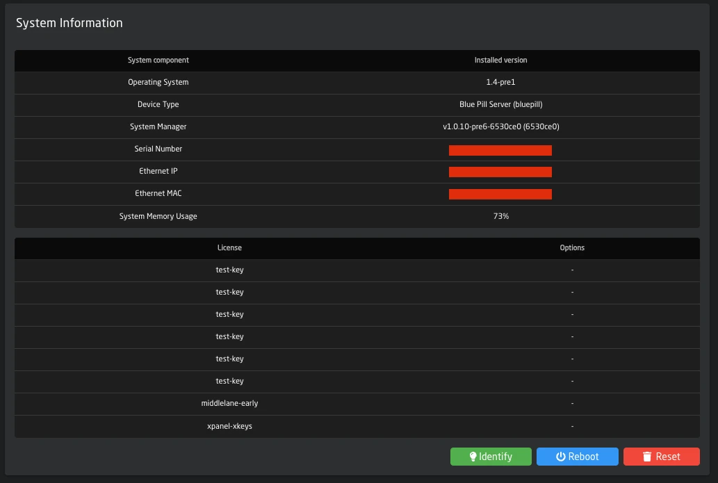
Network Configuration
Ethernet
Configure the primary network interface:
| Setting | Description |
|---|---|
| DHCP | Enable automatic IP assignment |
| IP Address | Static IPv4 address (when DHCP off) |
| Subnet Mask | Network subnet |
| Gateway | Default gateway |
| DNS Server | Primary DNS |
| Fallback DNS | Secondary DNS |
| Do not use for Internet | Prevent this interface from being used for internet access, useful if the default order of devices does not match whats needed |
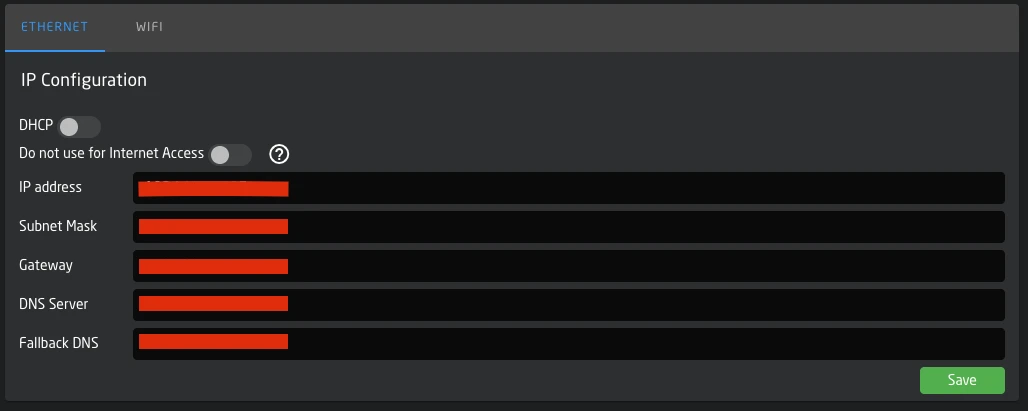
WiFi
WiFi can operate in three modes:
Disabled: WiFi radio is off.
Client Mode: Connect to an existing WiFi network.
- Use Scan Networks to find available networks
- Click a network to select it and enter the password
- View and manage saved networks
Access Point Mode: Device creates a hotspot.
- AP Name: Automatically set to
SKAARHOJ-[SerialNumber] - AP Password: Customizable (8-63 characters)
- IP Range: The device will be available on 192.168.4.1/24. A DHCP Server in the device will give out addresses in this range
IP configuration options are the same as Ethernet.
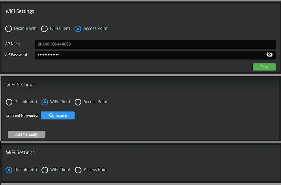
USB Ethernet
If available, USB Ethernet can be configured with the same options as the primary Ethernet interface.
Authentication
Enable web interface authentication:
| Setting | Description |
|---|---|
| Enable | Turn authentication on/off |
| Username | Login username |
| Password | Login password |
When enabled, users must authenticate to access the web interface.
Raw Panel Mode
Allows connecting the panel to an external reactor instance.
| Setting | Description |
|---|---|
| Enable | Activate raw panel mode |
| Port | Listening port (default: 9932) |
When enabled, the local reactor connection is disabled.
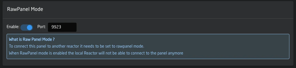
Devicecore Sharing
Share device cores over the network for access by other SKAARHOJ devices. This functionality is built in to system-manager and replaces the legacy "devicecore-connector" package
| Setting | Description |
|---|---|
| Enable | Activate device core connector |
| Advanced Config | Link to detailed configuration (when enabled), here you can define which cores are allowed access to and if they should have individual authentication |
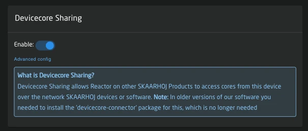
Remote Support
Grant SKAARHOJ support team access to your device for troubleshooting.
| Setting | Description |
|---|---|
| Enable | Turn on remote support access |
When enabling, you must accept the remote support agreement. Remember to disable after the support session.
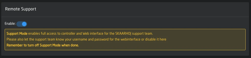
USB-A Port
Note: Not all devices have a USBA port
Toggle between USB-A port functionality and MicroUSB firmware updater:
| Setting | Description |
|---|---|
| Enable | Use USB-A port (disables MicroUSB firmware updater) |
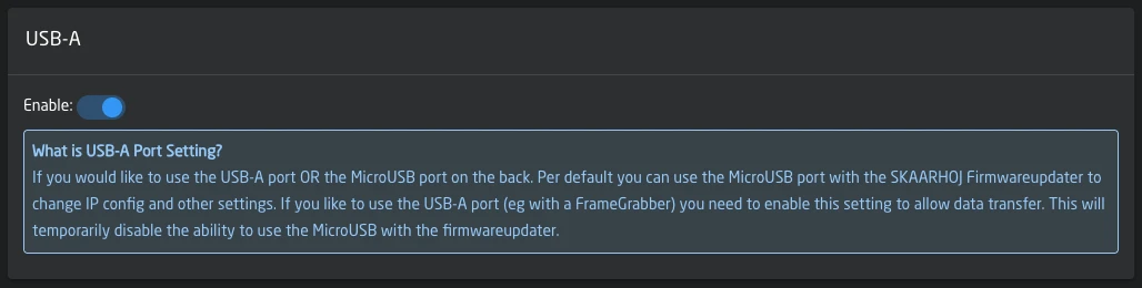
Date and Time
| Setting | Description |
|---|---|
| Date/Time | Current device time (click Edit to change) |
| Timezone | Select from dropdown or use auto-detected timezone |
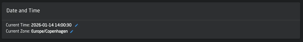
Advanced Settings
These settings are locked by default. Click the lock icon to edit.
| Setting | Description |
|---|---|
| HTTPS Mode | Off / On (HTTP+HTTPS) / HTTPS Only |
| Custom NTP Server | Override default time server |
| Disable mDNS | Turn off multicast DNS service |
| Disable Info Endpoints | Turn off information endpoints |
Use caution when modifying advanced settings.
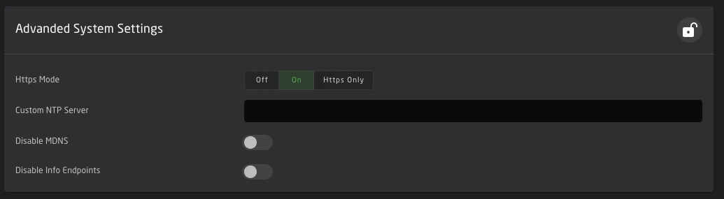
Distributed Architecture
Blue Pill products are designed with a three part architecture, hardware panels, the Reactor engine, and device cores. While these components typically run together on a single Blue Pill device, they can also be distributed across multiple devices on a network.
The Three Pillars
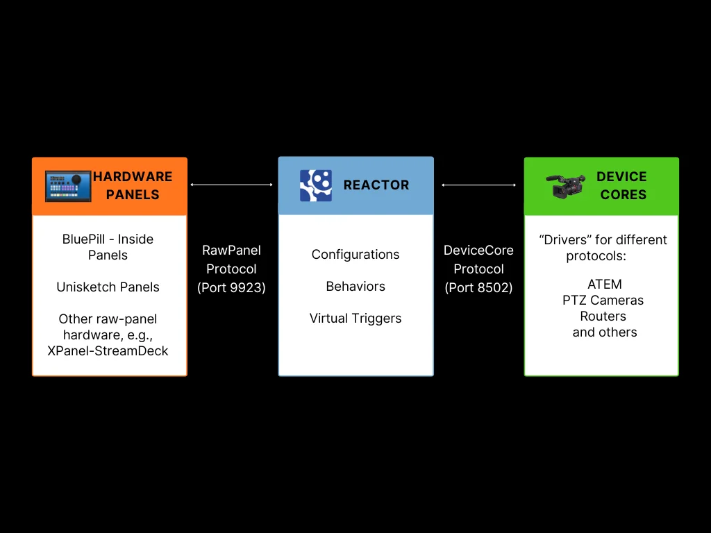
Hardware Panels
The physical SKAARHOJ panels with their buttons, displays, encoders, and faders. These communicate using the RawPanel protocol over TCP (default port 9923). On a Blue-Pill-Inside product you will typically find the "hardware-manager" application, that is responsible for this. On older "Unisketch" Products there are "BluePill Mode" configurations available on cores.skaarhoj.com
Reactor
The central brain that processes configurations, manages layers and behaviors, and routes actions between panels and devices. This is where your configurations live and execute.
Device Cores
The "Driver" applications, that communicate with external equipment (video switchers, cameras, routers, etc.). Each device core speaks the native protocol of its target device and exposes a standardized interface to Reactor. Several "generic protocol" device cores alro exist (http, osc, ...)
Why Distribute Components?
In most setups, all three components run on the same Blue-Pill-Inside device. However, there are scenarios where distributing them across multiple devices provides advantages:
Remote Panels
Connect panels from one Blue Pill to Reactor running on another device:
- Multi-panel setups: Use one Blue Pill as the central controller for multiple panels across different locations
- Centralized management: Manage all panel configurations from a single Reactor instance
- Third-party integration: Allow non-SKAARHOJ hardware to control Reactor
- Backward Compatibility: Enable Unisketch Panels and LinkIO devices to connect to the BluePill ecosystem
See Remote Panels (RawPanel Mode) for configuration details.
Shared Device Cores
Access device cores running on a remote Blue Pill Server or Blue-Pill-Inside Device:
- Hardware connectivity: Some device cores require direct USB or serial connections to equipment
- Geographic latency: Place device cores close to the equipment they control to minimize protocol latency
- Load Balancing Across Controllers: Spread processing load across multiple devices, when controlling 20+ devices, spread them across multiple Blue Pills
See Shared Device Cores for configuration details.
Network Considerations
When distributing components:
- All devices must be on the same network or have routed connectivity
- Default ports: 9923 for RawPanel, 8502 for DeviceCore sharing
- Consider network latency when placing components - device cores should be close to the equipment they control
Typical Scenarios
Scenario 1: Multi-Room Control
A central control room manages panels in multiple studios. One Blue Pill Server runs Reactor and device cores with all configurations, while panels in each studio connect over the network.
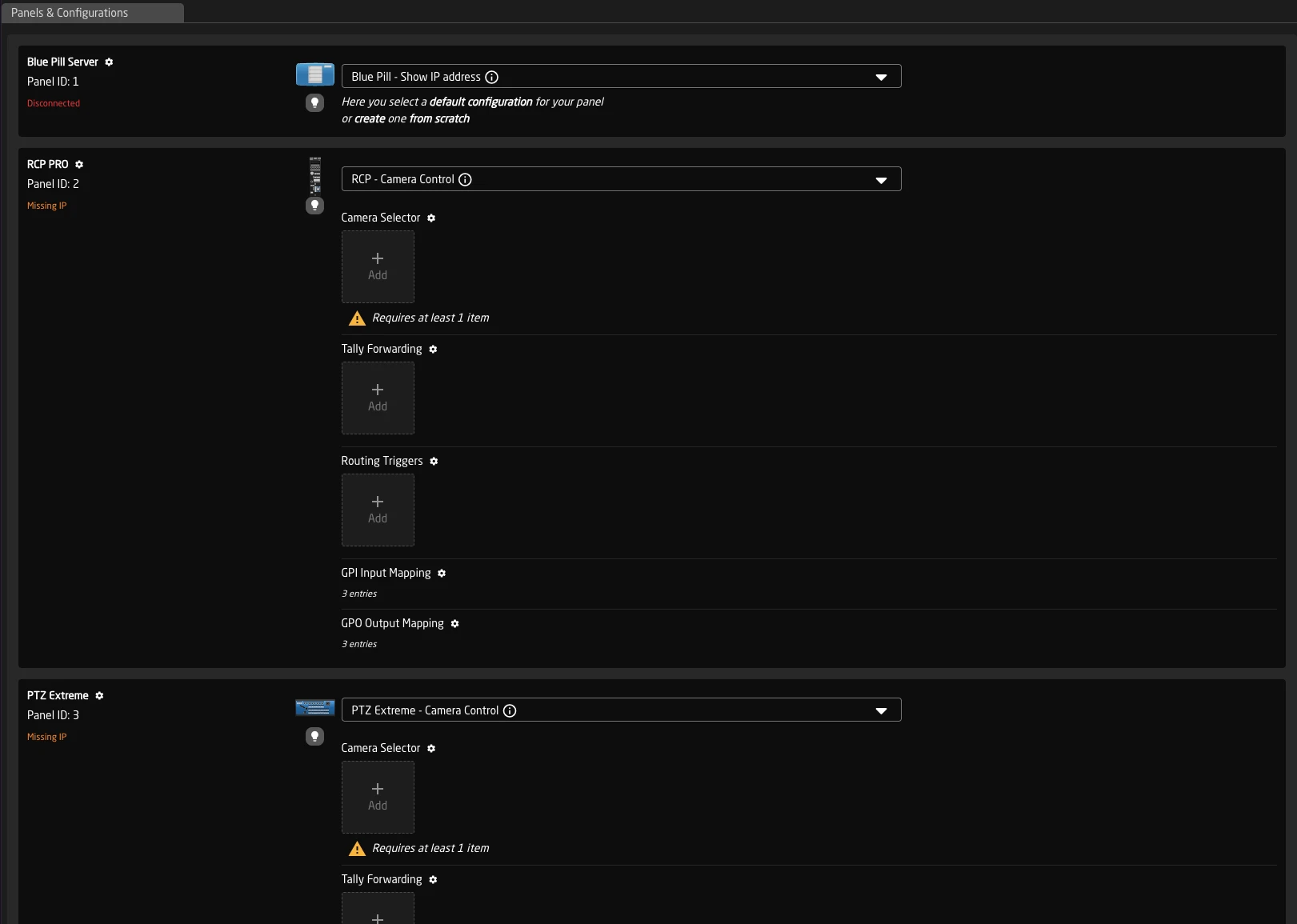
Scenario 2: Remote Production
An ATEM switcher is located at a remote venue. A local Blue Pill runs the ATEM device core with minimal latency, while the main Reactor instance at headquarters connects to it over the network. The device core protocol (based on GRPC) is more resilient to latency than some device specific protocols.
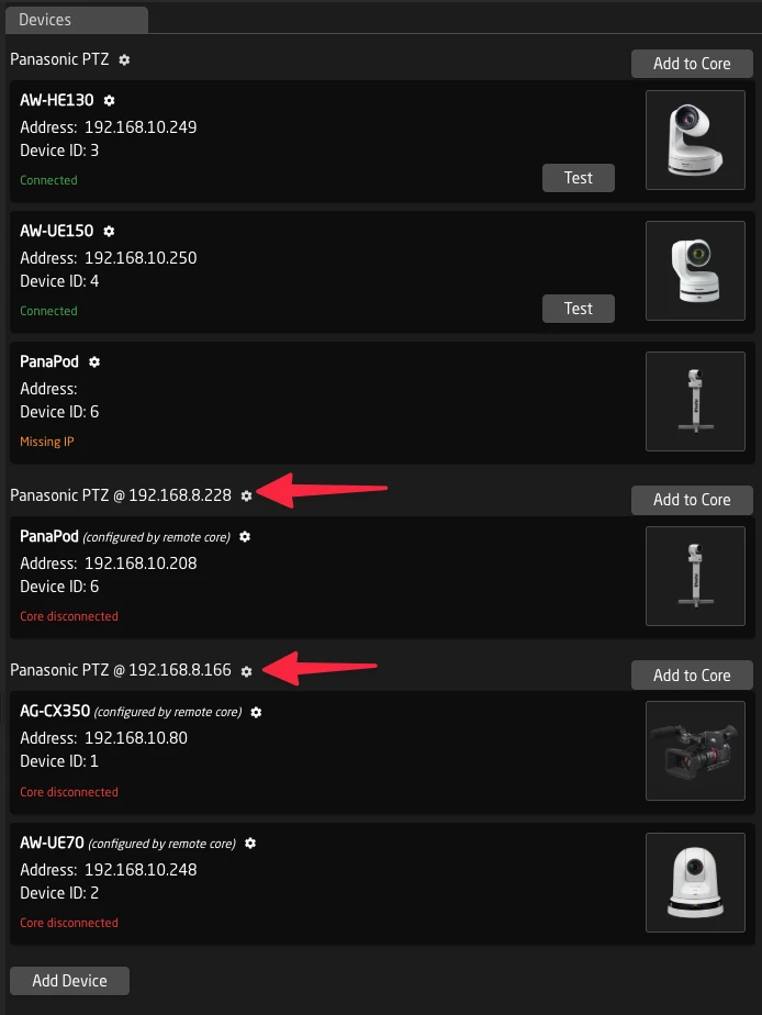
Scenario 3: Camera Control with Serial Connection
Camera control requires a direct serial/USB connection (e). A small Blue Pill near the cameras runs the camera device core, shared with the main Reactor instance elsewhere in the facility.
Devices that sometimes Benefit from this scenario are for example:
- Dreamchip / Proton Cameras
- Sony Mirrorless Cameras
- Serial VISCA Cameras
Scenario 4: Load Balanced Multi-Controller Setup
A large production facility has 20 devices to control and three operator positions, each with its own Blue Pill controller. Instead of having each controller run all device cores locally, the device cores are distributed:
- Controller A runs device cores for devices 1-7
- Controller B runs device cores for devices 8-14
- Controller C runs device cores for devices 15-20
Each controller's Reactor instance connects to the shared device cores on the other controllers as needed. This distributes the protocol processing load while allowing any operator to control any device.
Remote Panels (RawPanel Mode)
RawPanel Mode allows you to connect SKAARHOJ panels to a Reactor instance running on a different Blue Pill device. Instead of running Reactor locally, the panel exposes its hardware over the network for external control.
Why Use Remote Panels?
Multi-Panel Setups
When you have multiple SKAARHOJ panels across different locations (studios, control rooms, remote positions) or even close by (eg MegaPanel or Sidecar configurations like the Frameshot Shotbox), you can manage them all from a single Reactor instance. This provides:
-
Modular Panel Setups: Devices like the MegaPanel allow several controllers to share shiftlevel, pages and more over the network instantly. This way several Panels can act as one.
-
Unified configuration: All panel behaviors are defined in one place, Update configurations in a central location
Third-Party Integration
The RawPanel Protocol allows SKAARHOJ panels to easily control Supported Applciations, such as
- Softron M-Replay
- Panasonic Kairos
- many more...
On the other side it also enables third-party devices to input into Reactor, such as:
- StreamDecks
- Riedel Smartpanel
- Generic HID Devices
- XKeys
- BlackMagic Zoom and Focus Demands
- ...
This is usually using the XPanel integrations from SKAARHOJ and is license based.
Enabling RawPanel Mode
RawPanel Mode is configured on the Blue Pill that has the panel hardware you want to make available remotely.
Step 1: Access System Settings
Navigate to the Settings page in the System Manager.
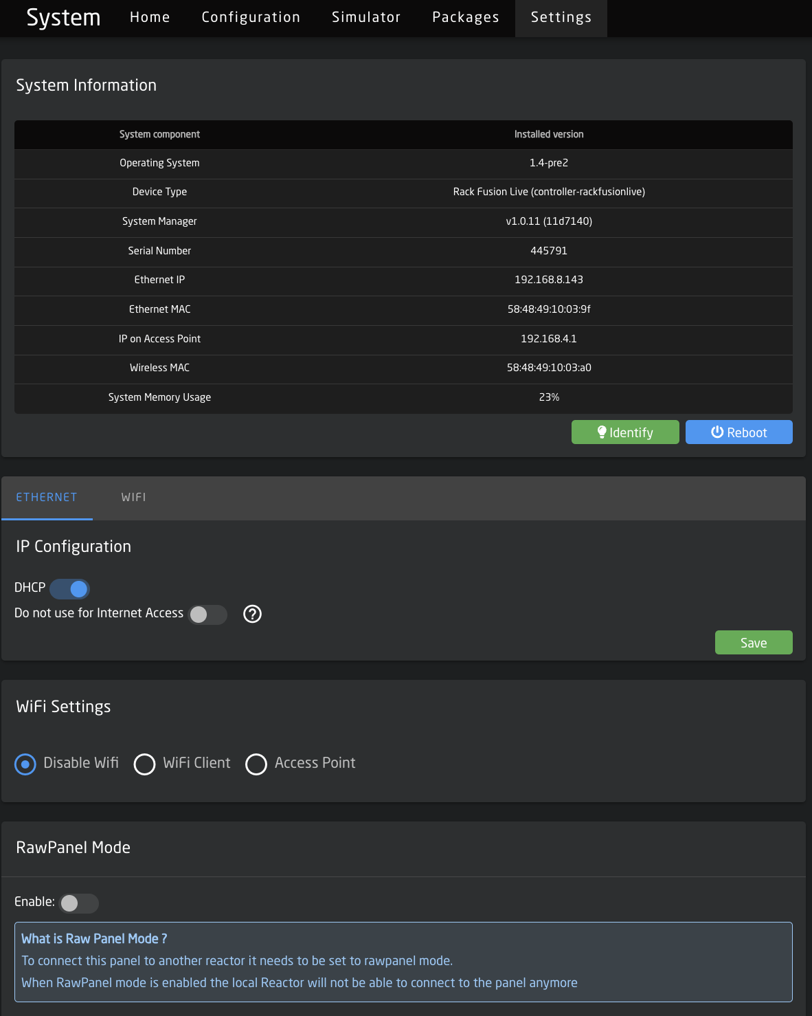
Step 2: Enable RawPanel Mode (and Optionally Disable Reactor)
In the Raw Panel Mode section:
| Setting | Description |
|---|---|
| Enable | Toggle on to activate RawPanel Mode |
| Port | The TCP port the panel will listen on (default: 9923) |
When RawPanel Mode is enabled, the panel is disconnected from the local Reactor instance. After enabling RawPanel Mode, a confirmation dialog will appear asking whether you also want to disable the Reactor package.
Disabling Reactor is recommended for panels used exclusively as remote RawPanels, as it frees up system resources.
If you choose to disable Reactor, the package will be stopped automatically. Reactor can also be disabled manually at any time by navigating to the Packages page, locating the Reactor package, and stopping it, you can then also disable the autostart switch, to avoid a restart on the next reboot.
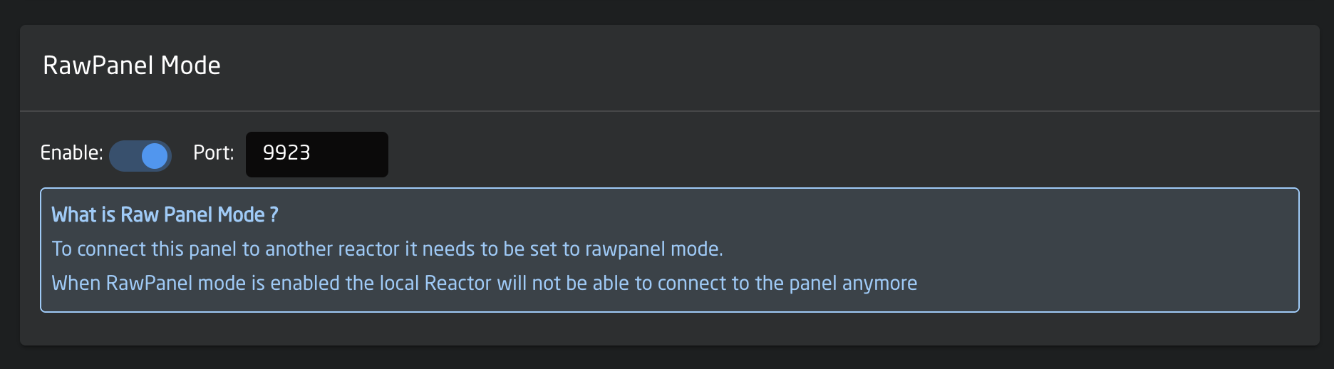
Enabling RawPanel Mode means the panel will no longer respond to local configurations if reactor is still in use. The panel will show "Disconnected" in the local reactor.
With Reactor disabled, you will only have access to the Packages and Settings pages in the web interface. The Home, Configuration, and Simulator pages will be unavailable.
Connecting to a Remote Panel
Once a panel is in RawPanel Mode, you can connect to it from another Blue Pill running Reactor.
Step 1: Add the Panel
On the Blue Pill running Reactor:
- Go to the Home page
- In the Panels section, click Add Panel
- The remote panel should appear in the discovery list if on the same network
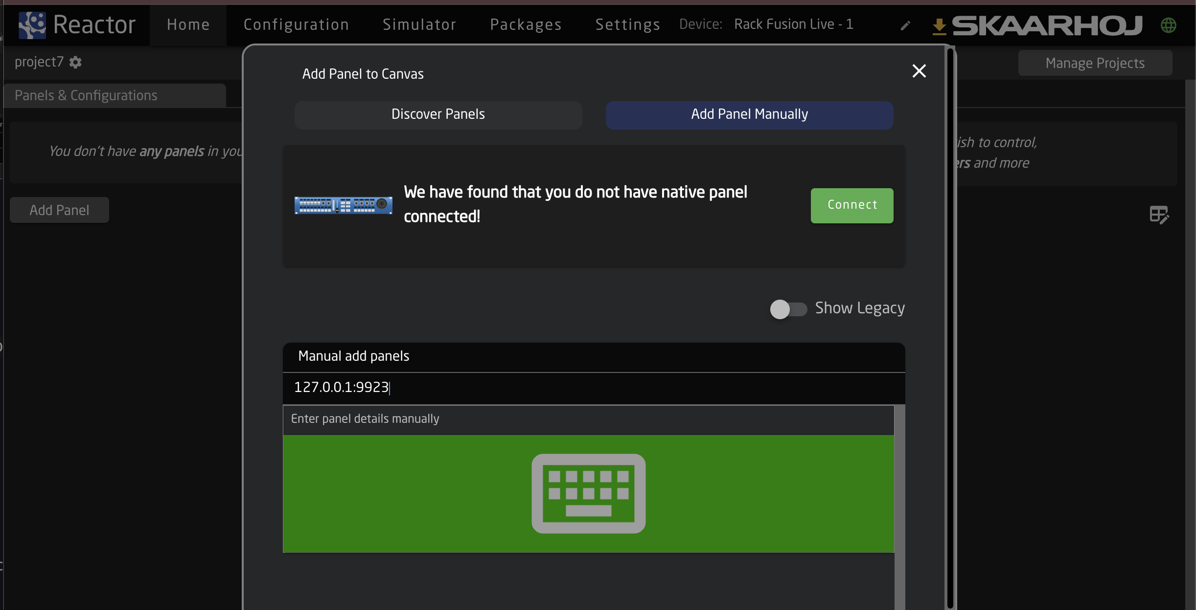
Step 2: Manual Configuration (if needed)
If the panel doesn't appear automatically:
- Click Add manually
- Enter the panel's IP address and port (e.g.,
192.168.1.100:9923) - Configure panel model and settings as needed
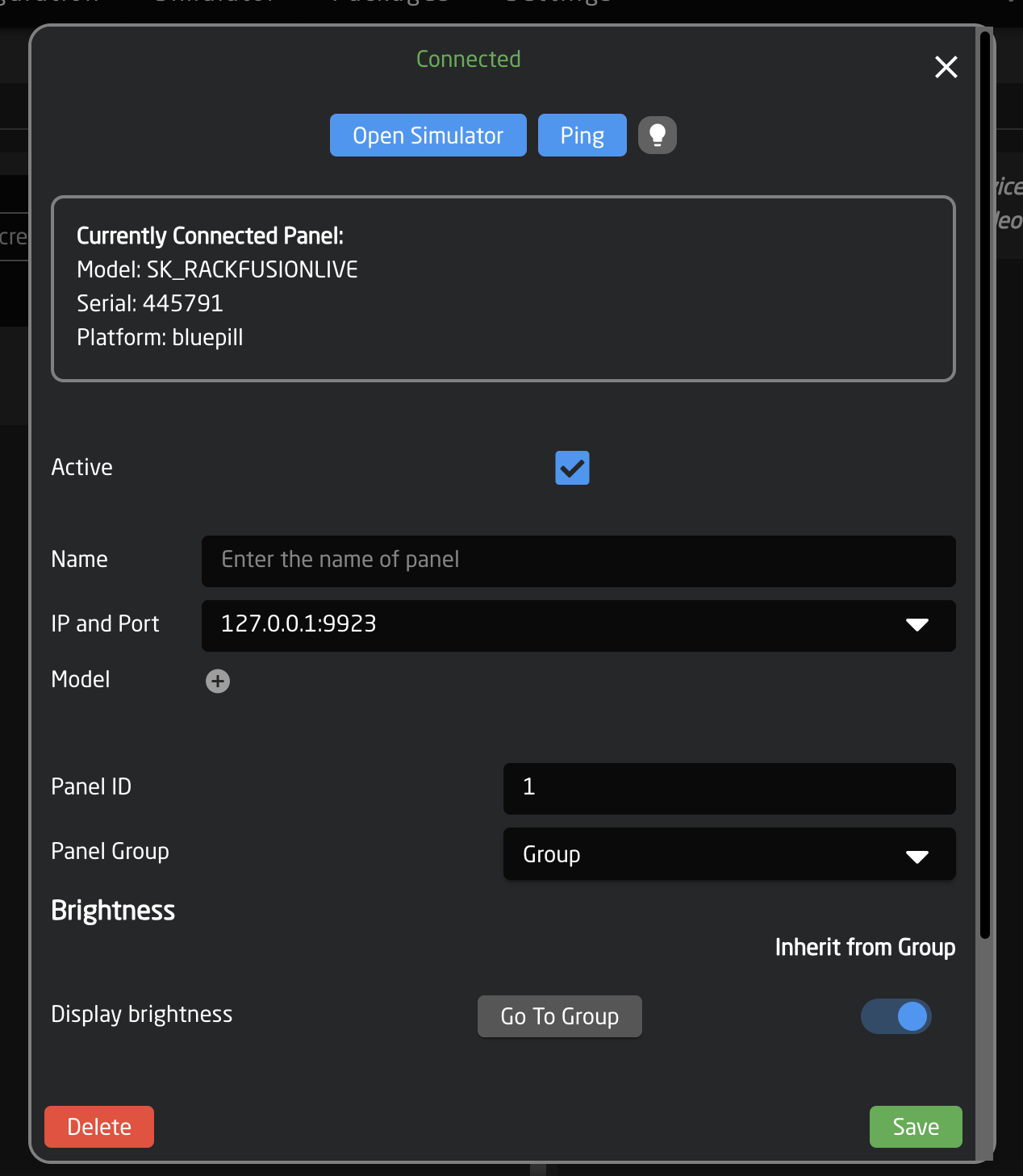
Step 3: Verify Connection
After adding the panel:
- Check the panel status indicator on the Home page
- The panel should show as connected (green status)
- You can now select configurations for this panel like any local panel
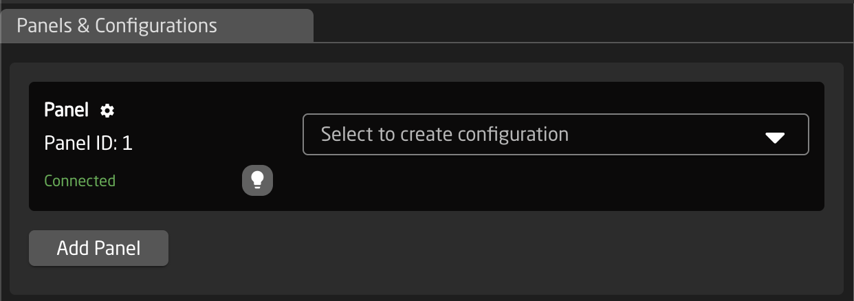
Panel Configuration Options
When editing a remote panel's connection settings, you can configure:
| Setting | Description |
|---|---|
| IP and Port | The network address of the remote panel |
| Name | A friendly name for identification |
| Model | The panel model (for topology information) |
| Serial | Filter by specific hardware serial number |
Reactors Panel Connection includes a few tricks for reliability:
- Automatic reconnection: If the network connection drops, Reactor will automatically attempt to reconnect
- Failover addresses: You can specify multiple IP addresses (comma-separated) for redundancy
- mDNS discovery: Panels can be found by their
.localhostname on supporting networks
Troubleshooting
Panel Not Discovered
- Verify both devices are on the same network
- Check that RawPanel Mode is enabled and the port is correct
- Ensure no firewall is blocking TCP traffic on port 9923 (or your configured port)
- Try adding the panel manually using its IP address
Connection Unstable
- Check network reliability between devices
- Consider using wired Ethernet instead of WiFi for critical applications
- Verify no IP address conflicts exist
Panel Not Responding
- Confirm RawPanel Mode is still enabled after any device restarts
- Check that no other application is connected to the panel (only one connection at a time)
- Verify the panel hardware is functioning correctly (LEDs, buttons responding locally)
Development Tools
Two companion applications are available for developing and testing with the RawPanel protocol. Together they let you emulate panels without physical hardware and inspect the protocol communication in detail.
RawPanel Dummies (Panel Emulator)
RawPanel Dummies emulates SKAARHOJ hardware panels in your web browser using the RawPanel protocol. This lets you test configurations and develop integrations without needing physical controllers.
Key features:
- Emulates a wide range of SKAARHOJ controllers in a browser window
- Includes topologies for legacy UniSketch-based panels
- Can simulate third-party devices such as StreamDecks
- Provides Crestron USP/USH modules for SIMPL Windows integration
To use it, start the application and connect Reactor to the emulated panel just like you would with a real remote panel. The dummy panel appears on the network and can be discovered or added manually by IP address.
Download: RawPanel Dummies Releases on GitHub
RawPanel Explorer (Protocol Inspector)
RawPanel Explorer is a discovery and diagnostic tool that scans your network for RawPanel devices and lets you connect to them to explore their properties and protocol commands.
Key features:
- Discovers RawPanel devices on the network via mDNS
- Connects to panels and inspects topology, state, and events
- Visualizes panel layouts with interactive SVG graphics
- Includes event plotting and VU meter demos
- Available as CLI or GUI application for both macOS and Windows
Use RawPanel Explorer to understand how the protocol works, inspect live panel state, and debug connectivity or integration issues.
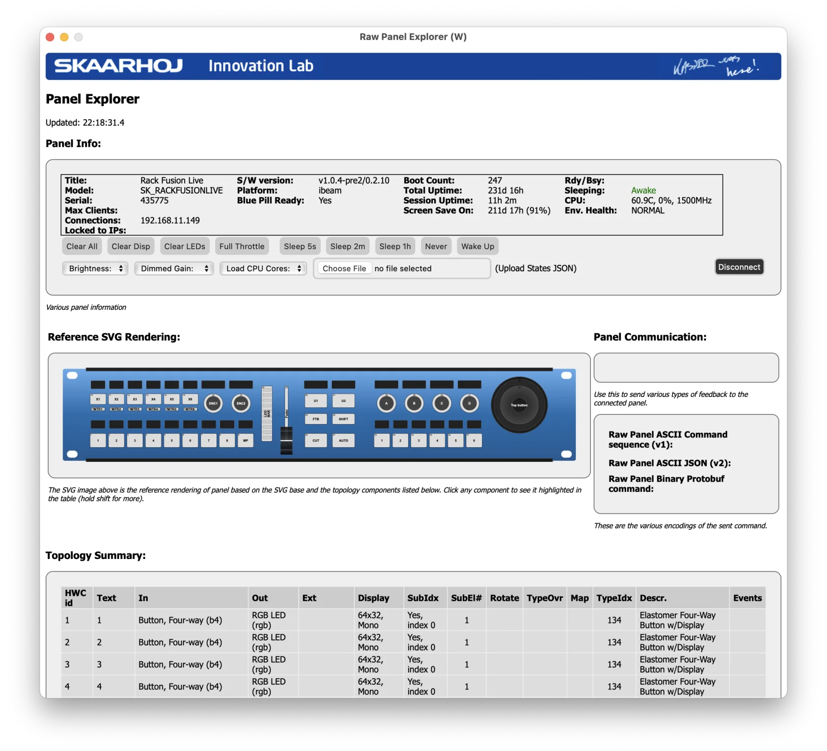
Download: RawPanel Explorer Releases on GitHub
Shared Device Cores
Device Core Sharing allows Reactor to use device cores running on a different Blue Pill Server or Blue-Pill-Inside device.
Why Share Device Cores?
Hardware Connection Requirements
Some device cores require direct physical connections:
- USB: Some camera control systems, specialized hardware
- Serial/RS-422: PTZ cameras, legacy routers, certain production equipment
When equipment requires these connections, you need a Blue Pill physically present at the equipment location. Device Core Sharing lets your main Reactor instance access these locally-connected cores.
Example: Camera control via serial connection. A Blue Pill near the cameras has the physical serial connections and runs the camera device core. Your panel's Reactor connects to this shared core.
Load Balancing Across Controllers
When you have a large number of devices to control (for example, 20 or more), running all device cores on a single Blue Pill can strain system resources. By distributing device cores across multiple controllers, you can:
- Balance processing load: Each Blue Pill handles a subset of device protocol communication
- Improve system stability: No single point of failure for all device connections
- Scale flexibly: Add more Blue Pills as your facility grows
Example: A facility with three operator positions and 20 devices. Instead of each Blue Pill running all 20 device cores:
- Controller A runs cores for devices 1-7
- Controller B runs cores for devices 8-14
- Controller C runs cores for devices 15-20
Each Reactor instance connects to the shared cores on the other controllers. Any operator can control any device, but the protocol processing is distributed across all three Blue Pills.
Geographic Latency
When controlling devices across long distances (different buildings, cities, or continents), network latency can significantly impact the responsiveness of device protocols. By placing the device core close to the equipment:
- Protocol communication between the device core and equipment has minimal latency
- Blue Pill-to-Blue Pill communication handles the longer distance more gracefully
- User experience remains responsive even with geographic separation
Example: An ATEM switcher at a remote broadcast venue. A local Blue Pill runs the ATEM device core, communicating directly with the switcher. Your main Reactor instance at headquarters connects to this shared core over the internet.
Limited Client Connections on a device
Some devices, eg some PTZ Cameras do not allow more than a certain number of connections before running into issues. This has also been a case for earlier versions of the ATEM Mixers. If we now want to use several controllers, GPI Boxes and other devices to access them you might run into trouble. This is why sharing the same devicecore can be beneficial, so that the end device only sees one connection.
Example: A older ATEM Switcher shall be used to provide Tally feedback to several PTZ Extremes and RCPPros. more than 5 connections to the device are not possible. To solve this, we setup one device to connect to the atem core, and add this device on all others as "remote devicecore".
Enabling Device Core Sharing
Device Core Sharing is configured on the Blue Pill that will host the device cores (the one with direct access to the equipment).
Step 1: Access System Settings
Navigate to the Settings page in the main Menu.
Step 2: Enable DeviceCore Sharing
In the Devicecore Sharing section:
| Setting | Description |
|---|---|
| Enable | Toggle on to allow remote access to device cores |
| Advanced Config | Access detailed sharing permissions |
Step 3: Configure Access Permissions (Optional)
Click Advanced Config to manage which cores are shared and authentication settings:
- Define which specific device cores can be accessed remotely
- Set up authentication requirements for each core
- Control access on a per-core basis
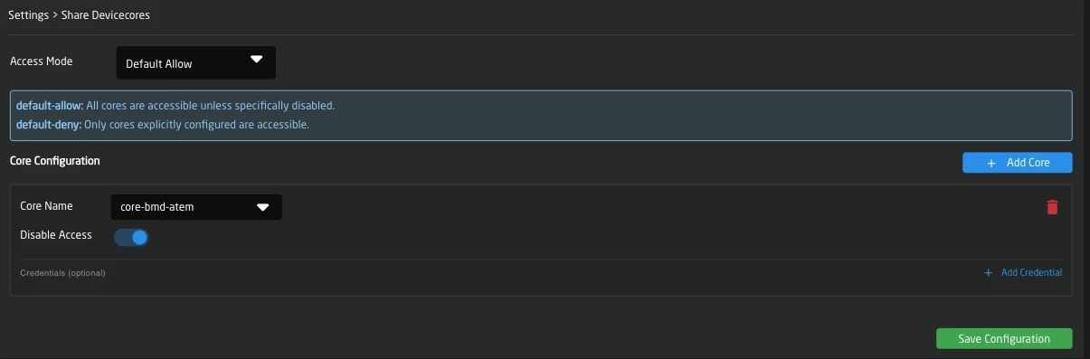
By default, all device cores on the hosting Blue Pill become available when sharing is enabled. Use Advanced Config to restrict access if needed.
Connecting to Shared Device Cores
Once sharing is enabled on the hosting Blue Pill, you can connect from another Reactor instance.
Make sure for each core (eg core-bmd-atem) every DeviceID is unique! else Reactor might stop processing till the issue is resolved. This is only relevant if you add for example multiple atem cores in your config, or combine local and shared cores.
Method 1: Select from Discovery
On your main Reactor instance:
- Go to the Home page
- Click Add Device in the Devices section
- Search for Shared Core in "Discover Devices" (not the specific device core name)
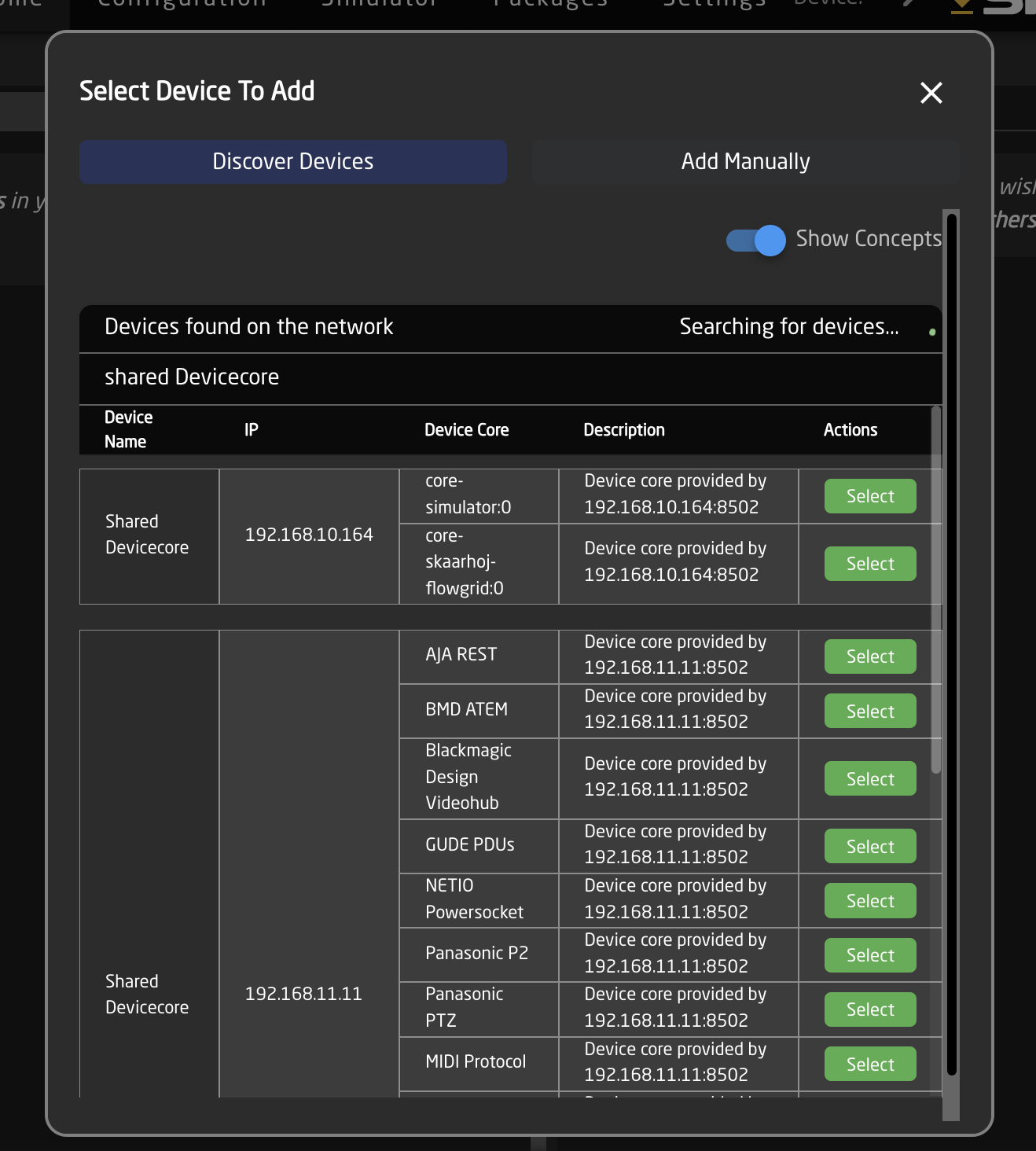
When adding a core, all devices configured on it are automatically added to your configuration
Method 2: Manual Configuration (if needed)
If auto-discovery doesn't find the remote host:
- Click Add manually
- Select Remote option from the device list
- Enter the IP address of the hosting Blue Pill
- All shared cores from your bluepill will then be listed, select the one you like to add. If you want to add multiple, simply repeat the process.
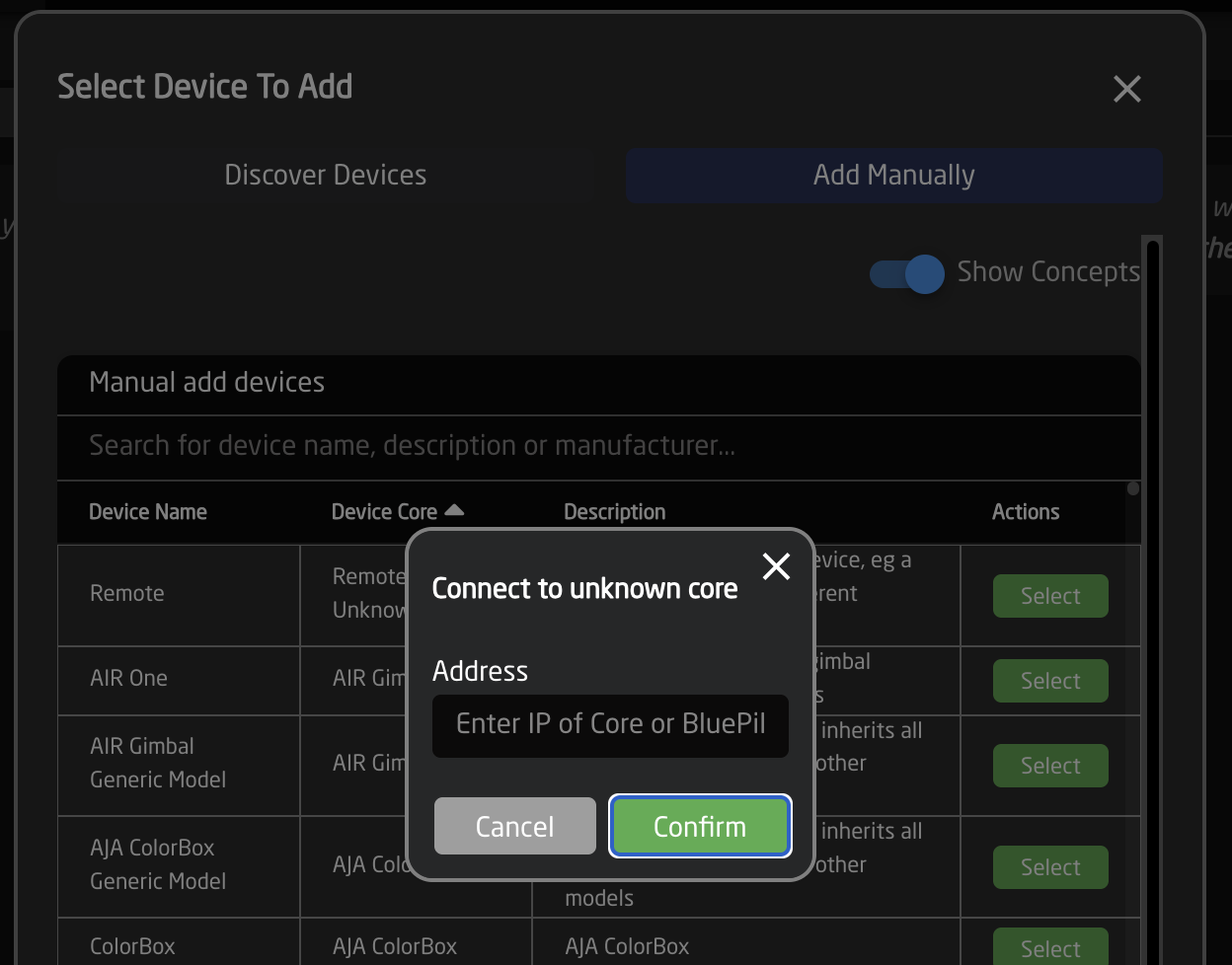
When searching for shared cores in "Add manually" use the "Remote" option and enter the IP of the remote Blue Pill device, not your end device
Configure Core Details
When a core is added as a Shared Core, its configuration is disabled on this Reactor instance. You must open the Blue Pill that hosts the core to configure it.
If you want to configure it from this reactor instance, enable Allow Remote Configuration in the shared core settings.
Only one Bluepill should manage a remote core at the same time, this is an advanced option, please leave disabled if unsure, and use the remote Bluepill's UI to configure your devices
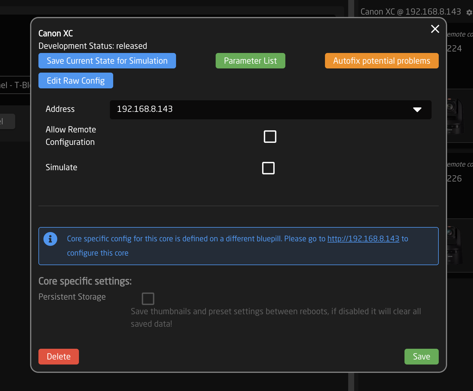
Network Considerations
Default Port
Device Core Sharing uses port 8502 by default. Ensure this port is accessible between devices.
TestTube for Development and Validation
When you need deeper inspection or repeatable testing of shared Device Cores, use TestTube (aka ibeam-testtube).
TestTube is a development tool for inspecting and testing remote Device Cores, with both a browser-based UI and CLI workflows.
Typical Use Cases
- Interactive parameter testing in a Web UI
- See the devicecore's internal state and interact with it
- Test Network discovery of devices via mDNS, SSDP, and Panasonic UDP broadcast
Installation Options
You can install and run TestTube in two ways:
- On skaarOS (Blue Pill): install the
TestTubepackage from the Packages page or upload the.ipksfrom devices.skaarhoj.com when offline - On a computer (macOS/Windows/Linux): download the platform binary from the releases repository and run it as a CLI tool
Releases repository: SKAARHOJ/ibeam-testtube-releases
Troubleshooting
Shared Core Not Discovered
- Verify DeviceCore Sharing is enabled on the hosting Blue Pill
- Check both devices are on the same network or have routing configured
- Ensure port 8502 is not blocked by firewalls
- Try manual configuration with the direct IP address
Connection Refused
- Confirm the hosting Blue Pill is running and accessible
- Check Advanced Config on System Settings Page for access restrictions (See Devicecore Sharing)
- Ensure the device core is actually running on the remote host
Device Not Responding
- Check the device connection on the hosting Blue Pill first
- The device must be working locally before it can be shared
- Verify network stability between the two Blue Pills
Configuration Not Syncing
- Shared cores may have their configuration managed remotely
- Check if
Enable Remote Configis set appropriately - Review which Blue Pill should be the source of truth for device settings
Serial Console Commands
Advanced command-line interface for device configuration via USB serial. To connect simply use SKAARHOJ Updater or SKAARHOJ Discovery, open the serial monitor and start typing commands.
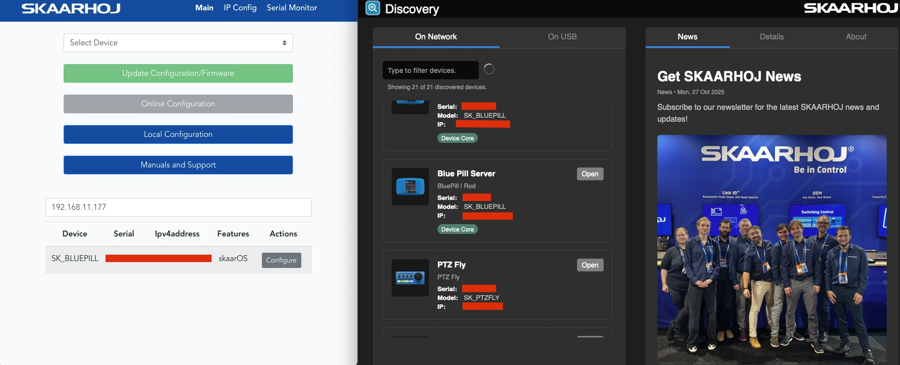
Command Reference
Query Commands
| Command | Response | Description |
|---|---|---|
ip=? | ip=192.168.1.100; | Get Ethernet IP address |
wifiip=? | wifiip=192.168.1.101; | Get WiFi IP address |
usbip=? | usbip=192.168.1.102; | Get USB Ethernet IP address |
mac=? | mac=AA:BB:CC:DD:EE:FF; | Get MAC addresses (Ethernet and WiFi) |
getCID | CID=skaarOS;Type;Serial;HWSerial; | Get device identification |
help | Help text | Show available commands |
Dump Commands
| Command | Description |
|---|---|
dumpIP | Export full Ethernet IP configuration |
dumpWifiIP | Export full WiFi IP configuration |
dumpUSBIP | Export full USB Ethernet IP configuration |
Network Configuration
Configure network settings using bulk mode:
- Send
bulkipto enter configuration mode - Set parameters:
ip=192.168.1.100(orip=0.0.0.0for DHCP)subnet=255.255.255.0gateway=192.168.1.1dns=8.8.8.8
- Apply with:
store(Ethernet),storewifi(WiFi), orstoreusb(USB)
System Commands
| Command | Description |
|---|---|
reboot | Reboot the device |
upgrade | Upgrade all packages to latest versions |
support=1 | Enable remote support mode |
support=0 | Disable remote support mode |
Example IP Setting Session
ip=?
ip=192.168.1.50;

getCID
CID=skaarOS;RackUnit;SK1234567;HW9876543;

bulkip
ip=192.168.10.100
subnet=255.255.255.0
gateway=192.168.10.1
dns=192.168.10.1
store
Resetting... (only network config)
Unrecognized commands return NAK.
SKAARHOJ Default Configurations
Out of the box, we provide a quick setup to get you started controlling your devices. We’ve created a curated set of configurations to make it easy to add and combine devices from different manufacturers with our panels.
Panel Classes
To create systematic configurations, we’ve developed Configuration Classes, categorizing each SKAARHOJ panel by its intended purpose.
The following Configuration Classes exist:
- Camera Light Class
- Camera Standard Class
- Camera Pro Class
- Switcher Class
- Audio Class
- Quick Class
- Routing Panels
- MegaPanel Configurations
Camera Light, Pro, and Standard Class
Pro and Standard Class compatible panels are used for shading and PTZ control. A Pro Class panel has a menu based on 8 standard encoders, while a Standard Class panel has a menu based on 4 standard encoders.
These configurations are usually called "Generic Camera Control."
Light Class Panels
- PTZ Wiz
- Air Fly Pro (V2 and V3) Wiz Section
Standard Class Panels
- PTZ Fly
- PTZ Pro
- Color Fly
- Right Side of Rack Fusion Live
Pro Class Panels
- PTZ Extreme (V1, V2)
- RCP Pro
- RCPv2
- PTZ View (aka MKA 2)
- INLINE 22 + XC 7
Configuration Options
In these configurations, each panel has a Camera Selector, a Tally Forwarding Config, and a Routing Trigger Config.
The Camera Selector allows you to add different cameras. Each panel has a dedicated button row for camera selection. Depending on the device core used to connect the camera, a different menu will be loaded when the camera is selected. You can also configure its name, tally index, and routing index in the Settings Table.
Switcher Class Configurations
Switcher Class configurations are designed for live switching controllers and device cores. They provide the most common functions needed to control a switcher system while offering advanced features for deeper control, such as the Quick Class or PTZ sections.
Switcher Class Panels
- Air Fly
- Air Fly Pro (V1, V2, V3)
- Master Key One (V1, V2)
Audio Class Configurations
Audio Class configurations are default setups for controllers with at least four faders as the main components.
To use them in Reactor, select a "Generic Audio" configuration for your panel and fill the channel configuration with devices.
Audio Class Panels
- Wave Board (V1, V2)
- Wave Board Mini
- Color Fly (V2, V3)
- Wave Board (V1) 1
Quick Class Configurations
Quick Class configurations work with a Quick Bar and selected controllers that have a section of six Four-Way buttons. Select a Quick Class configuration in Reactor and fill the selector with the devices you want to control.
For more info, visit:
Routing Configurations
Routing Configurations map router devices to utility controllers like the Rack Fly series or the Quick Bar.
MegaPanel Configurations
SKAARHOJ MegaPanel configurations typically consist of one large configuration for several controllers, often based around a T-Block (Left or Right).
One M/E row usually consists of two Master Key 48s and one T-Block. Additional modules, such as the Wave Board Mini or PTZ View, can also fit the MegaPanel frame.
Understanding Sections in Default Configurations
The default configurations provide a few easily configurable sections.
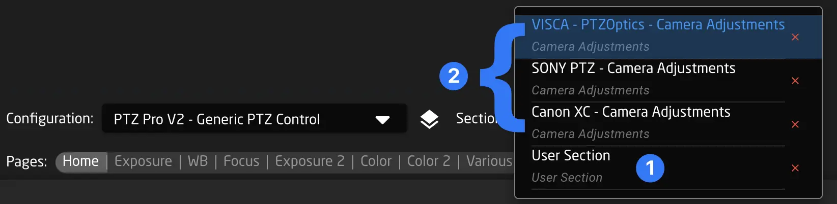
User Section (1)
The User Section exists in all SKAARHOJ default configurations. It covers nearly all components of a panel. When you create a behavior in the User Section, the new behavior overlays those defined below, allowing you to easily modify button functions even if they are deeply embedded in the default configuration.
Camera Adjustments (2)
The Camera Adjustments section is present in all camera-related configurations (Light/Standard/Pro Classes). The menu corresponding to the selected camera’s device core is loaded and can be customized here.
Engineering Menu
The engineering menu contains panel settings like, Brightness control and dim/sleep time. You can also find other settings like, expert mode and global Invert pan/tilt or the Panels IP Address.
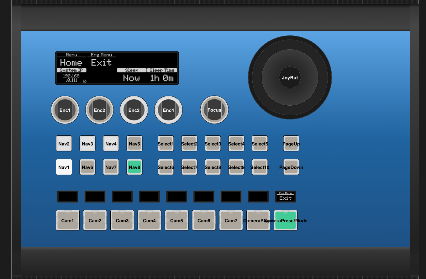
It can be accessed in different ways based on the panel, and chosen configuration.
How do I know which method my configuration is using? Here we have listed the different default Configurations that have the engineering menu.
Remember this is a list of configurations. So the specific panels named here, only have access to the engineering menu, when the loaded configuration contains such menu. This also means that you will find panels not named here, that can also access an engineering menu. To find the exact method used in your panel config, you can navigate the list here, and try methods that is in correspondence with your panel type.
PTZ Pro
PTZ Pro
How To Activate
Press and hold U4 A for a few seconds
Models with this method
PTZ Pro only
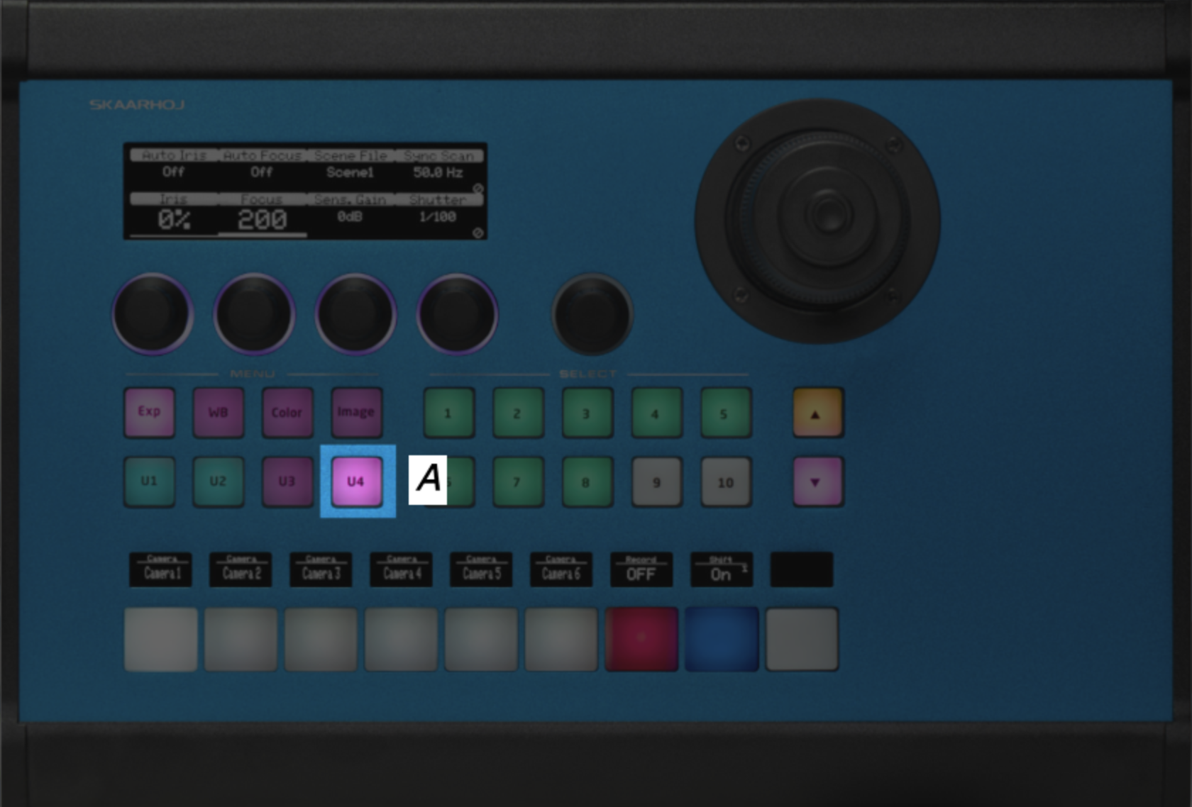
PTZ Extreme
PTZ Extreme
How To Activate
Press and hold A for a few seconds
Models with this method
PTZ Extreme only
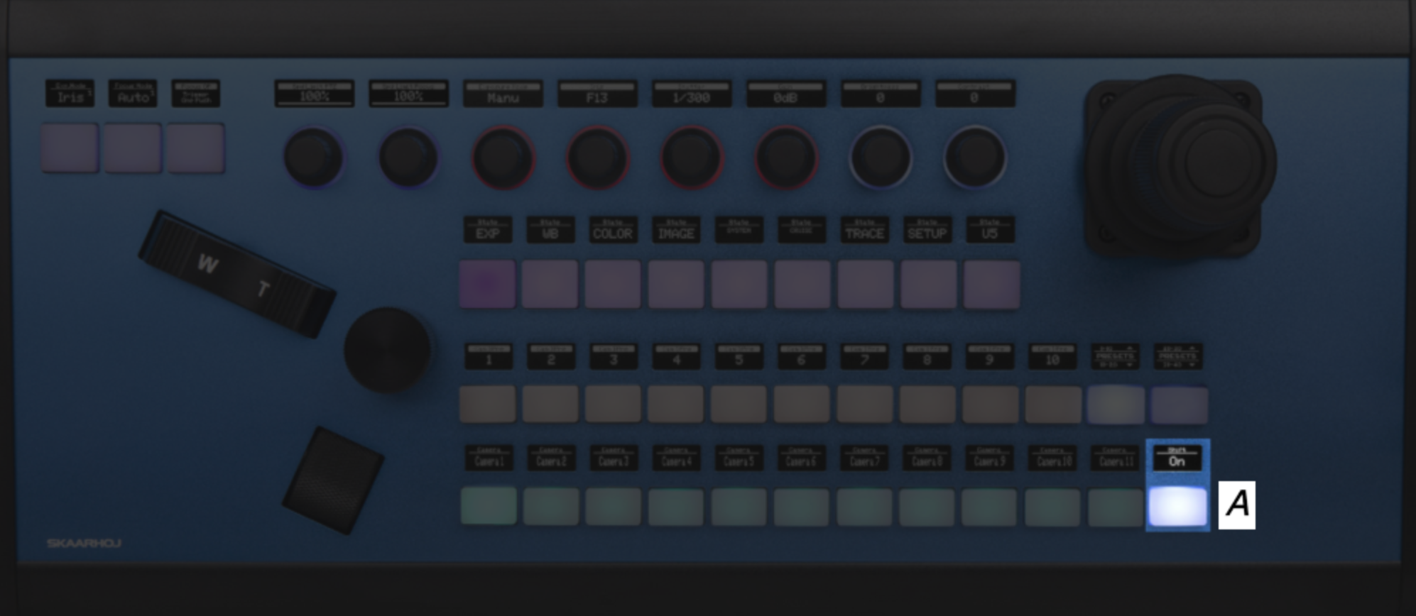
RCP
RCP
How To Activate
Step 1) Press and hold the 'Shift' button A
Step 2) Now press the 'Panel lock' button B to enter the engineering menu
Models with this method
All RCP models, with the config "RCP - Generic PTZ Control"
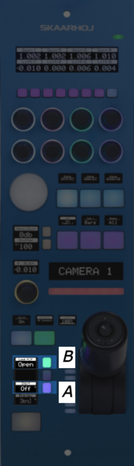
All other Configs with Camera Selector
All other Configs with Camera Selector
How To Activate
Press and hold the top edge of the 'Page' button A for a few seconds
Models with this method
Listed here is 4 panels that have support for a configuration, that have an engineering menu accessible the same way. Remember this is just examples, and that this method is not exclusive to these 4 panels.
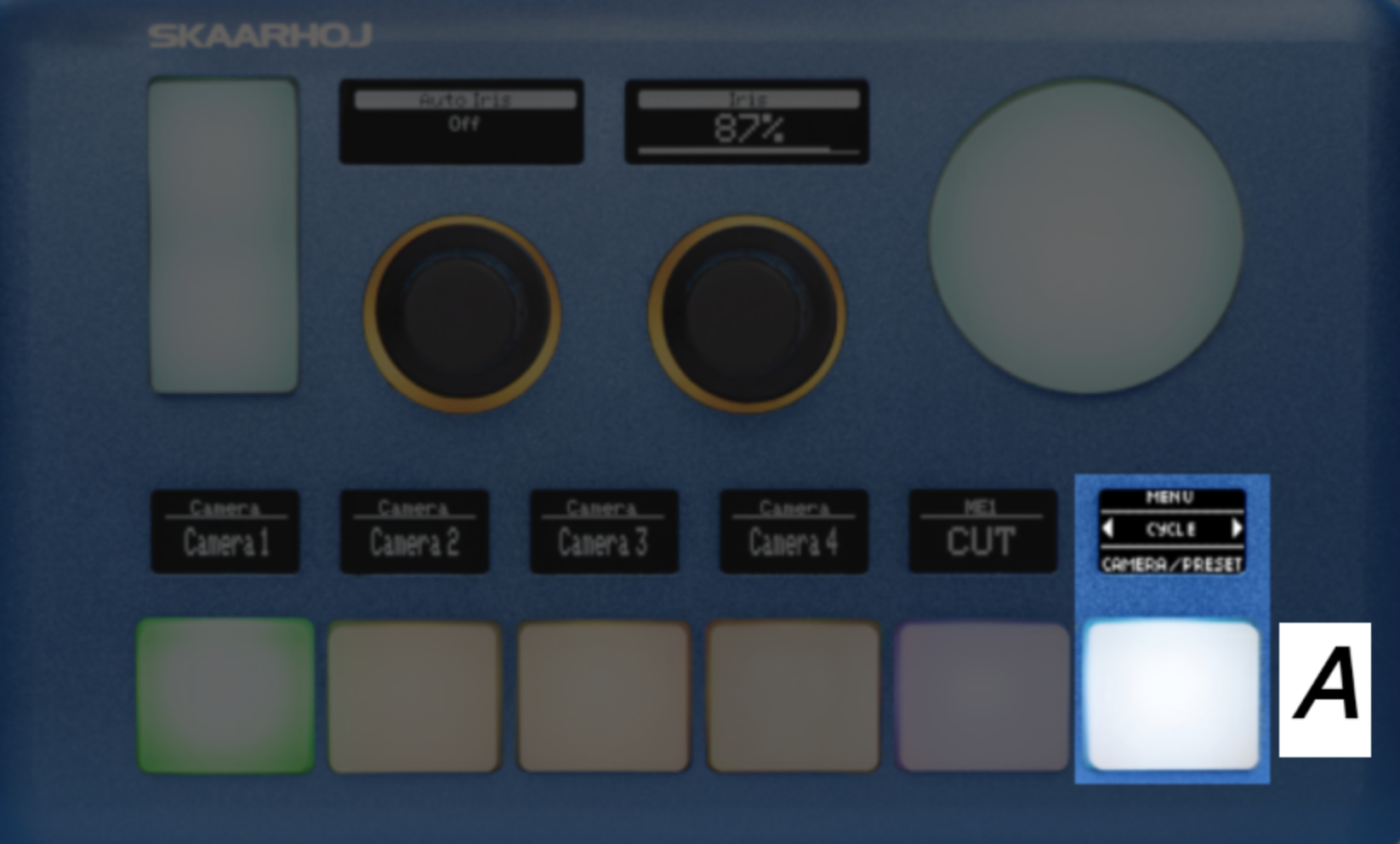
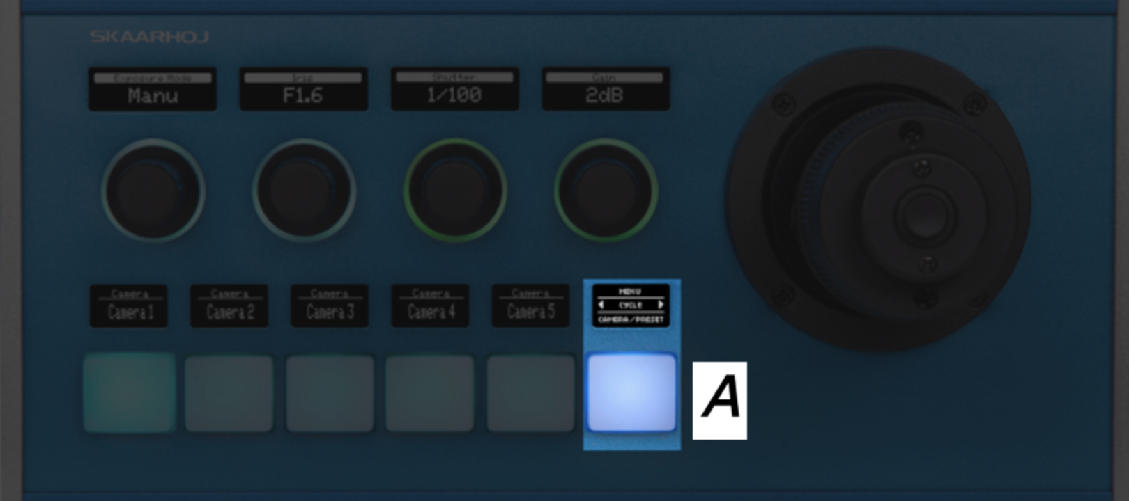

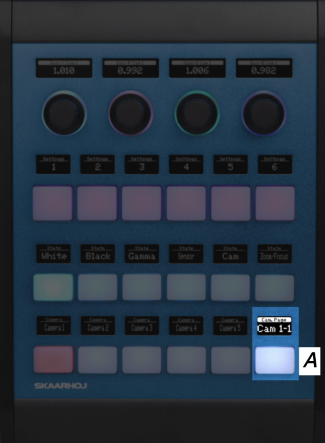
Mega Panel
Mega Panel
How To Activate
Step 1) Press and hold the 'Shift' button A
Step 2) Now press the 'Panel lock' button B to enter the engineering menu
Models with this method
MKT1A, MKT1B, T-Block-Left, T-Block-Right
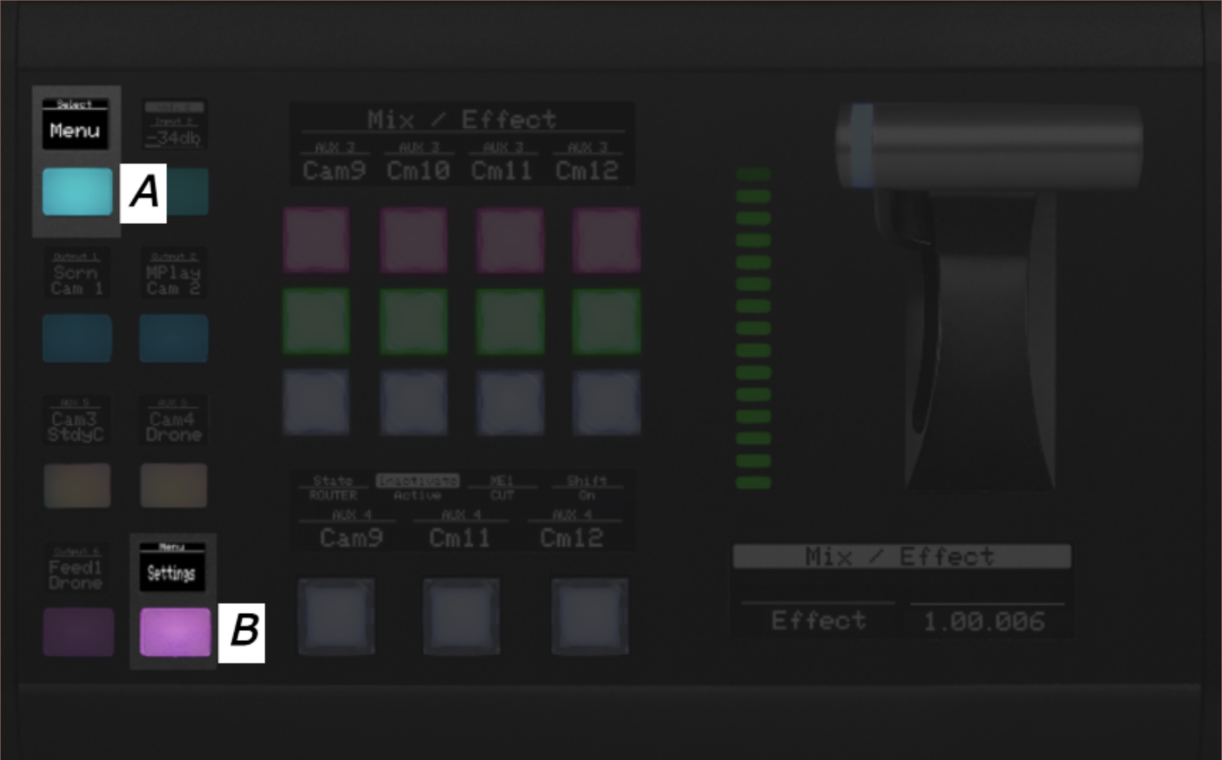
Kairos
Kairos
How To Activate
Step 1) Press and hold the button marked A
Step 2) Now press the button marked B to enter the engineering menu
Models with this method
Master Key One V2 with Kairos Config
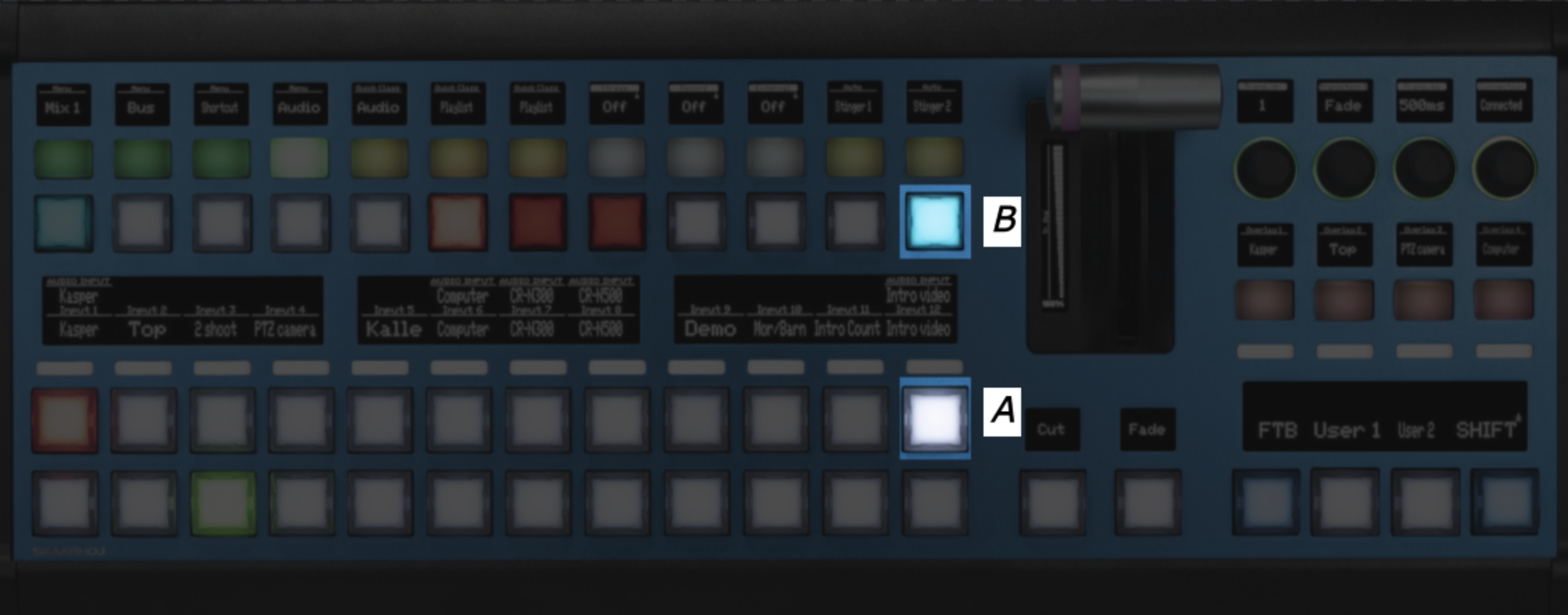
All other Switching Configs
All other Switching Configs
How To Activate
Step 1) Press 'Shift' A to make the FTB button light green
Step 2) Press 'FTB' B to enter the engineering menu
Models with this method
Listed here is 3 panels that have support for a configuration, that have an engineering menu accessible the same way. Remember this is just examples, this method is not exclusive to these 3 panels.
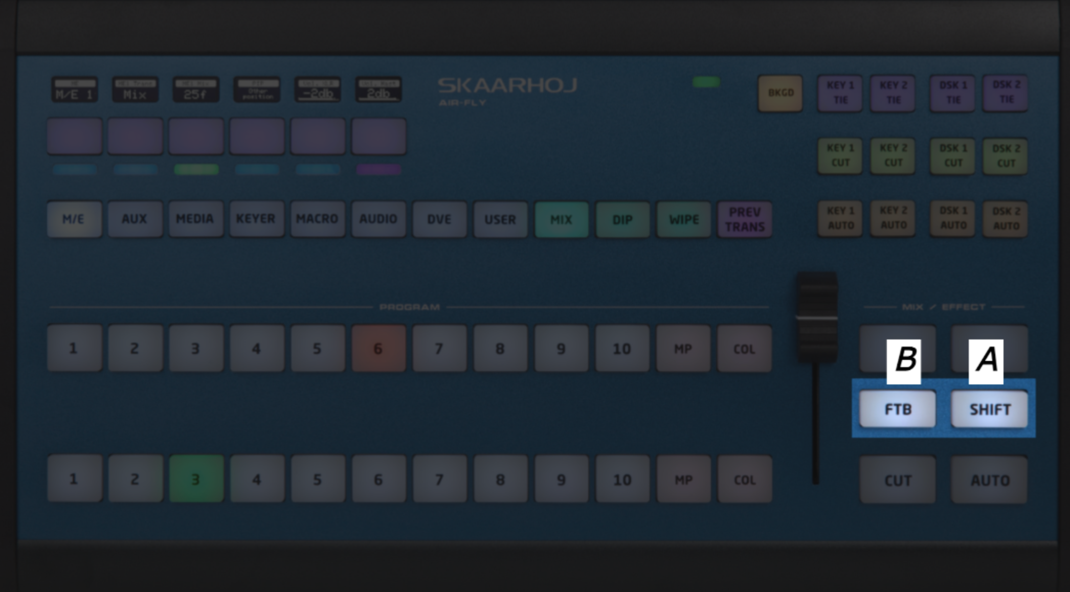
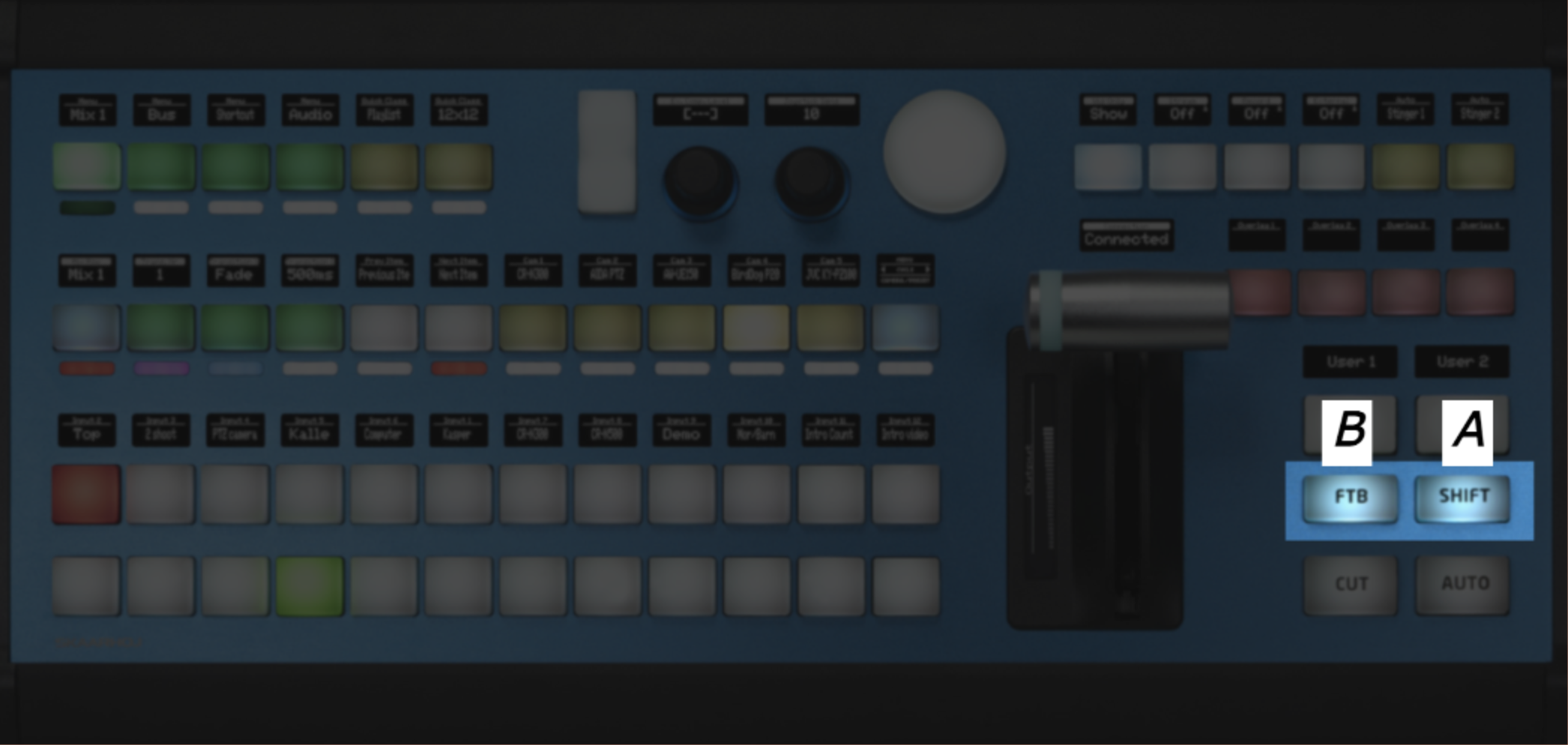
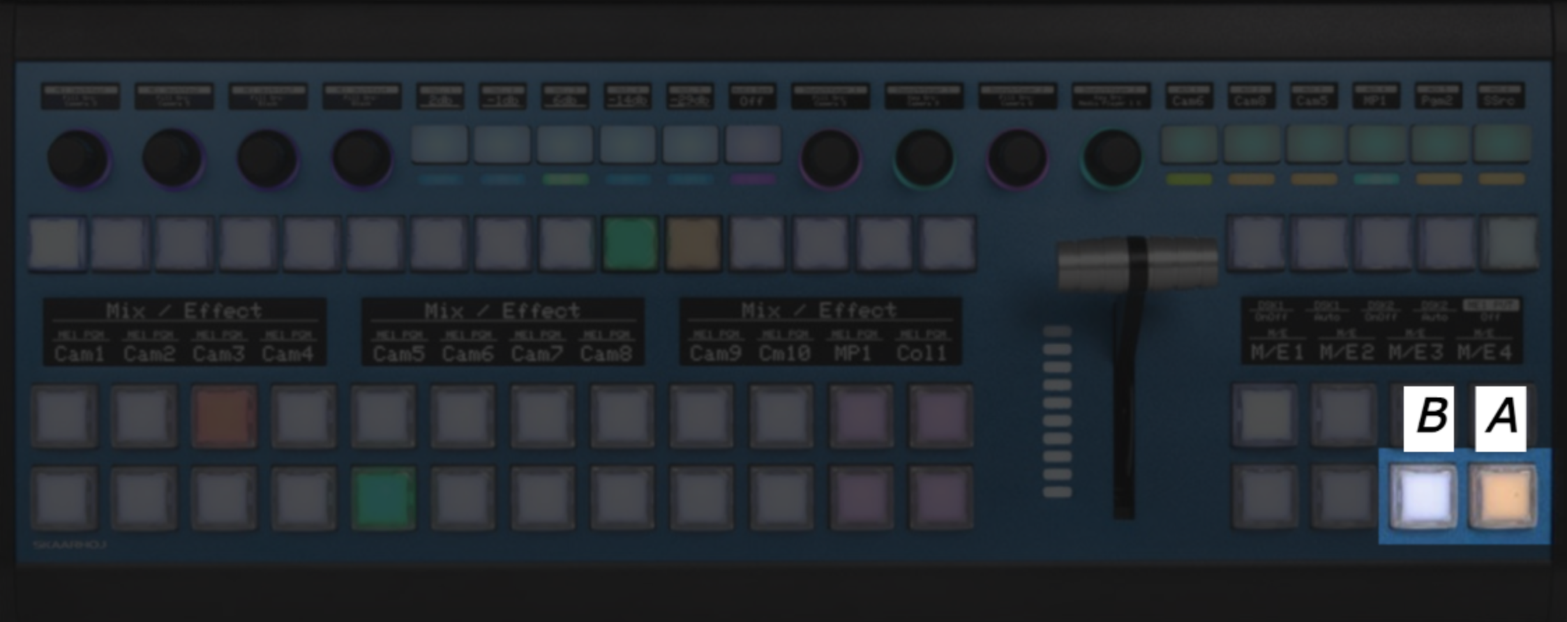
Audio & Light Control
Audio & Light Control
How To Activate
Step 1) Press and hold the first pager button.
Models with this method
Most panels that support the 'Audio & Light Control' configuration, supports this. Here a Wave Board is shown as an example.
-
Wave Board V1 has an alternative setup utilizing two extra buttons instead of the encoder. ↩
Tips and Tricks
Using Context Menus
In many areas of Reactor, you will find context menus by right-clicking to interact with elements. These can help you work faster. Here are a few examples:
- Remove a panel faster using right-click.
- Copy Variables in the Tree quickly.
- Create behaviors on the controller.
- Clear the contents of behaviors easily.
Use Shortcuts
Shortcuts are a great way to speed up your workflow in Reactor. Here is a list of the most useful ones:
- cmd+e: Toggle simulation mode in the configurator.
- cmd+u: Upload a new package manually (works everywhere).
- Hold shift on Add Device or Add Panel: Add a device or panel without closing the window, allowing you to add multiple devices faster.
- cmd+i: Quickly open the project import window.
Use Copy/Paste
Many places in Reactor support copy and paste to speed up your configuration workflow. For example, you can create a behavior on one component and then copy it to several others. You can also copy and paste in many areas of the tree view, to duplicate Settings Tables, variables, and other configuration parts between different layers.
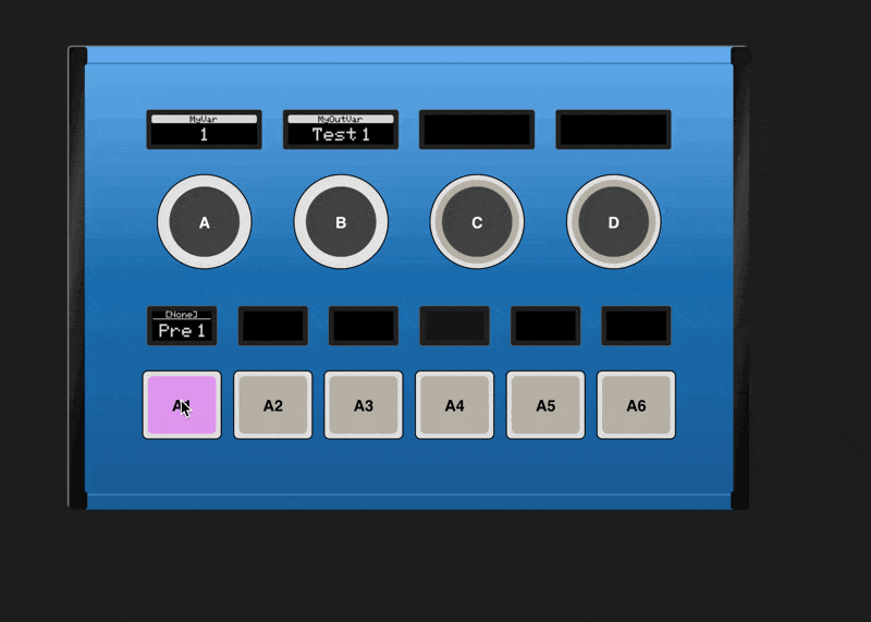
Use Undo/Redo
If you ever get lost in the configurator, don't worry-you can use the undo and redo buttons to revert or restore your previous changes. If you want to create a "checkpoint," use History View to create a tagged version of your config.
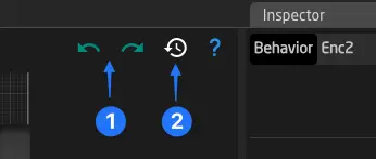
Batch Editing Components
The Batch Editor allows you to quickly edit several components at once. To batch edit multiple components, drag a selection across them in the configurator. If the selected components don’t have behaviors yet, the Inspector will offer to create new ones for all of them from the library. Otherwise, you'll see all common options of the selected behaviors to edit them quickly. To edit individually, click the table icon below to open a table view of all selected behaviors.
Using "Load Recent" in the Parameter Reference or Condition Helper Windows
When configuring parameters or conditions, you can quickly recall recent parameter references by clicking the Load Recent button in the top right corner of the window.
SKAARHOJ Glossary
Here you can find an alphabetically ordered list of all terms used in SKAARHOJ products that might need additional information.
Behavior
A behavior in Reactor defines how a hardware component should behave. It consists of Actions, and Feedbacks that enable you to define how the Parameter is interacted with and how it is displayed on your component (button, display, fader, etc.). Additionally, there are templates for the settings of a behavior. (See Behaviors)
Blue Pill
Blue Pill is the the platform or "brain" of most modern SKAARHOJ products. As the successor to our legendary Unisketch products, it packs a full Linux operating system into a tiny package and enables control of many devices. Blue Pill Server is a product containing only this brain alone, while most of our outer products ship with the Blue Pill "brain" inside.
Constant
Same as Field. The term "Constant" was renamed to "Field" in Reactor 2.2.5.
Device Core
A device core is a package that can be installed on a Blue Pill device. It acts like a driver that allows Reactor to communicate with your broadcast and AV devices using different protocols.
Device Collection
The Device Collection is a file storing all configurations of the devices that Reactor connects to. (See Projects)
devicecore-connector
The devicecore-connector is a tool that allows one Blue Pill device to share its device cores with other Blue Pill devices on the network.
Dimension
A dimension is an additional index on a Device Core parameter that represents one axis of multi-dimensional data. For example, an AUX source parameter may have a "Channel" dimension to select which AUX output to control. When a parameter has dimensions, extra fields appear in the Parameter Reference helper window. Dimension values can be literal numbers, Variables, or any other Parameter Reference.
Field
A Field is a static piece of configuration. Fields can have different types, like String, Number, Color or even nested Parameter (IOReference). They can either be defined directly in a Behavior (Behavior Field) or come from a Settings Table. Fields were called "Constants" prior to Reactor 2.2.5 and may sometimes still be referred to as such.
Hardware Component (HWC)
Hardware Components are input or output components on SKAARHOJ panels, such as buttons, displays, faders, encoders, and more. (See Components)
hardware-manager
A package running on your Blue Pill devices that communicates with the actual buttons, displays, faders, and encoders of your controller. It connects to Reactor or can expose the controller as a Raw Panel device on the network for external control.
IO Reference (IOref)
Same as Parameter.
LinkID
A LinkID is a reference to a different layer configuration file. It can be used inside the tree to include sub-configurations.
Master Behavior
Same as Template Behavior (or Settings Template). Originally named after "Master Slides" in presentation programs like Apple Keynote or PowerPoint.
MultiBehavior
A MultiBehavior allows a single hardware component to contain and execute more than one behavior. This enables sequences with configurable delays, combining different functions on one component (e.g., encoder rotate + press), or using Active-If conditions to dynamically switch which behavior is active based on a variable. (See MultiBehaviors)
Meta Value
A Meta Value is additional configuration data attached to a Device Core Parameter Reference that provides extra context when setting a value on a device. Meta Values are often used by protocol-based device cores such as MQTT (for topic and retain flag) and HTTP (for URL path and request type). They appear as additional fields in the Parameter Reference helper window and support both simple values and dynamic templating.
Panel Collection
The Panel Collection is a file storing all configurations of panels and Raw Panel devices that Reactor connects to. (See Projects)
Parameter (IO Reference)
A text string used to address any kind of parameter inside Reactor. (See Parameter Reference)
Raw Panel
Raw Panel is the protocol that Reactor uses to communicate with panels and controllers. It has different protocol variants. Learn more on the wiki.
Reactor
The main application running on your Blue Pill device, connecting panels to devices using configurations.
Settings Table (Constant Set)
A Settings Table is a table in the configuration. It can be used to store settings available on the Home Screen and to generate layers, behaviors, and virtual triggers based on its table rows. It's also called a Constant Set.
Template Behavior
A Template Behavior is used to quickly configure a behavior in Reactor for a given use case. (See Behaviors -> Changing Template Behavior) You can also create your own Custom Template Behaviors.
system-manager
System Manager is the main package running on every Blue Pill device. It provides access to system configuration using the web interface, handles WiFi, logging, package updates, and all other system-related tasks.
Variable
A variable in Reactor is used to store information like the current menu page. (See Variables and Conditions).